Wild Turkey unveils new look for its RTD range via The Creative Method
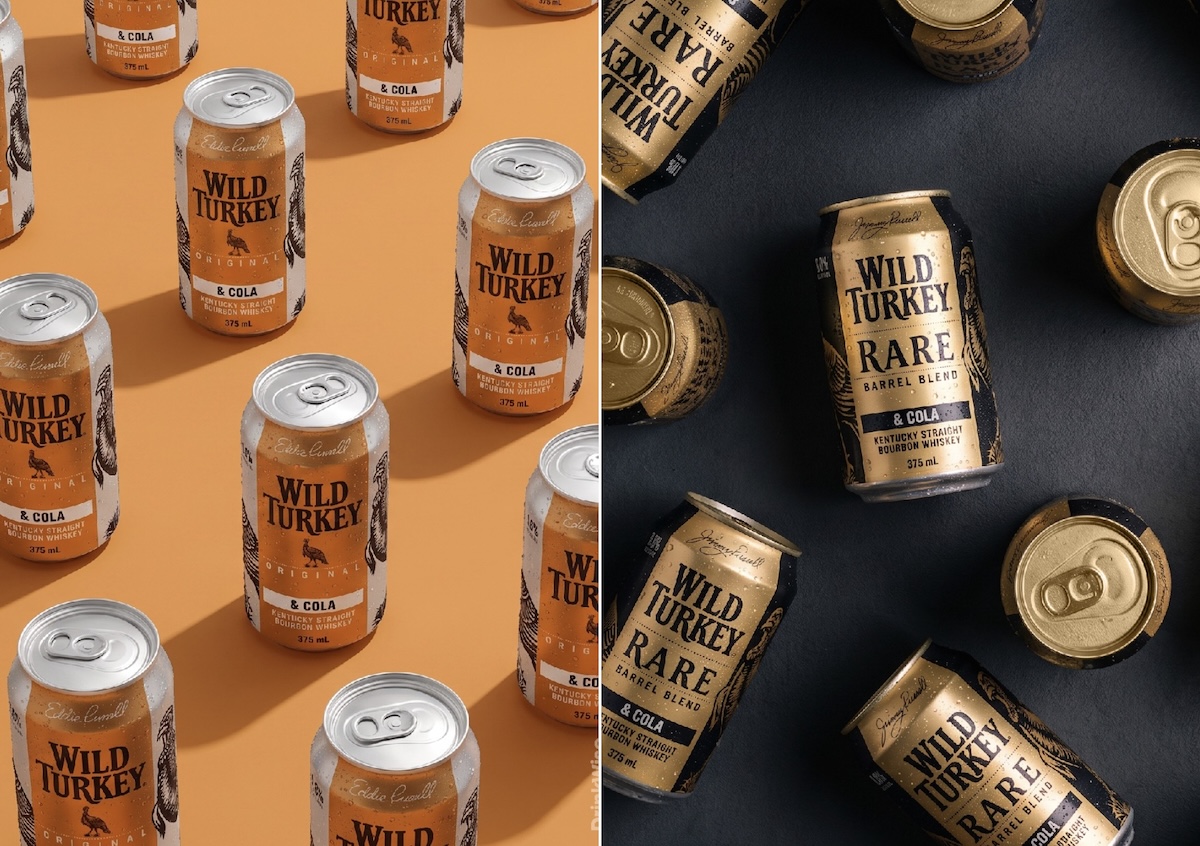
Wild Turkey has unveiled a new look across its 39-product Australian ready-to-drink portfolio, putting its iconic turkey illustration front and centre to strengthen the brand’s premium positioning and standout on shelf.
The new packaging system was developed by Sydney brand strategy and design agency The Creative Method, which was tasked with evolving the range while keeping it unmistakably Wild Turkey.
Rather than going looking for something new, The Creative Method found the answer hiding in plain sight.
Spanning cans and bottles, flavours, alcohol strengths, and Zero Sugar variants, the evolved portfolio draws more heavily on an iconic brand asset that has represented generations of Wild Turkey’s bourbon heritage.
The turkey illustration has been given a more prominent role across the portfolio, supported by a stronger visual hierarchy across formats and variants. A richer use of gold reinforces Wild Turkey’s warmth and bourbon credentials, while the bird creates an immediate and recognisable thread across the entire range.
Says Mark Watson, Marketing Director, Campari Australia: “Wild Turkey has generations of bourbon heritage behind it and the turkey itself is an important part of that story. We wanted the RTD portfolio to better reflect the uncompromising spirit and conviction and have greater standout on shelf, while remaining instantly recognisable to Wild Turkey drinkers.
“The evolved system heroes an asset that’s uniquely ours and gives us a stronger and more distinctive presence across the range.”
For The Creative Method, the project raises a bigger question facing established brands: when everyone is looking for the next new thing, are we overlooking the assets that already make a brand unmistakable?
Says Tony Ibbotson, Founder and Creative Director, The Creative Method: “When you’re working with a brand people have known for generations, the temptation can be to demonstrate change by changing everything. But the better question is: what have you already got that nobody else can own?
“Icons and images are more immediate and can carry more personality than wordmarks or type-based logos. For Wild Turkey, that icon was staring us in the face. Any bird that aesthetically challenging deserved some more love.
“The turkey already carried generations of recognition, character and story. We didn’t need to invent another brand asset. We needed to amplify the one that was already unmistakably Wild Turkey.”
Applying that thinking across 39 SKUs presented another challenge: creating a strong family resemblance across formats, flavours, and alcohol strengths while leaving room for the range to grow.
Ibbotson says established brands require a different mindset to those starting with a blank canvas: “That’s intelligent disruption. Knowing what to challenge, what to protect and what deserves to be amplified. Wild Turkey already had the story. We just made it harder to miss.”
The evolved Wild Turkey RTD range is rolling out nationally across Australia.
VIEW THE PRINT MAGAZINE + PAST ISSUES ONLINE. SUBSCRIBE NOW.
Register for FREE HERE and receive the Campaign Brief Daily Bulletin and/or the global Best Ads Best of the Week Bulletin. Subscribe to Campaign Brief Magazine.
#More Creative News #No paywalls #No annual membership fees
Subscribe to Portfolio & Reel for current listings of Australian and NZ ad agency and production company leadership and key personnel