Tourism Australia invites the world to come and live Australia’s Philausophy in major global campaign via M&C Saatchi Sydney, Digitas and UM
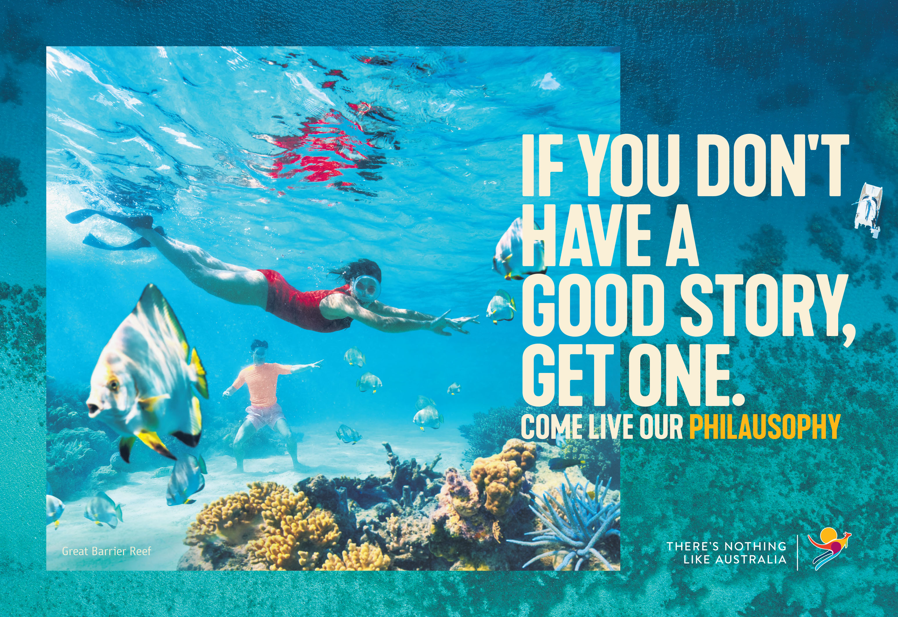
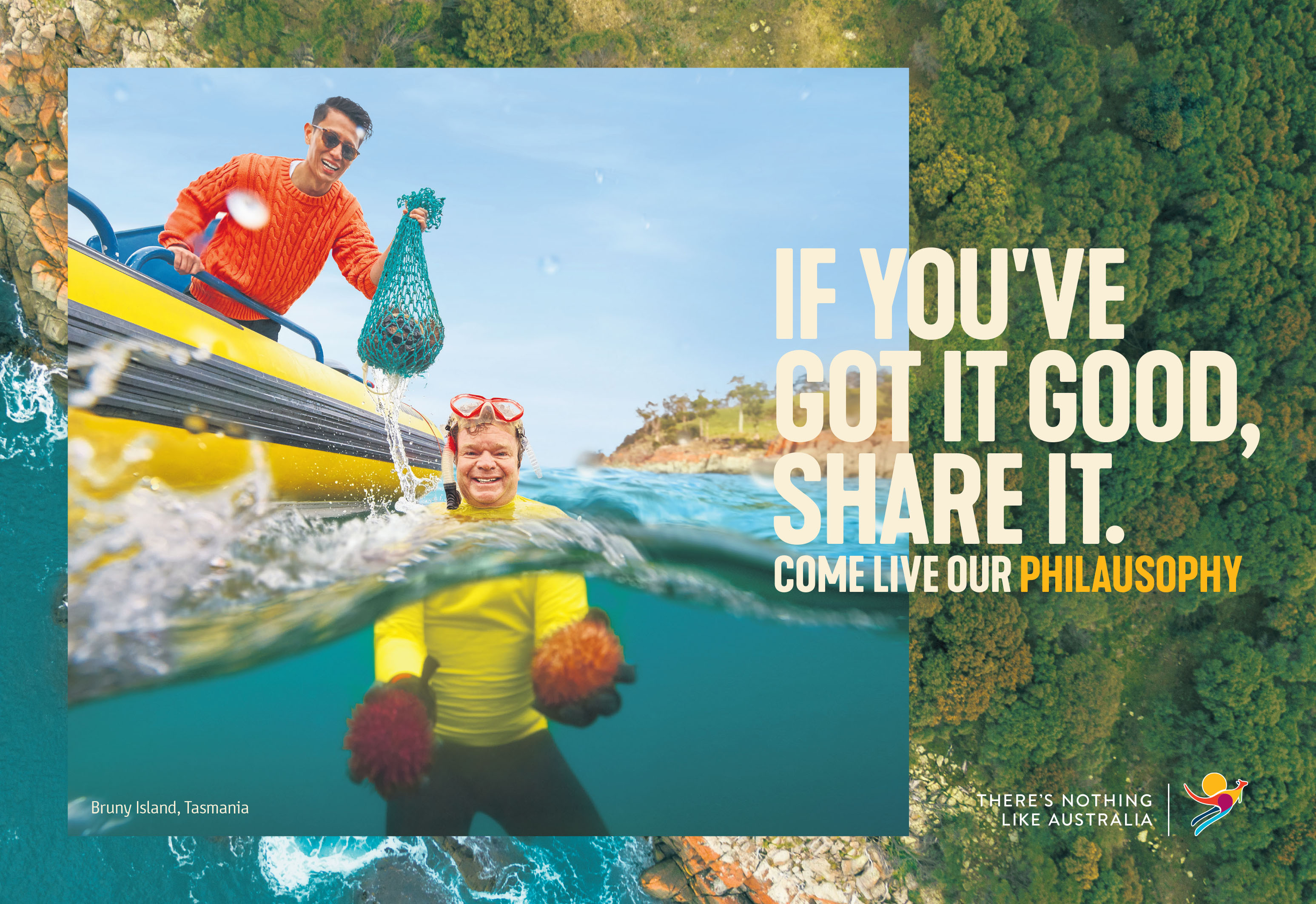
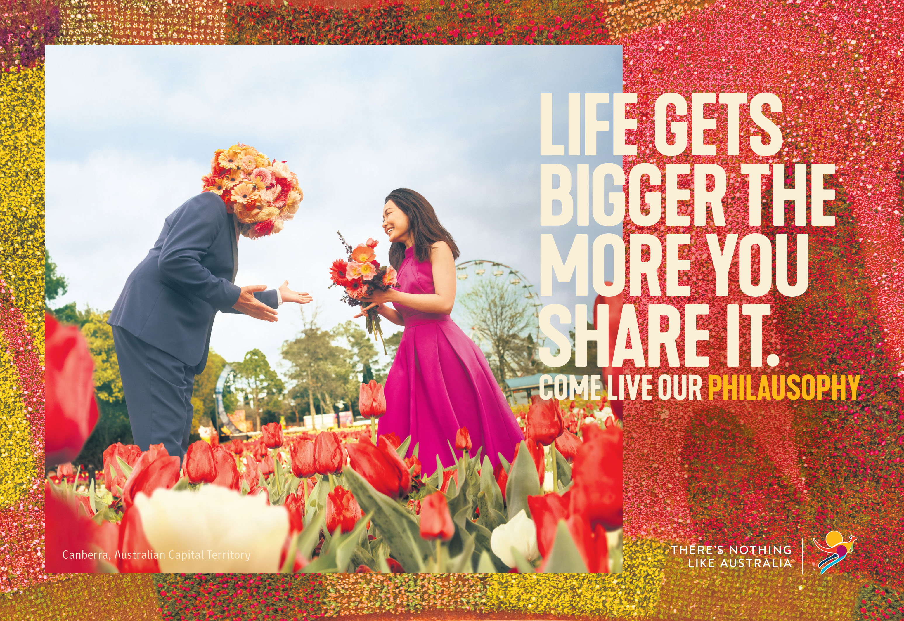
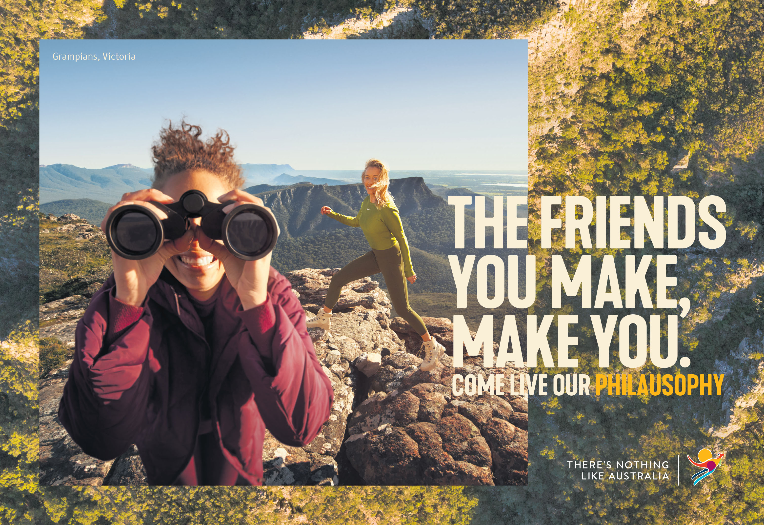
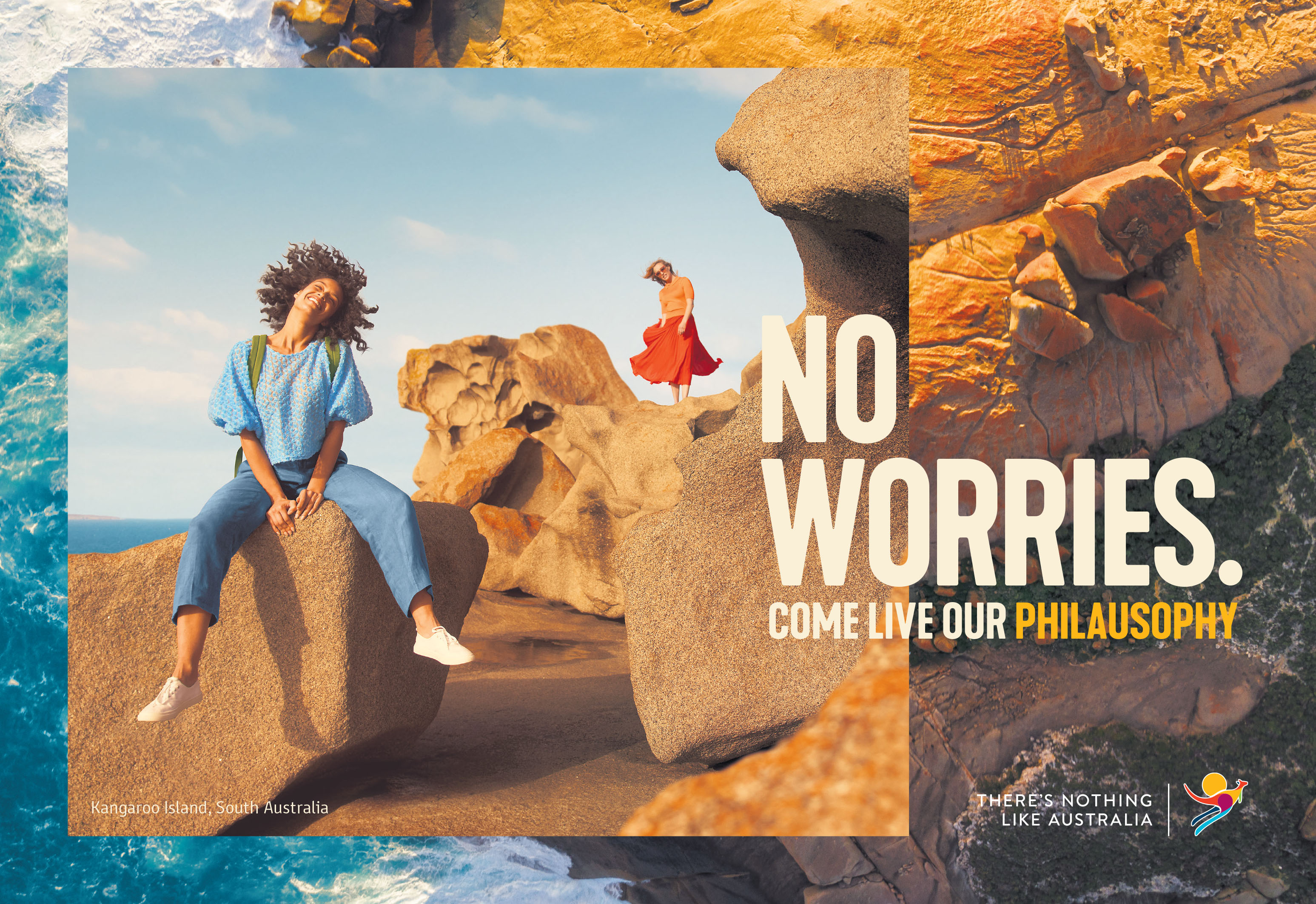
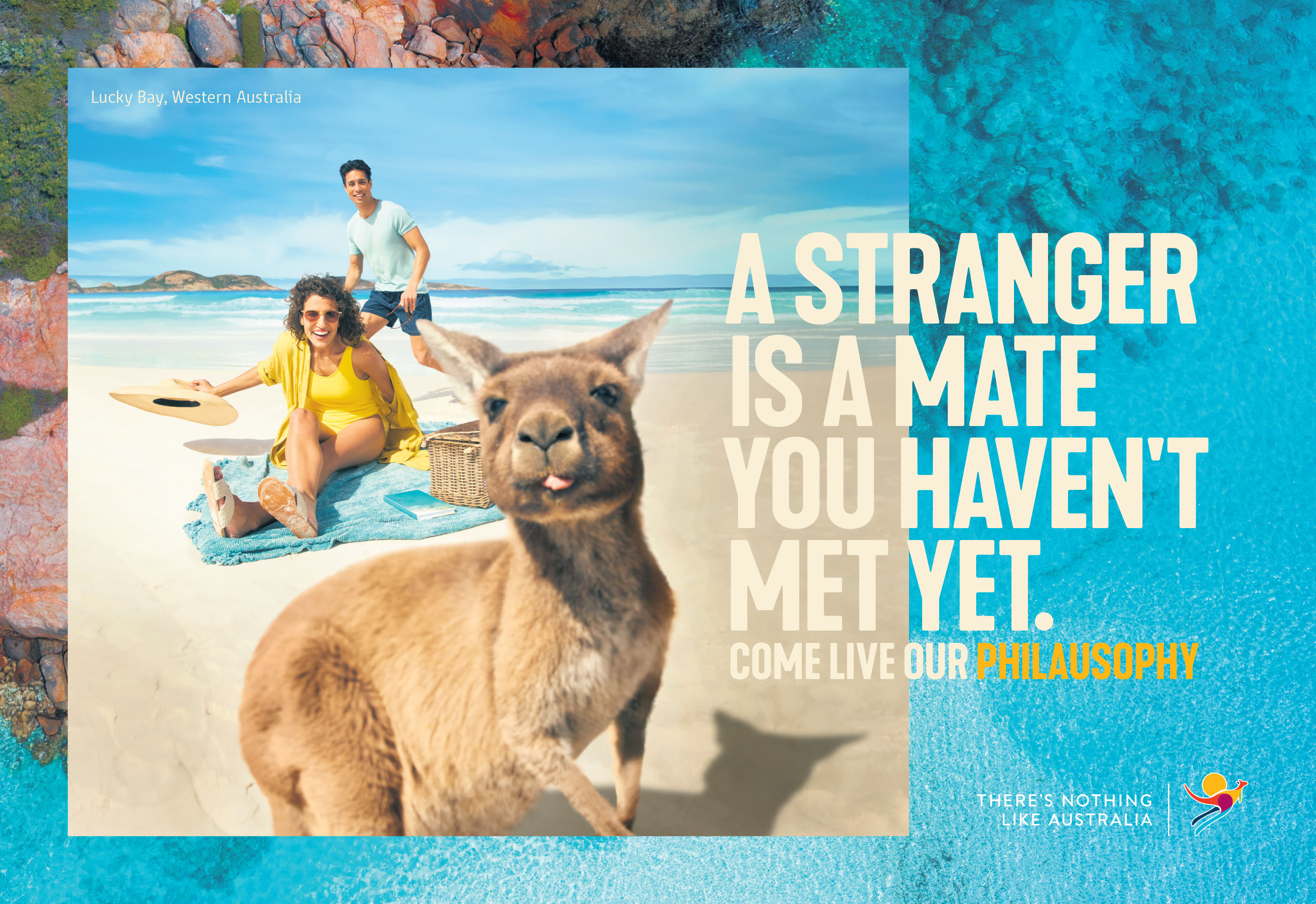
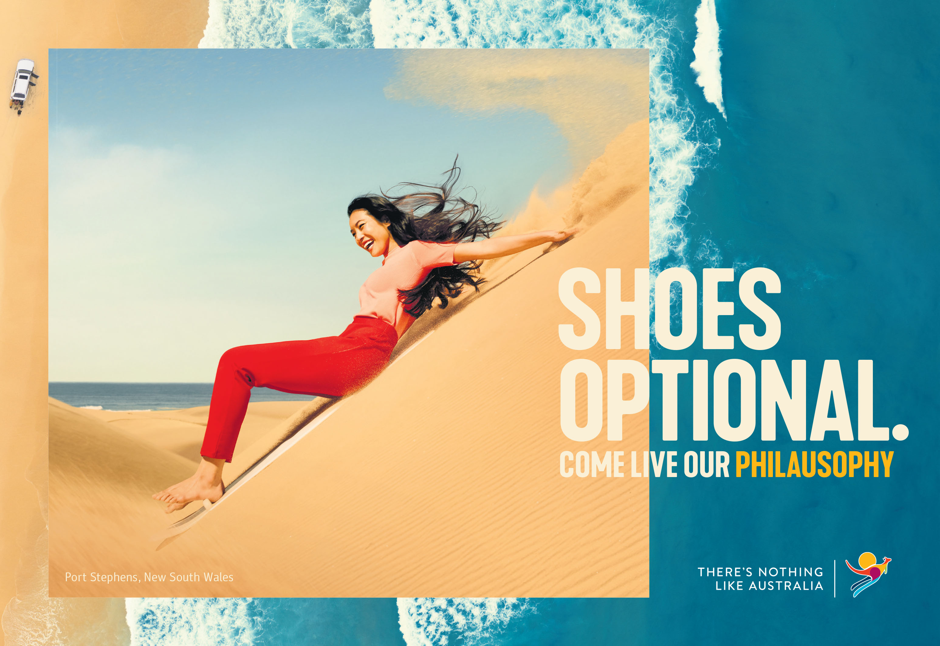
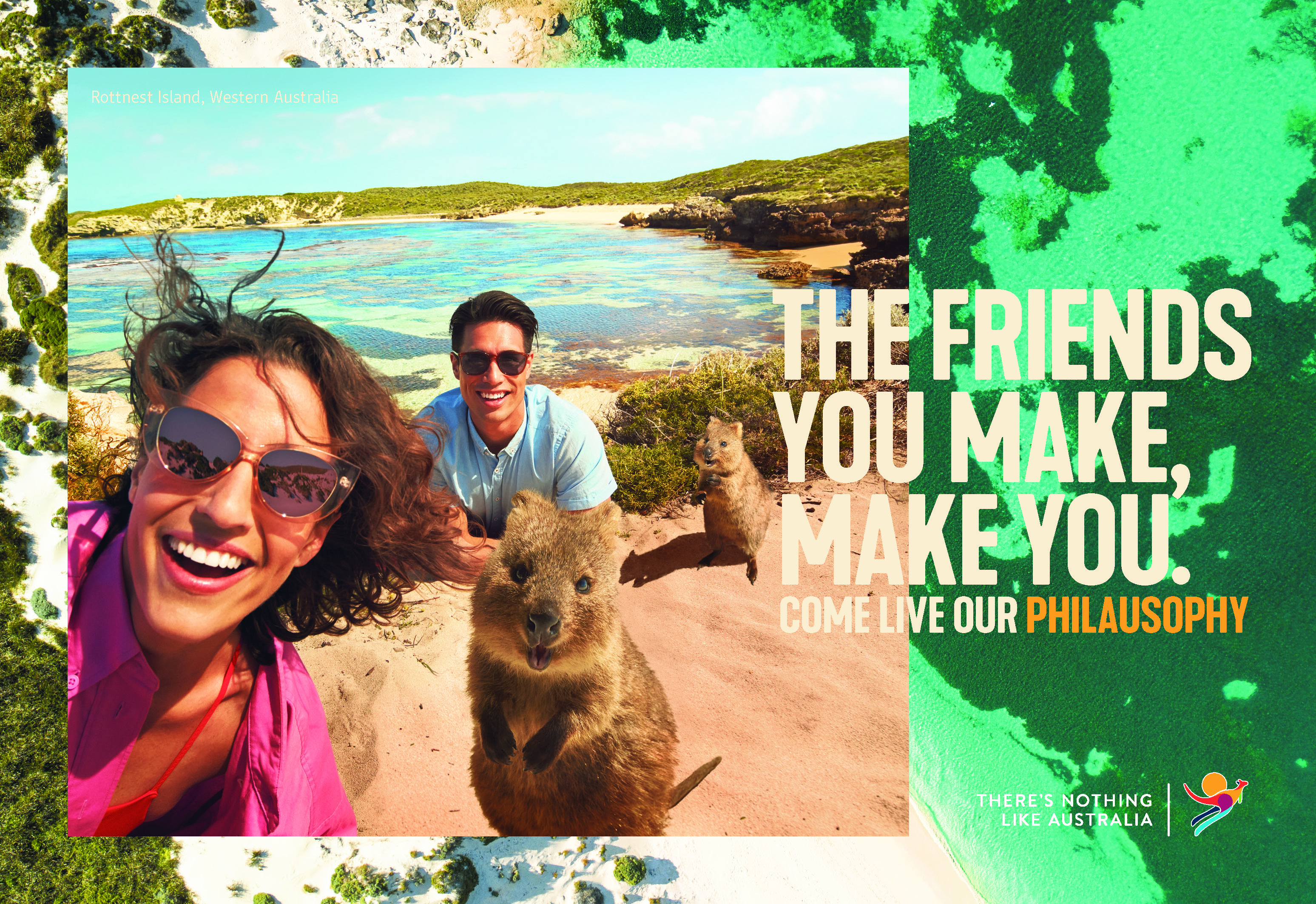
The distinct and defining character of Australia and of Australians will be celebrated in a new campaign unveiled by Tourism Australia today via M&C Saatchi Sydney, which will invite the world Down Under to experience first-hand the Australian way of life.
Key industry stakeholders were invited to a special preview of the new three-year global campaign, ‘Come Live our Philausophy’.
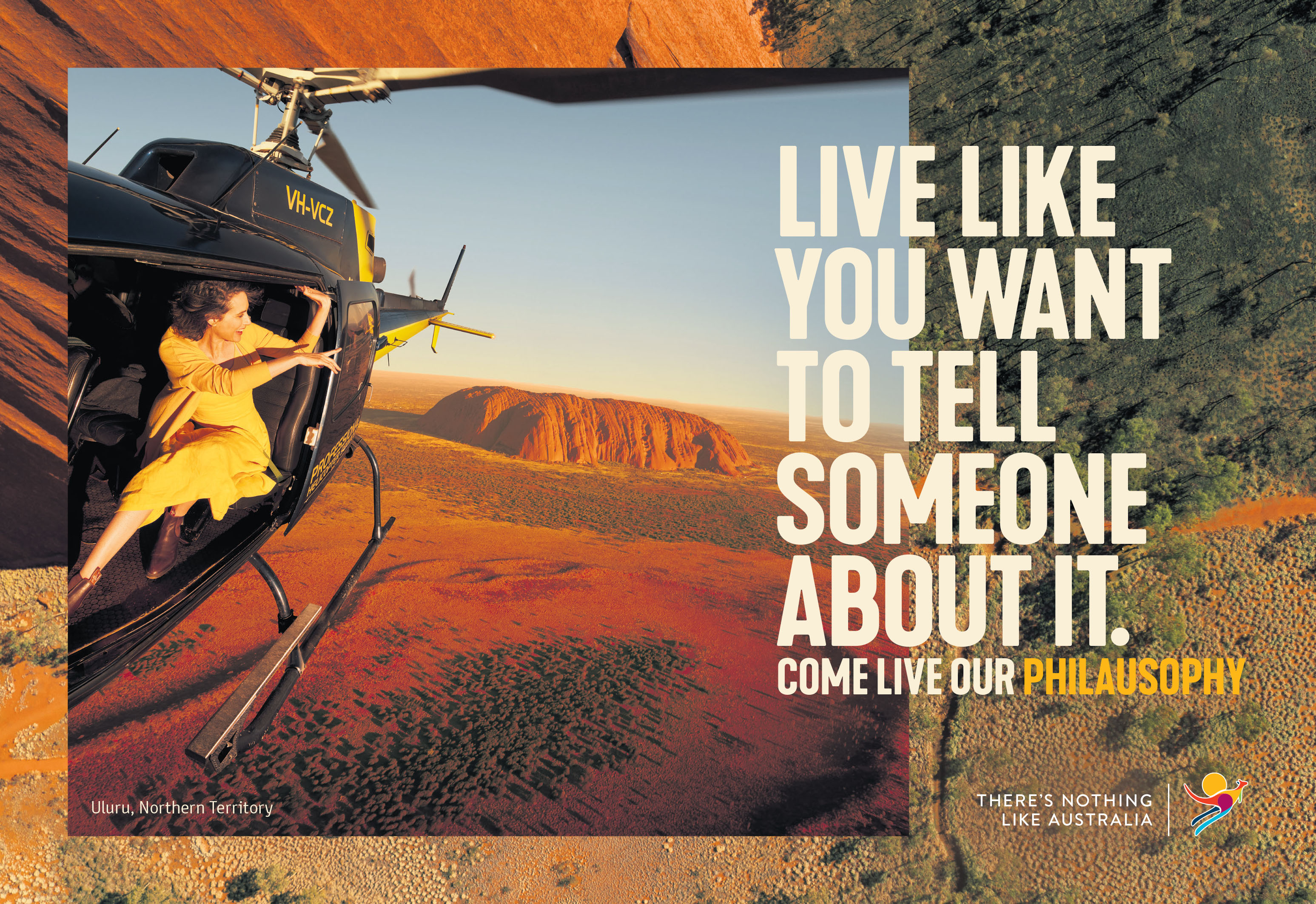
A deliberately Australian play on words, Philausophy aims to capture the philosophy of Australians and their informal approach to living, which research shows is highly appealing amongst visitors.
Federal Tourism Minister Simon Birmingham said Tourism Australia’s latest global campaign strategy is part of a $38 million investment that will be rolled out in our 15 key tourism markets over the next three years to attract more international tourists Down Under.
Says Birmingham: “Our $143 billion tourism industry is such a vital part of our economy and in order to grow the industry further and create more tourism jobs, we need to find new ways to sell Australia and differentiate ourselves.
“In such a competitive global market, the sell is tougher than ever. We need to stand out from the crowd and find a unique selling point that sets us apart from our competitors.
“Philausophy aims to do this by not only encouraging people to book a flight to Australia and visit our incredible destinations but go a step further and actually immerse themselves in the best of the Australian way of life.
“At its core, Philausophy, is about giving travellers from around the world a taste of what makes Australia such an enjoyable destination by shining a spotlight on the people, lifestyle and personality that make Australian experiences so memorable.
“Tourism Australia’s marketing campaigns have done a great job over the years of promoting our key destination strengths, from our spectacular coastal environments to our unique fauna and flora and our world class food and wine.
“We know the unique nature of Australia combined with the welcoming and fun-loving nature of Australians sets us apart, and it is this combination that will form a powerful platform for our next wave of exciting new campaigns.”
A suite of new creative assets have been developed for the Philausophy campaign, including over 5,000 new images captured across every state and territory, a series of industry videos, bespoke social content, a refresh of australia.com and Australia.cn, and a book featuring well-known Aussie icons who will have provided their own personal perspectives and experiences that help explain our unique Australian way of life.
Tourism Australia managing director Phillipa Harrison said that Philausophy was all about elevating one of Australia’s greatest assets and something that we know people from around the world will travel to experience firsthand – its people: “We know from our research that 70 per cent of international travellers believe that Australians have a different perspective on life; 79 per cent believe that the Australian people are an important part of the Australian lifestyle; and 82 per cent would like to travel to Australia to experience our lifestyle.
“The Australian character and way of life has long been woven into our marketing. The journey perhaps began with Paul Hogan and Come Say G’Day. In more recent times Chris Hemsworth, our global ambassador, has been integral in embodying the Australian character for our audiences. Dundee too was all about leaning into our personality. And promoting our people is at the core of our Friends of Australia advocacy program. Our new campaign will continue to build on this narrative by inviting the world to come and live our ‘philausophy’”
“Philausophy will be brought to life by our industry, because who better to talk about the Australian way of life than the tourism operators who live it themselves every day. Not only will they be front and centre in the campaign, but they will be pivotal in ensuring its success by continuing to be the face of our country’s tourism offering to international travellers.”
Speaking about his involvement in the new campaign, Australian actor and global ambassador for Tourism Australia, Chris Hemsworth said that Australians have something truly special to offer to the world: “To say that Australians are laid back, outgoing, and have a great sense of humour would be both buying into widely-known clichés and admitting an absolute truth. An incredible sense of adventure and an insistence on having a great time is truly born into our DNA.”
Says Cam Blackley, chief creative officer, M&C Saatchi: “Although a cute way to spell it, Philausophy celebrates the very real and unique systems of belief that Aussies have developed for not just hundreds, but thousands of years. Paired with our extraordinary landscape it’s a refreshing point of difference and incredibly fertile creative space that can and will live way beyond traditional advertising channels.”
Says Russell Hopson, group managing director, M&C Saatchi: “As we all know, Australia has so much to offer the world and the Aussie way of thinking about life is a massive part of that. Philausophy might just be exactly what the world needs right now. The launch of the campaign is the tip of the iceberg – we’re beyond excited to bring it out into the light. Just like Australia and Australians – there’s always more exciting stuff to come.”
Says Sophie Bingham, general manager, UM Sydney: “Reimagining the way we invite the world to experience Australia is a once-in-a-lifetime brief. Not just what we say, but how we say it in a truly Australian way. We’re thrilled to partner with Tourism Australia on this relaunch and see the campaign come to life through our global media connections and partnerships, both this year and into the future.”
Says Simon Brock, creative director, Digitas: “It’s never been tougher to stand out in the tourism industry. Gorgeous travel imagery is ubiquitous, thanks to Instagram. Global stories are a tap away, thanks to Netflix. To cut through, you need something uniquely ownable that people want and can’t get through a screen. That’s exactly what Philausophy is – a way of life that can only be felt by visiting and exploring Australia. What I love most about Philausophy is that it belongs to us – all Aussies – celebrating something about ourselves that we often take for granted but never goes unnoticed by those who visit our shores.”
The campaign – ‘Come live our Philosophy’ – has been developed with agency partners M&C Saatchi, Digitas and UM and will start to roll out internationally in the coming months.
Agency: M&C Saatchi Sydney
Chief Creative Officer: Cam Blackley
Executive Creative Directors: Mandie van der Merwe & Avish Gordhan
Art Director: Matt Corcoran
Copywriter: Rubini Gun
Group Managing Partner: Russell Hopson
Group Head: Emma McJury
Senior Account Director: Nikki Chapman
Account Director: Charlotte O’Brien
Account Manager: Sarah Dillon
Design Director: Simone Cherry
Designer: Alice Schofield
Senior TV Producer: Sarah Cowen
Lead Print Producer: Greg Hyslop
Senior Integrated Producer: Henry Welch
Lead Project Manager: James Steer
Chief Strategy Officer: Justin Graham
Head of Strategy: Rachael Fraser
Senior Strategy Director: Nick Jacobs
Senior Traffic Manager: Jenny Doyle
Retoucher: Nicko Mueller
Retoucher: Richard Hughes
Finished Artist: Ian Hartigan
Finished Artist: Holly Jones
Production Company, Photography: The Artist Group
Photographer: Georges Antoni
Executive Producer: Camille Peck
Producer: Jo Sinclair
Producer: Ilona Hyland
Production Assistant: Alisha Harding
Stylist: Nicole Bonython-Hines
Styling Assistant: Susannah Snow
Hair & Makeup: Allison Boyle, Michael Brennan, Linda Jefferyes, Noni Smith, Wayne Chic, Julia Green
Photography Assistant: Ollie Begg & Chris Proud
Drone Pilot / Second Photography Assistant: Ken Butti
Contemporary Aboriginal Artist: Rachael Sarra
Media Agency: UM (Global Team)
Senior Strategy Director: Jack Graham
Senior Client Director: Ashleigh Markou
Senior Digital Partnerships Manager: Anthony Thomas
Digital Director: Sarina Ballauff
General Manager Sydney: Sophie Bingham
Digital Agency: Digitas
Head of Production: Lizzie Strobel
Client Partner: Oli Cassidy
Tech Director: Rich Thompson
Creative Director: Simon Brock
Account Director: Max Cahill
Design Lead: Oliver Ree
Senior Copywriter: Hannah Melanson
Design Director: Emma Gough
Lead AEM Developer: Elise Boinnot
Senior Project Manager: Jade Skinner
Account Manager: Rachel Malone
Senior AEM Developer: Stephen Smithstone
Senior FE Developer: Sahil Jackar
Senior AEM Developer: Kanwal Singh
QA Lead: Ranjani Raveendra
PR Agency: opr
Chief Strategy Officer: Kaz Scott
Chief Creative Officer: Bridget Jung
Associate Director: Luke McClelland
Account Director: Ellee Donald
Strategy & Planning Manager: Laura Stoll
Chief Digital Officer: Daniel Young
Senior Digital Strategist: John Harding-Easson
Publicist Madeleine: Hanley
Senior Account Manager: Zoe O’Sullivan
Content Manager: Shanna Hall
Senior Account Executive: Madison Scott

104 Comments
Makes me want to go to New Zealand.
leave me off the credits?
When you remember Scomo had influence over this… it makes sense that the work completely reflects the false image of ‘quiet, easy going Australians’ he spouts daily.
Less philosauphically……. it’s just really not compelling.
Gutted to have lost to this ridiculous wordplay line. No idea here, just a bad line. I feel for D5 as the strategy was already in place ‘focus on the unique Australian spirit’ and they had created world class work. This is the poor poor offspring of that strategy. ‘Philausophy’ will get lost in translation in every market and feels juvenile. The art direction is ok at least.
the art direction looks like 2003 Shanghai.
Its impossible to continue Droga’s work. Its a one-off that cant be extended, repeated or refreshed. That’s one of the reasons they couldn’t keep the account.
Look instead at incredible India. Easily a 20 yr tourism campaign.
Now that’s a diverse group of caucasians.
Could not have said it better myself. Racist bullshit always wins in this market.
that casting has a psuedo – asian in each execution. That explains the terrible concept and cheeseball twee art direction. CHINESE DOLLARS ARE STILL THE MOST IMPORTANT. Look at the styling, its straight from chadstone shopping centre paris end. 🙂 hahahha what a cluster F*&K
they spelt philsophy wro-… huh- oh ..wait…wait a minute OH!!! *slaps knee* philAUSophy!!! it’s like PHILOSOPHY but it’s PHIL-AUS-OPHY hahahahahahahah! wow! genius! really makes you THINK….
I’m quitting advertising
That’s the best our industry could do.
Hmmm not that inspiring but I guess we are talking international markets here.
Longest creds list in history.
Which might go some way to explaining why it’s so clunky, laboured, and daggy. But at least everyone seems to have got their bit in .
Using word play to appeal to non-English speakers is a massive, gaping whole in the strategy underpinning this entire thing. And should have been picked up on day 1. So, well done to all involved who didn’t.
It’s not bad. It’s quite personal with all the people, which I think is good. But, it’s a big task to try and encapsulate an entire country into a campaign. It’s always going to be lacking in one way or another.
One thing tho – maybe its just me, but the philAUSophy wasn’t clear at first, I thought it was ‘feel’osophy they were on about. Need a better desing execution to make this instantly clear.
Anyway, not guna shite on it, there will be enough bitter/jealous people chomping at the bit to do that!
I don’t mind them
Flawed, at least they won’t understand how painful the line is!
Tasmania 1: Australia 0
My first thought at Philausophy was Palau…
Who’s Phil?
Love the desaturated reef shot.
Just like the coral bleaching future tourists are likely to see.
Stills are a busy mess too. How anyone would make Australia’s natural beauty this ugly is beyond me..
This is truly awful
what a waste of taxpayers money
such a shame given the brilliance of Dundee
unfortunately both the marketing and agency talent just isn’t there
This campaign is actually super important for our country and our economy.
Millions of people’s pay packets are directly affected by how many tourists jump off a plane and spend money here.
So, normally when I see work produced that is dull and bland I shrug my shoulders and move on.
But this actually makes me angry.
I don’t think I’ve seen a less cut-through advertising idea to sell Australia to the world in like, ever.
What an incredibly lame attempt at cleverness. How on earth does this help us compete against other great destinations around the world?
Oh yeah – because we don’t always wear shoes. Or because you might make friends.
Seriously? THAT’S what’s going to make people want to come here?
That, and a word pun that looks like a spelling mistake and only makes sense if you really think about it for a bit.
It’s just plain dumb and I doubt it’ll make even the smallest ripple in visitation.
What’s going on at M&C? This is a campaign that really matters, and they’ve done us a huge disservice.
I only hope that the film / social component is absolutely AMAZING and it makes up for this codswallop.
It’s a faint hope though. I’m not holding my breath.
. . . as a foreigner I think that Australia seems to think that saying hello, making mates and generally being easy going are unique to Aus. They’re not. Neither is laughing at themselves and having a sense of humour. Both things I think other countries do just as well and a lot of them do them better. Like meat pies.
So true.
The art direction’s pretty great.
…if you’re a 60 year old white dude who reminisces about ‘desktop publishing’.
Any campaign you have to study and analyse to wonder what it’s saying and how you feel about it is fraught from the start. I had nothing to do with the Paul Hogan campaign, but it just felt instinctively right – and still does. This feels contrived and forced. Any advertising that needs to be explained or rationalised is doomed. And if I feel that as an experienced professional, god help the poor consumer, especially those from different societies and cultures. Creative Director; where the bloody hell were you?
I like the look, fresh for the category. I hope there’s more to come from the campaign though.
That word play will work well in every country where English is a second or third language – not.
Seems like a cool guy
Aren’t we not supposed to hassle Quokkas for selfies?
nice ooh.
https://media.giphy.com/media/l41lFSzc9uzAxJyLK/giphy.gif
There’s nothing like a good pun.
Droga5 must be laughing!
This is great work……………………..
If you haven’t got a good line, get one.
Or give Darwin a buzz.
Ph___ awful.
Those are sh*t
Clip art make more appealing pictures.
I look forward to seeing whatever gets (quickly) made to replace this steaming pile of mediocrity.
M&C SAATCHI.
Creating a global campaign that workes across all countries can be a challenge.This campaign shows how difficult it can be. Unfortunately this is my tax dollars not well spent.
Awphil
I like it.
For saying I quite like it.
$38 million wallpaper
I cannot believe anyone involved is proud of this
Politics wins pitches
Spot on. Obviously this account was not won on the creative. The M&C machine has clearly perfected the process of luring big clients. The advertising itself seems merely incidental. The proximity of value of account gained and creative mediocrity only confirms this. The bigger the spend, the blander the work.
Wondering when the part of the campaign that has been spoken of in the press with iconic Australians that has been in the press will launch? Maybe it will help?
Incredibly bland and generic. Lazy headlines and lazy art direction.
And a horrible, terrible pun. That’s the best our country can do?
Jesus people who talk about ‘my tax dollars’ give me the shits.If you are on an average salary in this industry your measly contribution counts for f@&? all.
@Me,
This is advertising. Some pay over $5-600,000 in tax every year.
Saucrates and Platau are turning in their grauves.
Doesn’t make me feel proud to be Aussie, in fact it does the opposite.
But, I applaud M&C for somehow selling and convincing TA to buy this. Clearly good strategic creative wasn’t the criteria on the pitch. If it was, I’d hate to see the other work from the agencies.
I really don’t care about a bloody Hemsworth’s philosophy, I’ve already heard it before on those Swiss’s ads (which are better shot) and it’s paper thin. This idea is just plain awful, that it is high profile makes a joke of our industry. Why didn’t someone just stand up and say ‘this is a really shitty pun. Yeah it won the pitch, but we have to show them something better’.
It’s an AUSTROCITY.
for the account to come up for grabs.
surely!
The line is a bit average but the art direction isn’t too bad. I would love to see all of you geniuses come up with something for everyone and get it across the line with the stakeholders.
All of you crying about your tax dollars being wasted, I bet you’re really upset about 1 or 2 cents at the maximum that you would have contributed.
You’d need to throw a truck load of cash at we’ll know Aussies to go anywhere near that bucket of poo. Talk about trashing your personal brand to be standing there talking about your ‘Philausophy’. I can just see the talent mangers and PR peeps standing on set calculating the Plummeting value of their talent. This will make the Liam Hemsworth OPSM spots look authentic.
To everyone else this looks like a big bag of lazy old print ads, with a truely horrible pun hanging off them.
Lazy advertising with excruciating puns is M&C Sydney’s speciality. Remember ‘Stegglers’ for Steggles?
Thats all.
JESUS. Tourism is WAY too important to waste on this overly researched, underfunded, watered down bollocks. good god people. where’s our character, our bravery and cheekiness? this is bland, pointless, humourless and soul less and, like others it just makes me angry.
How embarAUSment
“Live like you want to tell someone about it.”
– My next lower back tattoo.
这则广告是否要求我不要在您所在的国家穿鞋
“Does this ad require me not to wear shoes in your country?”
Go bulls
Why in gods name is this campaign in the hands of a fashion photographer. what a joke. terrible. tripe.
You have to admire the shamelessness of politicians, marketing types and agency spokespeople to spout absolute tripe in defence of the indefencible.
Why are the wiggles catching sea urchins?
@Me and @Meh
Nobody spends someone else’s money as well as they do their own.
About as tasteful as a pint of Fosters.
Did someone save the 90’s Award annuals from getting thrown out?
That Art direction is so dated…. but the word play is worse.
M&C please note: the tirade of criticism being hurled at this work is not being done for the fun of social media outrage. It’s because this campaign is an embarrassment to both Australia and the Australian advertising industry.
Um.. who’s Phil?
this is sooooo disappointing – the line is embarrassing. the art direction so dated. this is unjustifiable. tourism is so important to this country and this undermines all the great work that has been done prior.
I wonder if the Philausophy line wasn’t done to appeal to tourists all over the globe, it seems like it was done to appeal to one person at Tourism. It’s one way of getting average work over the line…
At least it’s a “deliberately Australian play on words”.
Because the only way this could be worse is if it wasn’t.
Grow some balls.
I find the headlines tricky to read.
My main takeaway is that I am genuinely embarrassed that the rest of the world is going to look at this and presume that THIS is as good as we can do as a country when we are set the task of promoting our country to the rest of the world.
Not only is this a goddam awful advert for Australia, its a shocking advert for Australian advertising.
I agree. I want it to be great because it does reflect on the industry. And with such a huge cast … sigh. Lost the will to continue this comment … Philausophy … a copywriter’s life-blood draining nightmare… too clever but not clever … we don’t look good …
You’re a bunch of them.
You guys, you read my book Phil’s-osophy – https://www.youtube.com/watch?v=FVV7Yl88eKc
Everything that comes from an ad agency has already been ripped and appropriated.
How dare you take my name in vein.
This campaign is a direct result of too much navel-gazing.
nobody on a fishing boat in Bruny island is wearing le specs and a fucking bright Orange cable knot from uniqlo. Dont ever let a fashion team on an ad job again Mand C…what a huge error. The dude on the boat looks like a rich chinese uni student with whitened teeth on daddys money.
He looks like he just got out of his AMG 63 Mercedes bought on Crown casinos laundered money and paid a tv extra to gather urchins for him in a wiggles rash vest.
This is a UNIQLO “fa” CATION of what could have been a great campaign. And to think…. global loadings, big spend, what a fucking wasted opportunity. Go back to catalogues please whoever the hell the ARTIST GROUP are. Aint no ART there.
That retouched this saccharine tripe.
that execution on the boat is embarrassing.
Apart from the terrible idea the thing I find most offensive is the art direction, it is woeful. Even the best idea in the world wouldn’t’ have survived art direction this bad. It looks like the worst stock photography you could find laid out by a preschooler.
…or rather asks; which government fcuk-tards approved a global campaign based on an English language pun? I pity the poor copywriters tasked with rewriting them in the local languages.
Maybe the line in the first one should be, “if you don’t have a good idea, get one”
Is there anyway we can move our countries further apart?
I know you like dogs and this one is one.
Phhaaark, so shiiite.
The mistake was to use the stiff shirt word philosophy (in any form) to convey easy going.If the brief is friendly – which it’s been since Hoges- there’s an opportunity to use the times to milk it. How about keep the visuals but tag it with AUSTRALIA . WHAT THE WORLD NEEDS NOW.
เท้าที่เปิดเผยในประเทศของฉันเป็นสิ่งที่น่ารังเกียจ
Other than the unclear pun and overly saturated images.. the composition isn’t that bad right? Or am I just too much of a first year student to recognise shite composition….