The Reject Shop appoints Thinkerbell as consolidated agency partner; launches new work
Thinkerbell has been appointed as consolidated agency partner for The Reject Shop, responsible for their marketing strategy, all media (offline and digital) and creative.
The Reject Shop is a household name with more than 375 locations across Australia, known for providing great value on everyday essentials, seasonal like Christmas and Easter, plus special buys. It strives to help all Australians save more every day.
Says Andrew Stein, chief customer officer at The Reject Shop: “We’d been looking for a partner that would be able to help us strengthen our brand strategically from both a creative and media perspective, and had heard great things about Thinkerbell. We’re looking forward to working closely with the team at Thinkerbell as we continue to grow and evolve our business and marketing strategy.
Says Margie Reid, CEO of Thinkerbell: “The Reject Shop is a brand with a strong and loyal customer base, and the team at Thinkerbell are excited to play a part in the evolution of their brand, communications and media as they continue to grow and deliver for them, effective results, or as we like to say ‘measured magic’. This first evolution of the brand challenges customers to rethink the way they save, with Reject Shop customers coming out on top every time.”
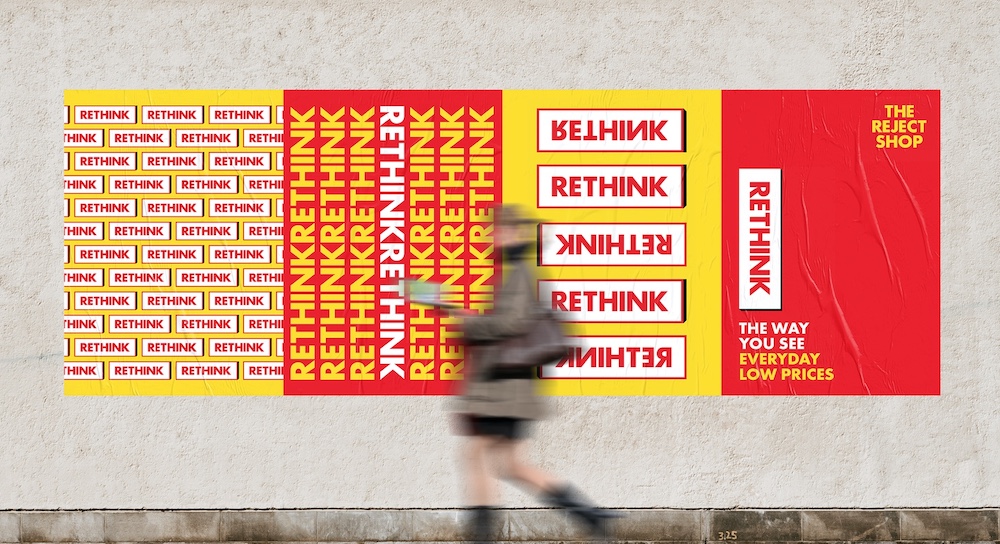
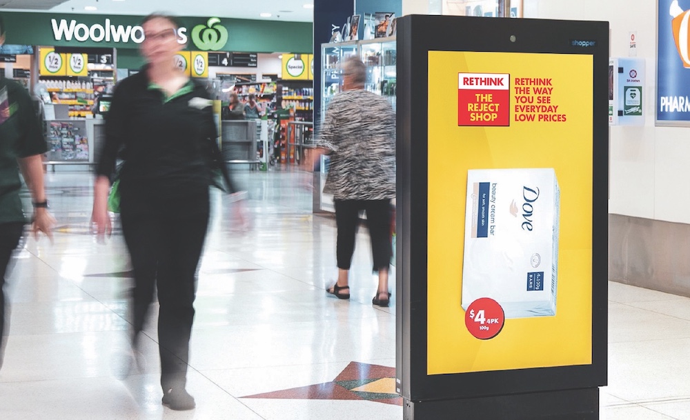
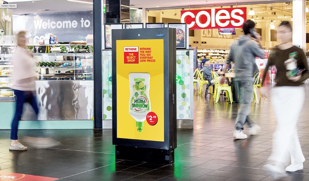
The partnership sees The Reject Shop launching a new campaign this week; “Rethink The Reject Shop”, all about positioning The Reject Shop as a trusted brand that stocks big brand essentials at real low prices, every day — like Morning Fresh 400mL, a low $2.49, Rethink The Reject Shop! — helping customers through the current costs of living. The spots are live across BVOD, out of home, radio, and social.


Client: The Reject Shop
Creative Agency: Thinkerbell
Media Agency: Thinkerbell
Production Partner: Magnetizer

23 Comments
Looking forward to the comments
Was the designer allocated to this job on holiday?
So many jokes…
I really like the idea and the 30s edit. But I don’t love the upside down product image. I wonder if there was another way to execute it without flipping the product? It just looks a little rushed and not as considered as the rest of the campaign.
Great Agency / Brand alignment
Poetic.
Really? We’re already rehashing the zoom-inside-the-head-thought-visualisation thing? I mean the Monkeys did it only a few months ago:
https://campaignbrief.com/drinkwise-reminds-parents-that-its-okay-to-say-nay-in-new-campaign-via-the-monkeys/
At least give it a year…
Fun design
So who did the work above. Dont mind the print.
Like it Fresh and bold
No announcement of an agency winning a client should get on here unless it comes with the first piece of work they made for them.
It kind of sort of nearly works, but was kind of sort of funnier on paper.
This is brilliant. Top stuff Thinkerbell.
Credits – says it all
Lol.
This is excellent art direction
Like it. Exactly right message. I wouldn’t shop there now – but I might.
This is targeted perfectly as it’s reaching out to families that are finding times tough. An alternative from the big players. Brief delivered. So many wankers on here commenting about Art Direction. Families who are looking for a cheaper alternative won’t get upset by the kerning or font. Chai latte anyone?
It’s not brilliant by any means but I’m impressed they’ve made something half decent for the reject shop.
Like it
https://www.youtube.com/watch?v=_FM89YE0-84
I’d rather pay a little extra for the regular morning fresh, the reject upside down bottles won’t stand up on my kitchen bench.
Love this. Really fun. It’s not overdone or anything. It’s one of those funny ha ha ads that make you smile through the day. You find yourself smiling and then you realise it was this ad that did it. Genius.