Resolution harnesses the power of possibility
 Relaunching the AMP brand to the Australian public with an inventive, graphic 90-second spot, Resolution has brought to life a campaign that takes typography and design to a heightened level of sophistication.
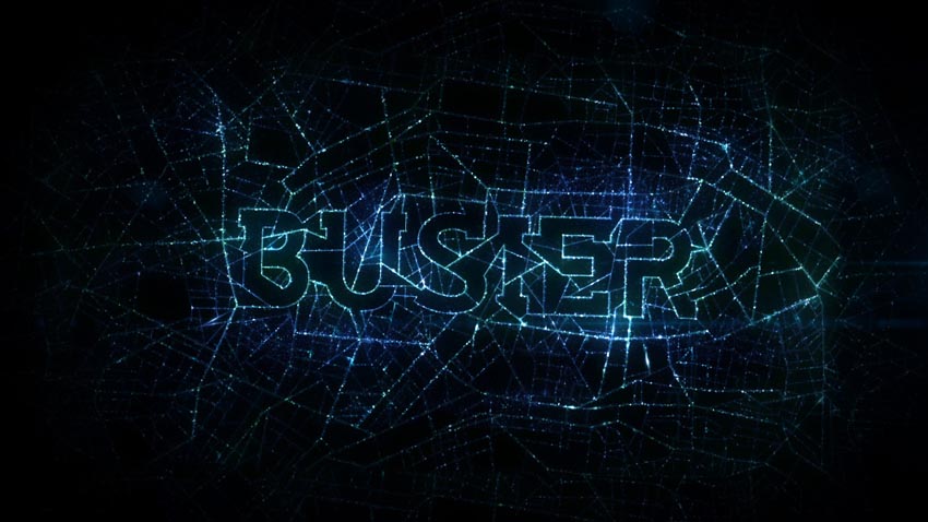
Airing for one week on free to air channels and for the first time on last night, the TVC takes viewers on a type driven journey by utilizing a varied palette of design imagery, 2D and 3D graphics, along with hand crafted typography.
Titled “Possibilities”, the latest animated commercial aims to inspire audiences to join the AMP brand on a stimulating visual narrative that informs viewers of the bank’s promise to help turn its customers’ dreams into a reality.
 The spot highlights AMP’s lending history, which includes its financial support to visionary ventures such as the construction and development of Sydney Harbour Tunnel , Sydney’s Centrepoint Tower and the city’s very first skyscraper, demonstrating that any vision — great or small — is achievable.
The campaign, via Sydney-based creative agency Banjo, is made up of a number of scripts along with an emotive score completed by Elliot Wheeler of Turning Studios, Sydney. No voiceover is used, allowing for the scripted typography to take centre stage and guide the viewer through the key campaign messaging.
“We had two award-winning typographers enlisted on the team including Sydney’s very own
Luca Ionescu along with newly discovered Tokyo-based talent Ant Hayes,” says Resolution executive producer Roy De Giorgio.
“We also had a team of high-end 2D and 3D designers on board the 8 week project. It’s a
unique vehicle brand ad that provides a truly different look and feel from anything else on
air,” adds De Giorgio.
The overall vision is seeded in the creation of a highly engaging, memorable and readable
spot with a distinct graphic quality and execution that allows for the treatment of keywords as
bespoken design, explains Resolution’s Creative Director Tim Dyroff.
“We tried to provide a high level of photo-realism and implemented a clean minimalist
backdrop instead of going with a pure graphics-based design,” says Dyroff.
“We styled certain type to feel like the material translation of the words and in this instance
created a universe of infinite and expanding connections to visually represent the meaning of
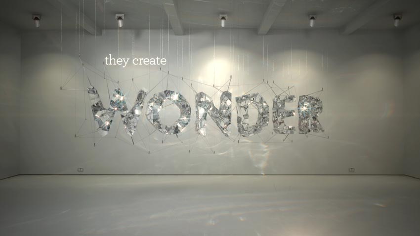
‘possibilities’ along with light reflecting off a crystal to represent the word ‘wonder’.
“We definitely steered away from a kinetic typography as we felt it was no longer a fresh approach. Instead, we went for an un-corporate execution grounded in the art space to create a tone that is ultimately a great fit for the AMP brand.”
Banjo senior creative Sean Larkin states that both the agency and client were impressed with the TVC production results. “Tim Dyroff was very prolific in generating hundreds of typography ideas and references,” says Larkin.
“We wanted the typography to have a ‘smile in the mind’ quality – with a clever relevance between it (the type design) and the message,” he adds.
Credits:
Client: AMP
Creative Agency: Banjo, Sydney
Creatives: Georgia Arnott & Sean Larkin
Agency Producer: Meredyth Judd
Post Production, Design & Animation: Resolution
Resolution Creative Director: Tim Dyroff
Resolution Executive Producer: Roy De Giorgio
Resolution Production Co-ordinator: Lily Crowley
Typography Designer: Ant Hayes & Luca Ionescu
Track: Elliot Wheeler, Turning Studios
19 Comments
Guys, maybe you should take the fight for the credit for this average bit of type outside. We don’t care if it’s Banjo or Resolution who did it. All we care about is the fact that it is not as good as you all seem to think it is. If you want to see how high the bar is, check out this guys’s work here: http://www.thereis.co.uk/
considering the conservative nature of the client – i can only imagine the obstacles that was overcome to produce this. beautiful typography coupled with lovely sound design make for a really nice spot.
What are they saying? Who are they talking to? With up to 25% of people tuning out during commercial breaks you need something humanly relevant to keep people watching. Not a good execution. Not an an idea.
anonymous hate
Let me guess tim dryoff directed this spot another world first simply brilliant!
Great party guys thanks for the free beers however really lame ad glad it’s only on air for 1 week.
Looks beautiful. No idea what AMP do though…
10.43 pm you really are a pathetic, insidious individual. The fact that you chose to write something like that (even if it was some twisted form of humour that only you can appreciate) says a lot about your motives and lack of human values.
For the record I think that while it may not be the best idea, it’s a very beautifully crafted piece with typography every bit as good as 7.04 pm’s Sean Freeman reference. Luca is equally as capable if not better when you compare their whole bodies of work as it is only fair to do in this instance (when you put up a website as comparison):
http://www.flickr.com/photos/lms1
I think the previous ‘own tomorrow’ commercial communicated the same thing in a much more interesting, human, relevant, engaging manner.
Great example for the young creatives in the community. If you work hard and polish your skills you will be rewarded with a lifetime of hate. Best pack your bags and move to NY or London then the haters will feel that you are creating something better.. it sounds much cooler when its from London or NY. Praise your talent Australia, let tall poppy syndrome be gone…
looks great. Well done.
You want typography?
Check out Len Cheeseman’s stuff for the NZSO. ‘Riot of Spring’
Classic, involving, beautiful, emotive even…though it’s still just words on a screen.
As opposed to this AMP artifice.
The technical director’s web link below:
http://www.davidcolquhoun.com/nzso/
I don’t want be critical of the typography because I don’t think the fault lies there (although Len Cheeseman has nothing to worry about)
I just think the way it has been put together is disjointed and the words are themselves are utterly charmless.
Almost like they just handed Resolution the brief from the planner
I get the concept and the execution is good, but it feels totally fake and made me cringe with its awkward, Michael Jackson-esque ‘Think of the future/children/insert cliche here’ feel.
But the missus thought it was great, so the jury is split.
I used to work with Banjo and remember them delivering briefs at 4pm on a Friday afternoon, with a treatment filled with random images off ffffound.com as their “style guide” – images that we had seen during our own week’s browsing of said website.
That said, I think this is more down to Resolution than Banjo, who couldn’t direct themselves out of a wet paper bag.
Who cares if it looks like the style of the times? From the perspective of designer, animators, and compositors (not to mention typographers) it’s a bloody amazing spot to have on your reel. It may not make AMP’s share price go up, but it will win TVC and design business for all involved.
I don’t think you guys understand the design industry.
Remember there is a client.
Remember the client has a deadline and well will probably not be open minded.
They will probably be very conservative.
In the end , good ad. Hit and Miss. Hit with the logo especially.
Logo is pretty average to say the least. No balance and trend driven.
You know the term, “you can’t polish a turd”? Well, apparently you can.
I loved the first time I saw it, it was different, it made to watch and had a magical feel to it, which I guess made amp feel more starlight to me. The animation was beautiful and I ENJOYED it. I think more than anything reading those comments, advertising is so hard when dealing with clients – so many hoops and so many boxes to tick. Gold star for getting it made. Whoever said do the human thing – everyone’s doing the human thing and it can be very dangerous with financial institutions. I think it’s braver to do this AND better because it makes you own the emotions that go with the words and invokes your experiences.
Anyhoo, I loved it.