
BlokHuis launches new visual identity via Young Folks

Melbourne B Corp-certified indie agency Young Folks has developed the new visual identity for BlokHuis, a Western Australian architecture practice specialising in bespoke building design using prefabrication principles.
Founded by architect Jemma Vandongen, BlokHuis brings more than 15 years of architectural experience to a category still heavily associated with standardised builds, transportable homes and, in Western Australia particularly, the ubiquitous mining donga.
BlokHuis was created to make prefabrication relevant to a different kind of client: design-aware homeowners who value the efficiencies of prefab, but still want the considered approach and individual design preferences that come with an architect-designed home.
Young Folks was engaged to translate that proposition into a visual identity capable of attracting discerning clients while giving the architecture itself room to do the talking.

Marco González, Creative Director at Young Folks, said the biggest strategic opportunity was to challenge the assumptions that come with the word prefab: “The concept of prefab construction comes with some pretty entrenched preconceptions, particularly in Western Australia. For a lot of people, it still conjures up base models, standard options and mining dongas.
“BlokHuis is operating in a very different space. Jemma is bringing a contemporary, personalised, and design-led approach to prefab homes, so the visual identity needed to signal this with confidence while staying out of the way of the actual work.
“We were really conscious that the brand should act as a frame for the architecture projects BlokHuis is delivering for its clients, rather than competing with it.”
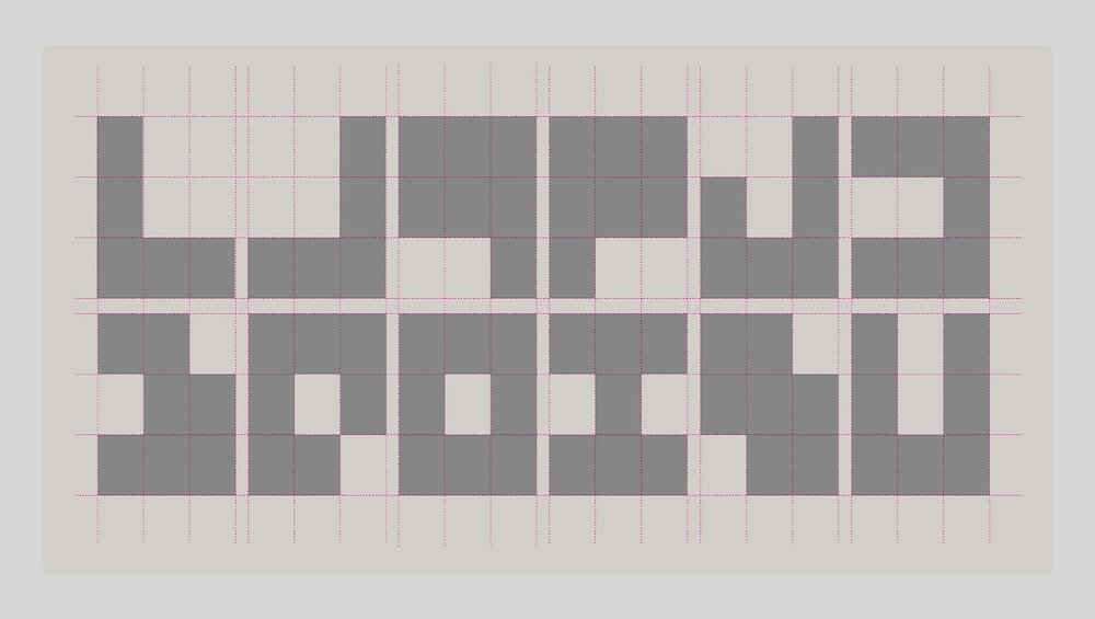
The resulting identity draws on the disciplined logic of Swiss Style, pairing a refined neo-grotesque typographic approach with a bold primary palette and softer secondary tones. At the heart of the system is a modular graphic device built from a 3×3 grid — a nod to the logic of prefabricated architecture that can flex between framing imagery, shaping composition and creating patterns across the brand.
For Young Folks, the project reflects the broader role brand identity can play in helping new businesses reshape perceptions within established categories.
Says Erin Morris, Young Folks’ Strategy Director: “When you’re launching into a category people already think they understand, differentiation is about much more than looking different.
“You need to understand the assumptions people are bringing with them, then build an identity that helps tell a new story. For BlokHuis, that meant making prefab feel considered, architectural and bespoke, while still retaining the pragmatism that makes prefabrication compelling in the first place.”
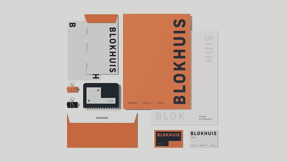
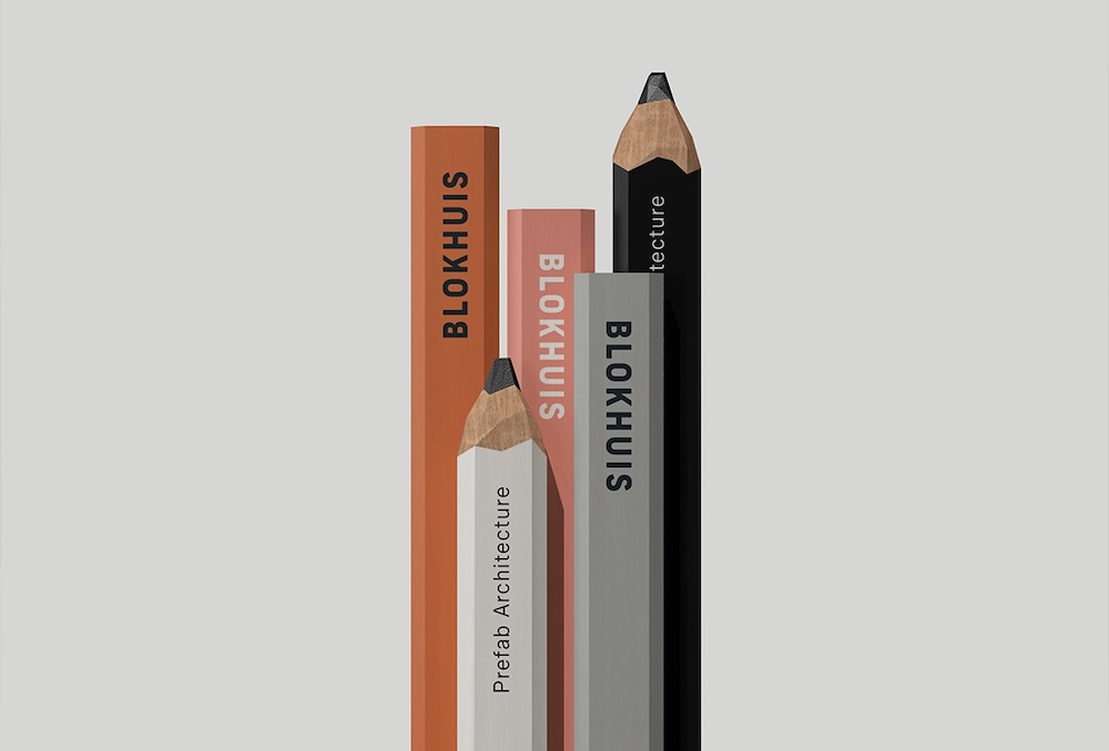
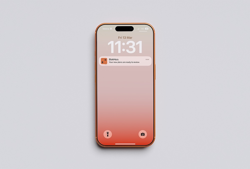

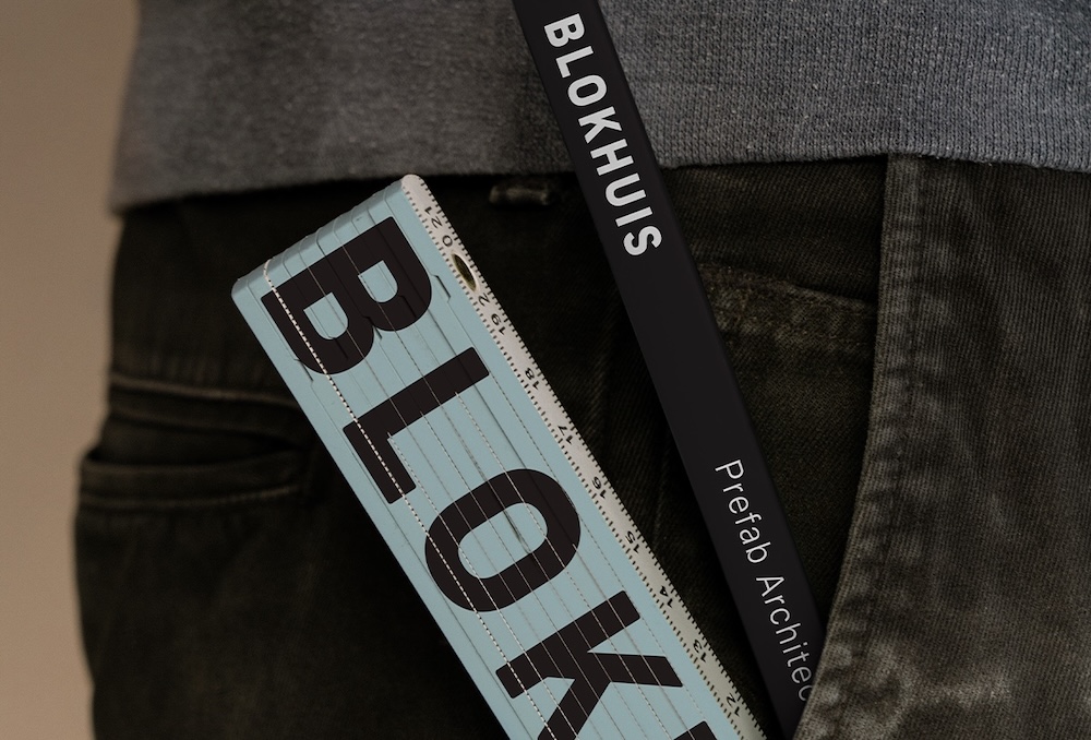
Client: BlokHuis
Founder and Principal Architect: Jemma Van Dongen
Strategy Director: Erin Morris
Creative Director: Marco González
Designer: Matthew Lumb
Project Manager: Nickie White
Register for FREE HERE and receive the Campaign Brief Daily Bulletin and/or the global Best Ads Best of the Week Bulletin. Subscribe to Campaign Brief Magazine.
#More Creative News #No paywalls #No annual membership fees
Subscribe to Portfolio & Reel for current listings of Australian and NZ ad agency and production company leadership and key personnel