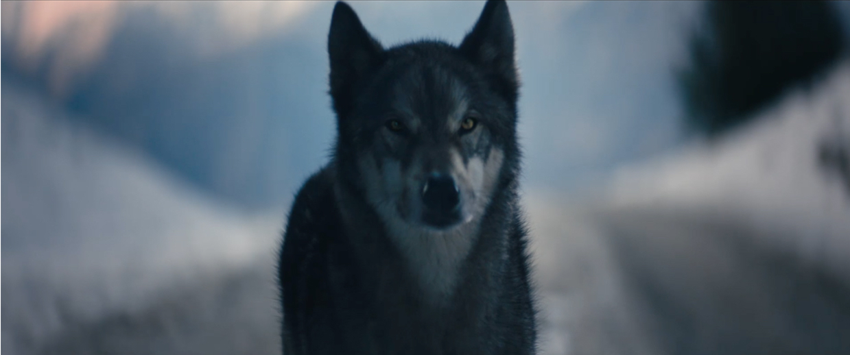
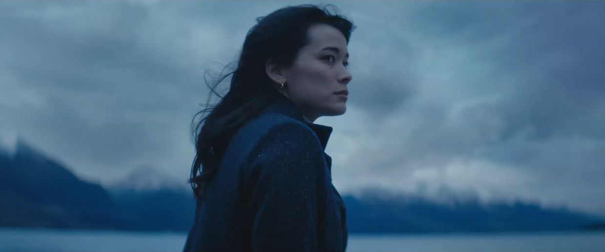
Audi Australia launches new ‘Scary Beautiful’ campaign for the Audi S model via WolfKing
This week, a new marketing campaign for the exhilarating Audi S model performance vehicle range hits the market, developed by independent agency WolfKing.
The Audi S model range delivers the perfect combination of exceptional performance and unadulterated luxury for discerning drivers, which led WolfKing to create an idea that highlighted the qualities of these unique vehicles, entitled: ‘Scary Beautiful’.
The ‘Scary Beautiful’ campaign is a through-the-line creative project for Audi Australia, created and produced by WolfKing.

Says Kit Bashford, marketing communications Manager at Audi Australia: “The moment we heard the ‘Scary Beautiful’ creative platform idea, we got excited. The whole process has been a collaborative and exciting one. We are absolutely delighted to see the performance and beauty of the S Range brought to life in such a powerful, cinematic way.”
Says Jason Woelfl, co-founder, WolfKing: “Creating this campaign has been incredible. Every person who has touched it has been dedicated to crafting and finessing it. The passion shown by Ben, Lucy, Tim, Billy, Abbie, Richard, Cam and everyone who has been involved, has been amazing. It’s work we’re incredibly proud of and sets the bar for the agency and future clients.”
Says Dave King, co-founder, WolfKing: “To be given the opportunity to work on a project for such a prestigious brand is an absolute honour. The Audi team have been true partners in creating this work, making it easy and most importantly, making it fun to produce.”

The campaign features a mix of television, cinema, outdoor, print and digital.
For more on WolfKing, visit wolfking.com.au.

Client: Audi Australia
Chief Customer & Marketing Officer: Nikki Warburton
Marketing Communications Manager: Kit Bashford
Senior Marketing Executive – Brand & Product: Mick Colgan
Agency: WolfKing
Creative Partner: Jason Woelfl
Creative Partner: Dave King
TV Producer: Bella Harris
Business Director: Kylie Jones
Studio: Richard Spencer
Retouching: Cameron Jones
Production Company: Collider
Director: Ben Briand
Executive Producer: Lucy Pilkington
DOP: Tim Tregoning
POST: BLOCKHEAD VFX
Producer: Charlotte Plowman
Colourist: Billy Wychgel
VFX: Richard Betts
Casting Director: Nikki Barrett Casting
Sound House: SongZu
Sound Designer: Abigail Sie
Music Supervision: Uncanny Valley
Music Supervisor: Charlton Hill
Track: Your Protector (Fleet Foxes Cover)
Writer: Robin Pecknold
Publisher: Kobalt
Artist: Wildernessa feat. Lovelier Other
Label: Pusher

66 Comments
Love it………I thought 303 had the account? or have they lost that too?
I want this car…Excellent.
Good work guys.
Sehr gut.
Heavy handed grade or comp. Can’t tell which one.. but the reds in the car are off.
Could have been visual beautiful, this misses the mark. Less is more remember guys.
Sic!
So cheesy.
Didn’t we just spend 3 weeks pitching on this?
Yes you probably did along with so many others.
I think they’ve lost their way, constant pitches show inexperienced marketers.
Here’s a great idea… let’s have a woman bark like a dog! That should really appeal to our target demographic of rich men.
Haha
Caught this O/A last week and I want this car (that is if I had the money) Nice job all.
Hey OFF….are you from 303 with negative comments like that?
I want credits for She Wolf
Interesting Audi Australia… you present a Howling female in the car driving aggressively? Is that really an image you want? Howling is very derogatory to females – it doesn’t show power its insulting and distasteful.
It’s becoming increasingly obvious your marketing is disrespectful to all genders. “Tall dark and Handsome” as a campaign was offensive to men (would you want an ad with a tag line “leggy Blonde”?!).
A tag of scary beautify is objectifying the person not the car. Nothing scary (is it unsafe, too fast, unstable?) or beautiful about this car.
Until she howled at the end, what was that about?
Anyway, yeah, good work peeps
Scary yes. Beautiful no.
Congratulations on picking up work for Audi. Well done. Beautiful spot too.
It’s nice that mates of the agency have come out to lend their support. And look, it’s good to support independent agencies and I’m sure the guys behind it are great guys and awesome drinking buddies to have… but c’mon. Really? It’s a mediocre 80’s car ad. It’s not bad, but it’s not particularly distinctive either.
Honestly though, good on them for getting a client across the line on the script and convincing them to give a small agency a go – but I suspect they’ll look back in time and consider this a missed opportunity.
Get ’em on the next one guys.
She howls…
oh dear…
Howler is quite offensive – according to the urban dictionary!
Do the females at Audi howl in the office if they find it so acceptable… isn’t a howl for the pack mentality?
Good stuff.
Scary no. Beautiful yes. Music was good too.
All you white old guys complaining about the howl. No idea.
I guess you’re scared of seeing a woman portrayed as empowered and fearless. Times have changed boys.
Howl all you want women!
I can hear the CEO and MD at 303 howling from here.
I laughed, is that the correct response?
It seems the wolf and the woman howling are by far the most memorable things about this spot. That’s not good. As an aside, perhaps the agency’s mission is to insert a shot of a wolf into everything they make, as a self-referential piece of branding – like the signature object that has to be in each year’s Tropfest.
Is that the correct response.
Loved it. Eerie, beautiful and powerful. I want the car and to drive in that location. Great job!
This is funny.
So does that mean 303ml have lost the Audi account?
looks like it’s been pulled right out of the 90’s.. Sheesh.
90s. Thanks for posting your stupidity.
Reading the comments from both client & agency, it appears all are really happy with the spot. They should be, it makes Audi look like a million dollars. Congrats to all involved, i’m jealous.
FFS, stop putting me in lame car ads.
This is hilariously cliched.
Sorry, what did I just watch? Is this the result of that pitch?
Woman drives car on road
There’s a music track
Then a wolf appears cos wolves are cool
Woman howls like a wolf cos – you know, wolves are cool
Audi logo
303 never did anything with the account, but this probably just goes to show maybe the agency aren’t the problem
absolute howler
….late 80’s.
Am I the only one finding it weird and Agency by the name Wolf makes their debut work with a wolf in it?
Beautifully shot, but not sure the S range is well linked to all the evocative imagery.
And on the howl, at least it’s got us talking. It’s exactly the sort of weird moment that sticks in someone’s head
Or thought provoking. It’s just a nicely shot car driving around a moody, dark landscape (I’m guessing it’s Skippers Canyon) It’s annoying because any agency can give this to a client and most agencies are happy to do so, it’s a decent junket to a beautiful part of the world. But we need to push harder and create insightful work, imagery that’s not stale or cliche. Stuff we as a community can all be proud of not a film that belongs in the early 90’s.
This does not make me feel good about my car. Don’t cheapen it with ‘humour’ – it’s not a down to earth brand and that’s what I like about it.
It’s German. Keep it that way.
Poor guys. Start their own agency. Make their own decisions. Get to work on Audi. Make a million dollar ad. Then discover that anonymous bloggers don’t like it. Yeah. I’d hate to be in their shoes.
Brilliant.
This is a great spot, beautifully shot.
Well done to all.
Hey Audi driver: I have an Audi and this film makes me feel good I have an Audi…and I like the humour as well. Twat.
The car may be 2019 but the ad could have been shot 30 plus years ago. So many cliches. I thought the marketing people at Audi would be a lot more progressive than this shit. This is the sort of script I could have written in 15 minutes if I was transported ‘Back to the Future’.
Sadly Phil, Audi didn’t come knocking on your door to ask you to spend 15 minutes of your valuable time creating new work for them. Amazing. I’m as shocked as you are.
Looks like this small indie shop ruffled a few feathers of the big boys.
Did we all just watch the same ad? Where some teary chick drives too fast up a shitty road to howl at a fucking wolf?
Are you all on drugs?
No. Clearly not. Because we used to make much better work when we were all on drugs.
This is not just awful, it’s Godwful. Holy fuck. How are we all patting each other on the back over this bit of wolfshit?
Fuck the lot of you.
With that kind of anger I fear your name would become famous for all the wrong reasons.
Fuck off.
You are very funny. Bless.
Butthurt.
Beautiful craft but what does it says about the brand, apart from “we do car for reach execs”? Could have plug any luxury car brand logo at the end of this spot. Audi used to stand for Engineering. A true brand that every car lovers would want once to experience. Some how, this brand lost its soul. Go wonder why sales go backward. A “collaborative” process that demonstrates how clients can kill a brand.
This ad is 20 years old, and 20 times cooler
https://www.youtube.com/watch?v=dnwHS3wc1B8
For saying what we were all thinking.
I like the film and I definitly want the car. The only issue is I don’t have the funds to buy just like the 36 other people commenting on this post.
Nice work from the guys at WolfKing.
@Nice I’m with you. Who cares what those Corolla drivers think. Let them catch buses.
@Nice I’m with you as well. Who cares what those Corolla, Hyundai or Kia drivers think. Hooooowwwwllll.
Just because the name of your agency is WolfKing doesn’t mean you have to put a wolf in your ad. What’s next? A king driving around a medieval village?
https://m.youtube.com/watch?v=HOlnsHFO84I
Sharing your work for a client who is in pitch mode? What were you expecting? A shower of compliments? Of course you’re going to get slagged. You have both been around long enough to know better. Shame. The ad is beautiful, distinctive and bold, but buried by the haters from the other agencies. Genuinely surprised at your timing.
Love this campaign.
This is not a good sign for 303. An existing client going to another agency to get better creative. It all smells a bit fishy me thinks.
https://www.youtube.com/watch?v=EfuSfxQ6_jE
How is this good? Please someone explain to me how? Is it the insight, the idea, the execution, the talent?
No. It is all bad, very very bad.
Looks like Howl, Wow, Awesome, Dave, Another Audi Driver and probably Yes are all one person working at Wolfpanty.
And Yes i liked it, Nick, haters gonna hate, ha ha and implosion are the other person.
Great work, you two. Fooled everyone.
We want our creative back
Anyone got a link to the exact cover of the song, I can only seem to find the original?