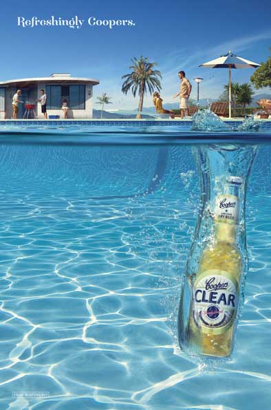
Coopers launches refreshing outdoor and print campaign for Coopers Clear via KWP! Adelaide
January 3 2012, 1:34 pm | | 27 Comments
 A lighter style of beer was a refreshing change for Coopers and an outdoor and print campaign for Coopers Clear from KWP! Adelaide was refreshingly light on words.
Creative Director: James Rickard
Creative Team: David Ormston, Amrit Jandu
Art : Jodie Kunze
Photography:Leonardo Vilela
Producer: Flavio Albino
Production House & Retouching: Platinum FMD, Brazil
Production Team: Micky Grant, Nic How
Media: Christine Phillips
Account Team: John Baker, Tristan Glover, Jock Auld
Client Team: Glenn Cooper, Claire Filsell, Rachel Cooper-Casserly

27 Comments
Didn’t West Coast Cooler do something similar circa nineteen eighty who gives a fuck.
Wow! Groundbreaking! Yeah!
Looks great. #
I seem to recall advertising full strength beer coupled with anything to do with swimming contravenes the AAPS code? Anyone?
Cool, I’m suddenly itching for a Clear.
No disrespect, but this does feel pretty dated.
The strategy feels miles off. In a crowded beer market, this isn’t going to stand out.
Brazilian photography & retouching?
If Coopers is going to blow it’s trumpet about being a truly local beer it could at least back it up it’s actions and put back into the local economy. Maybe the agency didn’t consider that part of the branding message.
Now that really is refreshing – a promotion for glass bottles to be dropped in swimming pools! “Drink responsibly”??
Brazil? to get an Australian Beer ad done why? Australia has so much world class talent at your disposal and you waste it for this? Not good!
What does it all mean? Kwp have lost great opportunities to do ground breaking work for Coopers. Quiet year for the AADC.
Great social marketing campaign. But the headline should have read “Don’t Drink and Drown”
Refreshingly Caravan Park
ha ha ha!
More piss than usual in the pool.
I have a great idea for a concept! lets throw a glass bottle into a swimming pool. Get it? the water in the pool is clear and that is what the beer is called, awesome idea. If we get it made in Brazil it will also make it look better and more international so we get an award for it. Surely we can promote a great beer brand better than this. Packaging looks very 1980 and the advertising matches, get with the times. Support Australian Industry and get a decent job done to replace this mess.
what insight?
Book the tickets to Cannes!
Very cool image, very cool idea. Congratulations!!! Taking Australian Advertising to the next level!!!
Beautiful image. Well done.
However, the same old REFRESHING strategy.
Come on you marketing morons, think outside the square.
Every drink is refreshing if you are thirsty.
I would say you have a very lazy client there guys.
Start Educating them!
Here’s to a better New year of CLIENTS!
mr Cool
“Advertising to the next level”!!!
How long have you worked in commercial art mate?
Grow up! and wise up!
Mr U A Crazy: Thanks!!!
I know Platinum FMD! These guys are crazy good!!! They work all over the world and have some of the most amazing images in the biz. Good for Coopers. One day I want to work with them too!
Seems to be lots of jealousy in this blog. I think it’s very refreshing to look at. What else do I need to know on a hot day? Good work KWP.
brazil? why not buy a cheap stock photo and add a pack shot. same impact as this tripe and costs 100 times less.
to Brazil. For Coopers. WTF?
Location maybe? haha! good going. Despite the misery on here, that is a pretty epic finish. Like it lots. The drink for summer for sure. 🙂