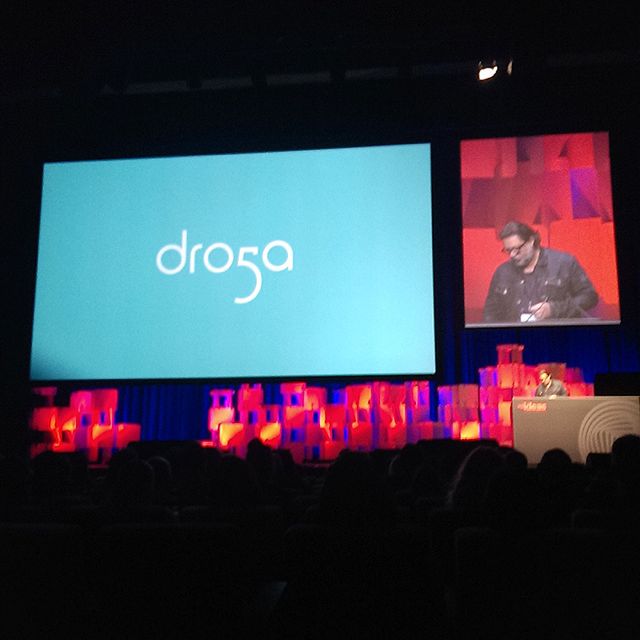
Yoke CD Richie Meldrum reports on ‘six of the best’ at agIdeas International Forum in Melbourne including Droga 5 creative chairman David Nobay
![agideas-2013-melbourne-international-design-forum[5].jpg](http://campaignbrief.com/wp-content/uploads/2013/05/agideas2013melbourneinternationaldesignforum5B55D.jpg) Yoke creative director Richie Meldrum reviews the adIdeas International Design Forum that took place last week in Melbourne – part of Design Week.
Yoke creative director Richie Meldrum reviews the adIdeas International Design Forum that took place last week in Melbourne – part of Design Week.
The creative equivalent of anabolic steroids, the agIdeas International Forum is a three-day dose of insight, advice and inspiration from design professionals spanning the full spectrum of the industry.
Part of the International Design Week, established back in 1991 by brand and design monolith Ken Cato, the forum is a simple set up. 40 designers from across the globe are invited to give 20-minute presentations on who they are, what they do and whatever else they can fit within their allocated time slot.
The speakers come from, and work in, a diverse range of specialist areas within the design industry. There were fashion designers, choreographers, typographers, architects and more. One minute we had the senior curator at Australia’s National Portrait Gallery, the next a Bondi Hipster.
Such was the scope of the field, you might expect for the vast contrast in subject matter to be overwhelming, especially in such a concentrated format. However, the line was walked well, and through carefully considering scheduling, it was a case of variety over disparity, which made for a delightfully enjoyable listening experience for the vast majority of the time.
The mix of subjects was matched by the different presentation styles. While some were clearly seasoned pros at this conference-speaking lark, others were a touch more wet around the ears. No matter how highly regarded you are, getting up in front of a dark abyss where you know there are 2000+ faces starting at you, can be pretty scary. Those with more elementary presentation skills wisely made use of the impressive audiovisual set up, displaying their work large scale on a huge screen as they talked to help keep the audience engaged.
Although the event had not been advertised or branded with a particular topic or theme, it did seem that many of the speakers geared their presentations towards those in the early stages of the careers with much of the rhetoric based around a ‘you are the future’ type mantra. This seemed an appropriate angle given the fact that a large portion of the crowd was made up of Gen Y kids thanks to the event’s links with various educational institutions. However, this doesn’t mean to say that those with a few more years under their belt were overlooked – far from it. The value of an event like this, with such a high standard of creative talent on display, is something that can be appreciated by all, regardless of how far down your career path you are.
While all the speakers brought their own unique offering to proceedings, the following is a selection of those who earned a special mention.
 David Nobay
Creative chairman at highly regarded advertising agency Droga5, David Nobay stepped in with a bit of a reality check, bursting the bubble on the idea of a creative utopia that has been built up by some of those who have presented before him.
With a number of real life statements from the ad industry and a refreshingly different presentation that exposes what he calls ‘the ugly truth’, Nobay started of by mentioning a topic that has been notably absent in all presentations thus far – clients. Not all clients actually want great work, he explains, and furthermore, what we might think is great work and what a client thinks is great work is not necessary the same thing. To avoid this horrible and painful situation arising, Nobay recommends doing what he does which is to directly ask the client exactly what success looks like to them, so that everyone knows what the aims are.
 The second of Nobay’s home truths is that there are simply too many of us. There are lots of people looking for jobs in the creative industry and not enough people leaving to free up space. He lists three types of creative people – great, good and gifted. A while back it was ok to be just good because there was enough work going around – not so these days.
Next he admits that, in creative advertising at least, the exotic is gone. The idea of a Don Draper type, sipping an Old Fashioned and bluntly telling a client that it’s ‘my way or the highway’ has been permanently resigned to the realms of legendary tales from yesteryear.
Finally, Nobay said that the creative industries had forgotten how to sell and quoted his college, Dorga5 founder David Droga who apparently said it’s not a great idea if you don’t make it. He went on to explain how the nature of advertising has become more complex. No longer is it simply a 30 second TVC, and a ¼ page press ad. Today advertising is about product, changing behaviour and generating messages that will earn their own distribution channels. In an environment like this, Nobay stressed the importance of being able to sell those new ideas to the client and convincing them that they have to make it. This can only be done by positioning an idea so it doesn’t look crazy – it looks brave.
www.droga5.com
@droga5
Neville Page
Neville Page is a creature and concept designer for both film and TV who has worked on some of Hollywood’s biggest blockbusters including Avatar, Prometheus, Star Trek and Tron. A smooth talking, sharp dresser with a special knack for crowd control, Page urged the audience to follow the approach of perhaps the greatest creative thinker of all time – Leonardo da Vinci. Page talked of da Vinci’s remarkable thirst to create, no matter what form it took, and of the almost spooky foresight the polymath demonstrated when coming up with ideas, theories and inventions that were far ahead of their time.
 Moving on to introducing his own work, Page explained the extreme lengths that he goes to when researching the finer details behind the fantastic creatures he has created for the likes of James Cameron and J.J.Abrams. This included building a skeleton skull structure and manipulating the jaw movement he had copied from a snake so that the Toruk (the dragon-like predators feared and honoured by the Na’vi people in Avatar) could look graceful when their moth was closed and terrifying when open.
Page also revealed a surprising source for some of his creations, which he discovered when mucking around on his laptop with a mate when they were at a party. Using some of the shape shifting effects on Apple’s Photo booth application, Page found that he could get some interesting interpretations of his own body parts as well as various everyday objects including a plu
cked chicken. The distorted shapes he captured would often trigger an idea for a new creation and, after adding a neck, eyes, colouring, additional detail and some further trickery, would turn into a final result worthy of any screen.
www.nevillepage.com
@NevillePage
![aerial-nudes-by-john-crawford[5].jpg](http://campaignbrief.com/wp-content/uploads/2013/05/aerialnudesbyjohncrawford5B55D.jpg) John Crawford
John Crawford
New Zealand photographer John Crawford gave a rousing presentation in which he identified passion, desire and inspiration as three muses to invoke in the search for creative achievement. Moving through his portfolio of work, the audience was shown a wide selection of images including ![]() some from his series of aerial nudes. These shots were taken from a helicopter high above the ground and show naked bodies lying flat against different backdrops both natural and man made. Crawford uses the human body to give scale, depth and focus to this series of photos. He also harnesses the power of symmetry in order to provide a path for the eye to move comfortably around the image.
some from his series of aerial nudes. These shots were taken from a helicopter high above the ground and show naked bodies lying flat against different backdrops both natural and man made. Crawford uses the human body to give scale, depth and focus to this series of photos. He also harnesses the power of symmetry in order to provide a path for the eye to move comfortably around the image.
According to Crawford, good photographs don’t just happen, you have to make them happen, and, thanks to the introduction of the camera phone, we now have the necessary tools at our fingertips 24/7. Crawford revealed he took 12,000 photos with his iPhone in the last 12 months, that’s a pretty staggering 47 images a day (all using hipstamatic to give it a neat square crop).
There is nothing wrong with the quality of the camera on an iPhone he tells the audience, and proves his point by showing a selection of beautiful shots of street dogs, landscapes and portraits – all taken on his iPhone – on the large screen. He finishes with a quote from Austrian photojournalist Ernst Haas, which fits nicely within his own specialist subject as well as the aspirational framework around which the event is constructed.
“There is only you and your camera.
The limitations of your photography is in yourself. What you are is what you see.” Ernst Haas
www.johncrawford.co.nz
 Claire Kahn
Claire Kahn is an executive designer at Californian based design firm WET. The firm specializes in creating environments and experiences that use water, light and other sensory effects to engage and entertain.
Opening her presentation with a shot taken by her brother when he was lying on a dingy as a circle of water jets fire 30 feet into the air around him, Kahn begins by explaining her love of water and the elegance she sees in its shape, form and movement.
During her 20-minute presentation she shows some of the amazing fountains that she has been involved in devising, designing and developing, including the famous fountains of Bellagio in Las Vegas. According to Khan, the Bellagio fountains make such a strong statement because of where they are and what they stand for. Surrounding by the fake, the faux and the flashy in this typically ‘Vegas’ environment, the fountains are unique because they are not trying to be anything that they are not. It is this honesty that pleases Kahn so much.
Other work from WET includes a kinetic sculpture fountain where small jets of water rise from the ground of a plaza when people move into specific areas. The design of the sculpture is not complete until it is engaged. In another, we see a video clip of a huge circle sculpture in a park in Seattle. Groups of children stand tentatively at its base, knowing what’s coming next. Suddenly, as the music reaches its peak, several large jets of water burst out from the centre of the circle in all directions and the kids run, laughing and screaming to try and avoid a drenching.
Kahn closes with a glimpse of a stunning new project WET is undertaking using a new technique that combines water with its opposite – fire. We are shown a fountain consisting of rows of small spouts from which bubbles made from the water’s surface are created. Inside each bubble is a flickering flame, steadily burning inside its own watery capsule in what is an awesome combination of polarized elements being brought together.
www.wetdesign.com
@WET_Design
![gotye-by-kane-hibberd[1].jpg](http://campaignbrief.com/wp-content/uploads/2013/05/gotyebykanehibberd5B15D.jpg) Kane Hibberd
Kane Hibberd
Oddly enough, Melbourne music photographer Kane Hibberd opens his talk by revealing he doesn’t actually like photography that much. Instead, his explanation for his chosen career path is that he couldn’t draw or paint but had images in his mind that he needed to get out and the only vehicle with which he could do this was a camera.
A former sound engineer who spent a lot of time backstage at various gigs and festivals, Hibberd enrolled in a course at RMIT in what was a bit of a whim after buying an SLR and taking the advice of a friend who said he should go back to uni study photography.
Apparently, his intended subject matter wasn’t even ![karnivool-by-kane-hibberd[1].jpg](http://campaignbrief.com/wp-content/uploads/2013/05/karnivoolbykanehibberd5B15D.jpg) music. Hibberd thought he’d take photos of interiors or architecture for a bit of easy cash. However, after being told that his shots of this were shit and his music ones were good, he realised he was off target and started to take more and more shots of his mates who were in bands at the time.
music. Hibberd thought he’d take photos of interiors or architecture for a bit of easy cash. However, after being told that his shots of this were shit and his music ones were good, he realised he was off target and started to take more and more shots of his mates who were in bands at the time.
Now a leading figure in the Australian ![slipknot-brisbane-2012-by-kane-hibberd[1].jpg](http://campaignbrief.com/wp-content/uploads/2013/05/slipknotbrisbane2012bykanehibberd5B15D.jpg) music scene having shot hundreds of artists, gigs and festivals, Hibberd sited his former career as a sound engineer as one of the things that gave him a leg up when he first started his business. His experience in the music industry where he laid witness to the ins and outs of touring, recording, management and more, meant he was
music scene having shot hundreds of artists, gigs and festivals, Hibberd sited his former career as a sound engineer as one of the things that gave him a leg up when he first started his business. His experience in the music industry where he laid witness to the ins and outs of touring, recording, management and more, meant he was ![]() able to use his inside knowledge to his advantage as a professional photographer, including calling up a few old contacts for a favour.
able to use his inside knowledge to his advantage as a professional photographer, including calling up a few old contacts for a favour.
Hibberd explained that he sees his creativity as the other factor to the success he’s had in his career. In his 20-minute slot he talked about really trying to think about what the band are trying to say and reflecting this in his photos. This involves looking at the song titles, themes of the music or the words to a particular song to try and get a creative concept that relates back to the release. An example of this in operation was shown through his image of Gotye for the album Making Mirrors, which shows the singer-songwriter matched against his own reflection.
www.theartofcapture.com
@kanye_lens
![UX-doodle-by-richie-meldrum[3].jpg](http://campaignbrief.com/wp-content/uploads/2013/05/UXdoodlebyrichiemeldrum5B35D.jpg) Chris Khalil
Chris Khalil
Chris Khalil, Director of User Experience and Design at News Limited, gave a fascinating presentation on the work that he does in the field of User Experience Design (UX).
Starting off by admitting that many people still don’t know exactly what the term UX actually means, Khalil explained that he liked to think of his areas of expertise as a combination of the head and the heart, where both the back-end structure and the visual delivery of the information of a digital interface take equal importance.
Khalil, talked about how working in UX design means working with ungoverned materials where new and emerging technologies and methods of digital communication mean the goal posts are constantly shifting. Here you do not have the historical rules of application that exist in other disciplines in the physical world – design in digital never ends.
Khalil revealed that his ultimate goal was for the work that he does to be invisible to the user. It should be so intuitive and so natural that no one even knows it’s there. If you’re familiar with some of Apple’s key products, a company for whom UX played a critical role in everything it does, then you will know what Khalil means when he says that good UX is most notable by its absence.
Consumer research appeared to play a central role in the way Khalil operates. He uses surveys and focus groups to ensuring the final outcomes are to brief, and to bring and objective truth to a subjective topic. This even extended to examining eye tracking to learn what areas of a digital interface people are looking at.
Offering some final advise applicable to all creative endeavors, Khalil exalted the virtues of exploration over refinement and urged the audience to purposefully try out lots of options so that bad ideas can die quickly.
www.chriskhalil.com
@chris_khalil
The agIdeas Design Forum was a fantastic event – well programmed, well planned and well executed, if ever there was an experience to enhance interest, spur ambition and drive you to be more creative at work or in life in generally, then surely this must be it.
Richie Meldrum is Creative Director at Yoke www.yokedesign.com.au

2 Comments
Is he a relative of Ricci Meldrum, the distinguished account director?
nope, just a coincidental ‘almost’ namesake!
cheers
richie