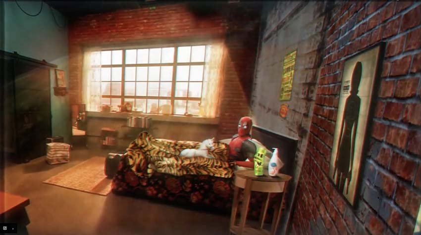
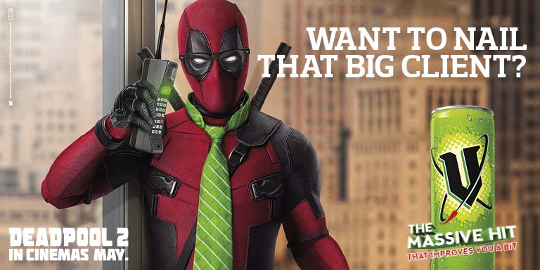
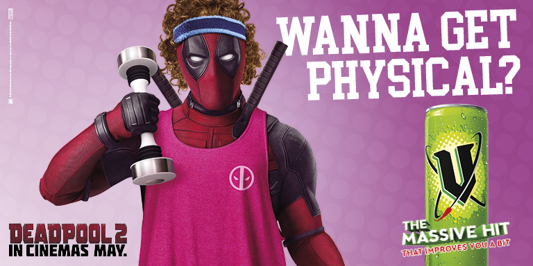
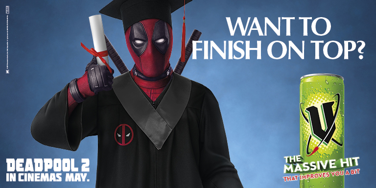
V Energy’s ‘massive hit that improves you a bit’ campaign receives the Hollywood treatment in latest ‘Deadpool 2’ campaign via TKT Sydney

V Energy’s “massive hit that improves you a bit” campaign has received the Hollywood treatment via TKT Sydney, with the latest iteration of the Aussie campaign starring Marvel’s anti-hero Deadpool.
The new campaign kicks off today in partnership with 20th Century Fox for the launch of Deadpool 2. The partnership builds on V Energy and Fox’s longstanding relationship and is set to be the biggest yet with a $4.5M national campaign across OOH and digital, along with large investment in-store, including an on-pack promotion and 12.5M limited edition packs, including a bespoke Deadpool V flavour.
The digital & OOH campaign features Deadpool as V’s spokesperson in various guises flaunting V Energy as a solution to your everyday energy-related needs. Big or small, serious or flippant, there’s nothing a V can’t make you a bit better at.


Says Chris Henbrey, Brand Manager on V: “Gaining the attention of the 18-24 key target is an increasingly problematic thing for brands to do. Partnering with a movie character that they love is a great way to get noticed. The trick is finding the right balance between movie character and brand, which I think we’ve done.”
Adds Kate Nicholls, Head of Partnerships, 20th Century Fox: “We are thrilled to be working with the V Energy brand to deliver an innovative partnership that celebrates Deadpool 2. TKT have embraced the virtues of Marvel Comics’ sexiest fourth-wall-breaking anti-hero and the V Energy campaign timing allows us to tease the new film and excite fans without revealing too much.”
Deadpool 2 will be in Australian cinemas on May 17, with the campaign hitting OOH, social media and digital from today.
Agency: TKT Sydney
Film Animation: Edwin de Swardt
Sound Design: We Love Jam Studios

6 Comments
Are those headlines for reals?
Wow. Really bad.
That’s really shit.
This stinks.
I loved TKT’s work for V on gaming with their Wasteland with a V’ campaign so had high hopes for this. Sadly it misses the mark, badly. Opportunity missed!
Such a shame.
I love how TKT kept everything super simple and uniformed WITHOUT any major spoiler alerts linked to the movie. I Really like the colour scheme as well, for the backgrounds though – I would have used a colored background for the business one or changed the fitness and school to have a blurred background of a school hall and gym to match a little bit more.