US+US creates ‘Brilliantly Unexpected’ brand positioning, identity and campaign for Ballarat

Brand agency US+US has created a new brand positioning, identity and campaign platform for Ballarat, reframing Victoria’s largest inland city as a destination where the past and present, tradition and creativity collide in unexpected and harmonious ways.
Located 110 km northwest of Melbourne, for many years, Ballarat has provoked the same response from locals and visitors alike – it’s old, gold and cold. Visible throughout its streetscapes, you can’t miss Ballarat’s gold rush heritage. But richer cultures and deeper stories thrived here for 60,000 years before the first prospectors arrived.
Ballarat is also a city bursting with contemporary culture and creative energy, from vibrant arts and crafts to a cutting-edge drinks and gastronomy scene. The time had come to inspire everyone – not just visitors – to see the region with fresh eyes; to create a confident place brand that expressed who Ballarat is, rather than what it’s got.

In a project two years in the making, working closely with Tourism Midwest Victoria, US+US began with an audit of existing strategic and creative assets. This was followed by a period of research and consultation.
This process uncovered key challenges for the region around entrenched visitor and local attitudes, but it also revealed an untapped insight: Ballarat is a place of glorious contrast and contradiction, a blend of the historic, fresh, expressive, quirky, diverse and more.
US+US Strategy Director and Partner Jim Ritchie says: “Destinations need to create brands that truly reflect their unique character. Ballarat has been pigeon-holed as a gold rush town, but it’s so much more – a progressive, self-assured city embracing its distinctiveness, diversity, and eclectic nature. A brand was needed to reflect today’s Ballarat, something all Ballaratians can get behind.”
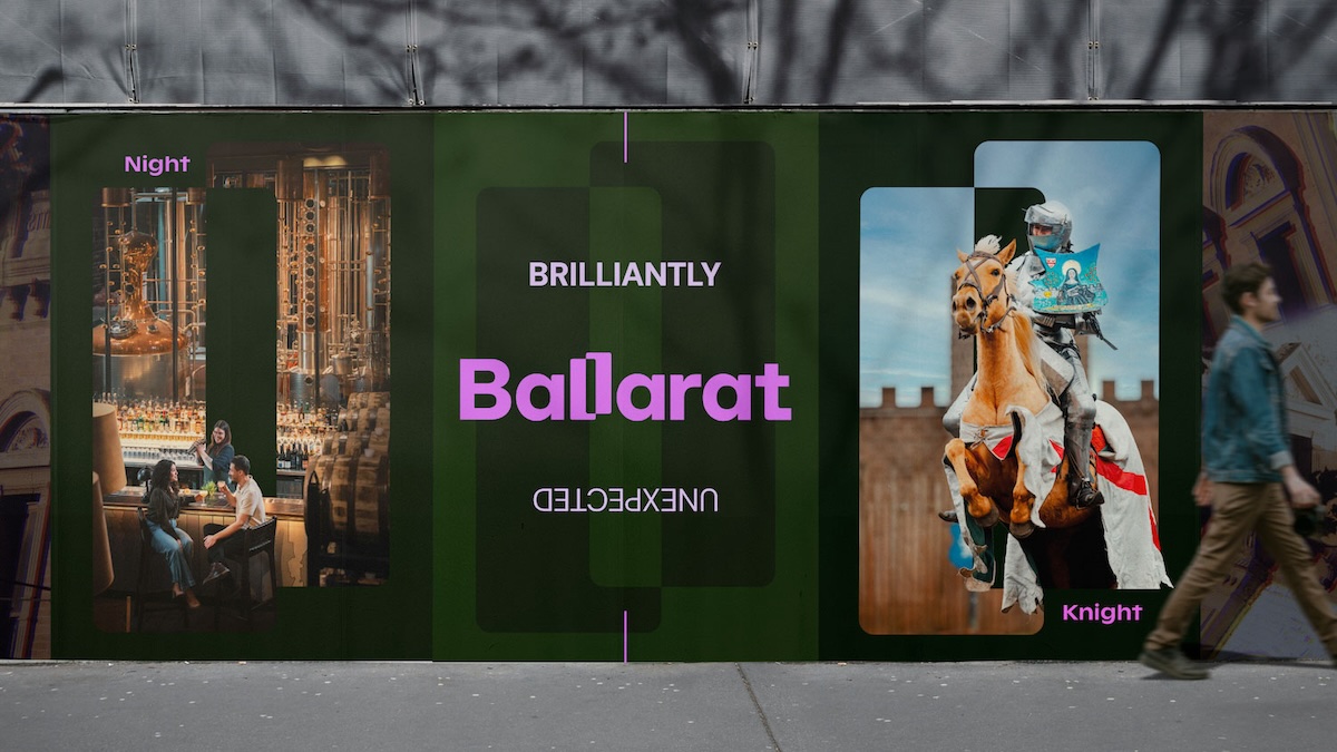
The new brand platform, Brilliantly Unexpected, brings the idea of contrasts and contradictions to life, highlighting four key pillars of the Ballarat brand: First Peoples, people and place (185+ years of post-settlement), creative energy, and signature experiences.

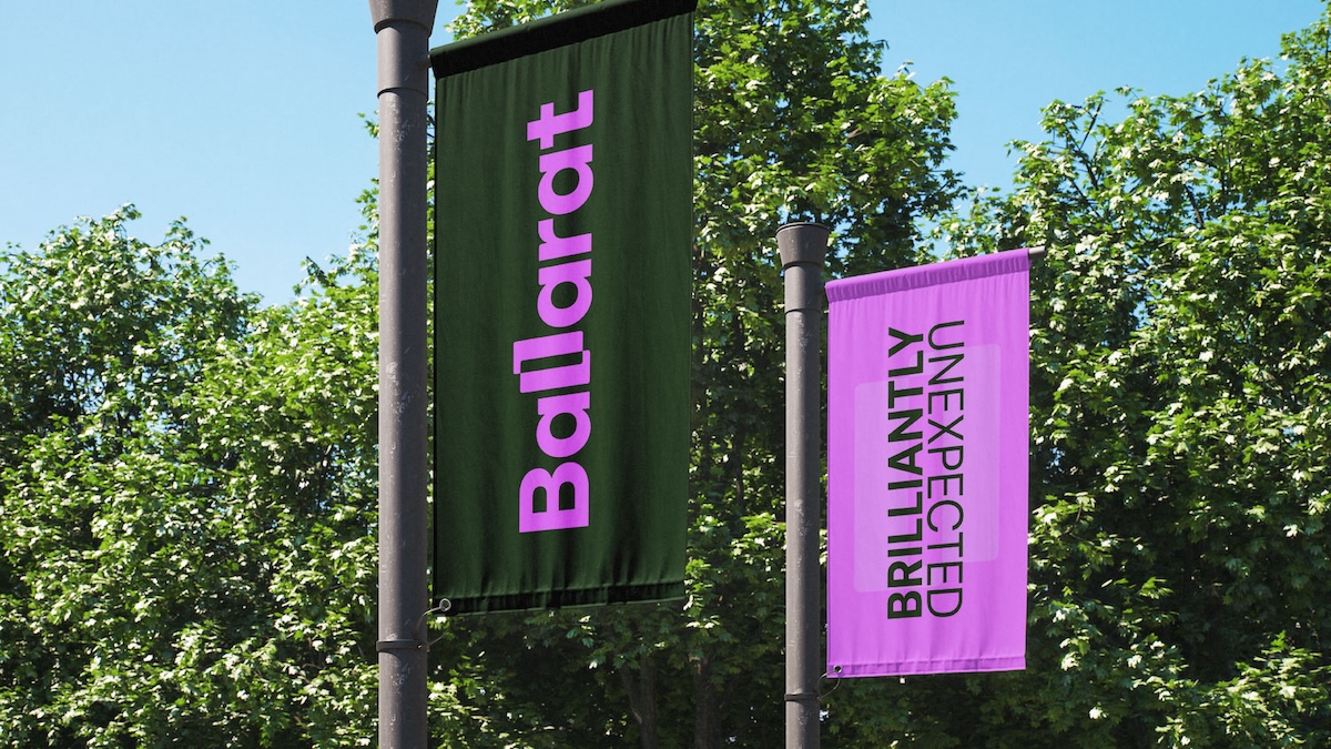
The new Ballarat logo takes its inspiration from the contrasts of the area, people and experiences which are reflected by a double-L ligature that also forms a versatile graphic device.
US+US Design Director and Partner Tom Hutcheon says: “From the start, we set out to create a vibrant and dynamic identity for Ballarat that embodies the positively unexpected experiences the region offers. Ballarat’s inherent contradictions are front and centre in the wordmark with the two Ls contrasting against each other and forming a distinctive device that flows through the entire identity.”
The Ballarat colour palette is designed to cater for the abundance of contrasts and diversity in the region, leveraging the unexpected. Similarly, the verbal identity is original, confident and lively, celebrating ‘Ballaratian’ personality and giving a voice to the ‘Brilliantly Unexpected’ brand platform.
Adds Ritchie: “It’s been hugely rewarding to work with Tourism Midwest Victoria’s marketing team and local stakeholders to develop an expansive and integrated brand framework that supports the visual and verbal identity. This approach has enabled us to create and maintain a consistent brand narrative across all facets of the brand, marketing and creative initiatives.”
Says Tourism Midwest Victoria Chair Hon. John Pandazopoulos: “The ‘Brilliantly Unexpected’ brand platform and new identity truly highlight our region’s distinct essence and personality. At every step, US+US has stayed true to the vision, ensuring our brand platform is as distinctive and compelling as the people and places it represents. We believe ‘Brilliantly Unexpected’ will perfectly position us as Victoria’s leading regional destination. We can’t wait to share this with the world.”
