Tourism Australia reveals new logo via Interbrand
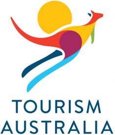
 Tourism Australia has unveiled its new logo, which was designed by Interbrand, part of Tourism Australia’s current global creative agency, DDB.
The new logo still features the iconic kangaroo but with a more modern design and vibrant colourful palette reflecting the rich and varied landscape of Australia.
Tourism Australia managing director Andrew McEvoy said it was the right time to update the eight year old logo and doing so would complement the recent update to the national tourism organisation’s global campaign.
Says McEvoy: “Tourism brands the world over, from Australia to Argentina, are continually updating their visual identity. Even New York’s iconic ‘I [heart] NY’ logo was revamped for the city’s recent summer tourism campaign.”
He said the new logo was more modern, sophisticated and better aligned with the contemporary and ‘best of Australia’ positioning being communicated by Tourism Australia’s recently updated campaign creative.
Says McEvoy: “While it has powerful visual elements that are still relevant, the current logo itself is beginning to look out-of-step with the next phase of our There’s nothing like Australia campaign.
“The strong use of blues, greens and yellows, and a significantly more contemporary positioning, is in keeping with Tourism Australia’s positioning of a modern and confident Australia open to the world.”
The current logo was designed in 2004 at the time of the ‘Different Light’ campaign.
The new logo will be progressively rolled out, starting in Australia and across the Tourism Australia network of 12 international offices from December 17. The timing aligns with Tourism Australia moving into new corporate headquarters at 420 George Street in the Sydney CBD.
Campaign artwork with the new logo will start to be used rolled from 1 January 2013′ with the aim of having the new logo included in all campaign material globally by the end of April 2013.

13 Comments
What was wrong with the old logo? This looks like clip art.
How much did they (we) pay for that?
Looks pretty stock standard for what I can imagine they would have paid for it.
It’s not bad I suppose.
But it does seem very familiar, like something I’ve seen before (and quite a while ago I’d say)
A compelling argument for crowd-sourcing.
Brand new and it already looks dated.
Hello there?
I’m calling to ask for my t-shirt design back
Yours sincerely,
Circular quay in 1994
Why so limp skip?
Interbrand are doing some awesome work. If I could have intimate relations with a logo, this one would be in with a chance.
very nicely stuck in disco 70’s
Like I said this logo is one COMPELLING argument for crowd-sourcing….
I have to agree with the general sentiments that it looks like a logo you would have seen on a shell suit at World Expo ’88 in Brisbane. It’s not that it’s so bad, moreso…well…it’s just pretty boring.
I think the symbol is great
but the typography is terrible – Futura centered talk about a warp back to the 90’s
It looks like they spent so much time developing the symbol they forgot how important typography is…