The Palace ventures into Sacred Grounds with print and POS to promote organic fair trade coffee
January 30 2012, 12:57 pm | | 22 Comments
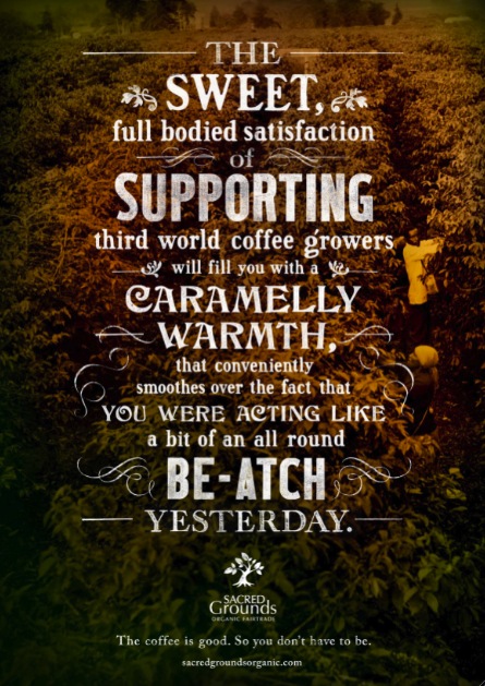 The Campaign Palace, Sydney has launched a print and POS campaign for Sacred Grounds Organic Fair Trade coffee.
Says Palace national chief creative officer Reed Collins: “Doing something as simple as choosing a coffee that helps the less fortunate should make anyone feel pretty darn good. It’s the small things we do everyday that can make a real difference. We wanted to create a campaign that has a little personality for what is, sometimes, a pretty somber issue .”
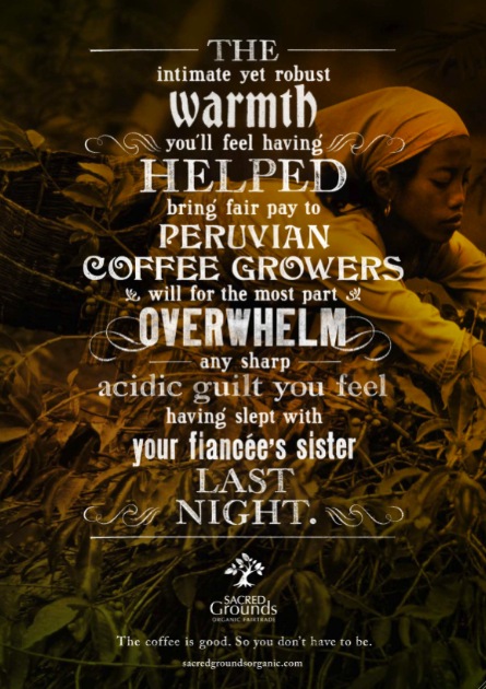

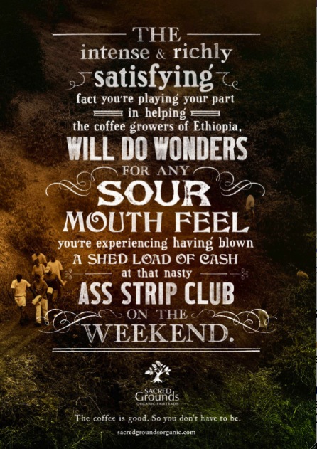
Chief Creative Officer: Reed Collins
ACD: Gerhard Myburgh
Writer: Hywel James
Art Directors: Helen Sham, Nic Buckingham
Designer: Helen Sham
Typographer: Helen Sham
Photographer: Getty, Corbis.
Art Buyer: Clare Yardley
22 Comments
I used to write really long, funny headlines like that.
art direction spoiled it
Overart directed, under thought.
Do Australians really say “bee-atch” and “nasty ass”?
A print ad? Not another 28 day prank?
Harsh!
I think the art direction’s great.
I think the whole campaign feels 25 years old, but the art direction is tip top.
I think the headlines meet the requirements for modern ‘long copy’ awards, so it might do ok in the shows.
This is good fun – well done.
There are numerous things wrong with the copy in these ads. The most notable is the lack of hyphenation between related adjectives to avoid confusion of meaning.
Exhibit A – nasty ass strip club should be nasty-ass strip club. Look at the way the art director has layed it out which adds to the confusion. It reads that it’s a nasty, ass strip club. Now I’ve never been to an ‘Ass Strip Club’, have you?
Throw in shed load, shed-load, and also all round, all-round, and clearly the writer/cd lacks a basic understanding of grammar.
Harsh, yes. But to let an ad out that is so blatantly grammatically flawed that it actually confuses the reader surely invites critique?
This is the best work ever by the Palace, they are killing it right now – the amazing Berroca print ads and now this -they are on fire. Wouldn’t be suprised if they win agency of the year for 2012 – the creative from Reed and Co is simply world class, totally orignal and edgy. Just incredible. The Palace must be the hottest shop in Australia right now.
‘Ass strip club’ is a funny notion, if you did it on purpose. But it’s plain to see that you didn’t. Therefore it is an EPIC fail. Is English your second language?
The awful attention to grammar and punctuation just made this lovely even funnier.
Even if its missed by 99.99% of the readers.
Agrees with a writer (9.49 am)
There’s a nice thought in there, but the execution (both writing and a/d) feels really half-arsed.
These ads are just crap…..but take a bow. If you can get away with producing turd burgers complete with poor grammar, punctuation and no real creative edge…more power to you. I wish my agency would pay me bucket loads for that sort of work and doing half assed jobs. I am so jealous!
A writer said (9:49 AM):
Exhibit A – layed it out.
Layed? A writer???
Oh dear.
Now I’ve never been to an ‘Ass Strip Club’, have you?
Should that not be:
Now I’ve never been to an ‘Ass Strip Club’. Have you?
This is the most ironic sentence of them all.
But to let an ad out that is so blatantly grammatically flawed that it actually confuses the reader surely invites critique?
I have an English ‘O’ Level from the 1970s. You are allegedly some sort of writer. Do quit your day job.
Advertising and grammar don’t mix. Every punk ass fool knows that it’s til not ’til or ’till. We refine the rules fool! Make no miss-take!
Write how you speak. Read how your audience might.
Irvine Welsh and Brett Easton Ellis are great examples of this.
@writer (9:49 AM), shame.
Nasty ass honey badjar don’t give a sh*t.
good work guys – don’t listen to these assholes……..the strip club ad resonates….thanks
@Amazing… are you completely retarded?