Telstra unveils major brand evolution in new ‘Colour’ campaign via DDB and Interbrand
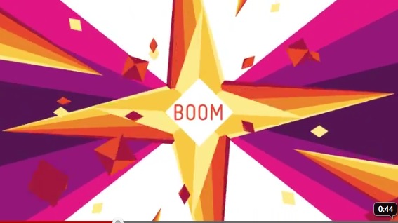
 Telstra has unveiled a new colourful identity that aims to capture the diversity of its products, services and customers, in the biggest change to the Telstra brand since its transition from Telecom Australia in 1993.
DDB Group’s specialist brand agency, Interbrand, worked with Telstra on the brand identity and along with DDB Sydney launched a new Telstra advertising campaign featuring the new look brand through TV and press launched yesterday.
 Marty O’Halloran, Chief Executive Officer, DDB Group said: “Telstra is one of Australia’s biggest, most recognisable brands. Our challenge was to maintain that familiarity, while also encouraging customers to re-evaluate what Telstra is about.
“Aspects of people’s lives are not any one colour, so injecting the existing branding with a full colour wardrobe means that we can take the Telstra brand to customers in a recognisable, relevant and engaging way.”
The new brand identity is designed to reflect the changes that have been happening at Telstra over the past two years, as the company moves to focus on customer service, sales and marketing while continuing its great legacy of engineering excellence.
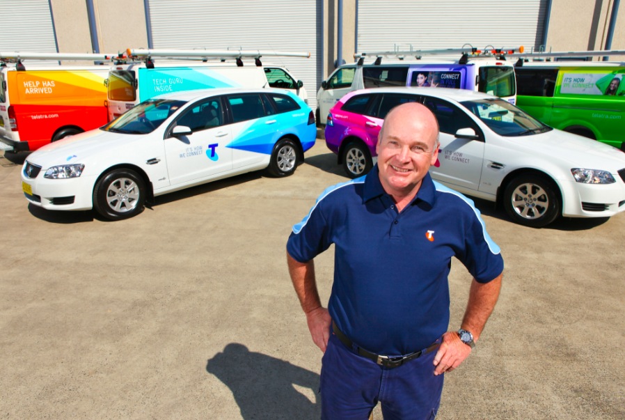
 The Telstra logo will continue in its current shape, and will feature a new colour palette incorporating orange, green, turquoise, blue, purple and magenta. The new look will be used for all customer groups including consumer, business, enterprise and government. It will be applied across thousands of applications from uniforms to service vehicles to packaging over the course of the coming months. Telstra has minimised the costs associated with rolling out the new brand identity by employing a gradual approach that aligns with scheduled cross-company programs of work.
Telstra Chief Executive Officer, David Thodey, said the changes to Telstra’s visual identity were designed to create a stronger and more emotional connection with Telstra’s customers.
“The time is right for a new look and feel for Telstra,” says Thodey. “We’ve been busy changing behind the scenes to better connect with our customers, and our new brand identity reflects this fresh approach.”
 “Our changes are more than skin deep and come after the introduction of new customer service initiatives such as 24 hour sales and support and on Twitter, weekend appointments with technicians, free calls to Telstra help lines and the launch of simple pricing summaries so customers have the key information they need in plain English.
“Other customer service initiatives include a new customer service facility in Facebook and a new online community called CrowdSupport where customers help customers. Service improvements soon to be introduced include shaping on domestic mobile data usage to help consumers avoid unexpectedly high bills and a new simpler design to customer bills.”
For more information on the changes, or a look back at some of the Telstra spots over the years head to telstra.com/colour.
* Best Australian Brands 2009 valued the Telstra brand at $9.7 billion

28 Comments
I like this. One of the problems with consistency is that when adhered to, a brand can look decidedly one dimensional, both in tone and offerings. Another by-product of consistency is that a brand can appear to be lying dormant, not changing. Surely a telco of all companies must look likes it is as contemporary and changing as much as the category itself. The colours I love. Having been privy to the earliest presentations by The Partners, the English firm responsible for the original Telstra logo, I always believed their use of colour was poor. [The original recommendation for newspaper ads was black type out of grey panels for all body copy!]. This is much better. Although, I’m sure all those responsible for the launch of Optus will cringe at seeing Telstar announcing ‘Hello World’.
DDBOOM!
Who the hell wrote the TV? A designer? Tried hard, fell heavy.
Question for Old Guy.
Would ‘Another by-product of consistency’ be Apple ??
Dear by-product of consistency,
I’m for consistency, but sometimes brands that do huge amounts of advertising can be hindered by that consistency. Same colour, same tone of voice, same voice-over, same look – all in the name of brand consistency. It gets to the stage where it’s hard to tell one product, or service from the next. For instance, every Toyota tvc used to feature a red car. Eventually, every car featured in a Toyota ad looked the same, no matter how different it was in design and features. I think Telstra was heading down that road. As for Apple, the unique product attributes of Apple products will always make each Apple ad different, regardless of whether they were shot in b&w, or colour.
Sincerely,
Old Guy
who designed this rainbow look?
Telstra now own the whole Pantone book…
Is the music a subliminal hint that Telstra will soon be owned by China?
Colourfully forgettable.
This looks like a TV station Promo.
Something that SBS would put out, More design than idea.
DDFuckoff.
ET, phone home.
Telstra continues the boring re-branding phenomenon – couldn’t they have used the money they spent on this (millions?) for something more worthwhile. Who cares if Telstra have a “new and exciting” brand – they’ll still be the same old profit-driven company they ever were. Not impressed.
Sorry DDB and Interbrand but this is a complete rip-off of what we created more than a year ago for the inspire foundation – http://www.behance.net/gallery/Branding-Infrastructure-Inspire-Foundation/754314
Is it wrong for me to like this?
Hopefully they will do something good with it…
Replace existing speech bubble straight jacket system with Vector rainbow straight jacket system.
Another one trick pony in 50 pony colours.
The new Telstra Bollywood ad.
I thought the whole colour and Bollywood style music was sending the message that Indian call centres were at the heart of their business. Sending the message that this previously Aussie brand is not about employing Australians or keeping all aspects of the business in Australia. Possibly not a good message to send in this country with a GFC in progress?
The ad is more than a subtle or subliminal message that Telsta = Indian not Australian operators, it is a very strong ad in it’s Bollywood presentation. Why, if you close your eyes you can feel your hands making various mudras.
who sings the song in this ad?
What’s the name of this song ? Please
I found that the music is by a band called WONDERFUL and the song is called Rainbow Colors.Not available in the Australian iTunes store, only US.
This is just too good for Telstra…
(And it’s not even that good.)
It is a band called Wonderful. They are a popular band in Seattle. I was told by my best friend that they have incredible live shows. I think the music will be available on itunes Australia soon if not now.
Done and for a lot less money too…. http://www.youtube.com/watch?v=bLwSiSxluKs
THIS IS AN AD CAMPAIGN, NOT A REBRAND
It is a campaign idea executed through design. The fact that the media keeps calling it a rebrand is seriously worrying. If the industry does not understand branding, we are in trouble. Branding i smooch more than the logo, but by keeping the old logo tells me that they have not changed at all. They have just put a colourful bandaid over the top – i am sure I am not the only one thinking this.
I’m a graphic designer and work in advertising and I think this is a typical but great new campaign. love the stylised freshness of the animation. And I think the caparison with the SBS ad is a little irrelevant.
all the pretty shapes and stars and colors its almost mesmerizing or hypnotic. reminds me of looking at the sky?
Anyone know the name if the blue and yellow characters??
It just confuses me. I have no idea what the different colour schemes mean, which is why I ended up googling it. And I still don’t know.