Telstra launches major new brand platform ‘Wherever we go’ via Bear Meets Eagle on Fire +61
Telstra is launching its new brand platform “Wherever we go” with an integrated campaign via Bear Meets Eagle on Fire +61 led by a whimsical animated film called ‘Duet’
‘Duet’ features two characters who journey together through a wondrous world in perfect harmony, as a metaphor for partnership. Brought to life by Oscar nominated animation duo, Smith and Foulkes, ‘Duet’ is set to a whistling composition of the iconic ‘Islands in the Stream’.
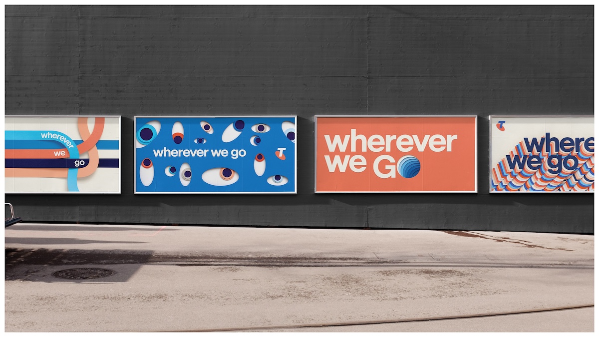
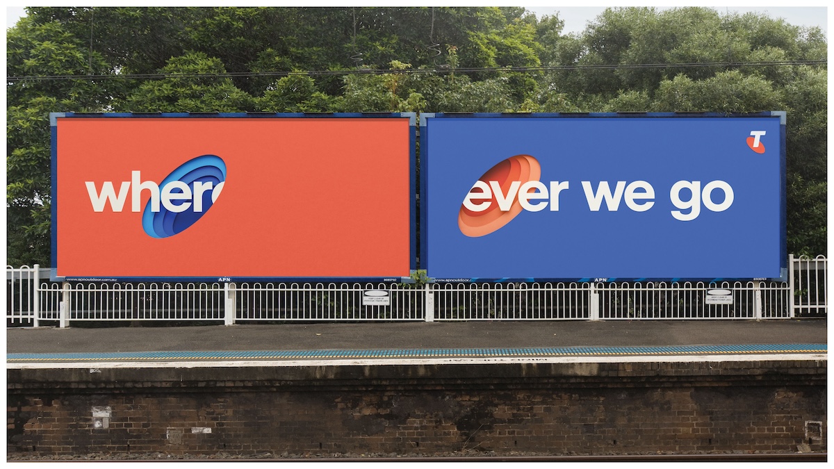
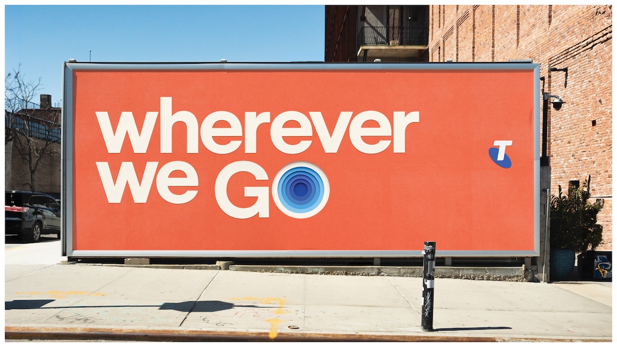
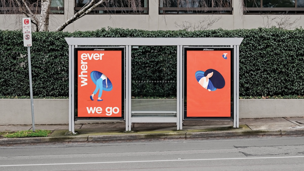
The craft and ambition doesn’t stop with film though, and in out-of-home close to 3000 sites, including forty special builds and painted wall murals, feature graphic illustrations by Ben Hassler that have been painstakingly recreated in layers of paper with artist Kyle Bean and photographer Carl Kleiner.
The range of executions and commitment to crafted detail suggest a more contemporary and imaginative chapter for Telstra under ‘Wherever we go’ and marks a conscious move away from the previously more corporate image for the brand according to Brent Smart, Telstra’s Chief Marketing Officer:
“If you want to change how people feel about your brand, you have to change how the brand feels. This work captures the spirit of optimism and promise of partnership that we want the Telstra brand to be all about. We want to show that the biggest brands can also be the most imaginative” says Brent. The campaign launches in both the AFL and NRL Grand Finals, before extending into media buys across broadcast, digital, and social.
“I’m just proud of all the folks who’ve cared so hard to make this work”, says Micah Walker, Founder and Chief Creative Officer of Bear Meets Eagle On Fire. “It’s not that often you get to make work this considered and crafted, and to do it at this scale, is just really rare.”
Adds Blake Crosbie, Managing Director of +61: “This campaign has also been a great journey with Telstra and the work is the beginning of redefining the relationship they have with their customers. It puts partnership at the center of the Telstra brand.”
“We’ve really pushed the boundaries within the media to bring this campaign to life. It’s about creating a world of epic wonder, from the screens to the streets, and places Telstra in high reaching, high attention, premium environments,” says Helen Guard MD of Media.
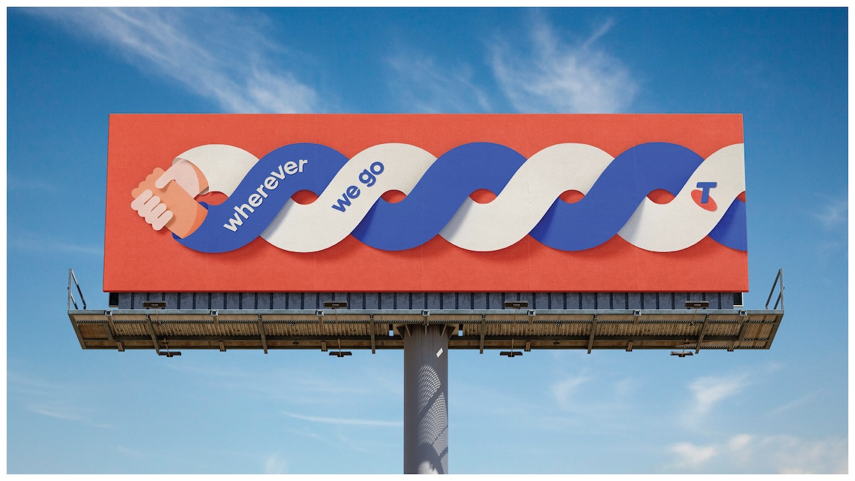
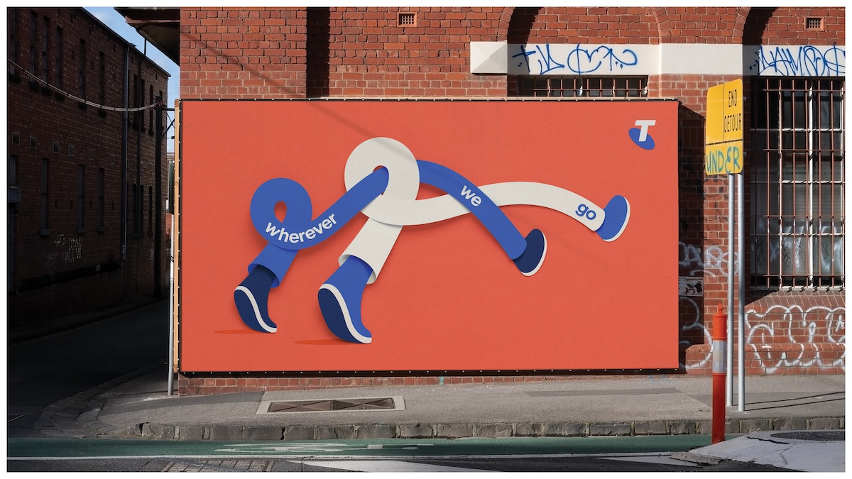
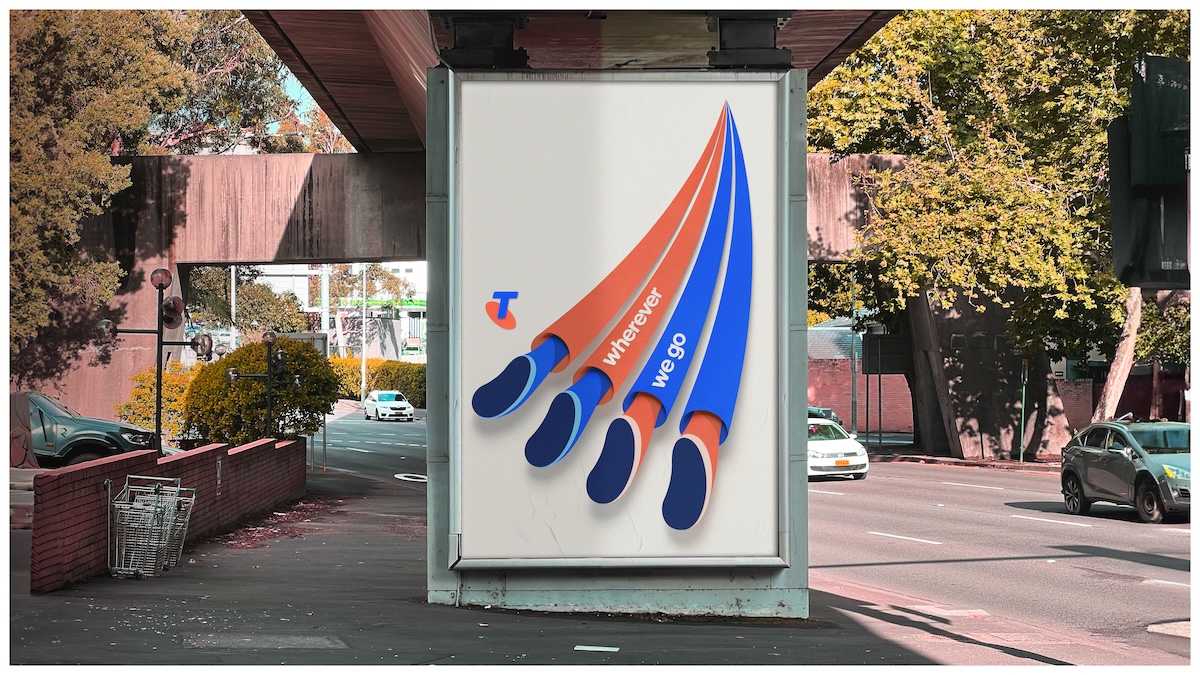

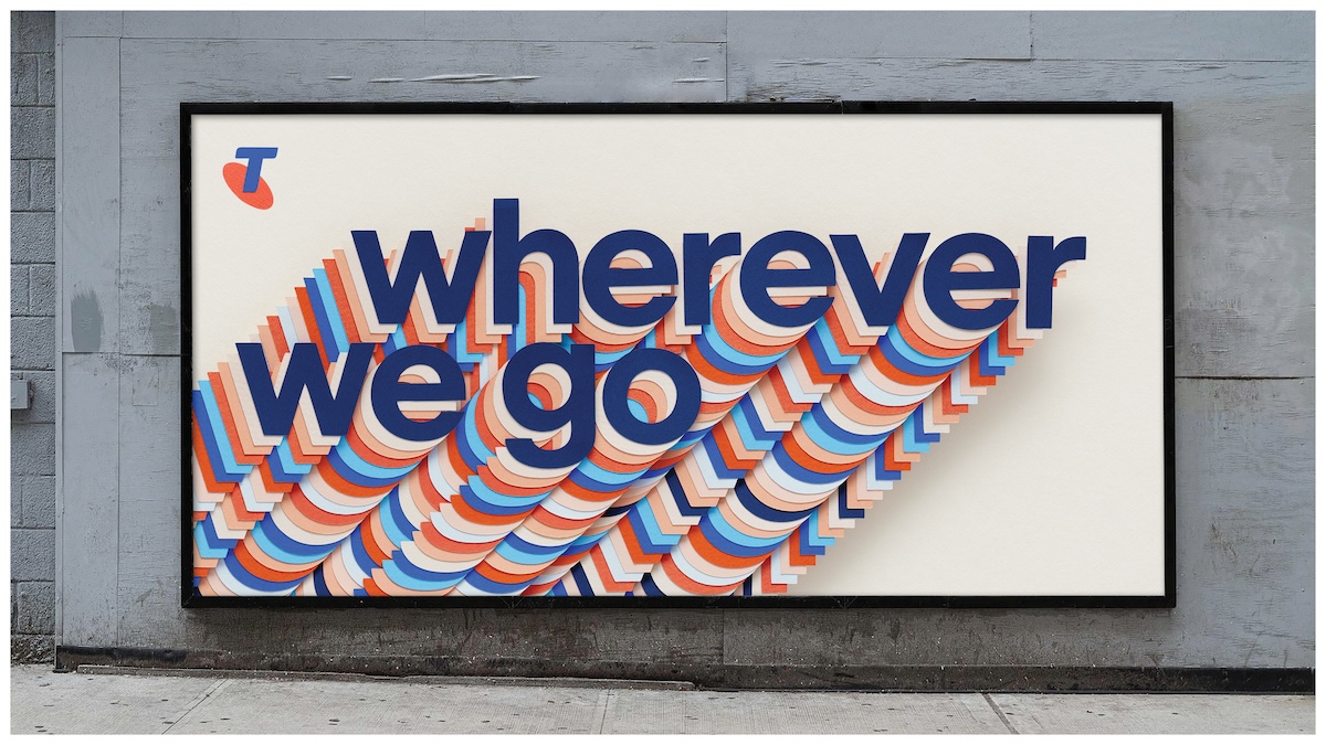
Creative agency: Bear Meets Eagle On Fire +61
Media agency: OMD
Client: Telstra
Chief Marketing Officer: Brent Smart
Head of Brand and Sponsorship: Alita Mcmenamin
Head of Creative Excellence: Anna Jackson
Senior Brand Manager: Jon Hollett
Brand Manager: Dene Mackenzie
Media & Marketing Operations Lead: Paula Marreiros
Senior Media Specialist: Robert Aoukar
FILM
Production Company: Riff Raff
Directors: Smith & Foulkes
EP/Producer: Tracey Cooper
PM: Theo Cassels
Character Designer: Chris Martin
Storyboards: Adam Beer
Post Production: Black Kite
Exec. Producer – Julie Evans
Senior Producer – Polly Durrance
Producer – Olivia Donovan
Colourist – George Kyriacou
2D Lead – Guillaume Weiss
Flame – James Belch
Nuke – Itay Greenberg
Nuke – Matt Hutchins
Nuke – Sarah Breakwell
Concept / DMP – Jimmy Kiddell
Concept / DMP – Carlos Nieto
Lead Animator – Conor Ryan
Lead Animator – James Brown
Animator – Loay Shaban
CG Rigger – Martin Villert, Chris Gill
CG Lead – Oleg Troy
CG – Daniel Moore, Kornel Makarowicz, Andrew Bartholomew, James Hansell, Jim Cullen, Aurelien Lemonnier, David Loh, Luis Yrisarry Labadía, Mark Ardisson, Sophie Langton, Alfie Gunter, Ethan Francis, Gabriela Di Vincenzo, Joel Paulin
Additional Post Production: ALT VFX
Music Supervision: Trailer Media
Music Production company: Manderley Music
Music arranger: Ben Cocks
Music producer: Sean Craigie-Atherton
Main Whistler: Andy McKeane
Harmony Whistler: Vanessa Forero
Additional whistling: Ben Cocks
Sound House: Rumble Studios
Lead Sound Designer: Tone Aston
Sound Designers: Daniel William / Renee Park
Sound EP: Michael Gie
OOH
Photography: Studio Kleiner
Photographer assistant: Robin Berglund
Production: MINK MGMT.
Illustrator: Ben Hasler
Paper artist: Kyle Bean
Paper assistant: Andrea Portoles
Agent: Atrbute

155 Comments
…so what was the deal with the fluffy animals then? Completely different brand.
Nice one Micah and the team from BMEOF!
This work just makes me so happy. It’s joyful. It gives me hope. It treat’s the audience like they have a brain and doesn’t need the logo in the first 3 seconds. Classy stuff.
Most people would say the art of advertising is dead, gone and over.
This partnership between BMEOF and Telstra is really proving that doesn’t have to be the case.
The recent campaigns have been so beautifully crafted, with such simplicity, all I have is jealousy.
Well done to all involved in this work (and the other recent Telstra campaigns).
This is a fantastic lesson to our industry that great work still greatly matters.
Beautifully done.I hope it works.
This is completely disconnected from existing memory structures, positioning, brand assets (not even the mnemonic was used). Telstra and agency have just single handedly destroyed hundreds of millions of dollars, all to win an award in the south of France for best use of CGI.
What’s wrong with new Memory structures? Surely you don’t think rinse and repeat is actually effective forever?
This, it’s a disconnected mess
Hahaha! It’s an ad. Not lord of the rings. No punter is gonna be down in the dumps cause they didn’t do a sequel. Speaking of memory structures, keep in mind we make ads. First and foremost, our job is to stand out from the utter nonsense. These do the job. So go take your ‘wisdom’ to another page please.
Very Coke…..
https://mobile.riffrafffilms.tv/uk/smith-and-foulkes#reborn-report
I love the animation style. His walk is so cool!
Im not sure im clear on the message. Together goes a long way? But then ‘wherever we go’? What are we saying here?
Wherever we go = Telstra is there wherever you are or need to be. Finally an ad that doesn’t sound like a brief.
Yep — I just don’t get the line? It’s visually stunning, joyful, and a beautiful piece of film. I can see a ton of elements that can evolve here but I’m just lost on the line: who is ‘we’? Telstra? Me?
Just feels a little disconnected.
So we just go and copy a bunch of ideas that have already been made? Sure
You’re so right, how will anyone in Australia know who Telstra is without memory structures!? Without these precious assets the everyday person just ceases to forget the most well known telco in the country.
When will the CB comments learn?
Love love love everything about the craft.
Messaging/brand direction however???
This is beautiful work, and hats off for being able to sell in producing a high-end animated short to client. As a film-maker, I am always super-envious when I see clients open the purse-strings and give creatives and film-makers full reign to make awesome shit for their reel.
I also think the line ‘Wherever we go’ is really nice, and does speak to Telstra’s wide coverage and broad offering…
But I hate to ask, is this same line obvious enough? Is the average punter on the street going to get it as a service proposition? I sadly doubt it.
Also, one slightly creepy interpretation of the OOH executions is that Telstra now hovers omnipresent at your shoulder and moves in total lock-step with you, limbs all tangled to the point you cannot ever hope to extricate oneself from their hold?
And while I LOVE the animation and the music… does it feel like it’s set in Australia? No. Not in the slightest.
Final observation… it does feel very soon to be coming out with a whole new brand platform since the 26-spot stop-animation animals and ‘Better on a Better Network’ campaign… and then the Telstra ‘Four Bars’ campaign less than a month later.
The brand just feels all over the place at the moment. Honestly, what message/platform are we meant to pay attention to? Make up your mind, Telstra.
I said what I said
Beautifully crafted. I can see advertising creatives high-fiving, but I’m not sure the message is following us wherever we go… Customers might need a GPS to navigate this one!
This is a classic case of the new brand manager (or CMO on the speaker circuit) creating a dogs breakfast of a brand. This latest “cool” ad has thrown everything the brand was built upon away. Strategy = fail, Idea = fail, Execution = tick… but this is now a brand all over the place and the telstra marketing fixation on creating cool ads, not strong brands is the big fail here. They only relaunched with “Australia is Why” recently, case in point.
Spot on. Australia is why followed by that security helicopter chase then claymation animals now some cool piece of film that could have a hundred different logos added at the end. All in about 2 years. New marketing team looking to win an award and more money down the toilet with zero measurable ROI. And the top brass will back it as some sort of quantum shift in the cultural DNA of the company … 5 mins after sacking 2800 people on the grounds of cost cutting LOL
I’m missing the Australia in it.
Imagine if they were swimming in the barrier reef?
Or Uluru was in the back?
Or a typical Aussie suburb?
And the v/o – why British? Imagine Felix Cameron from Boys Swallows Universe as the v/o. Iconically Aussie and next gen of Aussie’s doing amazing things.
This work feels joyously liberated from the over-strategising that seems to be standard practice in big agencies these days.
A large brand that doesn’t invest in building and maintaining consistent memory structures will find its competitors gaining on it – quickly.
Every brand needs them. You don’t get to a certain point and no longer need them.
Otherwise you’re turning up as a different brand with each new campaign (Telstra in 2024) and starting anew. And average joe who is likely to give you <2 seconds of their time, doesn't give a toss if you're #1 in market if they can't instantly recognise it's an ad from the #1 in market.
When you have zero strategists, an unlimited production budget and total trust.
It’s just a lanky guy loping through different magical worlds with his little companion, bringing to life the promise that Telstra works in more places. Tied up with a line that says exactly that. I feel like that’s a pretty easy get.
The spots are charming, and they connect really well to the OOH through character, rather than recreating the whole world. For the record, Coke didn’t invent long, tangly arms and legs either.
It’ll stand out because it’s simple. And for everyone who’s super mad because they’re not leveraging existing assets or memory structures or whatever, maybe calm your little farm. It all feels like a compatible tonal universe, with a common thread of everywhere/everything, and I really feel like consumers will be ok.
Maybe go for a walk or something.
… whether the business draws these new threads together into something truly coherent. It will definitely take time.
Very hard these days (or ever really) to really own an illustration style as a distinctive brand asset.
Loved the spirit of this.
Rarely do I feel connected to an Aussie brand these days, when all they do is hold a mirror up to society in their ads, which all look the same.
This made me feel something.
I can see the reef, the aussie terrace, the outback, just not in a cheesy cliched way. And it’s all the stronger for it.
Beautiful work
that they don’t need to be consistent. All of this great work is simply based around connectivity and it’s great! Well done, I love everything about this new direction
It doesn’t feel like Australia because it wasn’t made by Australians.
What a shame for one of our most iconic brands to be shipped overseas.
It’s bloody beautiful I’m not denying that, but I’m sure some Aussies could have made it just as beautiful.
But not even using an original Aussie track!? Shame on you.
such a strange comment. are you saying Australian agencies/brands should never be allowed to work with overseas directors, production co,’s, animators, illustrators, musicians, artists???
My unbiased opinion is that these are brilliant
means it’s good and you lot are jelly
why are aussies obsessed with things ONLY being worked on by aussies?
such a narrow minded view
“But not even using an original Aussie track!? Shame on you.”
@Aussie Aussie, You are everything that is wrong about Australian advertising.
Why does it have to be an Aussie track?
The fluffy animals made sense, were cleverly connected to network performance and were beautifully shot. This is the complete opposite.
It seems like there are a lot of completely different campaigns – in style, tone, visuals, messaging – being thrown at the wall now by Telstra in the hope that something sticks.
It’s a weird approach TBH.
Thing is it’s different. And that’s a big deal in Australia when you have most brands desperately trying not to be noticed.
Nice feeling, probably increases brand predisposition. Maybe it needs ‘wherever we go’ at the end to sell the message on this execution to Joe Punter but I do feel that ‘Together’ would be the better line for the brand platform
Totally different feel to the retail spots which won’t be a surprise to them and maybe it doesn’t matter? but that’s for the branding experts
This looks like it was made by ad people in poncy gentrified areas and won’t resonate with broader Australia.
Let’s see.
It also feels very one off, I’m not sure how this will help build the brand long-term.
Love the OOH work. Love the whistling. The rest is nice.
Doesn’t get any more Aussie than a song by the Bee Gees, mate.
Oh wait, they were from Manchester.
The OOH feels little borrowed?? https://www.behance.net/gallery/36649759/Steppenwolf-Poster
Great posters.
Comments referring to “not made in Australia”, missing reef scene, etc needs to check themselves. Perhaps go and work abroad and see how international talent is handpicked daily on all brand campaigns. Get out of your bubbles and get a grip.
Poncy gentrified areas is the target audience, not rural bogans like you who can’t afford the plans.
Is this a metaphor for an agency with a bird in its name walking through a self-absorbed ad world with the client when they both move on after destroying a brand.
So what you’re saying is that every ad has to hit the consumer over the head on why they are using it. As someone said earlier this work gives the consumer some credit for getting it. It doesn’t like sooooooooooooo many ads we’ve seen in the last month talk down to the consumer and make everything obvious. This work ties in nicely from a tonal aspect as the previous ‘Gram’ typographic work. Keep at it BMEOF. Light the f*&king way.
It’s a beautiful piece of animation. What’s it for, again?
Everyone wetting their pants about distinctive memory structures please get out of the creative department and back to the laboratory. Telstra have no competition. Optus? Ha. Vodafail? And they’re the only telco that work in the bush. May as well make some nice work. This is lovely, and a very easy get.
Stop it, or you’ll go blind!!!
Nice to have a cashed up CMO that allows you to create stuff with out a big idea or deep strategic thinking but just looks good.
Question: Can you craft your way into an idea?
Spot on.
Bring back The Monkeys.
I like it.
Who hurt you, honey?
Are we cool again?
I’m always intrigued by people saying that our advertising must feature Aussie VOs, Aussie music, Aussie backdrops… When you log on to Netflix do you only watch stuff that’s set in Australia?
It’s engaging.
It’s different from all the sameness.
It says Telstra is there wherever you go. Reliable. Coverage.
It will make people feel something.
It’s memorable.
It hopefully energises other brands, marketers, agencies, and so on.
Delightful.
Thanks to the real paper craft used in the statics, I’m pretty sure these are real shadows.
Firstly, the craft is exceptional. Kudos to all involved.
It’s gorgeous art… but is it actually advertising anything?
This film is looking to enter the same territory that Honda’s classic ‘Hate Something, Change Something’ did, right down to the whistling.
When you compare the two, it’s startling how much Honda’s ad packs into a short period of time. A clear message, strong tone-of-voice, and done so in a lush and vibrant way that links extremely well to its position.
Telstra’s ad, on the other hand… apart from the attempt at the very end, it has no message, tone or position.
There’s very little to build upon. For a long-term goal like changing brand perception, it can only happen if you stick to it.
Will we see these two characters again? Probably not, judging by the fate of those talking animals.
Will “Wherever we go” last as long for Telstra as “The Power of Dreams” has for Honda? I wouldn’t bet on it.
It’s a real shame, as the opportunity was there.
But, whenever we mistake our industry’s raison d’etre for “creativity” as opposed to something closer to “salesmanship in print”, we will continue to waste precious time, energy, money, and talent, on ultimately fruitless endeavours.
Still, it’s gorgeous art. Can’t deny that.
I like it and am commenting on the internet about it
Following your bulletproof logic, why advertise at all then?
Tell me you’ve never worked on an effective brand without telling me you haven’t…
Shareholders, stakeholders, many reasons.
Tell me you’ve not quite worked it out without telling me you haven’t…
I don’t really feel one way or the other about this work. It feels a bit 2006 to me, but like the better work from that era. Kind of makes sense as that was when Brent was in agencies.
I don’t really understand why anyone is grieving the loss of ‘Australia Is Why’. Memory structures, etc. I get it. But that line was never connected to any single piece of standout work. Monkeys did a few nice pieces but nothing memorable against the brand line.
Undeniably a lovely and well-crafted spot by a bunch of super-talented people. I do agree that the brand platform is already starting to feel disjointed. The “Memory structures” was a great foundation to underpin everything but this is a departure from that. Hats off though, I’m sure everyone would be happy having work like this on their reel.
This is a brand film.
Not an ad for diesel engine product.
Those two things are different.
Can’t deny that.
It’s not a brand ad…it’s a creative circle jerk for a client with a huge budget.
Honda Grrr without the grrr.
Every ad they make looks totally different from the previous. No consistency.
Creativity is a mistake? I really wouldn’t like to work where you work
This makes me feel something about the brand.
Something that hasn’t happened in a long time.
More emotive brand advertising please, brands.
To @alaska:
I’d be very worried if anyone was denying that! Still, the similarities are too strong to ignore.
(Fun fact: both ‘Grrr’ and this Telstra ad are animated by the same animators: Smith and Foulkes. I didn’t know that before researching this, but I would be very surprised if that fact was overlooked during the creation process.)
And to @Alaska:
No, creativity is not a mistake! Creativity is fantastic… but, it is not the reason why the advertising industry exists.
Advertising exists to act as the conduit between the product (or brand) and the people. In a sense, it’s finding the best way to communicate something worth talking about, to an audience whose behaviour you’d like to influence. “Salesmanship in print” is an eloquent way to put that.
All the greats of advertising did this; even those not considered as sales-focused as, say, Rosser Reeves or David Ogilvy. (What do you think Bill Bernbach, the master of creativity, was doing with Ohrbach’s, Volkswagen, Levy’s Jewish Rye, Jamaica Tourism et al.?)
Collectively, we seem to have forgotten this part of our history.
It’s a real shame.
I do hope it shifts back sometime soon… sometime when our award-winning ads aren’t just made to be dissected and analysed and critiqued, by industry insiders in a cramped room somewhere in the French Riviera.
At this rate, that may take a while…
All the marketing experts on here offering free advice yet they can’t distinguish between the ‘talking animals’ being a network campaign and this, very clearly, being a brand repositioning campaign. Ah well, keep displaying your naivety for the rest of us to enjoy.
because it’s not important at all for a brand to be consistent across it’s different messaging.
Lovely looking. Award winning craft. Could be for any brand. Not sure what its about.
Beautifully done but maybe the whistling will get a bit unnerving after the ads are endlessly repeated. Perhaps some twinkle chimes using the same tune might be more appealing. Cheers.
All these agency larks must be very quiet at the office to be getting this flappy about what is obviously a brilliant piece of work. Go back to your pitch decks, guys.
Tough brief in many ways. I’d imagine it’s hard to do a good piece of work that literally connects with everyone in the country. This is beautifully produced and a bold effort. I’m just not sure it ultimately emotionally connects people to the brand in any deep or sustainable way. I contrast it with Telstra’s recent footy work. Sure, it was a different brief. However, that work felt far more real, and I bet that way more people connected with it and with Telstra than will connect to this work.
Yeah, this ad stinks!
But they could’ve gone even further.
This still feels familiar, believe it or not.
I bloody love this. Whether it’s your exact vibe or not, it’s the kind of thing every creative wishes they could make.
Not really sure where to start with this one. The brand ethos is lost in a sea of quirky illustrations that don’t reflect the heart of an iconic Australian brand. I thought with the return to the nostalgic blue and orange Telstra colours we would see more of a reflection of values and trust in the brand, not this confusing message of “Wherever we go” which reflects more of an idea of being lost or not caring even especially paired with the illustration.
Overall, I think the new brand message isn’t doing Telstra any favours in building confidence back into the brand and then the illustration style amplifies that.
Yeah but Footy Country is inconsistent with all their other previous campaigns, like the Christmas reindeer one, the security team protecting the family in their car, the kid left behind at his footy game and so on.
They were all live action though, so there is that.
I believe going by all the trivial negative comments here this industry is really losing its mojo.
This is very good work and it will stand out.
Surely we can use local Aussie animators and artists rather than rely on the british? Yet again BMEOF fail to see the talent in our country?
Seems all the local talent is too busy bitching on here!
Christ I wish I did this.
No doubt the brand lacks consistency. And this campaign certainly adds to that melange.
To me, the footy stuff just emotionally connected with a far wider cross-section of the community – Telstra’s target audience – than this beautiful and whimsical work ever will.
Sure, it was a way different era, but the ‘Way We Were’ ad, the ‘Still Call Australia Home’ ad were bold enough and brilliant enough to find that emotional thread that connected people to a brand. Those ads didn’t need to hide behind craft.
It’s a miss for me. But I am sure there is a ton of research that says I am wrong.
You’re so smart.
And this is very, very good work.
…but I didn’t even realise it was Islands in the Stream being whistled.
Not that it probably matters as I don’t get the relevance of the song anyway.
I don’t get the relevance of your comment
with some fluffy animals making me laugh…
@Where are the memory structures?:
They are different objectives, correct.
Yes, it’s clear to someone with a trained eye who’s involved or otherwise interested in advertising.
Do you think an everyday person will be so discerning?
Will an everyday person see this film, then actually remember it, then remember it’s from Telstra, and then recognise its objective as a brand repositioning film? Especially when compared to the “better network” ad they may or may not have seen?
Almost certainly not.
The industry already has plenty of issues with establishing ad recall and brand fluency.
As an example: George Lois did a great ad for American Tourister involving a gorilla. Which company’s sales increased after that campaign? Samsonite, the market leader.
For your point to stand, one would have to assume that an everyday person, with so many more important things going on in their life, will take their precious time to divert their attention, then watch it to the end, then search for both campaigns, then carefully analyse the two ads in the way we’ve all done here, and then rationalise the differences between the two campaigns.
…
That’s a little naïve, don’t you think?
To all the negative commentators. There is so much advertising created in Aussie by you guys why is it so bad.
At least this work is breath of fresh air.
It’s strange, these ads have a distance to them, I find them vaguely alienating and disconcerting. I think it might be because they are so self consciously made of past ‘good’ advertising that they barely exist in their own right. I’m not normal though, I’ve spent far too long absorbing dubious cultural analysis, but I think ‘normal’ people will feel it too.
Or to be precise, not feel it.
When a bear meets an eagle on fire this is the result.
But is the eagle on fire, or was the bear on fire when he met the eagle?
I wish they made this in Australia and supported local industry.
I’ve worked on this client’s marketing and advertising across multiple agencies and eras.
They’ve sucked the life out of entire agencies before.
With the perspective of distance and time, you recognise the revolving door of people and messaging and hope.
Every so often, there’s a renaissance of sorts – where they’ll swing for the fences – in the vain hope that advertising can make people love a nasty, self-serving behemoth.
Truth is, Telstra genuinely had a chance to win. Our digital lifestyles gave Telstra the opportunity to own connection, communication and entertainment. They could have been seen as the supplier and enabler of life as we now live it.
Instead…another tagline to further fracture the ‘who/what/why’ of the brand and the offer.
This is just a cute, well meaning bit of fluff. Seriously…”Wherever we go”?
Wherever they go, they can’t outrun who they are.
Fix the product. Be accountable and transparent. Be honest. Don’t overcharge. And for the love of God, overhaul your IT systems and databases to make it all seamless, simple and fast. Staff should not have to access 3 separate databases to sign you up.
This is just tinkering at the edges. Again.
one-hundred-and-EIGHTYYYYYYYY?
Is this the latest piece of jargon to come out of strat or am I missing something?
Sweet campaign by the way.
I’m sure it’ll penetrate many a memory structure.
Brands love penetrating memory structures.
If you don’t know the difference then you shouldn’t have the job that you do. Not very Smart.
So interesting… this is really nice work and the incorporation of revised visual identity is pretty effective I reckon. Problem is it reads like a campaign, if this is in fact a platform idea then it will be interesting to see where it goes, the sophmore album. Tbh it doesn’t scream POTENTIAL but prepared to be surprised.
Interesting that the idea has precisely ZERO presence on telstra.com – almost as if capital B Brand struggled to gain the right level of internal support that would ensure the idea is activated/championed from the inside out (soz it’s not on our digital roadmap guyzzzzzzzzzzz) ….?
FFS, if you can’t see ‘wherever we go’ extending beyond this very pretty, but ultimately meatless execution, then I think you should consider a career in a different industry.
One cannot simply hurl a smattering of campaigns into the ether and call it a platform David.
Shhhhh dont mention the fluffy animals??? WT?
Nope, it isn’t a new bit of jargon. It’s been the basis of all good marketing since time began.
You do interesting, distinctive things over time – consistently. Those things turn into memories, which in turn make your brand more likely to be purchased. You then carefully reinforce those memories over time to remain salient.
Happy to answer any further questions.
That’s common sense.
But I’ve been doing this over 20 years in a few countries and this is the first I’ve heard it referred to as such.
Seems like a wanky way of saying to make something memorable personally.
Who had “hating the words ‘memory structures’ “ on their bingo card at the start of this week?
Tbh it is quite wanky, you’re right. But then what isn’t in this game?
They really went with the ‘corporate pitch deck’ art style of the Google era for the new brand spot huh?
I get the impression that the biggest marketing budget in Australia has been funneled into one agency, because it’s one big budget ad after another with no tie, no clear strategy
It would have been an excellent ad for Twitter.
… you can do stuff like this.
So kudos for doing stuff like this.
You all can rant as much as you like.
But it’s bravery (yes, that terrible word) applied to a situation where bravery is needed, and isn’t terribly risky at all.
It’s smart as Smart and Jackson are.
It’s nice distinctive art, and the positioning (reliable network and coverage) is pretty standard telco fare. I’d be worried that the T.com website has none of this branding – if T wants it to stick it had better permeate all of its visuals rapidly and be around for a while.
I’ll tell you later…
…just without a big idea.
FAIL.
“Wherever you go” is a bit 2000.
T-Mobile used this line, Mazda did, Visa did, and Garmin did.
It’s not really saying anything other than the expected or the obvious.
I don’t see how this will have longevity.
Well I guess we’re only three more Telstra brand platforms away from Christmas now
… we use fluffy animals… (poorly branded)
And It’s Footy Country…
And now Wherever We Go.
But the APP has a picture of 3 kids in the surf.
The homepage has a picture of an Iphone 16.
And the instore has branding from 3 campaigns ago when the brand was actually showing up with consistency.
#schitzophrenic
#clueless
#memorystructures
It’s “wherever WE go”
This is what happens when clients get off on wanting to work with global directors. Sad.
I’m so glad someone else (or the same person) has added another ‘memory structures’ comment. Keep em coming guys, this is great gear
Look, can we all just get back to talking about mammary structures?
Brent recently said ““We want to find all different ways of expressing the brand. Now some brand experts will say that lacks consistency. But I think they look at consistency in a very narrow way, which is: everything has to look the same. I think we want everything to feel the same versus look the same.”
Whether you agree or not it doesn’t matter. He’s trying something different and soon we will see if this approach works vs the alternative.
Exciting times indeed.
We all done? Let’s hope the good people at BMEOF take our feedback on board (memory structures included) and endeavour to do better next time to uphold the long tradition of great Telstra advertising of the past, not to mention the world class work we see on this blog week after week.
I just wanted to have the last comment on this thread but for the record I think this is sick
It’s beautiful, congrats!
Sounds creepy and stalkerish.
Bit like Succession’s ‘We Here For You’?
If you strip the budget away, there’s not much there.
If that budget wasn’t there you wouldn’t be so bitter
Not only was it stylistically out of date, but messaging such a vague, roundabout way to say they have better coverage (didn’t they just say the exact same thing with the last rebrand with the animals?)
I get the strategy of toghertness…its a fantastic insight..
Bur what new idea is there in execution.. its almost like the brand has devolved to thinking stop motion and animation is good enough that nobody will care about what it actually means to customers.. the brand clearly more worried ahout themselves tbh.
Surely we expect more.. the afl platform shows you want ir could be..
The problem with the afl platform, (not the ad, the only decent thing Accenture Song ever made for this client), is that it does absolutely nothing for Telstra. It says we support the footy, but is utterly meaningless in a wider brand context.
I absolutely adore it! Congratulations Telstra…this will become the new “Louey the Fly”!
I’ve no connection to advertising or marketing ….but I’ve felt compelled to find somewhere to comment on this gem !
This made me proud that Telstra was an Aussie company, it moved me, it was subtle in its messaging of Telstra’s reach and dependability , and I think its warmth will influence the thinking of a whole new generation. Love it!
Done with more emotion, 13 years ago. https://www.youtube.com/watch?v=r8ZC9uDg8Ik
Telstra’s brand is in a right pickle. With creatives going unchecked producing work that only appeals to their own peers it’s become an industry ‘in-joke’.
I don’t doubt the talent, creativity or imagination put into the work, but they’ve lost sight of what they are supposed to be. This is what will resonate with consumers the most. A brand adrift at sea, restlessly trying anything and everything to try and salvage some form of identity in the blind hope of a connection with the Australian consumer.
Unless of course, all the consumers for Telsta are going to come from within cult-like closed doors of the Australian creative industry.
The only clear message from Telstra at the moment is, “Look how much money we can spend and do what the hell we like. You’ll end up going with us, because you don’t have much else of a choice.”
I don’t like the new ad. It is just ridiculous. The previous promotion with the animals was much better.
The marketing team need to come up with something that would make people switch to Telstra from their current provider. At the end of of the the aim is to attract new customers.
I dont get it. You managed to get cool with the previous animal ads that was simple, well executed and cut through. A hard thing to do with a brand people love to hate. Now you’ve outputted this animation that has thrown out all you’ve gained. The creatives who say the audience can relate to it have the hand up their you know what.
I love it
It reminds me of my grandson
Joyful optimistic floppy hair loose limbed
arms swinging music in his heart
Life’s good with your Mate
Seeing all these new things
Sometimes that’s all you need ?
Completely wasted the previous campaign, which had real cut-through and was widely liked. Telstra clearly has no ad strategy whatsoever.
I really don’t see the connection of the advert message to Telstra. It has me confused. The animated character is humanly unrealistic making it unrelatable.
Seems to portray someone with a carefree approach having no care in the world , whistling and flapping his arms around aimlessly.
Sorry. Doesn’t inspire me to buy Telstra.
Do the Bee Gees get a mention anywhere for writing that beautiful song in Telstra ad, Islands in the Stream
Abosolute crap
This is singly the most annoying and painful ad currently on TV – stupid cartoon, horrible whistling- has definitely ruined a mediocre song- it goes on and on – take it off- telly is horrible enough without this abuse to our eyes and ears- if it never plays again it’ll be too soon- and I’m a customer- barf!
So disconnected for an ad about being connected everywhere lol.
It makes no sense what is being sold – even if it is the brand.
It would make more sense if the character was walking through Australian landmarks / sites….
Silly add and annoying
Absolutely Fabulous so Good Cannot help watching it