Sydney Swans launches new brand identity via SDWM

One of Australia’s most iconic sporting clubs, the Sydney Swans, has redesigned its brand via independent creative and design agency, SDWM.
The new Sydney Swans identity reflects the relentless Bloods spirit forged through the club’s rich history, whilst setting a new benchmark for football in this country.
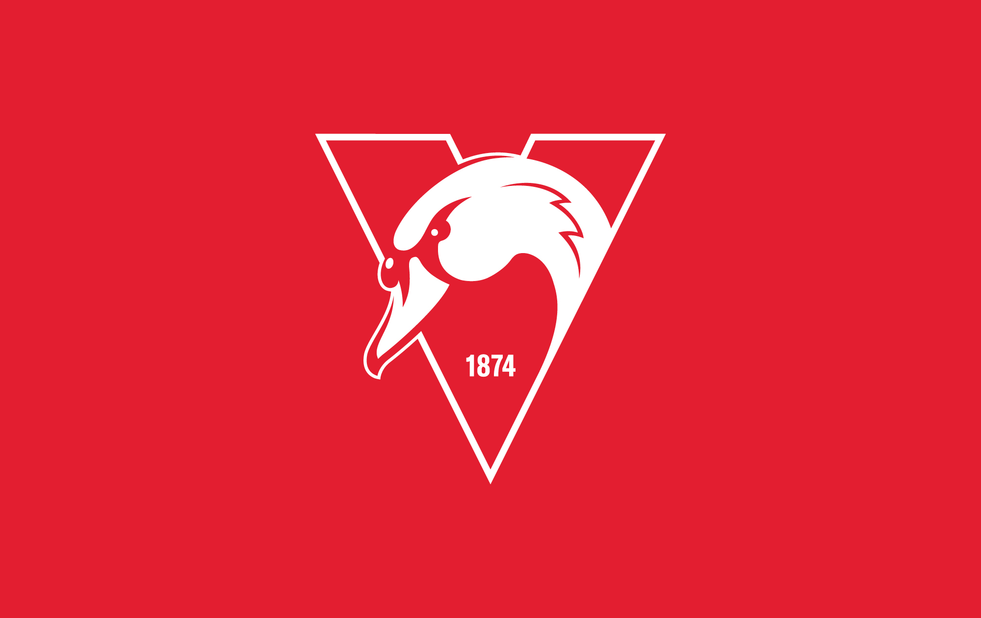
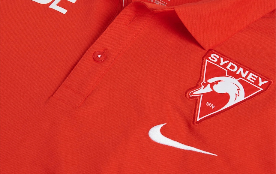
Just like the club, the new swan is fierce in its focus and is illustrated with a sense of movement, prominence and grit – a reflection of the city of Sydney. The new logo introduces the club’s inception date, 1874, and proudly sits within the traditional V acknowledging the club’s origin in South Melbourne.

Central to the rebrand is the club’s home – Sydney – which has been called out bigger and bolder. By creating something that truly represents the city, the new logo aims to galvanise fans behind the club they are proud of.
Says Tom Harley, CEO, Sydney Swans: “We’re excited to embark on the next chapter of our club’s history and believe the new brand identity strikes a balance between honouring the past and looking ahead to the future.

“Through conversations with players past and present, staff, our members and our partners, we explored what it really means to be a part of the Sydney Swans, and the team at SDWM has done a terrific job in interpreting that vision.”
Says Jake Turnbull, design director, SDWM: “It was important for us to express the Bloods spirit in a really genuine way. We wanted to ensure the brand was designed with a sense of purpose, urgency and a bit of mongrel.

“It’s a proud moment to have had a hand in bringing to life the spirit of the club through this new brand and identity. Credit to Tom Harley and the entire Sydney Swans leadership group for having the clarity and conviction to take the club into the future.”
Client – Sydney Swans
Chief Executive Officer – Tom Harley
Executive General Manager, Marketing and Communications – Loretta Johns
Manager, Marketing – Billy McLean
Creative Agency – SDWM

17 Comments
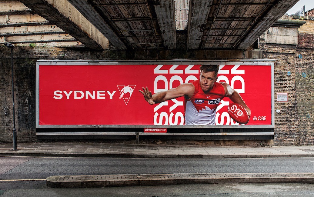
Feels very derivative. Especially the billboard implementation. When are we going to stop seeing WORD WORD WORD behind cutouts of people?
I like it. That swan’s got attitude.
‘…Setting a new benchmark for football in this country” – get your hand off it
… which isn’t a bad thing at all.
Me likey.
Lovely work guys. Should work well particularly at small scale. @Designer derivative of what? Graphic design principles?
The logo undoubtedly needed an update, but diminishing the significance of the Opera House leaves this looking like any old duck from V ictoria.
Nice and clean. I like the V. Is the feather on the neck a subtle reference to the Opera house?
Well done guys, it’s a really nice piece of work in what was no doubt a very challenging stakeholder environment.
Word, word, word – esp vertically spliced and tapering off – is a bit of a design trend of the last 12 months
This is a solid job, if not a little safe
Is clearly in the UK
Looks like Macdonaldtown to me?
Great job for the Sydney Ducks.
As a Swans fan, I love this.
Very trendy, let’s watch as it dates in a few years and they rebrand again…
Also, the type is lacking a bit of power. The typeface is not doing any favours.
Word is that the Opera House have been trying to get money from any sporting clubs that use their silhouette (see also Sydney FC, the Roosters)… I imagine part of the criteria for the rebrand was to remove it from the logo, even if it was iconic.
… and they’ve moved the Opera House to the feathers… see?
Kinda clever
Nice work Jake and Co. A strong, bold brand for the GREATEST SPORTING TEAM ON THE ENTIRE PLANET.