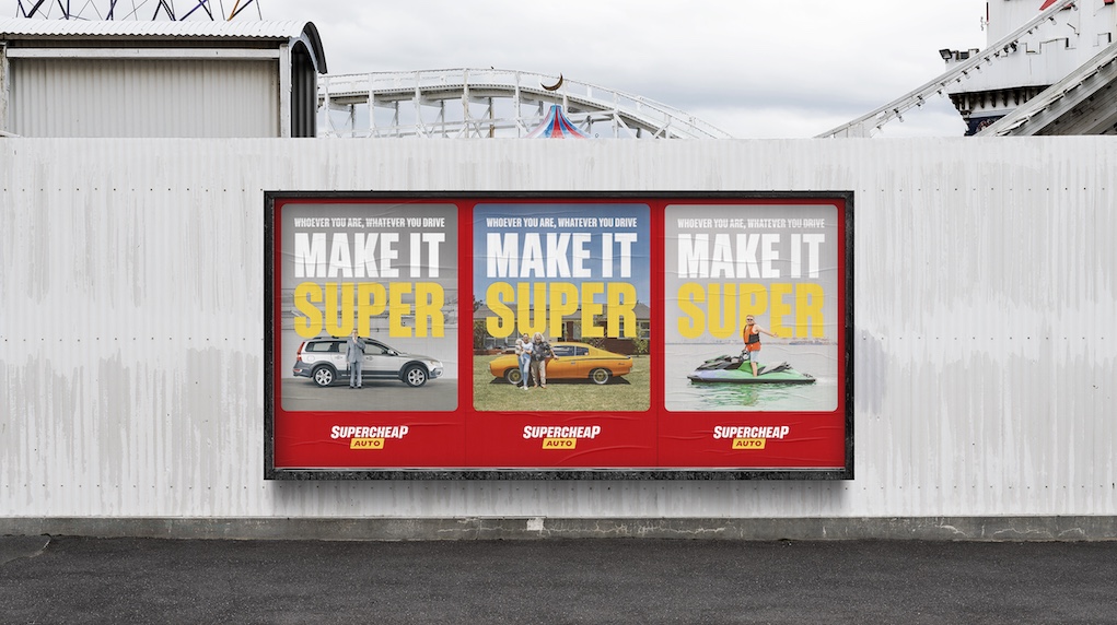
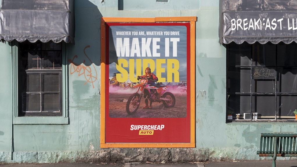
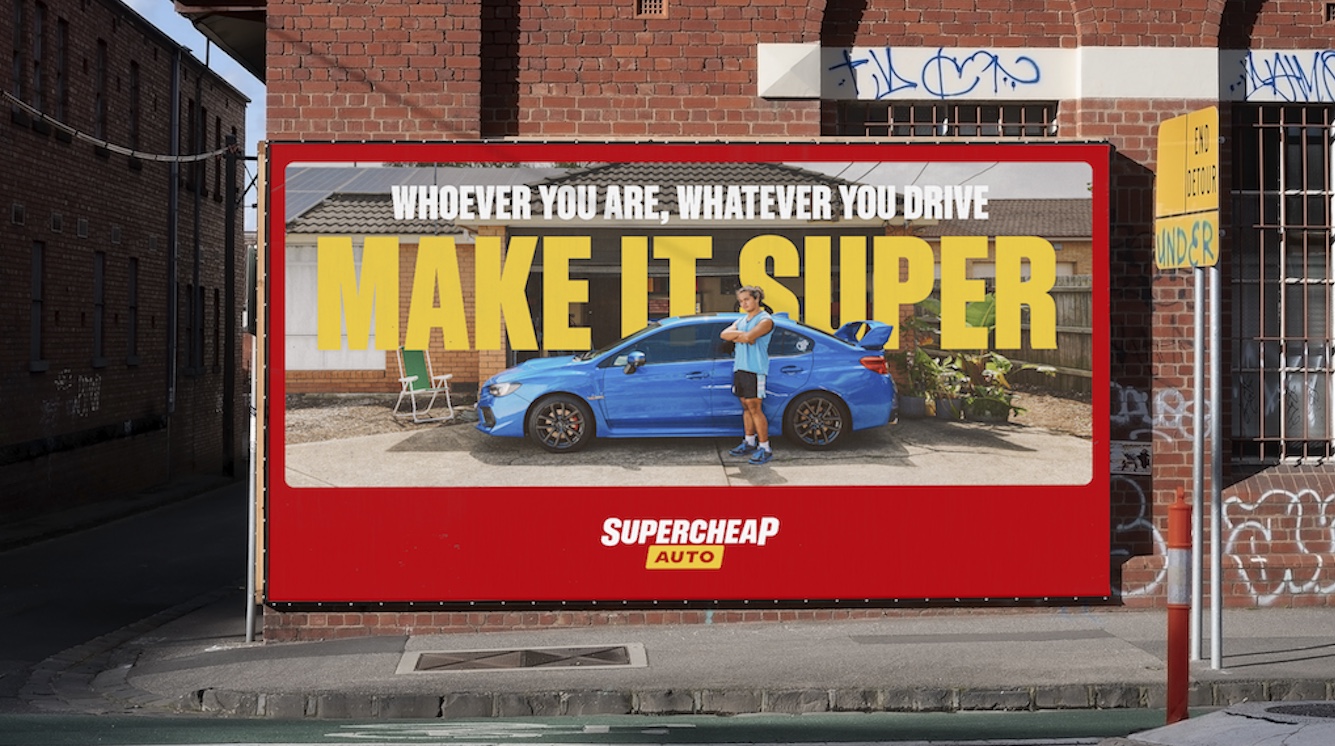
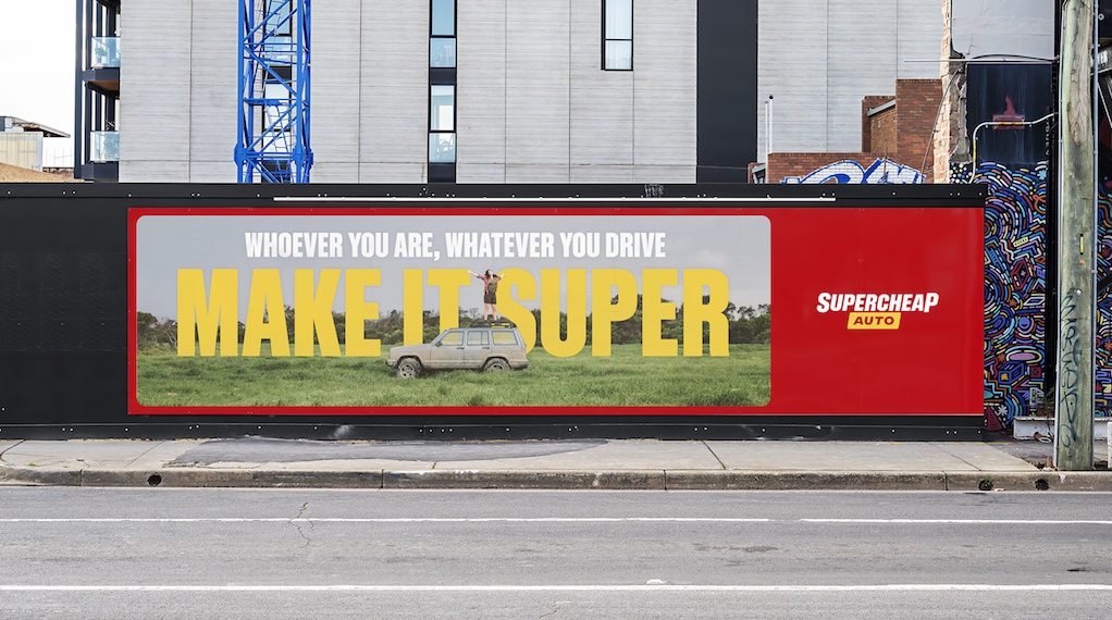
Supercheap Auto unveils ‘Make It Super’ platform and visual identity via The Monkeys and MAUD
What does Supercheap Auto stand for? Ask most people and they’ll say ‘everything auto and much, much more’ but, they’re much, much more than that. Yes, they’re cheap but there’s another word in their name that defines them more and that’s SUPER.
Created by The Monkeys, part of Accenture Interactive, the new brand platform showcases that whoever you are, and whatever you drive, Supercheap Auto can help you ‘Make it Super’.
The launch of the new brand platform also coincides with a reimagination of the brand’s visual identity from the store design to logo by The Monkeys’ partner agency, MAUD.
Says Benjamin Ward, managing director, Supercheap Auto: “For over 50 years, we’ve been making it super for our customers, our team and our fans and we look forward to taking our new platform to our customers.”
Says Connor Beaver, creative director, The Monkeys Melbourne: “We recognise that not everyone is a car lover, but everyone loves their car. We wanted to broaden the appeal of Supercheap Auto to the sort of people who have never stepped into an auto retailer in the past.”
Says Scott Zuliani, associate creative director, The Monkeys Melbourne: “Even I can make my Subaru VX Super.”
Says Richard Smalley, executive creative director, MAUD: “Working with a brand like Supercheap Auto is a huge responsibility. But, from communications through to in-store, their team have embraced our ideas on how ‘SUPER’ can be experienced fully by their customers in a way that is genuinely progressive for retail design.”
The hero film was directed by Sam Hibbard from Finch with photography by Chris Searl. The integrated campaign launched this week in Australia and New Zealand across TV, outdoor, radio, social, online and in-store.
Client: Supercheap Auto
Managing Director: Benjamin Ward
General Manager – eCommerce & Marketing: Andre Korte
Head of Marketing: Janet Newton
Brand Communications Manager: Emma Halasz
Content Manager: Reece Moger
Project Manager: Alex Barry
Creative Agency: The Monkeys, part of Accenture Interactive
Chief Executive Officer: Paul McMillan
Chief Creative Officer: Ant Keogh
Head of Planning: Michael Derepas
Chief Client Officer: Jaimee Kerr
Senior Planner: Dave Collins
Creative: Connor Beaver
Creative: Scott Zuliani
Senior Craft Designer: Raph Tamkalis
National Head of Production: Romanca Mundrea
Producer: Katherine Muir
Producer – Stills: Emma King
Content Director: James Wilkinson & Allan Carlow
Content Manager: Georgia Randall
Brand Agency: MAUD
Executive Creative Director: Richard Smalley
Design Director: Tomas Sabbatucci & Michiel Reuvecamp
Senior Designer: Gary Corr & Anthony Teoh
Business Director: Kate McIntosh & Fushia O’Hara
Production Company: Finch
Director: Sam Hibbard
M.D: Corey Esse
E.P: Loren Bradley
Producer: Cath Anderson
DOP: Sherwin Akbazadeh
Post Production: Atticus Studio
E.P: Amelia Bromley
Colourist: Alina Bermingham
Online: Drew Downes
Photographer: Chris Searl of Title Artist Management
Retoucher: Adam Hayes
Music: Level Two Music
Sound Design: Squeak E. Clean Studios
Sound Designer: Paul Le Couteur
E.P: Ceri Davies


19 Comments
Just awful. What is it with these hyper-Aussie, try-hard, bogan VO artists that seem to be the go-to? Super shit.
The only Aussies who try too hard are the ones who can’t admit that we’re all bogans, just some bogans are poorer than others. Especially the ones who live in a terrace house and can’t afford a 3-car garage.
He drinks a Whiskey drink, he drinks a Vodka drink
He drinks a Lager drink, he drinks a Cider drink
He sings the songs that remind him of the good times
He sings the songs that remind him of the best times
(Oh Danny Boy, Danny Boy, Danny Boy)
Is bloody good. Wouldn’t be half the ad without his timing and delivery. Love it!
https://www.youtube.com/watch?v=eU7V4GyEuXA
This is super. Perfect tone and idea for Supercheap. Well done all.
It’s not a good idea to stretch a 30sec gag into a 60sec.
Dig it.
Kevin section got me in the LOLz
Great example of how to do a ‘we’re for dogs’ style ad without doing that
Love it
Love it, super campaignable (see what I did there?)
First name super second name cheap That ad makes you feel super cheap and not in a good way
I liked it, wasn’t as cringe, out of touch or insulting as the other stuff these guys have done lately. Just a cute ad with a good prop and a double entendre that does it’s job. Strong. The kinetic type thing and androgynous speedway motorbike girl feels like it was bitten from flybuys tho.
I want to like it. It’s great for supercheap auto. But it just reminds me of this spot https://vimeo.com/587807556 which is executed so much better
Sorry it’s just been done so many times now.
But as someone here has already pointed out, it’s just the BrewDog ad
So, so, so, so good.
Not even trying to hide the fact it’s the Brewdog ad.