Stacks Law Firm bucks the trend of legal advertising in new campaign via Milk+Honey
After recently being appointed agency of record, Milk+Honey has launched its first brand campaign for Stacks Law Firm, Australia’s largest law group, with 22 offices across Australia.
In a striking break from traditional legal advertising, ‘The lawyers you know’ reflects the uniquely personal and reassuring style Stacks is known for, ever since E.R. Stack opened the first office back in 1931.
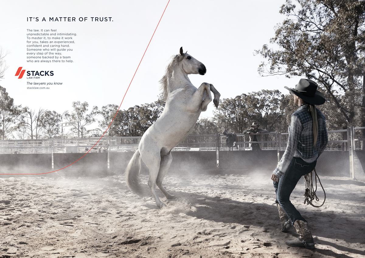
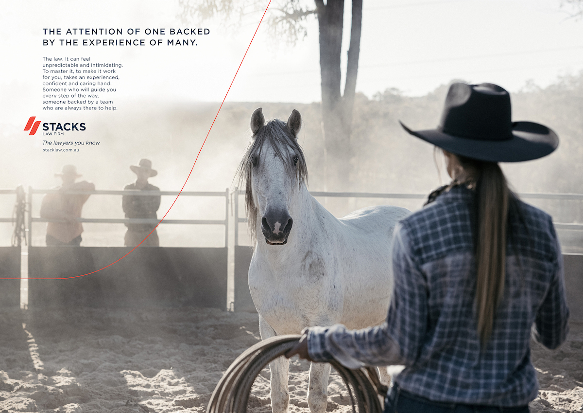
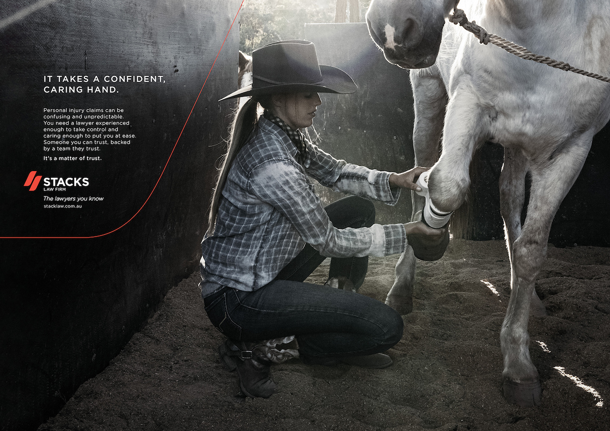
The new integrated campaign will run nationally across TV, online, social and press. Directed by Paul Middleditch and shot by DOP Daniel Ardilley, the filmic centrepiece uses the analogy of a wild brumby being tamed by a Jillaroo to convey how the emotional volatility of the law can be mastered with an experienced, confident and caring hand.
Says Ben Stack, chief executive officer, Stacks Law Firm: “Milk+Honey’s level of strategic thinking and creativity is second to none, and their collaborative style gave us confidence every step of the way. At Stacks, we have so many different audiences and different areas of practice that it’s really hard to find a new brand positioning that can work seamlessly right across the business. They absolutely nailed it.”
Says Andy DilLallo and Steve Jackson, founders, Milk+Honey: “The marketing of legal services has been a staid and predictable format for years: Insert lawyer in front of bookcase and flash phone number. We were excited to bring new and fresh thinking into the category to help position Stacks in their rightful place.
“From our very first encounter with Stacks, it was clear that they have never forgotten their country-town origins and country-town values, even though they’re a big success in the big smoke, so we felt it was important to really emphasise that.”
Says Hazelle Klønhammer, managing director, Milk+Honey: “Stacks has a unique heritage and culture. They genuinely treat clients as they would want to be treated if they were in their shoes. It feels good to help them land in a long-term space that is so true to who they are.”
Client: Stacks Law Group: Ben Stack and Liz O’Reilly
Agency: Milk+Honey United, Sydney
Production Company: Plaza Films
Director: Paul Middleditch
Producer: Peter Masterton
Production Manager: Nicole Richardson
DOP: Daniel Ardilley
Post Production: The Editors
EP: Nicoletta Rousianos
Editor: Laurence Van Camp
Colourist: Ben Eagleton
Online Op: Matt Edwards
Music & Sound: Massive Music
Executive Creative Director: Ramesh Sathiah
Composer: Lance Gurisik
Sound Design: Abigail Sie
Executive Producer: Katrina Aquilia
Photography: Louis & Co
Photographer: Ian Butterworth
Executive Producer: Louis Molines
Producer: Camilla Carey
Retouching: Cream Electric
Media Agency: Slingshot
Casting: Fountainhead Casting


42 Comments
People don’t watch ads all the way through.
This evokes a powerful feeling.
Have we moved from “make the logo bigger” to “make the logo the opening frame” now?
…Are killing it! Very nice..
Love this, especially for the category
…you’re saying these lawyers are cowboys?
That’s a lot of effort some ambulance chasers. What a load of horse…you know.
You already said that in your press release
Love this work.
you’re on the wrong blog mate.
Lovely shots and grade.
I don’t know
Thank YouTube
It’s a lovely analogy. And it’s very well shot. Nice work all.
Well done. Great work. Great track.
My Pa used to break in brumbies, he even turned some into racehorses. Ignoring the technical anomalies in this commercial, comparing someone who can earn the trust of a wild animal with a lawyer is a fucking insult.
Haha, I very highly doubt your ‘Pa’ turned brumbies into racehorses…
Glad you had a laugh, Cas, but it’s true. The 7 year old horse you shot probably has less horseshit than you.
Bold, I like
The horse represents the police, the boots represent left and right wing politics, the cowgirl represents the constitution and the sand represents… well, the sand represents sand. Right?
Show me something Better for a law firm in Aus.
https://www.youtube.com/watch?v=hh-7DSQsT3U
Guys, this might be the best ad for a law firm ever produced in Australia, but it doesn’t stop it from being a very dull film with a cliched vo.
Not sure I’d be breaking that wild old gelding in those diamond prick spurs.
It’d clear the fence in a breeze at the sheer sight of ’em.
This looks like a pharma ad from America in the 90s
The craft these guys are turning out on everything they do is insane. Keep a close eye, there are two very accomplished creatives at the helm.
would definitely win a bronze at 1996 One Show
audi bull
I’m sorry, not sure about this. The over exaggeration of sfx to compensate for the lacklustre performance of the horse is evident. Plus the close-up, cut to close-up, cut to birds, etc is tired. I also feel the idea of taming a beast as a metaphor for a business is a bit stock.
But credit for convincing a law firm to do a 60sec film.
I’m not sure if you’re a troll or one of the ‘two very accomplished creatives’ but this comment is hilarious.
This has its metaphoric pros and cons, but technicalities around breaking in brumbies aside, it’s an easy get for everyday punters and let’s be honest, the most creative thing a law firm has ever done in Australia. So from a bravery and creative perspective it gets a tick from me.
Was this made with the bargain basement promotion – buy 4 and get your 5th ad free ?
The jillaroo is the lawyer, and the wild horse is the client who just received the bill.
Hats off. Love that you didn’t fall into the trap of using a stale, cliché analogy. Keep up the fresh thinking.
Amazing craft on this one !
Anyone who’s ever dealt with a client’s legal department know they have little care for creativity.
And as a client themselves, sometimes even less.
This is a win. The print for me, mostly.
Prefer this: https://www.youtube.com/watch?v=c7Dss0ZI5ik
And I much prefer this classic: https://youtu.be/4_t3bM77DUU
https://vimeo.com/161412159
Couple tips to make their ads more Aussie.
Perfectly shaped Akubras with ironed edges that look like they’ve never been trodden on by a horse. Or a human.
RM Williams / sexy cubans. Cause we wear those on farms and such. Seriously.
More convict references. We never remember where we came from.
Brumbies. Obvs.
Farmgirls with botox. Cause obvs.
Occy straps on clearly-trained old horses. Defo a given.
Maybe a coupla ‘yeah nah’s’ if it’s not too much to ask?
A story. Cause us Aussies love that.
And that’s pretty much it. Looking forward to the next commercial with impalas and honey bears.
Cheers cunz.
Jeez those stills eh. Someone get a bit handy on the desat slider. Is it colour shot or a mono shot? Please explain photoshop 6.0 ?
Interesting analogy, beautifully shot. It breaks category norms and for that it should be congratulated. Always astounds me how many Campaign Brief readers are nasty old sour pusses. This is nice work amongst a sea of sameness.