SNOOP DOGG APPEARS IN PRINT, POSTER AND WEB FOR MTV
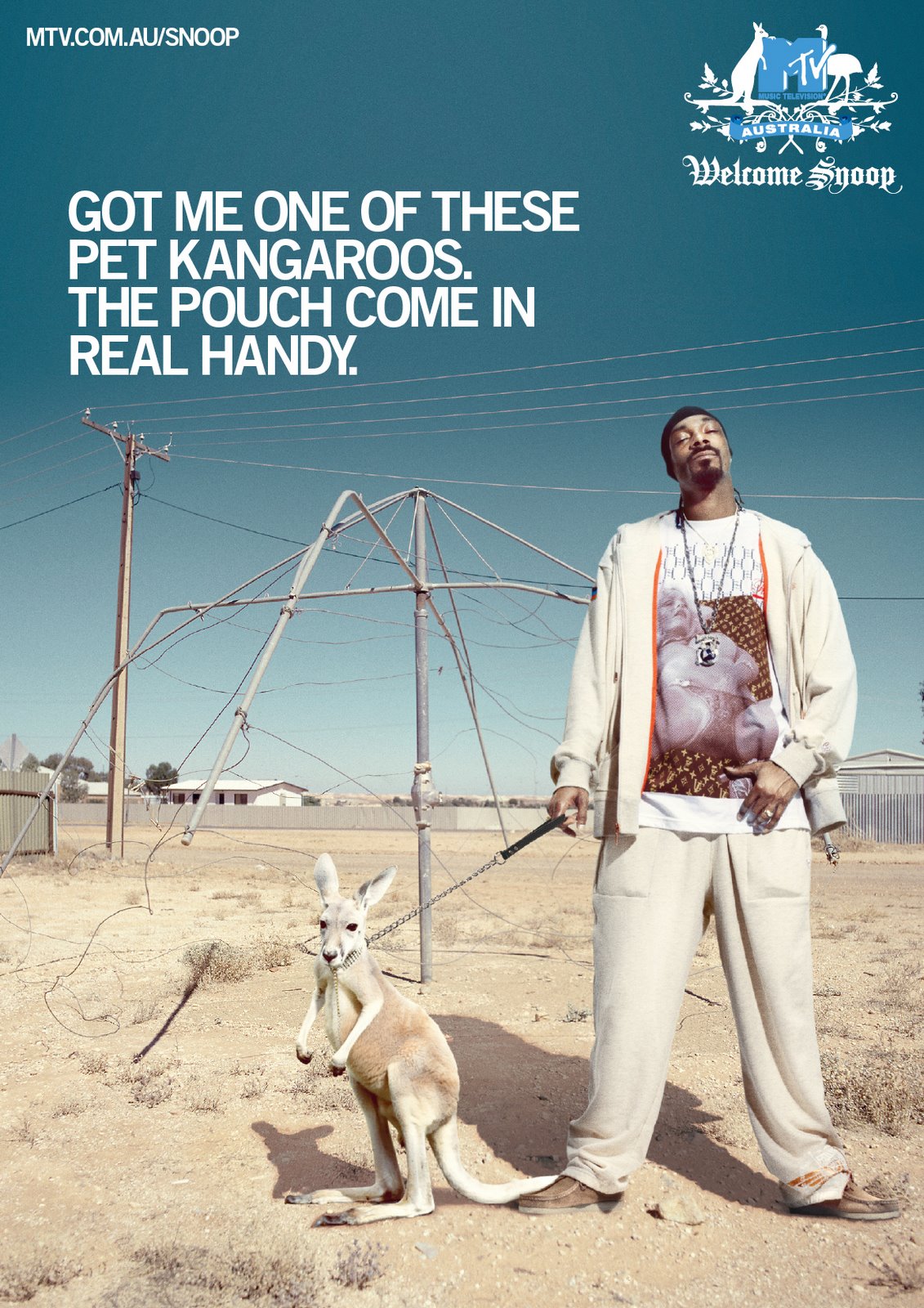
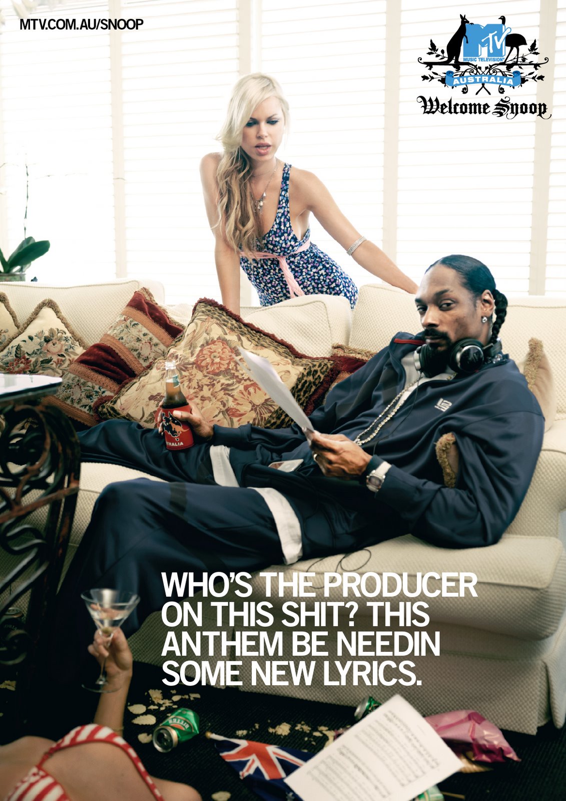
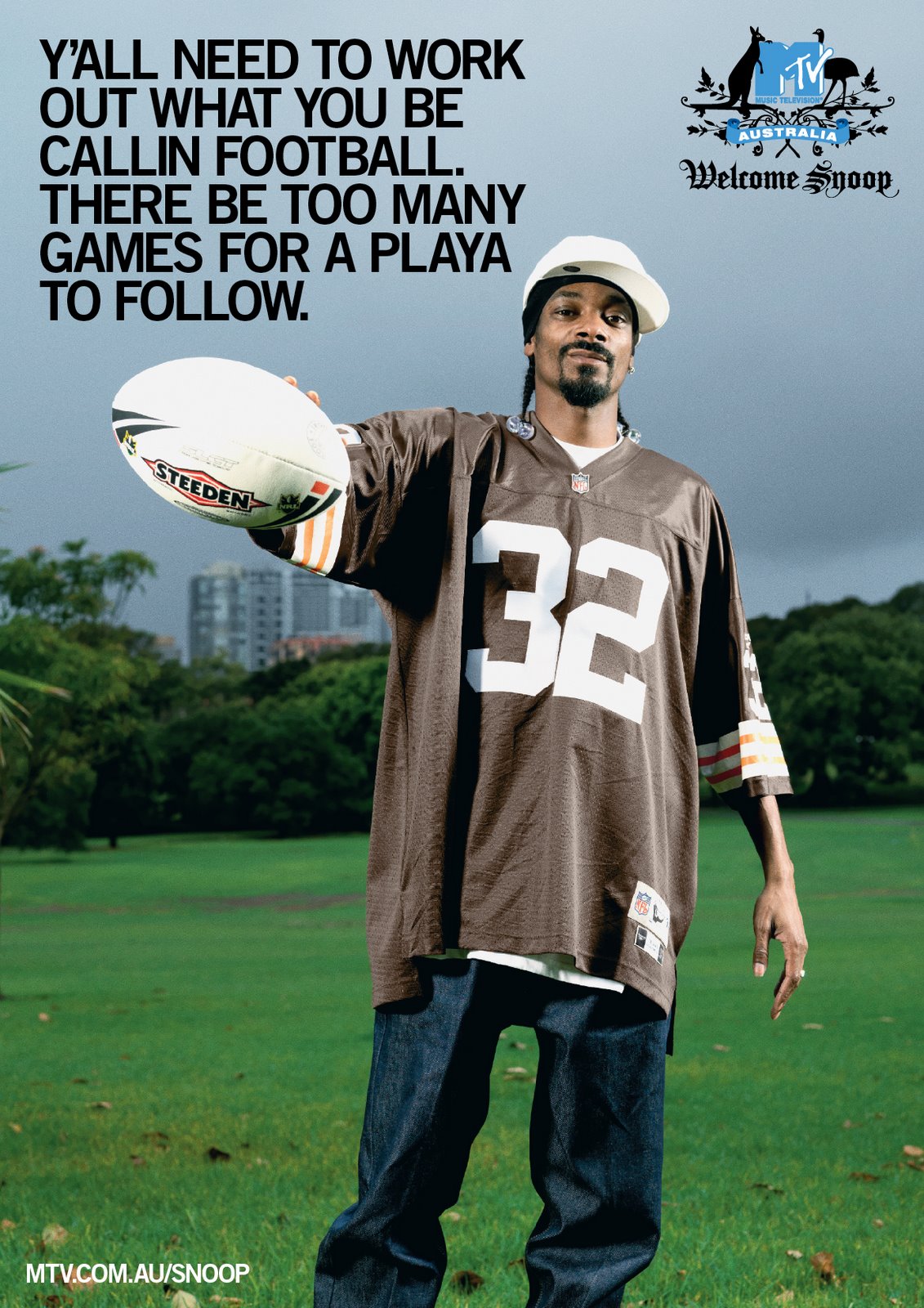
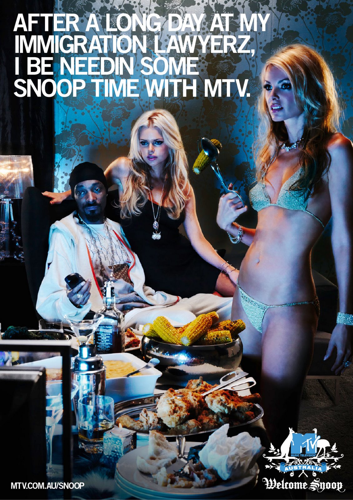
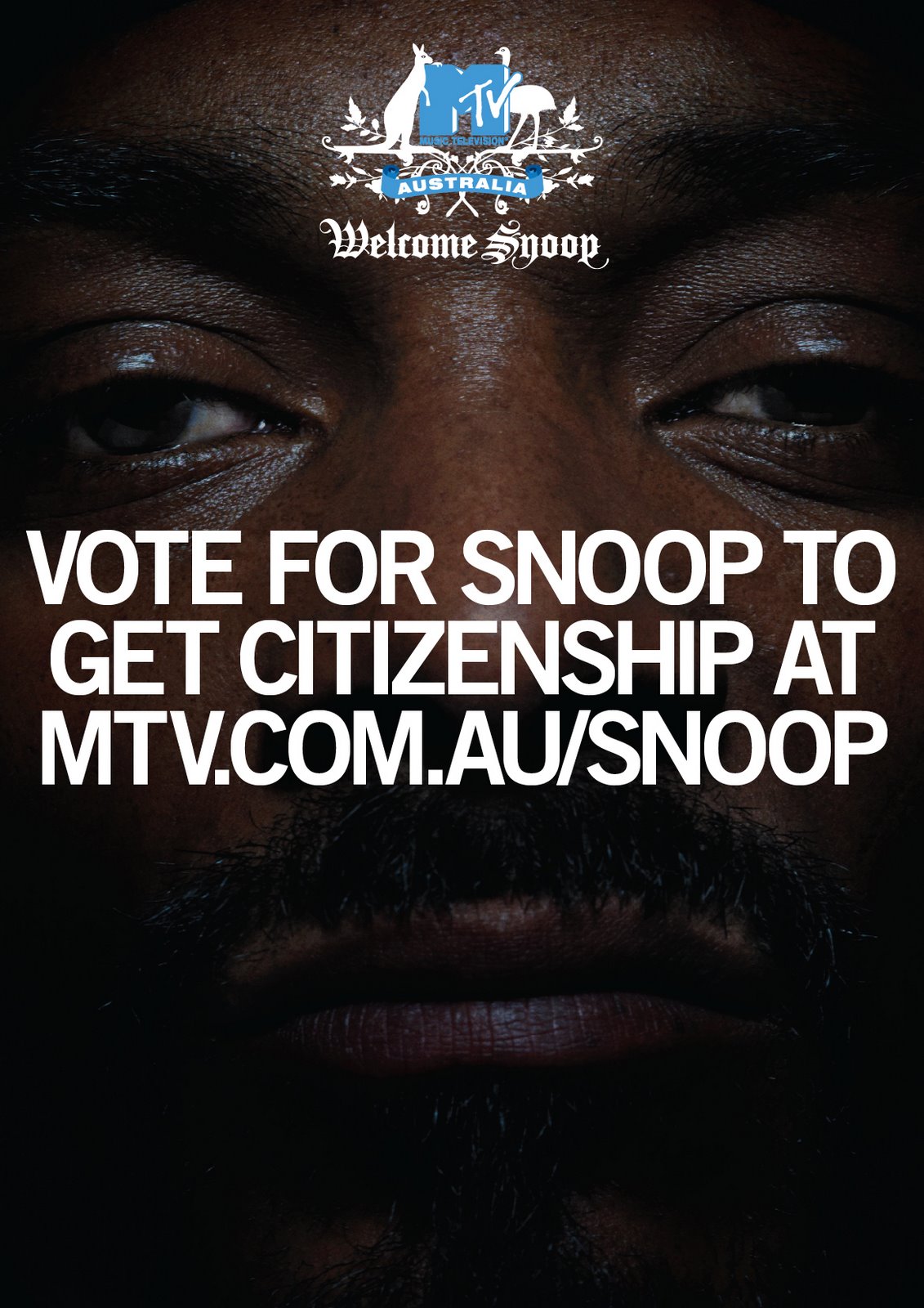
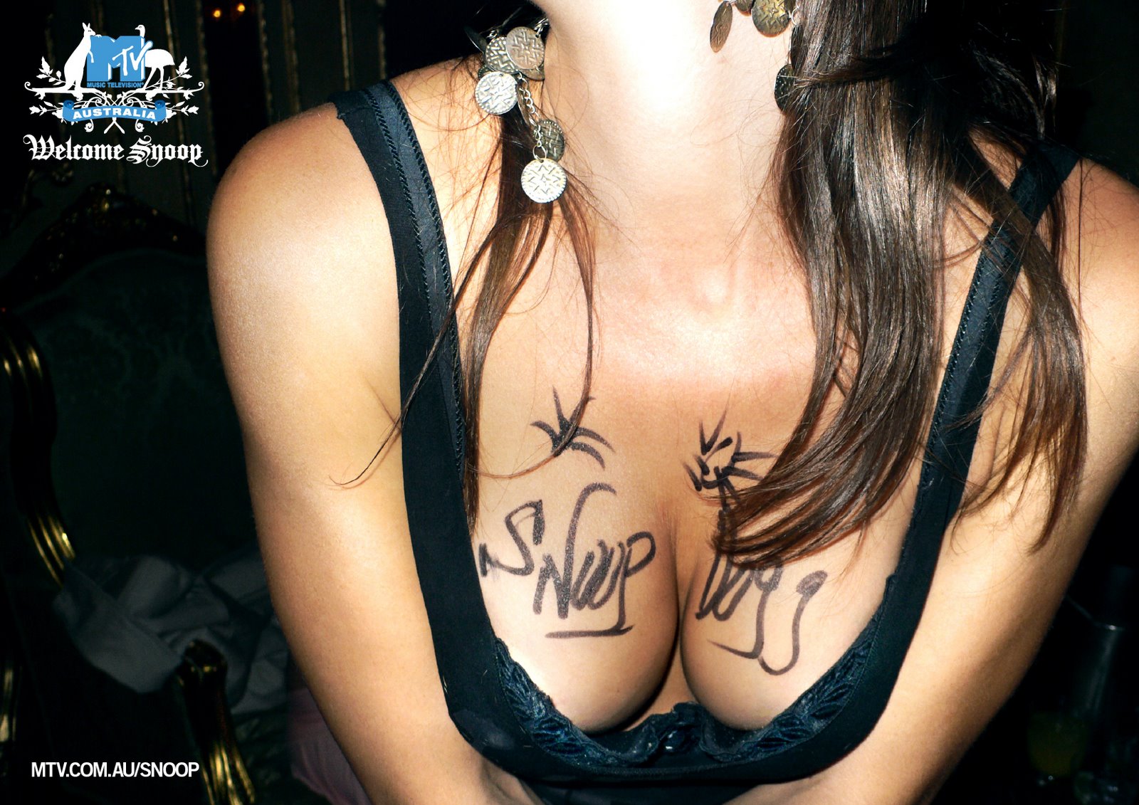
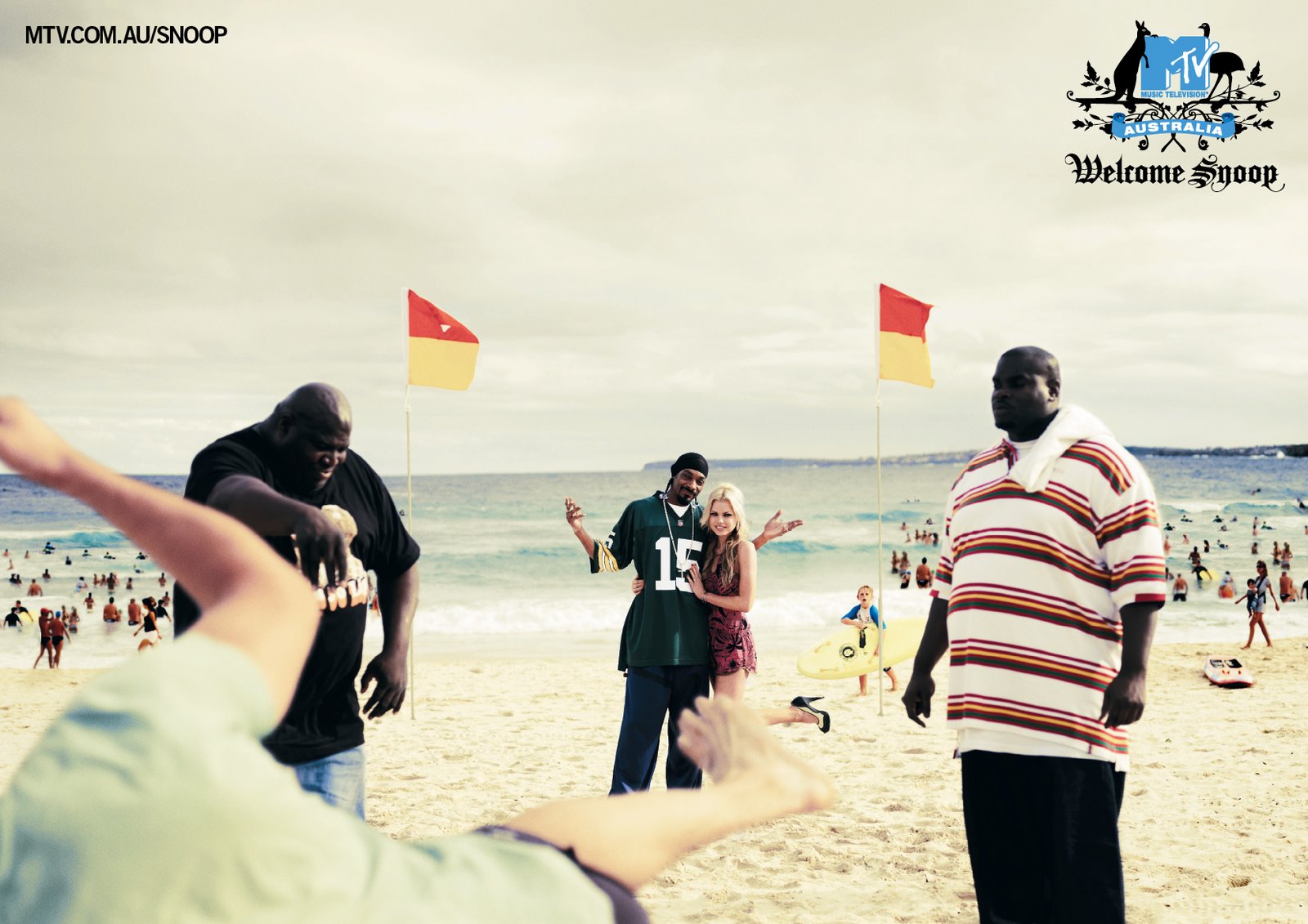
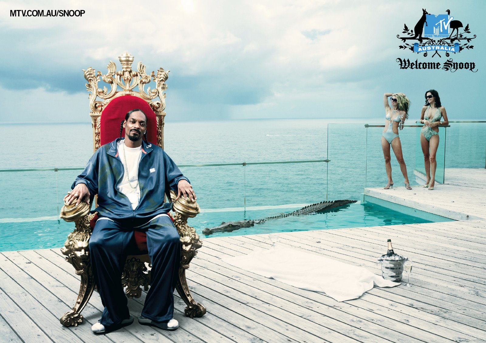
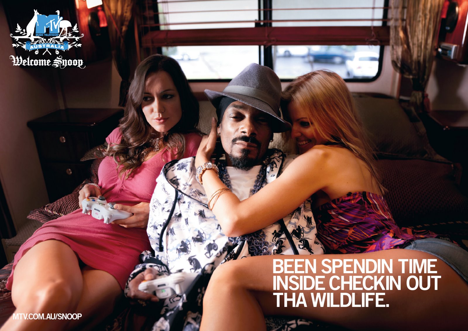
MTV Networks Australia has extended the ‘Welcome Snoop’ integrated brand
campaign with these magazine ads, posters and downloadable wallpapers.
Agency: Lowe Hunt, Sydney
Client: MTV Networks Australia
Creative Team: Dejan Rasic, Rebecca Carrasco & Howard Collinge
Photographer (Brand Print Campaign): Andreas Smetana
Producers: Rachel Henderson & Kristen
Stylist: Suzannne King
Retouching: (Brand Print Campaign): Electric Art
Agency Head of Production: Darren Bailey
Agency Producers: Lisa Cordukes and Charna Henry
MTV Creative Director: Vanessa Zuppicich
MTV Marketing Team: Colin Blake & Sam Coombes
MTV Managing Director: Dave Sibley
MTV Communications & Publicity Manager: Laura Vozzo

31 Comments
Yeah, we got it the first time. And the second…You bitches be cloggn up my bloggn.Shizzle!
Even Russ Hinze would dig this.
Gee they pump it out at Lowe Hunt don’t they.Great stuff.
This campaign raises something very interesting to me about the whole obsession with integrated campaigns. At what point does hitting every conceivable touchpoint known to mankind just become flogging a dead horse? To me, this campaign was really a simple idea that probably warranted a 30-second spot or a couple of press ads. Suddenly, there’s 10-minute docos and hundreds of press ads. Just because you can ‘explode’ a campaign into heaps of different places for varying lengths of time doesn’t mean you should feel the compulsion. Either each new extrapolation needs to add a new layer of meaning or it needs to be piss funny. In my view, this campaign, like this post itself, is repetitive and long-winded. In my view, this campaign, like this post itself, is repetitive and long-winded. In my view, this campaign, like this post itself, is repetitive and long-winded.
Like the coat of arms guys
10:34 PM – Yawn. Another constipated critic.Superb strategy and well timed use of a celebrity that is relevant. Smart, entertaining and more importantly builds the brand. Piss funny? Yes it is.
Jealous 10:34PM?
i’m jealous. i want to work with those suits.
I simply don’t think it’s funny. I haven’t heard any punters raving about it either. Not funny. Simple as that.
awesome. All of it.
I love how 9:42am says “It’s not funny. Simple as that” like he/she is the definitive opinion on what’s funny – and how the punters aren’t “raving about it either”.By the way, my 15 year old son told me about it. It seems that they are “raving” about it – at least in his school.Well done.Bruce A.
Just find it very heavy handed and obvious, I mean a ‘girt’ joke for christ’s sake.
the t-shirt in the kangaroo one is a nice touch…
This is great. Forget the one small man who keeps rubbishing it. He reminds me why I left Australia.Everyone here is talking about it and rating it big time. RG
insightful, topical, and above all a really funny execution. I don’t really buy that it’s overkill to expand it into different mediums – and quite frankly, it’s almost a given for MTV’s audience.Welcome to 2007.
Hate it.But then, I also hate his music. (Music? Fuck off.)So maybe I’m biased.But it just seems all so obvious and so short on wit.I’m not the market (obviously) but it just looks like a checklist of cliches to me.But then, that just about sums up MTV so maybe it’s on the money.
1:51 – the fact that you hate it will reassure MTV that their campaign is working extremely well I am sure.LOVE IT
Geez, some tough critics here.I reckon they’ve done a great job. Jumping on a current topic, making it relevant and funny. I tend to agree with the long-winded blogger who questions the need for everything to go everywhere, but in this case it makes sense because it’s a campaign to get the guy citizenship – it warrants more than just a press ad. I didn’t laugh my arse off, but I don’t remember doing that on 99% of the stuff I’ve ever seen anyway. It’s a well done from me.
It’s terrible.The print work tries way too hard yo.Snoop is a funny guy – nice work making him unfunny.
The “touch points” touched me good – a big thought and topical and relevant to the target. Best campaign of the year by far.
outstanding through the line campaign and exciting to see world class work coming out of Australia. As a whole body of work, this is smart thinking.
fab BIG campaign guys. Expect metal. Lots of it.
A campaign that just gets better and better. I like the way it ties into popular culture and pokes fun at authority for denying Snoop entry to Australia. A highly original thought that is spot on for an “integrated” campaign. 10:34 is wrong in this case. It’s not about “flogging a dead horse” – Snoop deing denied entry to Australia is no doubt major news for MTV’s target and this makes the thought all the more engaging. I’d love to see the stats.
Everything on the blog is crap. period. I hate every campaign that has ever appeared and i will hate every campaign that will appear from this day forward. Call me negative but I’m just a blogger with too much time on my hands and nothing better to do than shit on everything that gets posted.Big Blogger Bob
Ha Funny but true.Well done on the campaign guys. Like it. A lot. I wish I was the dogg sometimes.
a good way to tell how the campaign is doing is to have a look at their myspace page. 6000 friends. not a bad total for a campaign page. however compare that to snoop’s own mysapce, he has 52000 friends.obviously it is a bit unfair to compare these things but it is interesting to look at these figures.
10:34pm wrote”To me, this campaign was really a simple idea that probably warranted a 30-second spot or a couple of press ads.”10:34pm, go and write 100 timesI AM A TWIT. MY OPINION IS WORTHLESS.
It’s a great idea executed bloody well and everyone who was involved should be proud of it. Will clean up at the awards that matter.
For the most part, this is sexist drivel made by boys with tiny cocks.
your comment is funny given one of the creatives on it is a female. Snoop Dogg is just being himself. That’s what makes this great.
Dejan and Becs are two of the most talented creatives in the region. I love the TV and the thought behind the campaign but the press and poster work make me go “lazzzy”. Not wanting to be rude but I think a lot better work could’ve been done on the print and I think if you had a few wines with both of them they’d probably agree as well.