Sara Lee launches bold brand refresh via Disegno
Sara Lee, one of Australia’s most loved and nostalgic food brands, has unveiled a bold brand refresh across strategy, positioning, brand identity, and packaging design – marking a major reboot that has reignited consumer love and delivered strong commercial momentum.
Spearheaded by brand transformation studio Disegno, the project reimagines Sara Lee for a new generation while reasserting its place in Australian hearts – and shopping baskets.
The brand’s return to prominence comes just 18 months after entering voluntary administration. Rather than retreat, new owners Klark and Brooke Quinn acquired the brand in January 2024 and moved quickly to invest in long-term brand value – appointing Disegno to lead a complete rethink of what Sara Lee could stand for today, and where it could go next.
At the heart of the reboot is a powerful, emotionally resonant idea: Tastes Like Home. Disegno used this insight as the springboard for a brand system that balances modernity with familiarity, comfort with confidence.
“Consumers never fell out of love with the product – the brand just stopped showing up with the same clarity and pride,” says Aaron Turner, Head of Strategy at Disegno. “Our job was to bring it back with relevance, consistency and purpose.”
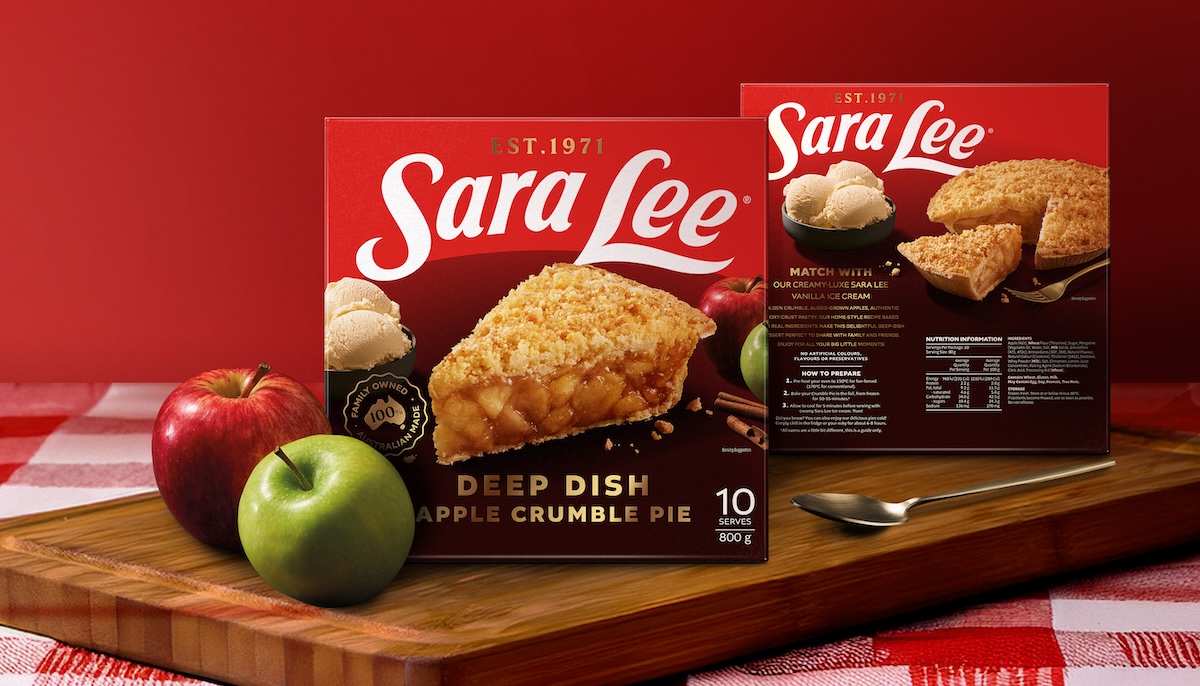
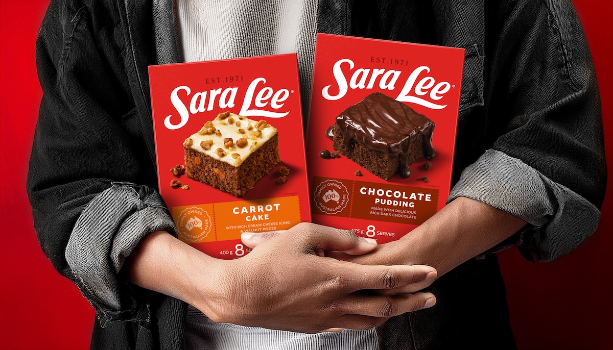
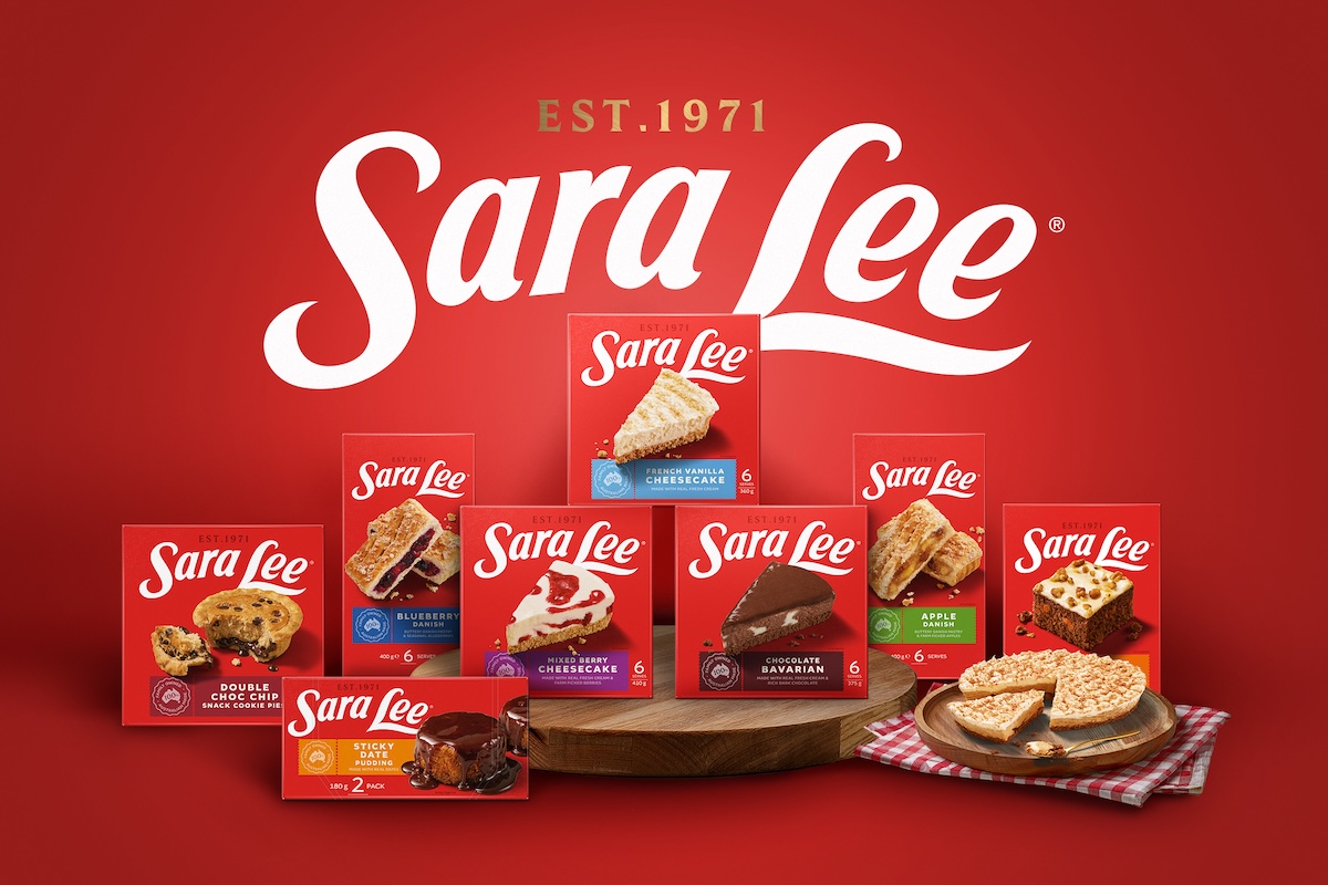
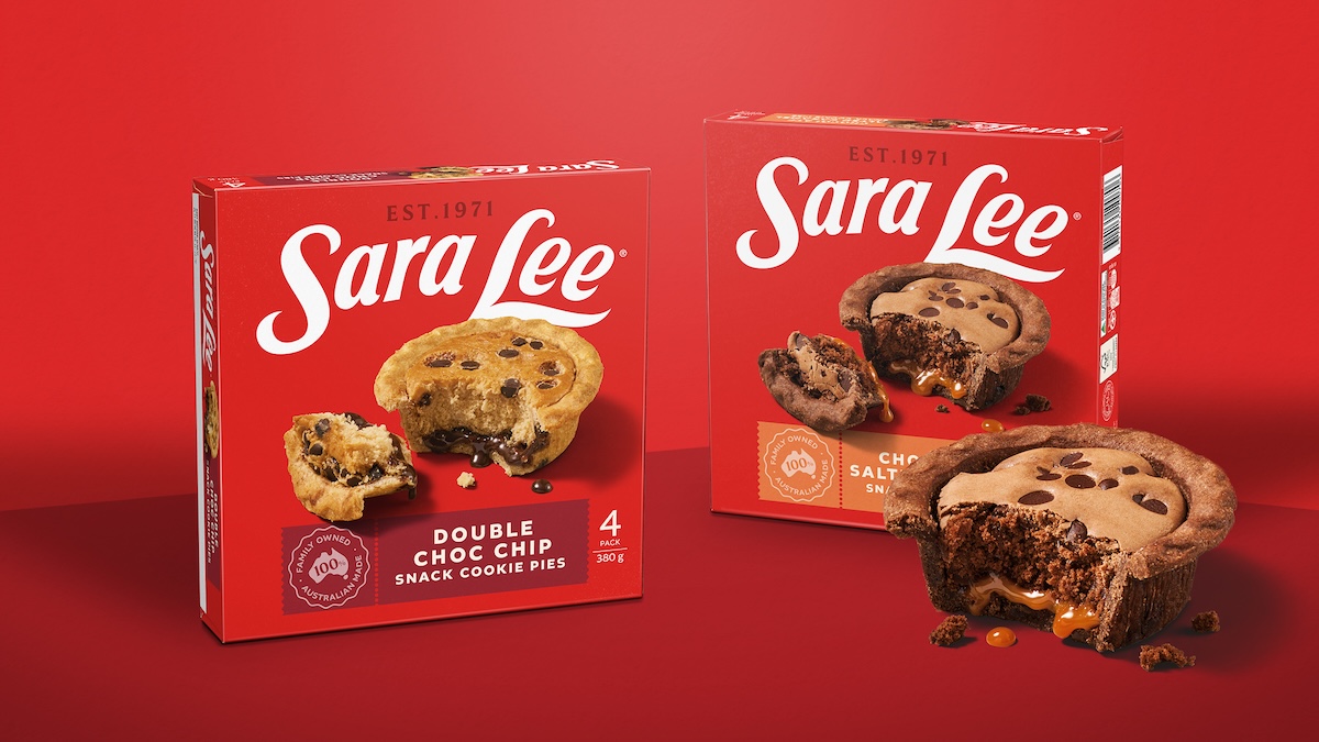
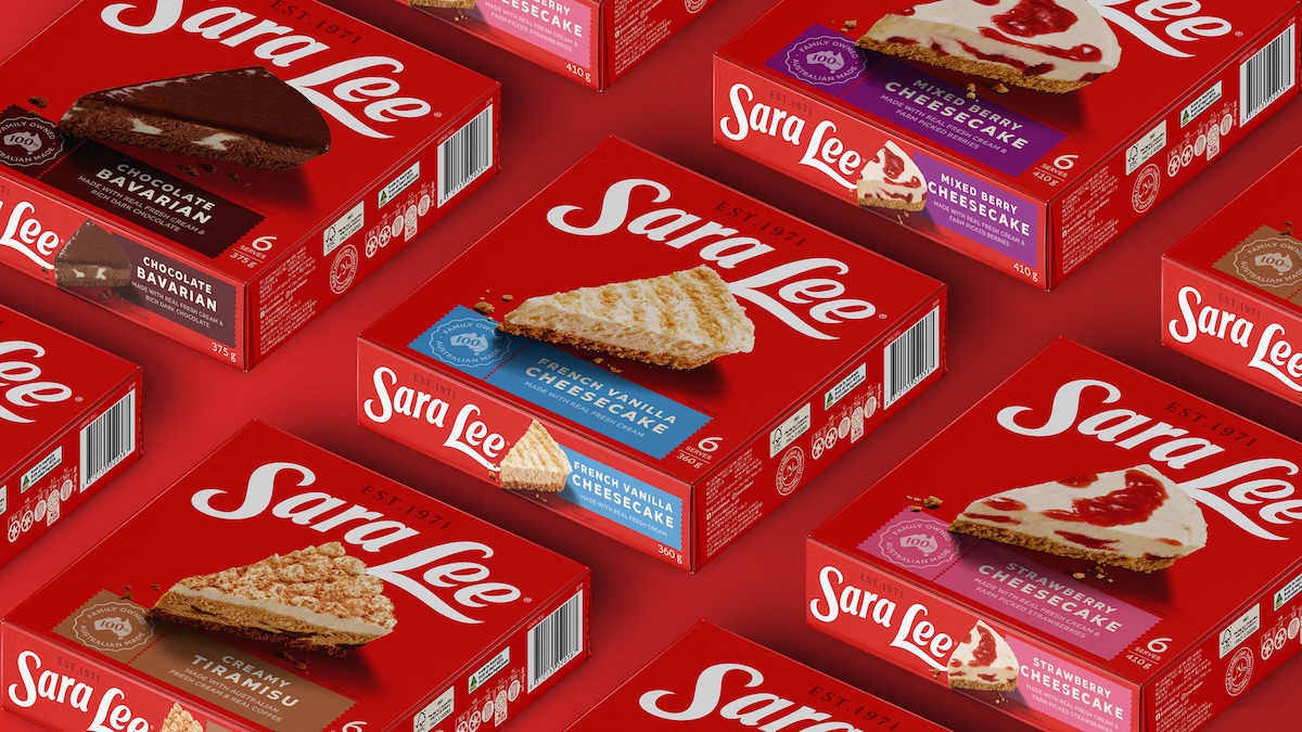
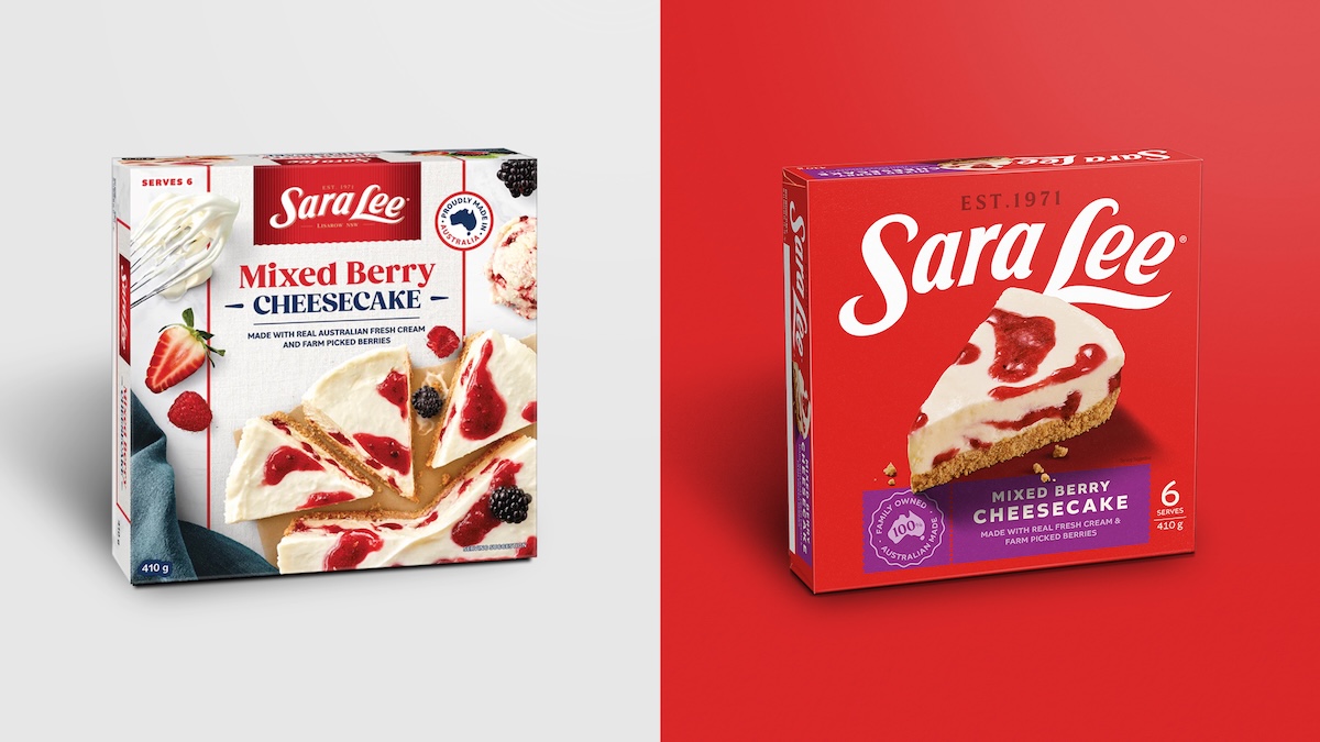
The new identity reclaims Sara Lee’s distinctive memory structures – particularly its signature red – and amplifies them with a confident, shelf-commanding brandmark. Photography has been completely overhauled, shifting from artificial swirls to honest, generous food imagery that evokes real appetite and emotional warmth. A streamlined pack architecture improves navigation, while a re-energised tone of voice reconnects the brand to life’s big and little moments – from family dinners to solo indulgences.
“We approached this with equal parts respect and boldness,” says Natasha Pandji, Creative Director at Disegno. “There’s something deeply familiar about Sara Lee that Australians connect with – our work was about protecting that emotional truth while creating a identity that can grow and flex across categories for the future.”
The new brand look began appearing in freezers across Australia in March 2025 – and immediately turned heads. Retailers reported increased visibility and stronger shopper engagement, while independent consumer testing via Mintel confirmed significant improvements in appetite appeal, quality perception and brand trust.
But this wasn’t just a redesign for redesign’s sake – it’s become a springboard for cross-category growth.
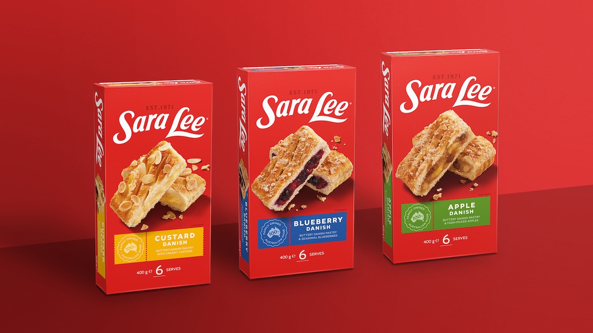
With confidence restored in the brand, Sara Lee has expanded beyond frozen desserts into the Bakery category for the first time. The launch of a premium croissant range – proudly wearing the bold red identity – signals the brand’s intent to compete in new retail contexts, with new shoppers.
“The bold red pack has become a springboard, opening up new categories, channels and possibilities,” says Klark and Brooke Quinn. “It’s instantly recognisable and distinctive enough to cut through, even in completely new retail environments. If we’d tried that with the old pack, we’d have faded into the noise of every other commodity bakery brand.”
Sara Lee’s return isn’t just commercial – it’s cultural. The brand has reclaimed its place not just in the freezer aisle, but in the lives and memories of Australian households.
“It’s just seriously excellent – a big red bay that stops you in your tracks,” says Klark and Brooke Quinn.
The redesign has also been met with praise across the marketing and creative industries, with brand leaders and designers citing it as a best-in-class example of clarity, restraint, and emotional intelligence in design.
“This wasn’t a superficial facelift,” adds Turner. “It was a brand revival grounded in truth. Sara Lee feels like Sara Lee again – but built to thrive in a new era.”
For a brand that had drifted into irrelevance, the turnaround is being recognised as one of Australia’s most effective and emotionally resonant brand evolutions in recent memory – proof that when strategy, creativity and truth align, design becomes a powerful engine for growth.
Want to leave a comment? Share your thoughts in the comments box below, making sure to include your full name and email address.