Principals rebrands IAP2 Australasia to the Engagement Institute
Branding agency Principals has rebranded community and stakeholder engagement peak body IAP2 Australasia, now known as the Engagement Institute.
Founded in 1998, IAP2 Australasia is a not-for-profit member association with more than 15,000 members. Its purpose is to elevate community and stakeholder engagement and improve environmental, social and governance outcomes.
Says Engagement Institute CEO Marion Short: “We’re proudly part of IAP2, the International Association for Public Participation Practitioners. But while ‘public participation’ is widely understood in North America, it doesn’t carry the same meaning here. The preferred term is ‘community and stakeholder engagement’, so we set out to reshape our brand to reflect how the practice is understood, valued and delivered in our region.”
To better represent its members and the work they do, the organisation engaged Principals to reimagine the brand from the ground up.
The project began with an investigation into the brand’s effectiveness, which involved interviews with trainers, honorary fellows and board members in addition to quantitative research via research firm The Navigators.
The research found that while there was pride in IAP2 Australasia’s work and training, the brand didn’t clearly convey what the body is and does.
Says Principals Strategy Director and Principal Moensie Rossier: “The rebrand needed to build credibility in the boardroom while reflecting the warmth and purpose of its members. We landed on the positioning ‘The Confidence Engine’ – because when engagement is done well, it gives everyone involved the confidence to move forward. The new descriptor, ‘Home of engagement professionals’, gives clarity about who the brand is for.”
Principals’ in-house language studio XXVI developed a narrative and voice to fit the new name –Engagement Institute. The visual identity brings the new positioning to life, starting with a distinctive monogram formed from the letters ‘e’ and ‘i’. These letterforms are interlinked to symbolise connection, collaboration and positive outcomes.
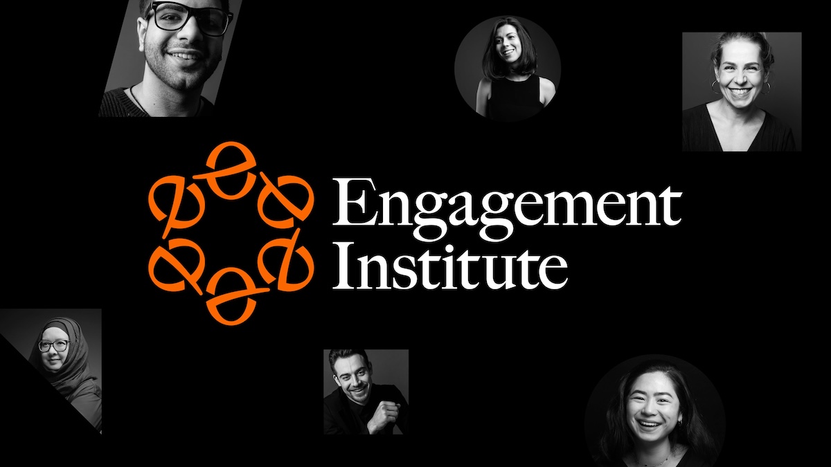
The design system is built for flexibility and function with an earthy colour palette and bold graphic shapes that build into endless patterns, as well as photography that puts the spotlight on real people driving change.
Adds Short: “This new identity gives us a clear, confident and human way to champion our members, engage with decision-makers and advocate for the vital role of engagement in creating better outcomes for everyone.”
Want to leave a comment? Share your thoughts in the comments box below, making sure to include your full name and email address.