Principals guides MTC Australia into the future with MTC FutureReady rebrand
Branding agency Principals has rebranded social enterprise MTC Australia to better reflect the organisation’s future-focused mission.
Established in Sydney as Marrickville Community Training Centre with a team of just three, for more than 35 years, MTC Australia has been delivering high-impact employment, mentoring and training programs that help Australians with the skills, confidence, and equipment they need to get into the workforce. Today, the business employs more than 450 people across nearly 60 locations and is poised to further expand its footprint and program delivery.
While the day-to-day work of the organisation was highly regarded, the brand didn’t truly reflect MTC Australia’s thinking and contributions to the community. The organisation also faced the complication of being mistaken for another brand called MTC, which operates in another sector.
MTC FutureReady General Manager, Marketing & Communications Claire Van Heyningen says: “The purpose that drives us at MTC is walking beside people on their path to meaningful work. To reach and support more people, we needed to align our brand to our business growth strategy, increasing our attractiveness to funders and talent along the way. We turned to Principals to guide us through this process.”
Principals conducted a brand review and built a case for change, bringing the MTC people and board on the journey. The agency tabled a series of strategic brand ideas to drive a step change in perception and position MTC as a progressive, innovative brand.
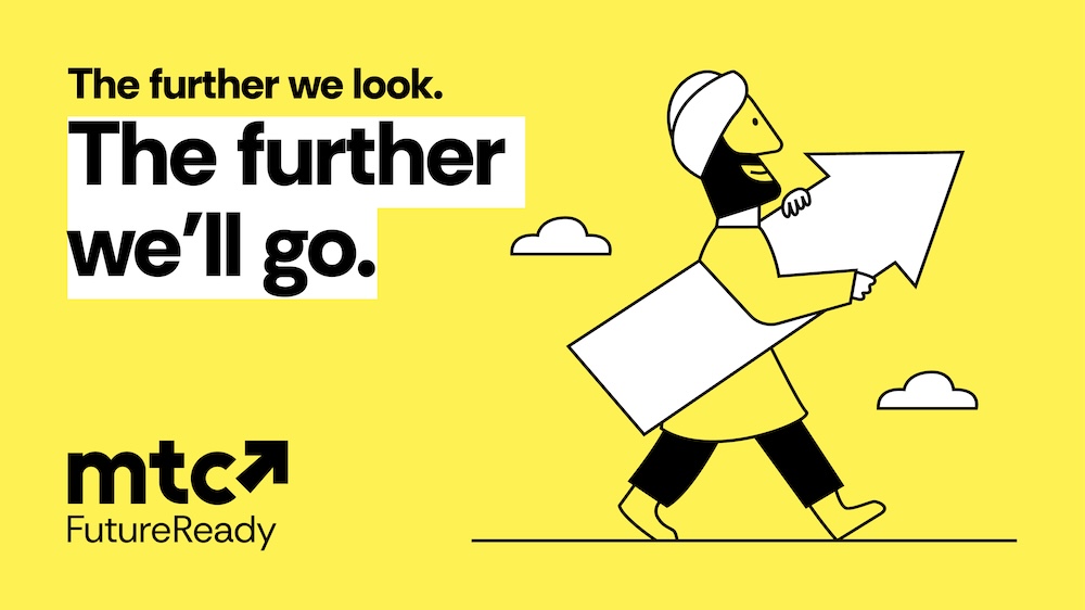
The stand-out idea was ‘The further we look, the further we’ll go,’ which provided a holistic view of people’s needs and opportunities, and a long-term view, in keeping with MTC’s vision.
Reflecting MTC’s true character, Principals’ in-house language studio XXVI developed a new brand voice and a name that kept the connection to MTC’s roots. MTC FutureReady was born.
Says Principals Strategy Director and Principal Moensie Rossier: “The belief that brand is a force for positive change was central to our work with MTC. MTC FutureReady signals progress, purpose and possibility. It captures the organisation’s ambition to make a long-term impact and its commitment to helping people shape better futures.”
Building on these foundations, Principals created a visual identity that captures the strengths of MTC FutureReady. Yellow was chosen as the brand’s hero colour to symbolise optimism and positivity, with an upward-facing arrow becoming the brand mark.
MTC FutureReady CEO Rob Marshall says: “Through this collaborative process, Principals challenged our thinking and helped us articulate who we are and where we’re going. MTC FutureReady captures the energy and ambition of our next chapter. The result is a brand that truly reflects the organisation, and we’re incredibly proud of it.”
Want to leave a comment? Share your thoughts in the comments box below, making sure to include your full name and email address.