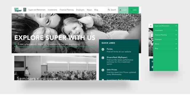
NGS Super tackles member engagement with new ‘Knowledge Centre’ + refreshed website via S1T2
 NGS Super, in partnership with its digital agency S1T2, has redesigned the industry fund’s digital channels, creating an improved user experience that redefines the way it communicates with new and existing customers.
In line with NGS Super’s strategy to enhance user engagement, S1T2 has undertaken a complete redesign of the industry fund’s website to give customers direct access to the tools and information that will help them understand and maximise their growth with the fund.
Based on quantitative and qualitative member research, NGS identified key knowledge gaps relating to knowledge of personal finance and investing – including superannuation. This guided the development of the NGS Knowledge Centre – a personalisable online information portal designed with real member needs in mind.
Member needs were at the heart of the entire website redesign; instead of pre-determining what customers want and need, NGS Super’s new website prioritises intelligent search and quick links as a way to hand control back to users. By creating smooth, satisfying navigation that responds directly to the user, these features ensure that customers are always able to find the information and content they’re looking for.
Tash Tan, head of digital at S1T2, explained the importance of well-designed search functionality and site navigation to generating a seamless online experience.
Says Tan: “By improving the efficacies behind organising and presenting data, we hope to create greater value for all of NGS Super’s customers in line with how audiences look for information today. These capabilities are the first step to providing a user centric design experience, one that considers the importance of a user journey catered to your needs.”
Applying the principles of material design across the website design represents a particularly important development in the quality of NGS Super’s online presence. By capitalising on natural visual cues and the idea of ‘meaning in motion’, material design creates an organic digital landscape that provides a more intuitive user experience.
Loyce Cox-Paton, head of brand and digital at NGS Super, described the new website design as crucial to the industry fund’s overall strategy for user engagement.
Says Cox-Paton: “At NGS Super, we aim to provide a whole wealth solution to our members by listening to our target groups and how they wish to engage with their superannuation fund.
“We wanted to create a place that housed everything our members wanted to know, not just about superannuation but their whole wealth journey. The findings of our research really guided this process and revealed members were after easy-to-understand content about the relevant things impacting their finances – including investment strategies, global and local market movements and changes to superannuation policy and regulation.
“We answered this call for content by arranging an exclusive and free-to-members content-sharing partnership with Alan Kohler’s The Constant Investor – granting members access to content in line with their financial needs – a move that has been met with an overwhelmingly positive response from members.
“Making sure our members are engaged with their super is a key focus at NGS Super, and for the superannuation industry as a whole. We want to take the lead in listening to our members, to reassure them that we are here and present on their financial journeys, by providing them with a central hub of information easily accessible through our new website.”
Focused on transforming the online conversation around superannuation, NGS Super and S1T2’s innovative approach to online user experience has ensured that the newly launched website is able to grow and adapt with users as they partner with NGS Super to understand and grow their wealth.
