Newly renamed Rugby Australia announces new identity via Sydney creative agency Digilante
 A new era for Australian Rugby Union, now named Rugby Australia, or Rugby AU for short, has been announced with the unveiling of a new brand identity created by Sydney-based creative agency Digilante.
Digilante was tasked with representing Rugby Australia’s progression to become a more relevant, inclusive and accessible sport that appeals to today’s broader and more diverse audiences.
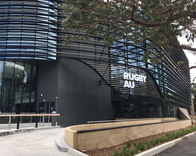
 The Rugby Australia brand evolution has been over a year in development and was delivered in time to support Rugby Australia’s move to a new, state-of-the-art corporate HQ in Sydney’s Moore Park. Part of a broader organisational change, the new ‘Rugby AU’ brand heralds an exciting new era, focused on making Rugby a game for all, and represents the
 changing face of the game.
Says Eric O’Brien, executive creative director and co-founder of Digilante: “Reinventing such an iconic, long-standing organisation required a lot of listening and understanding to confidently propose a new identity that fans, stakeholders and participants alike would connect with.
“The rebrand needed to reflect a deep organisational change that is more significant than a corporate face lift. So Digilante used the rebrand as an opportunity to restart a positive conversation around Rugby and what it has to offer to individuals, teams and communities. Rugby AU represents not only the Wallabies and our elite national teams, but also the boys and girls, men and women of all shapes and sizes who are inspired to pick up a footie, have fun playing with others and experiencing the sense of belonging that Rugby can bring.
“At its heart, we wanted to create a future-focused identity, one that embraces diversity and enables Rugby to deliver on its objectives in appealing to future participants. Ultimately, it is about celebrating the human qualities of Australia’s great global game by showing Rugby in a new light.”
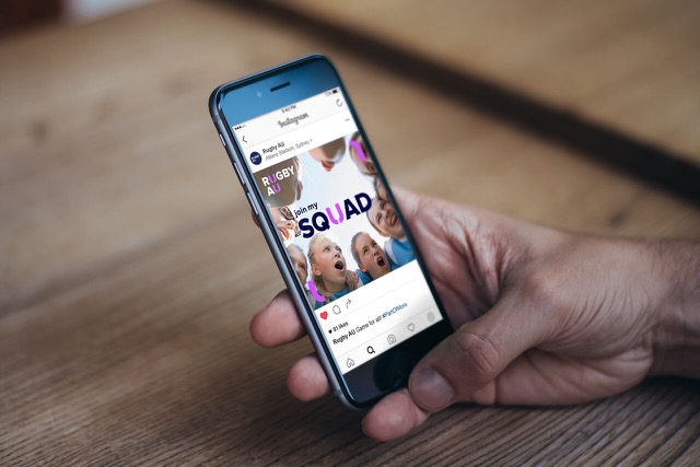
The announcement precedes a larger, national launch of Rugby AU to the public, planned for early 2018 with the start of the new Rugby season and junior registration sign up. In presenting a more consistent brand, Rugby AU is redefining its corporate structure and game formats to align under a new, more consistent brand family. The new name and logo will be supported by a community-focused brand campaign that showcases individual stories across every level and highlights a shared narrative around how Rugby is more than just a game.
The national launch will feature the full ‘part of more’ brand TVC and a series of content stories told from the perspective of the Rugby community. The launch will also include a website and social plan accompanied by a digital media strategy.
Says O’Brien: “The project is the result of an extensive body of research Rugby conducted in 2016 and reflects the thoughts and ideas of a passionate Australian community. The research helped Rugby AU to better understand the many challenges their sport is facing in today’s rapidly changing landscape, and to focus on making Rugby more accessible, more inclusive and more relevant from today into the future.
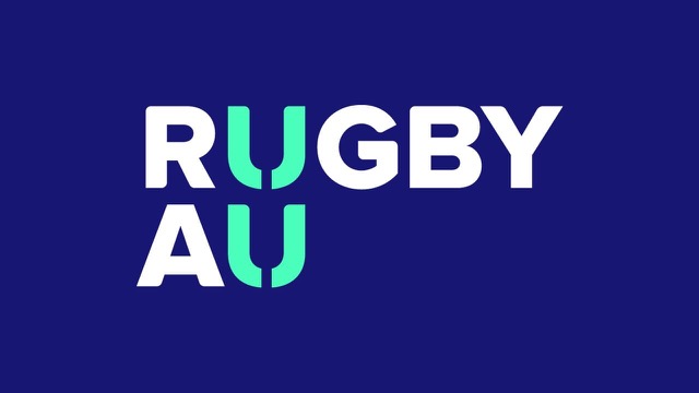
“As a result, the new identify departs from tradition by using vibrant new colours, and putting an emphasis on the ‘U’ and how Rugby is for You. This idea sits at the center of the Rugby AU logo concept. The unique ‘U’ shape underpins the branding for all the communications across every level of the game. It represents you, Australia, Rugby’s Union heritage and uniting people.
Says Bill Pulver, CEO of Rugby Australia: “We are thrilled with our brand evolution that will be revealed over time. Our new identity embodies Rugby’s shared vision to ‘inspire all Australians to enjoy our great global game’ and is the first step in our broader strategy to re-define Rugby for future growth, with a message to all Australians that if they are part of Rugby, they are part of much more than a game.”
Says Adam Freier, head of digital and communications at Rugby Australia: “Digilante have done a fantastic job in answering this brief, it’s a significant time for Rugby in Australia, and there are a lot of positives for the growth of our game. We really wanted to highlight the sense of belonging and identity that can be achieved through Rugby, and communicate it in a culturally relevant way. I am looking forward to Australia seeing this rebrand as it continues to roll out early next year and inspire more Australians to play Rugby.”
The rebrand represents an important new step towards a broader national initiative designed to reinvigorate Rugby in Australia with the introduction of new initiatives for the growth of the game at every level. These include introducing new formats in 2018 designed to make Rugby more accessible to more schools and clubs across the country.

8 Comments
More Interbrand wanabees.
Those two overlapping U’s… look like…
Ok…this follows the equally generic Australian Open logo.
Asexual, non binary , provenance free. And stirs no emotion. Therefore brand free.
Got almost to the bottom of the PR blurb and found myself wondering what on earth Adam Ferrier had to do with this. Then I realised it was actually some guy called Adam Freier. Time I went for an I test me thinks!
Glad to finally see the ARU (Rugby AU) marketing doing something positive for the code. I hope they live up to their grass roots promise!
This sort of stuff is anti-design.
Bold design and great to see ARU championing a sense of belonging through sport. Look forward to seeing more from these guys!
@logo not a brand
You say this is a ‘logo not a brand’, then say its like the Australian Open ‘logo’?? Then you describe what you dont like about the logo???
What you’re seeing here is a small example of the new visual identity – one portion of the brand.
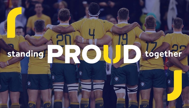
It doesn’t get your juices flowing? Fine (nor me at this stage, I think the use of the split U as a sort of bracket device is a bit odd, and I’m not a fan of that copy line about sanding proud together)
But there are 4 images here….4. You honestly think you can make a call about the merits of this as a brand project based on 4 images?
Wait to see what they do, how they act, how they speak, what events they put on, what issues they stand behind, how this all aligns with their strategy, then make a call.
The logo is the high dive, the brand is the laps