MullenLowe evolves the octopus ~ launches new global positioning and brand identity

MullenLowe has unveiled its new global identity and a refreshed positioning, created to unite the network across 57 markets globally and differentiate it from competitors. MullenLowe sees the octopus evolve from an operational mascot to a kindred spirit that visually represents how brands need to grow today.
The agency’s positioning is underpinned by research revealing innovative brands grow at twice the pace of their competitors, and brands that continue to innovate grow seven times faster.
Says Kristen Cavallo, CEO of MullenLowe Global: “Our mascot offers the perfect metaphor. The octopus has survived over 300 million years precisely because of its fluidity and ability to adapt. It is the only organism that routinely self-edits its own DNA—a model for how brands should behave today.”
The new brand identity was created by MullenLowe U.S. and led by head of design, João Paz.
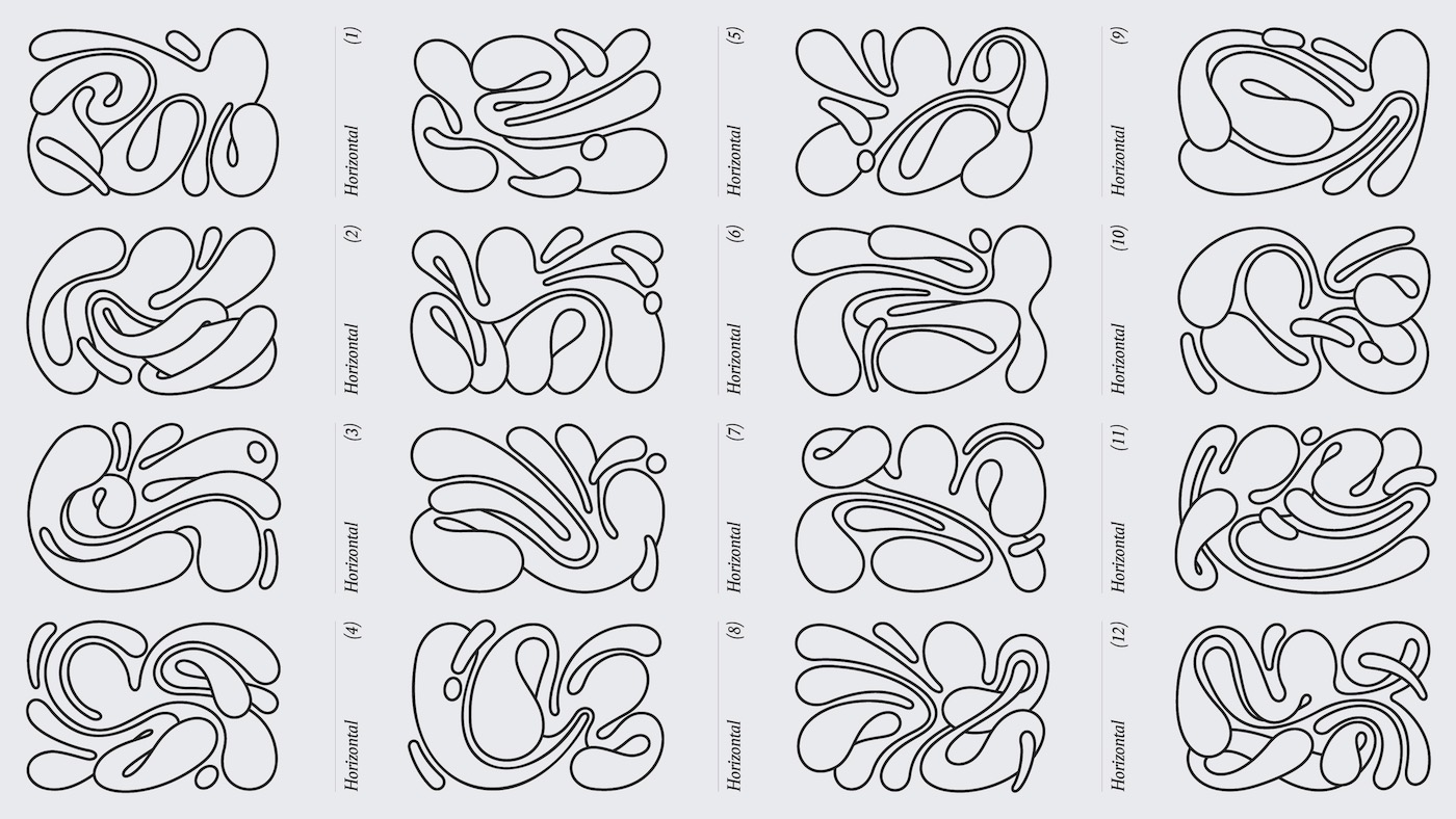
Says Paz: “We want to challenge the way brands show up in the world. Our octopus is not afraid of change; it’s in its nature, its DNA. We embraced that with a fully generative identity, crafted to show personalization at scale.”
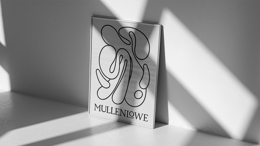
The new logo doesn’t live by the rules of logic. It breaks free from any type of symmetry and rigidity. With no corners or end points, it changes and moves and behaves in different ways.
Says Paz: “Our octopus is alive. It has a will, a personality, and, above all, it wants to move. With its endless twists and turns, it has the freedom to reinvent itself infinitely.”
MullenLowe has invited its more than 4,000 employees globally to design their own octopus using a generative app.
Says Paz: “We want the design system to reflect who we are and allow each person who’s part of MullenLowe to make their own mark.”
It allows users to customize the octopus for email signatures, social and profile icons, and even the background of an Apple Watch.
The fluid octopus is paired with a bespoke wordmark that is stark, reliable, and firm in its logical Serif treatment. It grounds the funkiness of the octopus, combining emotion with reason. While the octopus welcomes the new, the wordmark pays tribute to the past and the agency’s long-standing heritage.
In addition to all the individual iterations, a pattern was created to represent inclusivity and the coming together of all the unique expressions and people who make up MullenLowe.


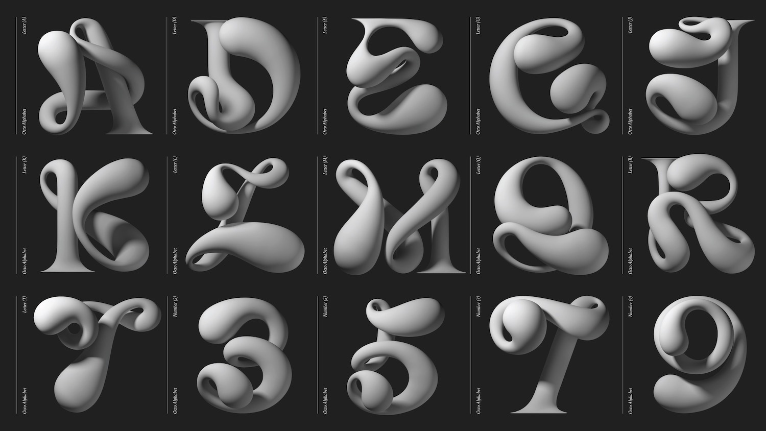
To complete the visual identity, the system includes its own trademarked typographical treatment. The octopus’s tentacles morph into letters and numbers that create a full typeface from A to Z, and from 1 to10.
The identity has rolled out across the agency’s communications touchpoints, including the website and social media. It will be splashed across office walls and with highly anticipated swag. The new look goes beyond design to create renewed energy, pride, and confidence in the network’s next chapter.
Says Cavallo: “This is more than just a logo redesign. We have a point of view on how brands grow, and we built our identity and voice to reflect that belief. In a rapidly changing world, more of the same is not the path to long-term success. Brands need to earn and continually defend their unfair share of attention/ Products might be boring, but brands can never afford to be.”

3 Comments
THIS NEEDS RESPECT! IMPRESSIVE STUFF.
Love this. Similar to the &Walsh ampersand, dynamic logos are super fun (especially if fluid like this). Many opportunities to be playful.
It’s a nice ID and good to see an ad agency taking that part of things so seriously.
Sticking with the octopus and the metaphor that comes with it makes sense too.
Would have liked to have seen more language come into it…but yeah, strong.