Marketforce creates new print campaign for The Salvation Army in WA
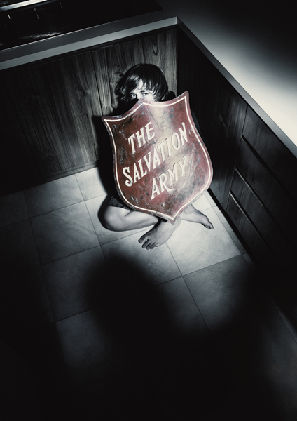
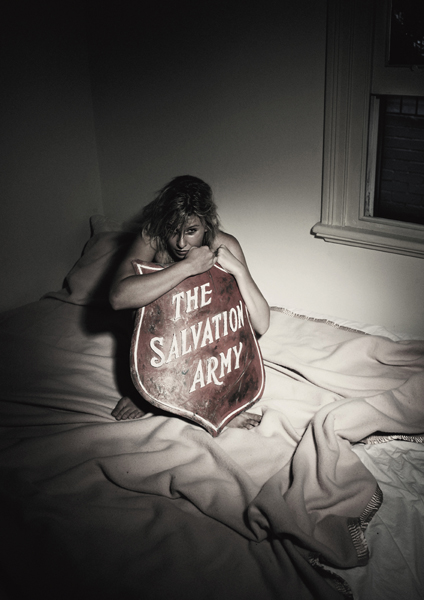
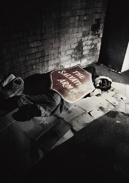
 Marketforce Perth has developed a new series of ads highlighting thedramatic impact that The Salvation Army has on the lives of young peoplesuffering from neglect and abuse.
Through their CrossroadsWest program, The Salvation Army provides valuable support for youngpeople whose home lives are severely disrupted by their parents orguardians’ alcohol and drug addiction, physical abuse or abandonment. The Salvos have set up residential houses to provide a safe and stableenvironment to help them make the transition to independent living.
The initial brief was for a single ad for a special edition of Campaign Brief WA but was expanded into a campaign based on the strength of the concept.
TheSalvation Army’s Warren Palmer said “These ads depict strong visualimages of the reality that troubled youth face in WA every day and wehope to use the campaign across other areas”.
CREDITS: Agency: Marketforce. Writer: Ryan Albuino. Art Director: Andrew Chu. Creative Director: Andrew Tinning. Photographer: Allan Myles. Retoucher: Madeleine de Pierres. Producer: Kate Downie.


60 Comments
What a wasted opportunity.
Nice!
I love the symbolism of the shield. My only suggestion is this – add some positive imagery to the negative imagery. In other words, don’t just show me the sad before shots, show me some happier after shots as well. The Salvos are a good news story after all.
Anon
Saved to serve.
Beautiful work guys.
Nice photograph. Average idea. Using a logo as a device isn’t new.
Simplicity at its best.
Well done.
(From someone who bags heaps of work on this blog).
Really nice. Perfect for the brand.
3:25PM
You are not referring to your own life as that wasted opportunity, are you?
I love this work. It’s fantastic. Well done to all concerned
Typical bad client/suit like observation: “Show me the positive”, ‘The Salvos are a good news story after all.” Hack.I say cheers for the Salvos WA and Marketforce for delivering a brave, hard hitting impactful campaign. Saved to serve, stay on your day job.
It’s true. the idea shows someone in a bad situation. so, where’s the help?
Simple. And that’s a fine starting point.
yes 3.25, your comment was
I really like this. Well done.
But not that surprising considering it’s from Marketforce. I’d be tempted to move to Perth, from Sydney, just to work for Tinning. Seems like a great CD.
Nice. I’m jealous.
I disagree with two comments above; one that you should show some positive shots as well, and two that the photo is better than the idea. The photos hurt you I think, they feel too melodramatic and would be better if they were more real. They feel a bit 2003. Nice idea though.
Nice – simple idea, well executed. Why do so many people on this blog still kick everything they come into contact with? Especially if anyone outside Sydney dares to put work up. Let’s dig ourselves out of this self-hate pit we call advertising guys.
that’s great stuff.
I really like it. Well done.
Does this not say that the shield, and by implication the Salvos, can’t make the abuse and suffering stop?
I like the simplicity and the photography but I do wonder whether the meaning is absolutely clear.
A shield protects you there and then – not as a post-fact kind of remedy.
It’s like the problem and the solution are not being properly separated.
Please don’t eye gouge me and murder my grandmother. It’s just an opinion.
These days all our so called paying clients are charity cases – they are fuckin lucky to get more than a white page for free!
it’s so simple, logical and relevant.
3.25, your parents were right about one thing: you are a fucking idiot.
I like the campaign. I like the use of the shield. I like the shots. I’d also like to see some positive imagery. Rey Carlson or Steve Rogers shot a Salvos campaign also worth looking at.
I’m not sure about the third one – the shield doesn’t seem to be shielding the kid from his problems (being on the street) and the second one seems to double up on the first.
Nice tho, very nice, great photography even if it is a bit desaturated / ‘in vogue’ (not a criticism, there’s a reason things are in vogue).
Oh, it’s a shield. Wow, I get it. So the Salvo’s shield people from harm.
I hope the bloke that designed the logo in 1914 is available to pick up the award.
Silly me, in all those years of red ‘shield’ appeals I never connected.
Thank God for the …….Salvo’s.
No, I meant thank God for the junior team for pointing out the obvious.
Hard to hang shit on, hey.
I like that. Thumbs up.
4:53 needs to show some manners. 3:34’s comments have some merit. As someone who’s worked closely with ‘street’ charities, the most successful have been when people see some hope and aren’t belted over the head with misery. If you think that’s a client/suit perspective so be it. Despite all that, I think this campaign has real potential. By the way Saved to Serve is the Salvos motto.
I’m with 4.54.
Although I’ve only glanced at it, I’d have had the ‘victims’ using the shield more defiantly. But that’s just me.
However, I’m sure they thought of this, so I’ll jump down from my soap box.
I prayer the muppets on here with comments like this from 8:21pm “I’m not sure about the third one – the shield doesn’t seem to be shielding the kid from his problems (being on the street)” aren’t in an ad agency, let alone a creative department.
It’s shielding him from the elements, you bean-counter, a problem when you’re homeless methinks.
Move to Sydney Tinning. I want to work for you.
9:53, if you prayer to speak engrish I hope you realise that it doesn’t fit with the other two. The only beans I count are the ones I pop on weekends or celebrating recent award wins.
It’s a different idea and it doesn’t shield the kid from the problem, being on the streets.
Still a nice campaign.
‘Appy Days.
i like guys…shields or no shields.
more work for a charity. they must have some real problems over in western australia with all the anti-smoking, driver safety, child protection, domestic abuse and homeless ads that come out of there.
I’m sorry but I don’t get it. Why are they looking unhappy behind the Salvation Army Sheild? I thought the Salvos are there to help. Nice photography.
I quote:
“…I’d be tempted to move to Perth, from Sydney, just to work for Tinning. Seems like a great CD.”
and
“…Move to Sydney Tinning. I want to work for you.”
Someone’s after a new job it seems.
Nice angle, 1:05AM.
really simple. really strong.
You people are completely missing the point. All the people in these shots are shielding themselves from the photographer. Photographers are evil!!!!!!!
Nice. The Salvos (in this case the shield) protects people. That’s it. The end. All you people picking it to bits until it’s a crap campaign sound like clients…or research groups. Leave it alone.
I like this campaign but 1:05am’s comment is pretty cutting. I like cutting.
1.05
Apparently 85% of their work comes from the government in WA. There’s very few big brands still based in WA. They seem to me to be doing great things with what they’ve got. Maybe you should be breaking your balls do do as well with your big clients because it won’t be long before these cats are over here taking your job. Give them a break.
Whatever you say, there’s gonna be metal somewhere for this campaign and it ain’t necessarily coming only from the Salvos shield. Mark my words.
It’s a pity the only people who will get to see these are the 400 or so ad wankers going to the the Campaign Brief Awards tonight. Still if sticking them up in the foyer and putting them in the free awardnight magazine helps a few young people to win international advertising glory, it will all have been worthwhile.
I never post on these sites…especially not about print stuff. But I really like this. Great imagery and art direction…plus well taken photos.
Nice work.
A director from NZ
would you all like it if it was a family looking wonderfully replete whilst hiding behind a Birds Eye logo?
11.20 quite possibly. Unfortunately it won’t be in the collecting tin – where Salvos really need it
very nice stuff
It’s good,not great and i doubt it’ll trouble juries much.
“I never post on these kinds of sites…”
What a lame attempt at making your opinion somehow seem more valid.
Lovely.
Definetely not award worthy.
Read the blurb. It says, ‘The initial brief was for a single ad to appear in Campaign Brief WA’. And then, of course, the agency did 3 versions to turn it into a campaign. How about doing proper work for proper clients to win ya gongs, boys.
hello
It’s 1.05am.
I am breaking my balls to do some work. I’m in the office at 1.05am.
as to these chaps taking my job, they can have it! I’m in the office at 1.05am
Maybe the NZ director should have started his post with..
“I never really post comments here, but as the Kiwi economy has collapsed and I haven’t shot a job since September I suddenly have time to post comments in between quarter pounder orders…”
I’m surprised that amongst all the commentary, nobody’s made the point that perhaps the greatest strength of this campaign idea is that it’s incredibly well branded. In a crowded charity category, in which a number of worthy causes are all competing for the altruistic dollar, that’s crucial. This campaign could only be for the Salvos.
On that score alone, it’s a great idea. And another thing: whilst it may seem bleedin’ obvious to use the logo in this way, as far as I’m aware, nobody thought of doing it before. It was a gift, waiting for someone to breathe new life into it..
The best ideas often seem incredibly obvious. It just takes some clear thinking to unearth them. No I don’t work for Marketforce , I’m not a planner and had nothing to do with this work.
While it’s fine to point to the branding and the functionality of the brand in action there still isn’t a strong emotional insight here. Yes, the victims look unhappy and are being shielded by the Salvo’s shield, but is it helping? They look frickin miserable.
For me it tells the following story: Someone’s got a bad life, they find a salvos shield, thinking that’s going to help – but sadly it doesn’t. Their nativity will result in another beating or a night outdoors.
I agree with 3:23, it’s visually striking and there’s no way you miss who the charity is…it’s good stuff guys.
“For me it tells the following story: Someone’s got a bad life, they find a salvos shield, thinking that’s going to help – but sadly it doesn’t. Their nativity will result in another beating or a night outdoors.”
1:08
When you say “But sadly it doesn’t” is really only a reflection of what a very bleak outlook you have of the world, chin up old chap…sometimes the glass is half full.
wow, this lithium is really hitting the spot.
Cold and horrible strategy and execution. The salvation Army are people with hearts that beat who are there to help other people with hearts that beat. What happened to ‘Thank God for the salvos’?
Nice photography. VERY average idea. And I seriously doubt it will do anything positive at all for the Salvation Army itself.
I think that these are the kind of the ads that have been needed for a long time.