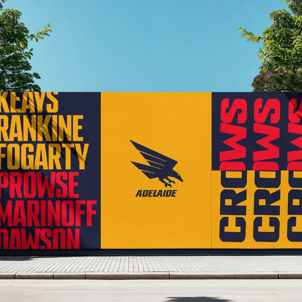
Made from South Australia: Adelaide Football Club unveils bold brand for a new era via Fuller

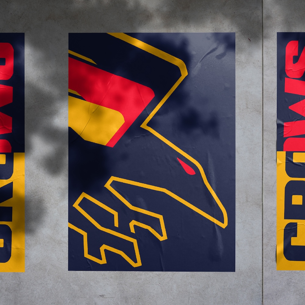
The Adelaide Football Club has unveiled a reimagined brand identity developed by Adelaide-based independent creative agency Fuller Brand Communication, presenting a fresh vision for a new generation of South Australian football fans.
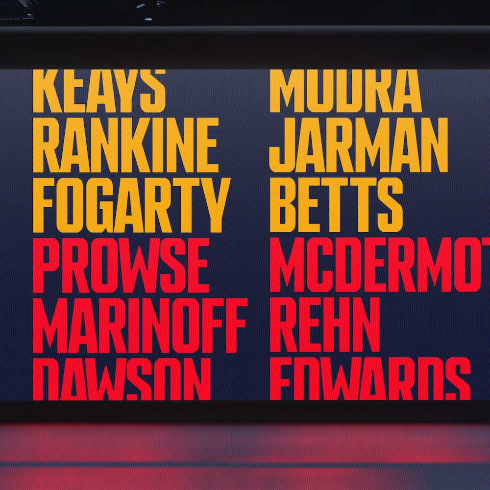
This revitalised brand, which includes a redesigned logo, cohesive style elements, and a custom font, combines the legacy of South Australia’s first AFL team with a striking, future-ready visual identity that delivers the flexibility essential for a modern sporting club.
The significance of rebranding the Adelaide Football Club was not lost on Fuller Brand Communication’s Managing Director, Will Fuller: “We’re a proud South Australian agency, and many of our team are passionate supporters—we know how much this brand means to people across the state.

“The Crows belong to a unique group of AFL clubs created to represent an entire state, not just a small area—they are the Pride of South Australia.
“The statement ‘Made from South Australia’ is a simple but powerful expression of the deep connection between the state and the club, and speaks to the many elements that they share, including its name, its colours and its symbols.
“This foundation is woven deeply into the club’s identity, and we wanted to develop a brand that honours this pride while also providing an expressive, adaptable, and enduring look.”
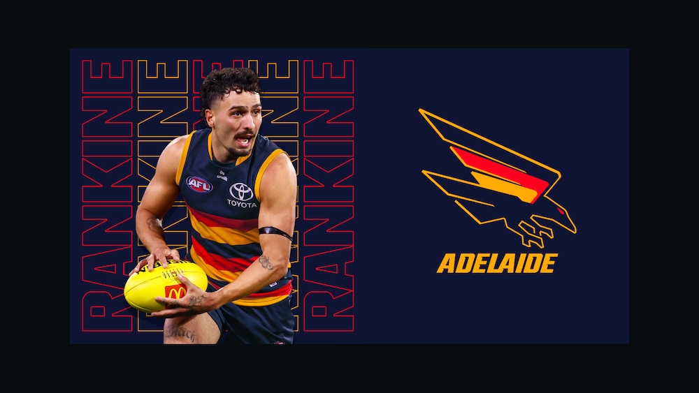
At the heart of the redesign is the return of the iconic ‘swooping crow’ from the original 1990 logo, now reimagined with a bold, minimalist twist. The crow features a tri-color wing, inspired by the shape of South Australia, symbolising the club’s strong connection to the region.
The core colours have also been refreshed to reflect South Australia’s state colours and the original guernsey, featuring a deeper navy, brighter red, and richer gold.
The custom NinetySeven typeface, a tribute to the club’s first premiership, combines traditional hand-painted Australian Rules Football lettering with sharp, angular forms that reflect the crow’s aggressive aesthetic.
To ensure the brand resonated across the fan base, Fuller led an extensive consultation process that included brand workshops, focus groups, presentations, and surveys.
“We engaged over a thousand stakeholders, from players across all three teams to staff, former players, and members and fans both in South Australia and interstate, involving them at every stage,” Fuller explained.
“Their feedback played a huge role, and their words can be seen throughout the brand messaging.”
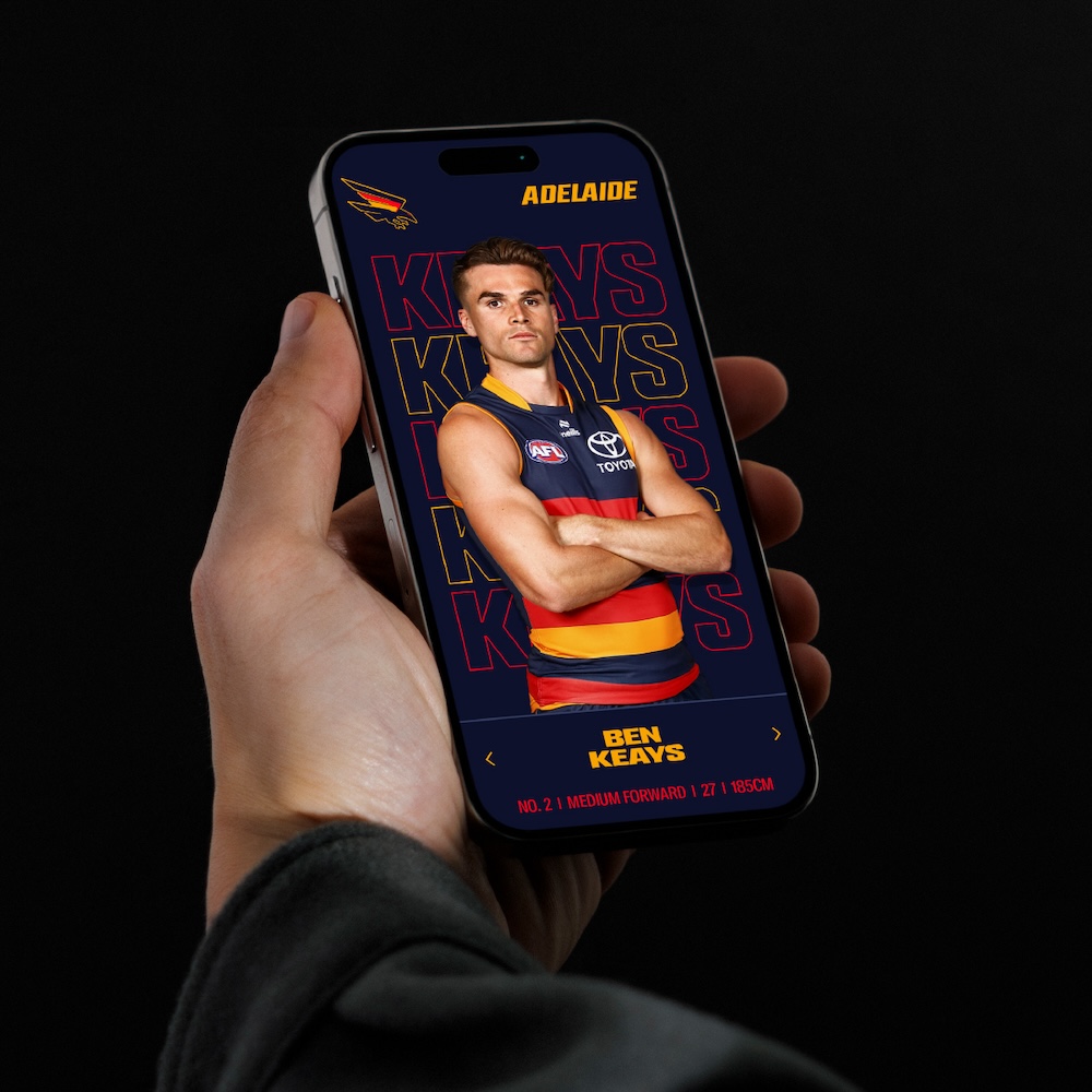
To celebrate this exciting new chapter, Fuller also produced a suite of videos, including a brand film that includes playing vision and Crows fans to capture the club’s rich heritage and its connection to the South Australian community.
Adelaide Football Club CEO Tim Silvers said the alignment between the agency and club was central to the success of the new brand: “The team at Fuller are as passionate about South Australia as we are and from the outset, they really understood what we were about and what we wanted to achieve.
“Their creative, thorough approach and discretionary effort meant we had a high level of confidence throughout the process, from the consultation and design phases through to the rollout.
“This was so important given the intense scrutiny and attention our Club, and the football industry, receives. We are really proud of the finished product.”
2024 has been a landmark year for the independent creative agency. Highlights include partnering with global agency Lippincott to provide local insight, creative support, and roll-out assistance—including film, print, and photography—for the new Adelaide University brand. Fuller also provided strategy, identity design, and research for the rebrands of Wine Australia and Morphettville.
Full case study of the Adelaide Football Club rebrand can be found here.
