Macca’s brings back the classic Big Mac chant in #TheOriginalMouthful campaign via DDB Sydney
The world’s oldest burger chant is back with an incredible homage to its trip through time for old and new generations of Big Mac fans – proving that the Big Mac is truly ‘The Original Mouthful’.
McDonald’s Australia, DDB Sydney and OMD have partnered to reintroduce the iconic Big Mac chant in the first phase of a fully integrated campaign, featuring a TV campaign and innovative out-of-home executions, launching today.
Big Mac lovers from the ’70s, ’80s and ’90s will fondly remember the classic chant: “Two all-beef patties, Special Sauce, lettuce, cheese, pickles, onions on a sesame seed bun.” That legacy of love will be brought to life in a film from DDB Sydney called ‘TheOriginalMouthful’ that pays tribute to how loved Big Macs were throughout the decades and how the chant entered the Aussie vernacular.
The TV campaign directed by Revolver’s Leilani Croucher leans heavily into the Big Mac’s 56-year legacy. A 60-second hero film takes burger fans all the way back to 1968, when Big Mac creator, Jim Delligatti, initially devised the now iconic burger. The film then travels through the Big Mac’s evolution across the decades, showcasing just how the burger and its ingredients have stood the test of time.
The campaign draws on DDB’s rich creative heritage – the original Big Mac chant ad campaign was developed by DDB’s then creative leader, the legendary Keith Reinhard, who is still Chairman Emeritus of DDB today.

Says Matt Chandler, executive creative director, DDB Sydney: “Bringing the Big Mac to a new generation was an awesome task. It’s an icon and part of Australian culture – it’s The Original Mouthful.
“The launch film was shot and crafted with excruciating attention to detail, ensuring every decade was brought to life as though it had been found on a shelf in an archive. From the wardrobe and propping to the speech patterns and performances of our talent, everything was lovingly recreated to give that innocent and infectious feeling of fun you get trying to nail the chant.”
Says Samantha McLeod, marketing director for McDonald’s Australia: “The challenge of introducing a new generation of Aussies to the Big Mac and the much-loved chant was something we did not take lightly! Australians love their Big Macs and we’re really thrilled with this campaign from our agency village – it’s McDonald’s ‘feel good marketing’ at its best and there’s a lot more exciting stuff to come, so stay tuned.”


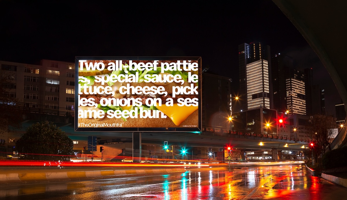
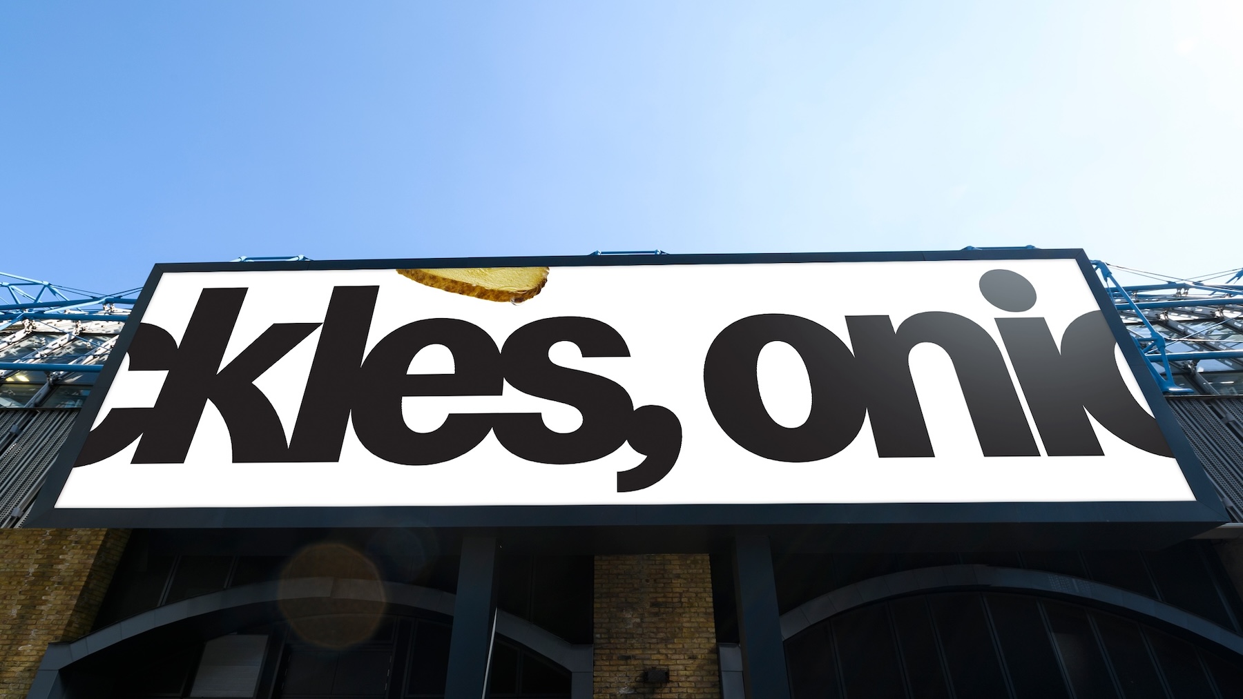
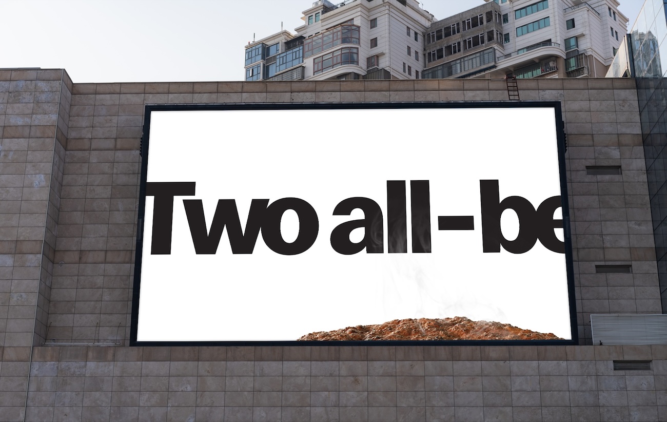
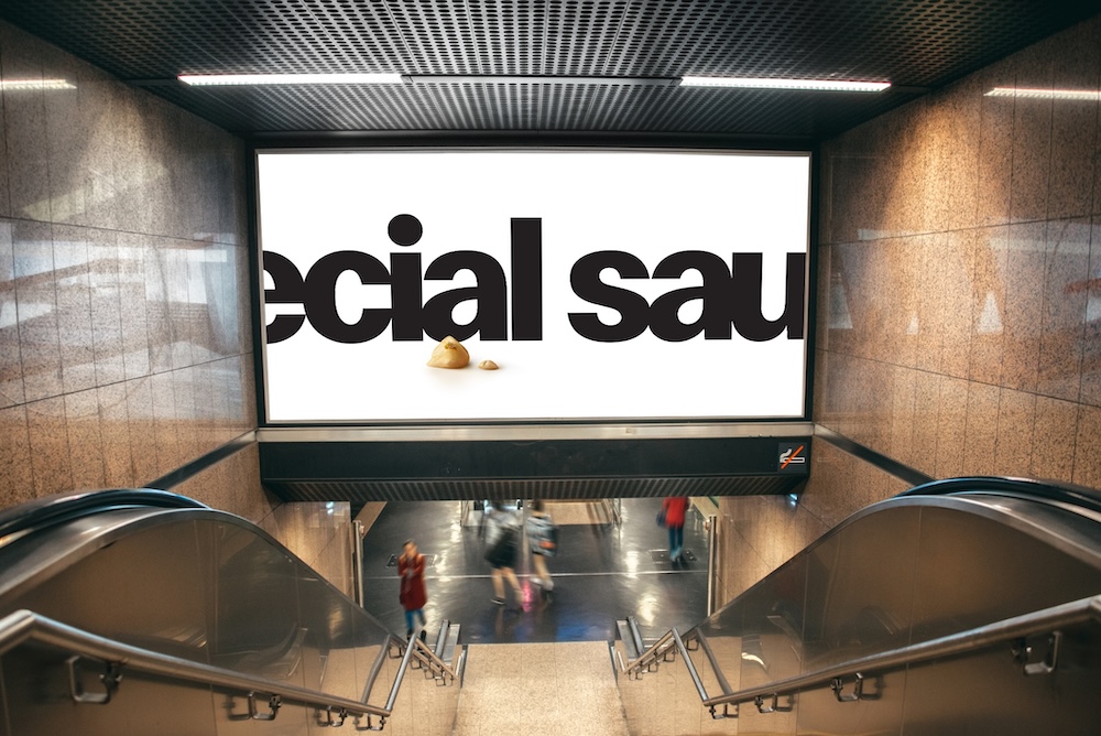
To prompt Aussies to get into the chant, a large format digital out-of-home campaign integrates the lyrics of the Big Mac chant into a delicious, macro shot of the Big Mac. A teaser out-of-home campaign launched on 28 March featuring snippets of TheOriginalMouthful.
The new campaign is rolling out across April, featuring on TV, online video, out-of-home, radio, digital audio, social, print, POS, PR, influencers, and partnerships with more innovative elements to launch soon.
Play the 60 sec radio teaser:
Client: McDonald’s Australia
Chris Brown – Chief Customer Officer
Samantha McLeod – Marketing Director
Liz Whitbread – Senior Brand Manager
Luke Elzerman – Experience Optimisation Manager
Chloe Brannagan – Brand Manager
Creative Agency: DDB Sydney
Stephen de Wolf – National Chief Creative Officer
Matt Chandler – Executive Creative Director
Cam Hoelter – Group Creative Partner
Stephanie Allen – Senior Copywriter
Andrew Torrisi – Senior Art Director
Paul Jansen – Senior Designer
Sophie Hackett – Junior Art Director (Social)
Amy Morrison – Junior Copywriter (Social)
Mandy Whatson – Group Managing Partner
Adam Blaynee – Group Business Director
Chloe McIvor – Senior Business Manager
Rene Shalala – Executive Producer
Katharina Wynne – Strategy Partner
Katy Andrews – Director Social and Content Strategy
Production Company: Revolver
Director – Leilani Croucher
Managing Director / Co-Owner – Michael Ritchie
Executive Producer / Partner – Pip Smart
Senior Producer – Serena Paull
DOP – Andrew Commis
Production Designer – Damien Drew
Costume Designer – Sophie Fletcher
Post Production: ARC Edit
Executive Producer – Daniel Fry
Producer – Sally Quade
Editor – Elise Butt
Colourist – Edel Rafferty
Online Artist – Richard Lambert
Online Artist / VFX – Patrick Campbell
Sound & Music: Smith & Western Sound
Nick West & Dan Higson
Casting: Citizen Jane Casting
Media: OMD
Emily Bosler – Head of McDonald’s
Zoe May – Head of Strategy
Catriona Oran Barthram – Head of Comms Planning
Brittany Meale – Strategist
Taylor Hilditch – Account Director
Anna Heslop – Senior Account Manager
PR & Influencer: Mango
Tabitha Fairbairn – Managing Director
Ashleigh Vallance – Senior Account Director
Nada Duyker – Account Director
Sidney Balfour – Senior Account Manager
MyMacca’s app and POS: Akcelo
April Tunstall – Business Lead
Melanie Tozer – Senior Account Director
Alex Kostiouk – Senior Project Manager
CRM: Digitas
David Huang – Account Director

36 Comments
Awesome work Steph & Torrisi.
The timing of this and the British Airways outdoor is uncanny.
It is so good to see well established brands play and entertain people. That’s what great brands do!
I do not think you can fault this.
Other big established brands take note!
Ship it
You think this is the same level as British Airways? What are you smoking?
Outdoor is particularly great
So well executed – and love the OOH. Art director on point.
Love the nostalgia. Love the craft. Big congrats to all involved.
Nick and Dan nailed the music. Very clever
Love the outdoor.
One tiny mistake. Until about the mid nineties Big Macs came in those horrifying styrofoam containers…
…..there is an old school styro box in the 80s burger scene
super simple. can’t wait for the promo part, assume that’s coming like the original campaign, wonder how they’ll operationalise that at maccas now. good one ddb
Looks, sounds and tastes great.
Average ads, burgers getting smaller, prices going up, and supporting the IDF. Just another day for Maccas.
Very nice guys. Lovely OOH
Looks, sounds and tastes GREAT. Well done guys.
DDB first brought back the Big Mac cheat in the 1990’s.
It worked then and it works now.
Nicely put together.
DDB campaignbrief crack team, assemble!
The film is unbelievably boring, but the OOH is outstanding. Makes me wonder why a client who could clearly be so bold with the outdoor, could be so crippling safe with the film. Maybe it was a trade off … “We’ll do whatever humdrum crap you like for the main piece, so long as you let us enter the outdoor without any logos.”
This is honestly, probably the best ad I’ve seen ever.
Is there always a ‘Yeti’ among the commentators?
Get lost.
Epic work from all and the dream quad – Steph, Torrisi, Sophie and Amy!!!
Tasty work from all involved – especially from the dream squad Steph, Torrisi, Sophie and Amy!
No one, outside this comment section, will understand the OOH.
Sorry lovies!
Lots of back slapping, patty flapping, cheese splatting, hi5 clapping DDB comments here.
the outdoor work? I think people wont know its McD. I saw it before I knew it was a McD ad and I had no idea. It doesnt have quite enough visual cues – a la BA. I honestly feel 50% of people wont know what its for.
It takes a brave and confident client to run OOH like this. I think it’s great. Big, bold and crafted perfectly while resisting the temptation to over play it. I don’t need a logo to tell me who it’s from. Shame the people here questioning it aren’t brave enough to ever present work like this to their clients.
It’s not brave to present work that won’t work for your client. The BA work had its product at the heart and was subtly branded. No one walking to the train at 8 in the morning will know what ‘ecial sau’ is without more of a hint, no matter how badly you want to think they will
You’re making assumptions. How do you know it won’t work? Because some old school book about branding, key assets, memory structures from the 80’s told you? Or was it some research company pulling out some graphs in PowerPoint.
I like your thinking though, it lets others rise to the top.
Are we all looking at the same ad? The art direction on this is horrific!
‘Horrific’ that’s overkill. A word intended to hurt and nothing else . Not saying it’s the best I’ve seen but the craft and attention to detail is there. It’s pretty damn good. Food photography is on point. Cropping is considered. Typographically it’s bold and stands out.
Great stuff Andrew and Stephanie – loved keep your eyes on yer fries – i’ve noticed Pepsi has gone back to their retro logo too and it’ll work.
everything about this, 10000000000/10.
Nice work.
Where’s the bit where you get a free Big Mac? That’s the whole idea of the original chant.
Looks like we’ve got someone who actually speaks the truth and isn’t just in it for the money.