Lenland launches new campaign + branding for its mixed residential offering Synergy via Toast
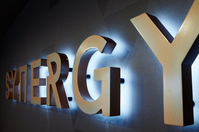 Sydney branding agency Toast Creative was commissioned by property developer Lenland to conceive and produce the marketing campaign for the launch of its highly anticipated mixed residential offering, Synergy, located in Hornsby.
Toast’s full scope campaign includes Synergy’s naming and branding in addition to its dedicated display suite, brochure and sales book, direct mail, press advertising and website design and development.
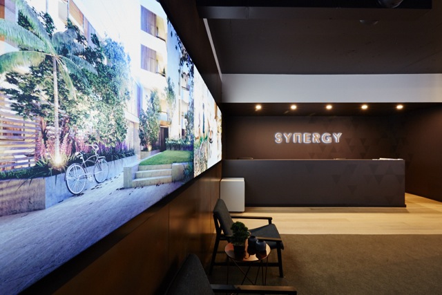 Toast set out to fully understand the development’s target market and the area’s benefits to create a suite of marketing tools to convey the key selling points to prospective buyers and investors, with the aim of achieving solid off-plan sales.
The team commenced the Synergy project with a strategic phase before progressing with the naming process 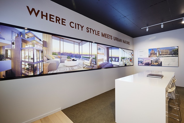 followed by the development of creative concepts for the brand, which are applied across all brand communications.
Says Benny Deng, managing director, Lenland Property Development: “Toast brings extensive experience and considerable knowledge in property marketing. Nick and his team have a particular creative sensibility and 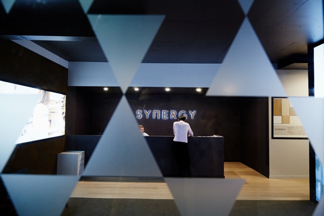 market understanding that marries with the industry’s needs. We are extremely pleased with the creative outcome of Synergy which reflects the quality of the build and its uniqueness in the Hornsby area.”
The Synergy brand is a modern and stylish brand identity that translates with sophistication across all marketing communications. Its 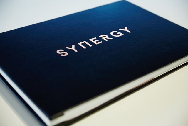 organic, bronze palette and geometric typography reflect the intersection of urbanity and the location’s natural surrounds. Meanwhile the name itself – Synergy – connects the development’s two towers, east facing ‘Urban’ and west facing ‘Aspect’. While many developments focus on tranquillity, Synergy is unapologetic in its focus on the dynamism on urban living and all
 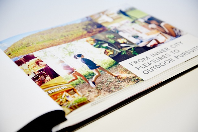 that city living has to offer.
Says Nick Sammut, managing director, Toast Creative: “Synergy is another property marketing project that showcases our diverse industry expertise. We’re confident this development heralds a new chapter in Hornsby’s property market and that our creative articulation of the brand is entirely consistent with the area’s evolution.”
Nick Sammut, Managing Director
Natasha Marsh, Group Account Director
Tremaine Kingi, Project Director
Ross Davison, Creative Strategy Director
Rachel Batty, Designer.
Developer – Lenland
Architects – Architecture Saville Isaacs
Real Estate Agency – CBRE

4 Comments
Isn’t the name synergy the most overused and unimaginative team name from the apprentice TV series? Hornsby is a great spot for urban meets suburbs but I can’t help but feel the ‘contemporary’ ‘matrix’ styling is a a bit 2000. Sorry!
Design is unimaginative and dull. Logo is too techno for property branding.
Doesn’t look exciting at all. Very standard run-of-the-mill stuff. Big yawn.
Lenland deserves a campaign that says “do not trust us, we do not deliver”.
http://www.domain.com.au/news/seven-more-buyers-in-the-castlereagh-discover-onebedroom-units-are-now-studios-20151021-gkef99/