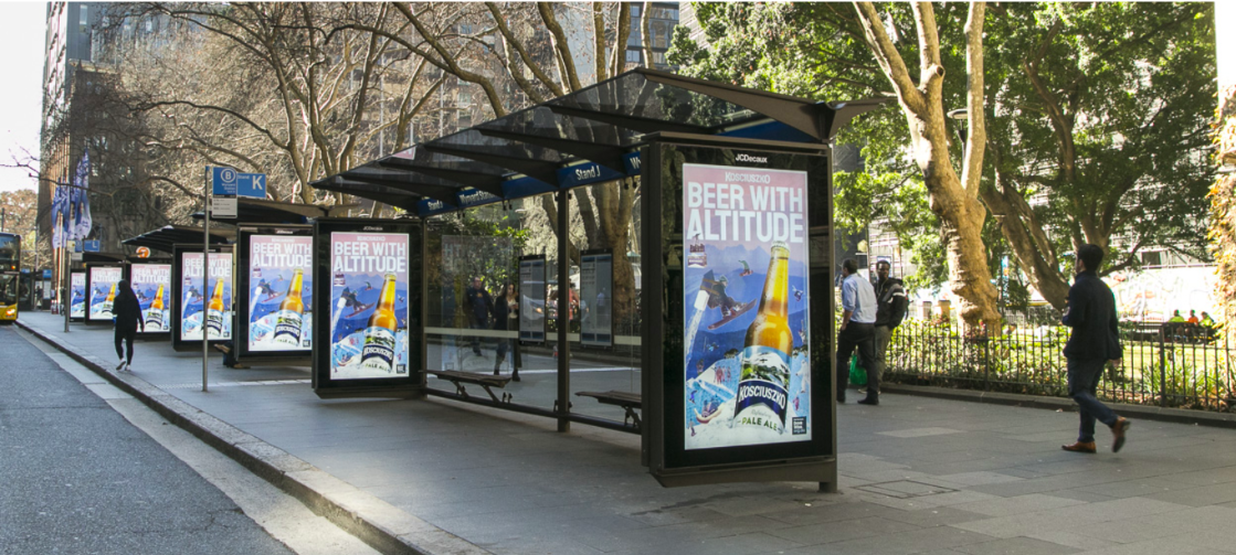
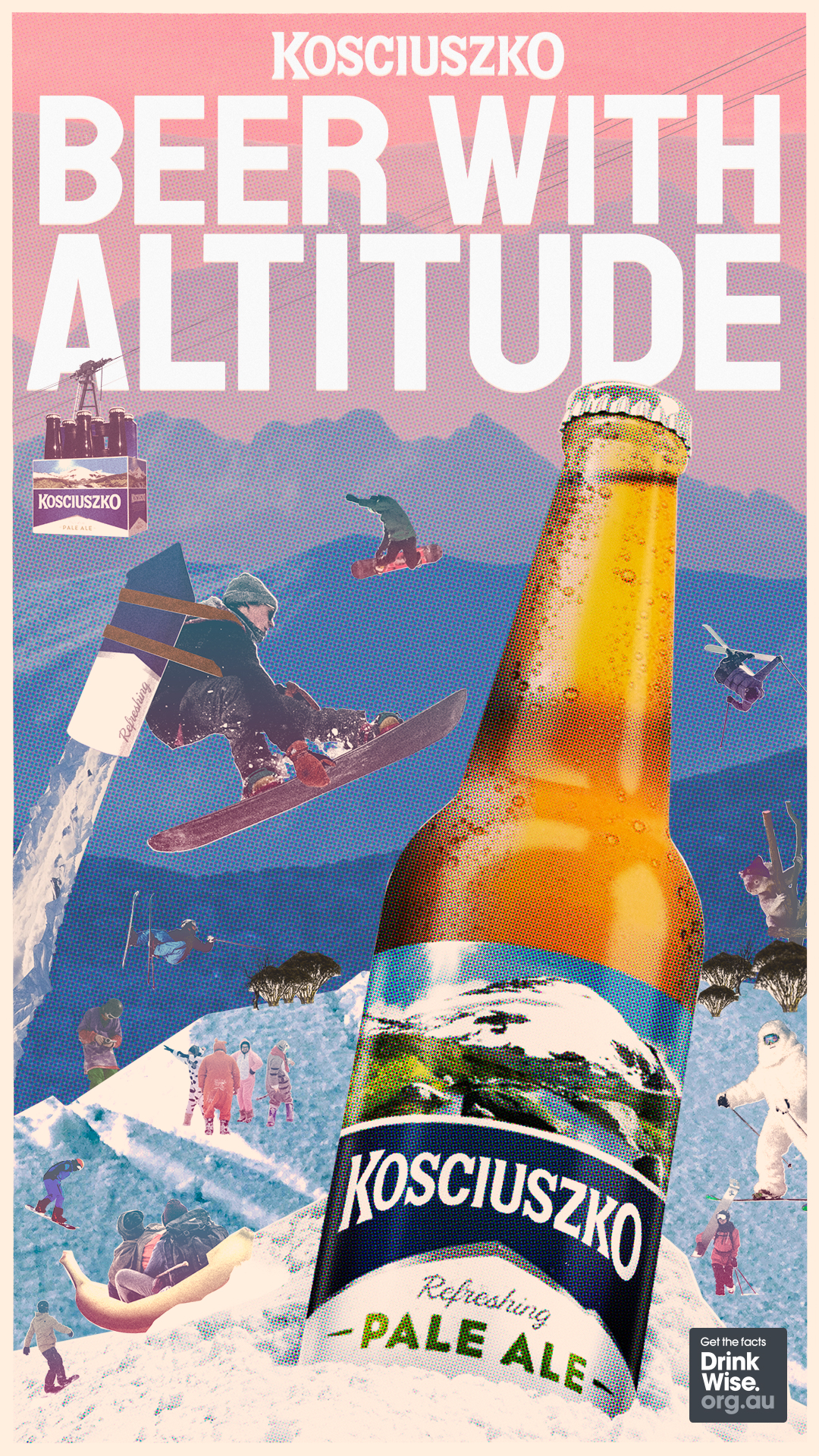
Kosciuszko Pale Ale launches new ‘Beer with Altitude’ brand campaign via 72andSunny, Sydney
72andSunny has launched its first work for Lion, with a brand launch for Kosciuszko Pale Ale.
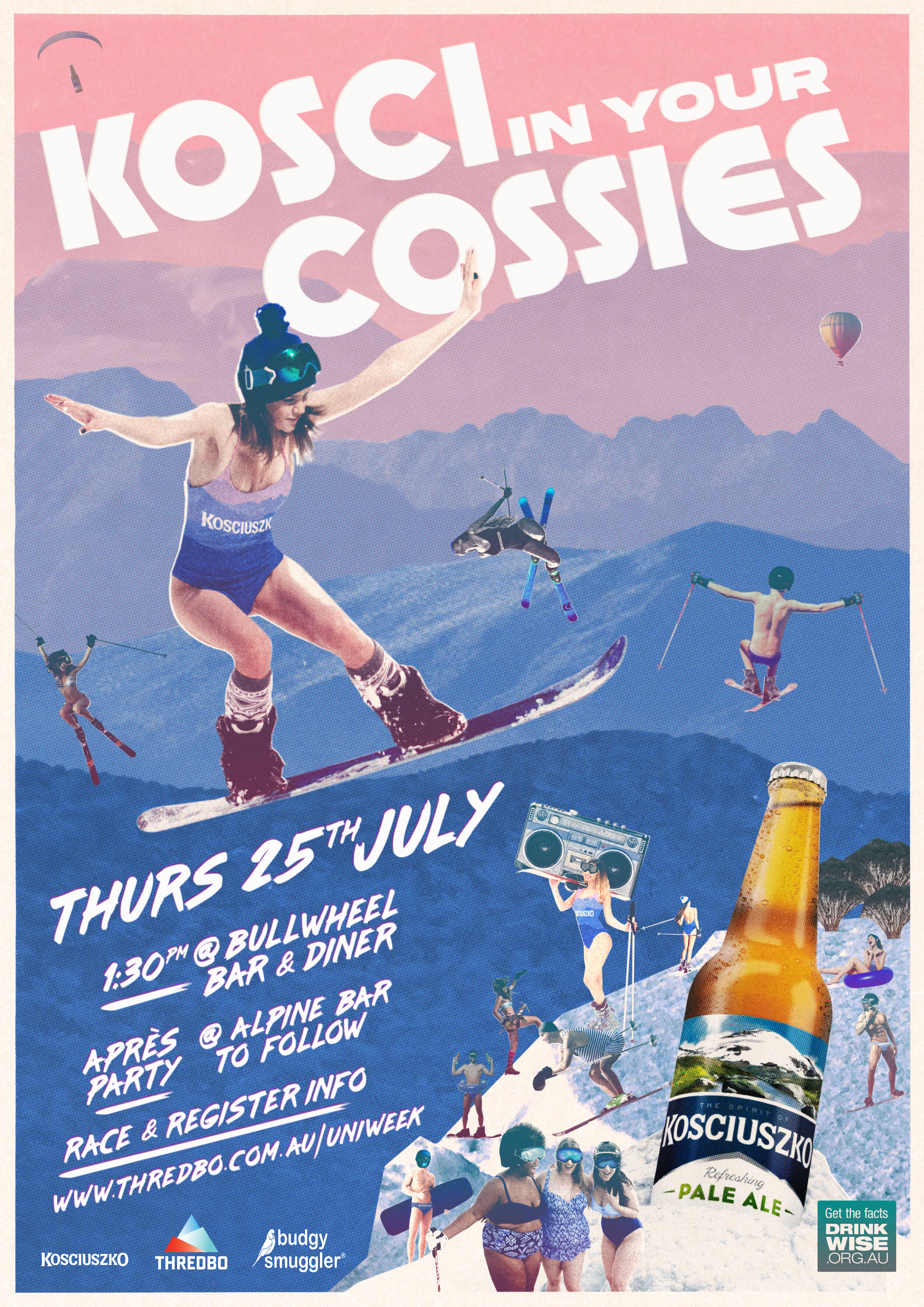
This is Lion’s first focused marketing campaign for the brand, and 72andSunny created the brand aesthetic, design and comms, including film, social and OOH.
Says a spokesperson from 72andSunny: “The 72andSunny team has collaborated effortlessly with the Kosciuszko brand team in producing a new aesthetic and way of bringing the Kosci spirit to life. We are looking forward to the next phase of this fantastic partnership.”
Says Malcolm Eadie, director of craft at Lion: “We are absolutely thrilled with this new creative for Kosci from 72andSunny. It truly encapsulates what the brand is all about and it is fantastic to kick off its first ever marketing campaign.”
Client: Lion
Agency: 72andSunny, Sydney
Production: Alt
Director: Stefan Hunt
Media: UM


35 Comments
This looks rad.
I like this. Different to the usual beer ads. I can’t wait to see what other kind words our industry has to offer about someone at least trying to do something different.. Well done Lion!
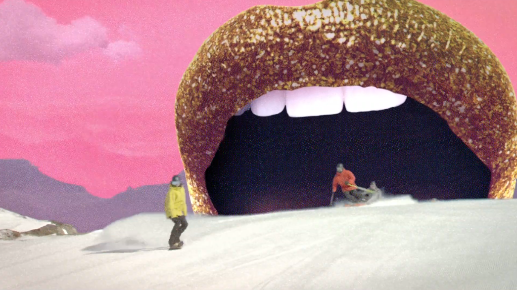
I love those glitter lips. This is fun work. Well done guys!
Nope.
Best Lion work so far this year…..congrats 72.
Great work team 72.
Loving how wild this is. Kosciuksuksjksko finally has a TOV. Nice.
Like it. Great line. Well done
Great fun work.
Get very defensive before the comments are in.
Have you been hurt in the past?
shame the master branding and packaging is so off tone for the pop style ad.
but , nice to see a creative agency do something really fun unlike the same ol shit great northern do or the cub brand stuff….masculine tripe.
Enjoyed watching this. Nice stuff!!!!!
This is what happens when all your creatives leave and you’re forced to downsize and relocate to Manly.
Not great.
I quite like this actually. Only question I have is, do they literally ‘jump the shark’ during the ad? And is that meant to be ironic, or meta?…. (Not being critical, just genuinely cannot work out what they are trying to say with that bit).
But overall, great line, looks rad, gives the beer a tone and personality.
Takes a sip….ahh
Reminds me of the good old days when we used to try different art directions.
The quest to be ‘digital’ has made a lot of stuff look same same lately.
This is refreshingly different.
Rad?
C’mon,it’s horribly dated and crudely crafted.
…..of a low budget art school project.
You couldn’t get more digital than this art direction,
completely cut and pasted together by a millenial with basic photoshop skills.
Looks brilliant guys. Well done.
I quite like it.
Sure, not the biggest budget, but it will definitely stand out.
As the beer grows, i’m sure the budgets and creative will too.
I will say, i am not a big fan of the punny line however.
All in all, a pretty good effort. Haters prob being forced to make wallpaper.
Definitely get noticed and probably sell a bottle or two.
But the standard of beer advertising has become so bad thanks to ex P&G marketeers that this seems good.
Which it isn’t, but for these days it is.
So, so bad.
##### with attitude is so generic!
Surely at some point this office doesnt get to use the 72&S name anymore?
That Copywriter needs a cuddle. That line doesn’t sound like it was consensual.
For Lion, in Australia, this campaign is a win. Simple as that.
Feels dated, looks cheap. A desperate attempt that’s missed the mark. Moving forward, the line can be explored further and could lead to better things.
Can the suits at 72 please stop commenting on their own work.
We know who you are, Okay?
the work is awful. The line worth keeping.
it looks like what Super Dry was doing 3 years ago with ‘never settle’
This will sell beer, to the target market. I’m sure anyone giving this campaign a rough go doesn’t fit that market anyway.
I’m the target market.
Your ad is shit.
I can’t remember a recent beer ad better than this so it’s doing pretty good.
The market being beer drinkers right?
Ehh this ad is a bit weird, kozzies were a craft beer not playing the trendy hipster card, which is outdated now… and this plays right into that.
This ad doesn’t weigh up with the $13 per pint pubs sell it at. If you have an expensive product, don’t have a cheap looking ad.
It’s a damn good beer, and it was cool because it didn’t have attitude. Slipping in a pun beside the point.
This is rubbish. Pure unadulterated shit. Sorry 72. You have produced nothing but garbage here. Apart from that dog spot. Which CB ruined by giving away the punchline in their announcement.