Kern in hell: R/GA New York creatives launch hellish font ‘Hellvetica’ for Halloween
October 29 2019, 11:11 am | | 14 Comments
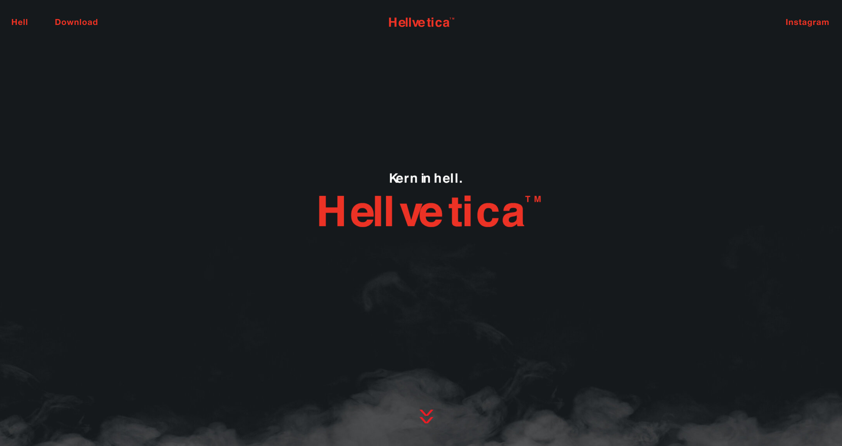
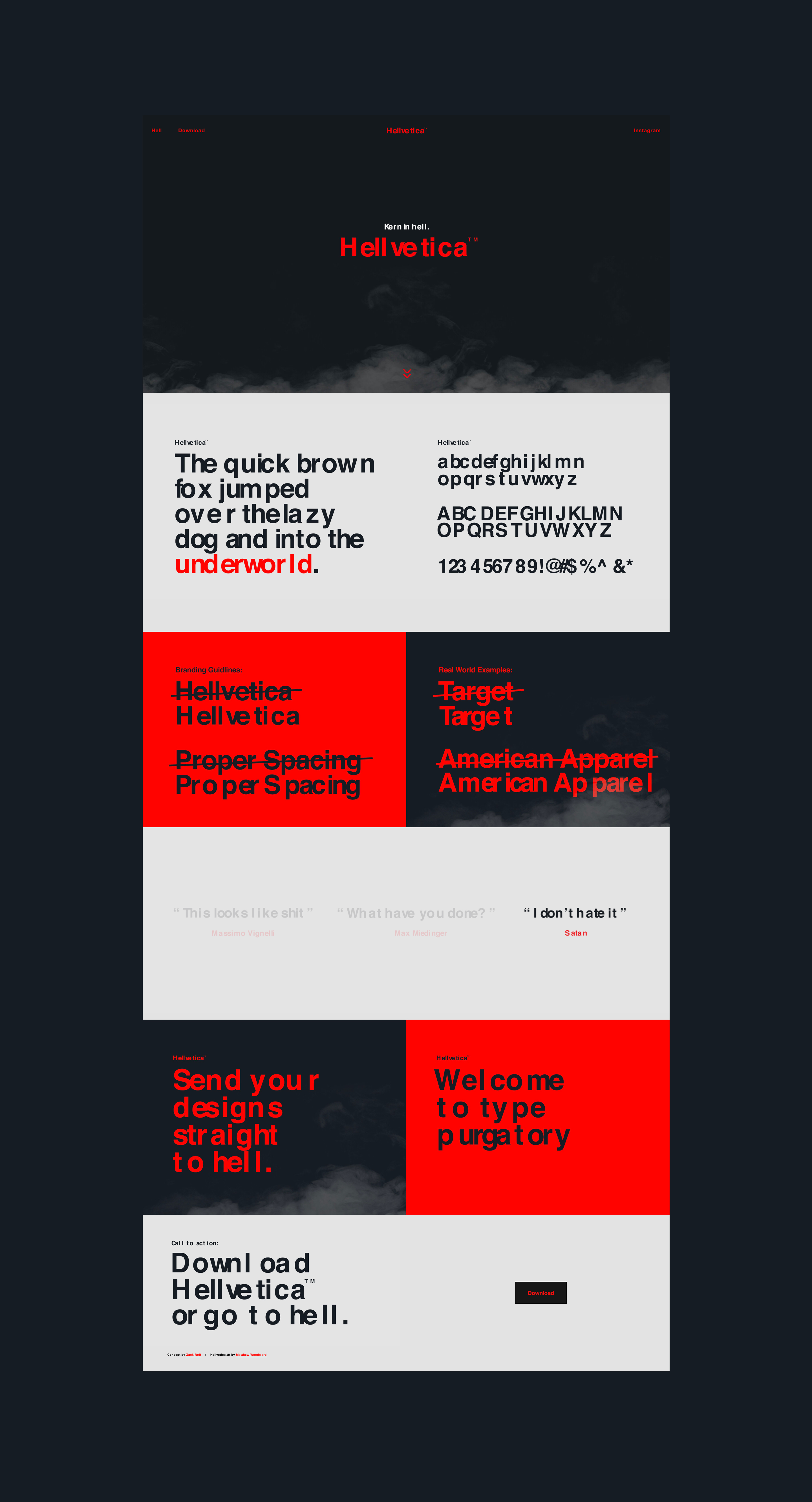
A group of creatives at R/GA New York, including Aussie expat and former TBWA\Sydney copywriter Chloe Saintilan, have created and launched ‘Hellvetica’.
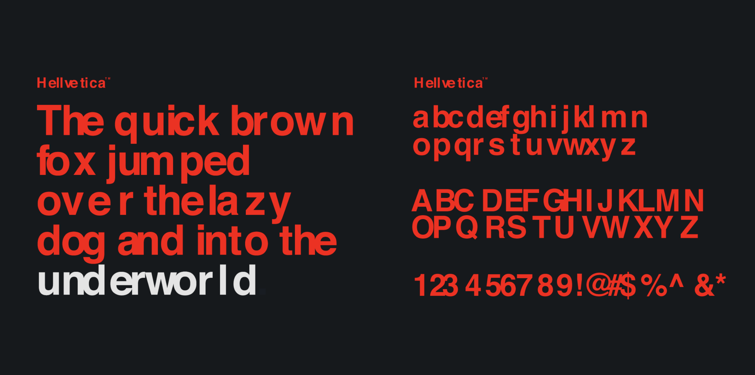
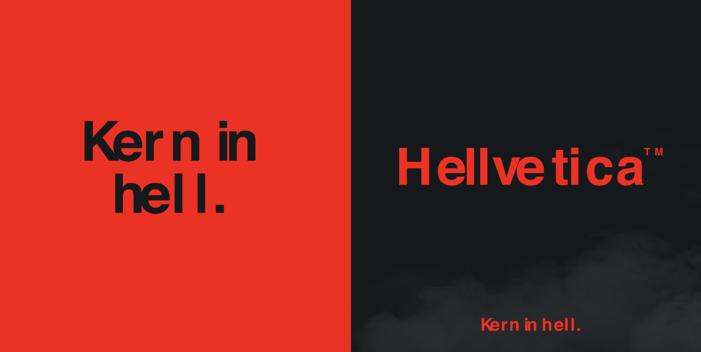
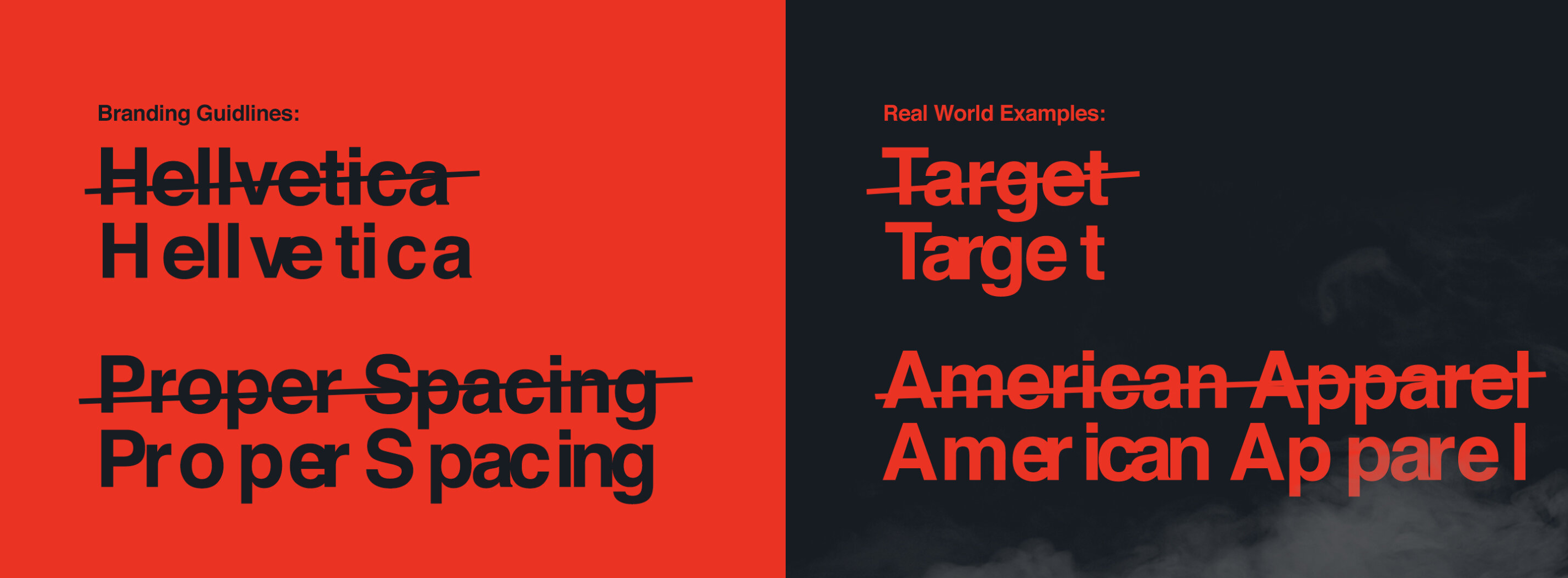
Hellvetica is a hellishly kerned version of the iconic Helvetica font, which looks absolutely awful.
The font was developed in the spirit of Halloween and has launched with its own website where anyone can download the typeface.

14 Comments
Like.
URGH! Ad agencies talking to themselves again.
We’ve been to hell and back since you left.
Yeah ok, right.
The typographic equivalent of a pun.
So pleased it took a whole team of them to create this.
I’m pretty sure I’ve seen this exact idea before, and the critique is the same: the bad kerning is way too obvious. I think a more subtle effect (such that average Joe wouldn’t notice it) would drive us more truly and deeply insane. With the typeface released into the wild we could be sniggering for years to come as people continue to unknowingly use it, noting that actual Helvetica is difficult to acquire
Funny!
L OVE IT ! !!
Oh – this idea again. Rolling my eyes. It’s a type pun as old as letterpress.
I can’t believe these guys spent all this effort without even seeing if it’s an original idea.
A cursory google search shows another version done in 2017.
https://www.behance.net/gallery/51109969/HELLVETICA-A-New-Free-Font
2014:
https://profont.net/family/hellvetica.html
2010:
https://beccalieb.com/Evil-Fonts-1
If you keep looking, there’ll be more.
Yes the name already exists but the overall concept itself is worn and predictable.
https://i.imgur.com/4tBNA0w.jpg
At least show some initiative!
https://i.huffpost.com/gen/2384998/original.jpg
How is anyone supposed to reverse engineer this joke?
I’m standing in the street and see a badly kerned headline.
“Hey that’s a shit looking sign”
“It looks like hell.”
“It looks like hell and its Helvetica”
Oh it must be Helvetica”
“Hahhahahah…. those typographers are up to their tricks again, they just slay me every time…”
Our fishbowl is so small when we start shitting on this kind of stuff…
Sounds like an ad for a design role at RGA Sydney right now.
You have just won the internet. Not only is that amusing, its actually true.
Will the last one at R/GA Sydney turn off the lights.
The first time I saw it.