Kathmandu launches new global campaign ‘Come Find Us. We’re Out There’ via Motion Sickness
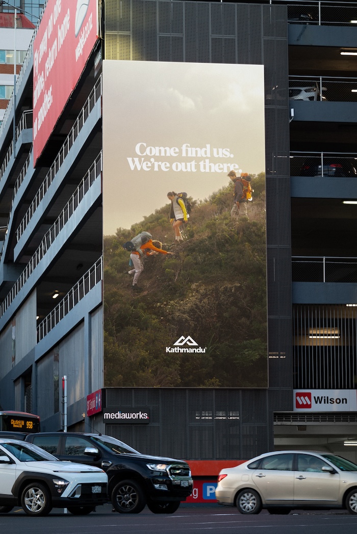
Come find us. We’re out there. – Kathmandu’s new evergreen brand campaign – explores the transformative power of nature, including the endorphin increasing experience of being in the wilderness. Wanderlust cliches aside, Come find us. We’re out there. is an invitation to feel that thing that happens inside, when we go outside.
The first collaboration between Kathmandu and NZ creative agency Motion Sickness establishes a new direction for the brand.
Says Jo O’Sullivan, general manager of marketing, Kathmandu: “Come Find Us. We’re Out There. sets a new tone for our brand, leaning into what made us fall in love with the outdoors over 30 years ago. It’s the peace, connection and meaning we discover while out there, and this campaign invites our community to join us in experiencing that together.”
The campaign was shot entirely on Aotea Great Barrier Island and in partnership with the locals. Leaning into Kathmandu’s new Zealand heritage, the Island showcases the ruggedness and realness of New Zealand’s wild spaces, and the people embody being ‘out there’ in its truest sense: off the grid, amongst the elements, and in harmony with the land.
Says Hilary Ngan Kee, head of strategy, Motion Sickness: “This is an iconic brand from the bottom of the world, and the new campaign lays the foundation for the future. We’re just getting started, with exciting plans to activate this new direction in unique ways over the next few years. We’re excited to see where the Kathmandu brand can go.”
The hero film is guided by Aotearoa radio icon Kim Hill, whose unmistakable voice carries audiences on a journey into nature, pondering and unpacking how being outside changes us. Accompanying Hill’s voice over is bespoke sound design constructed from live recordings on the island, by talented Auckland-based music producers
Says Sam Stuchbury, ECD Motion Sickness: “Kathmandu, Great Barrier Island, and Kim Hill all have a special place in many Kiwi hearts. The combination felt like a magic formula for resetting the brand.. The north star for this campaign was making nature, and the experience of it, our hero. It’s about being out there, getting mud between your toes, and knowing you have a good pair of Kathmandu socks to warm them up in.”
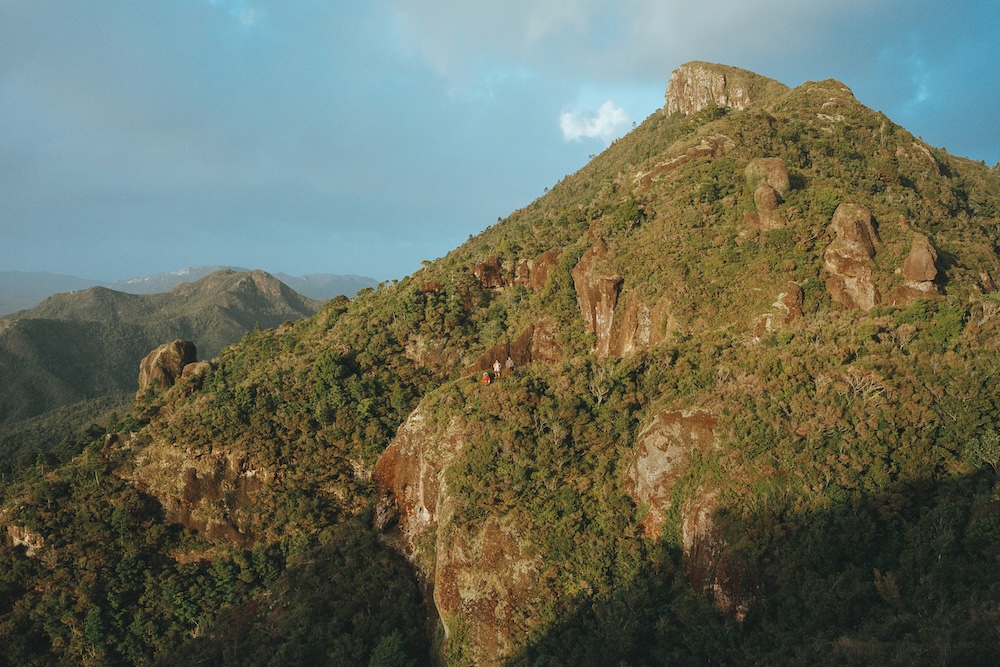
Complementing the film is two suites of imagery, shot by US-based photographer, Jerry Buttles. The hero suite was inspired by timeless National Geographic covers, framing people amongst vast and varied landscapes of Aotea Great Barrier, and shot on a mixture of 35mm film, 120mm film and medium format digital.
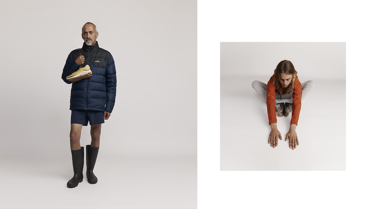
The second suite features nine Aotea locals (of 150 who applied to be part of the campaign), wearing new season Kathmandu gear. Shot at the Island’s local hall, Kathmandu’s latest range is styled with the talent’s personal pieces, including a well-seasoned pair of Red Bands.
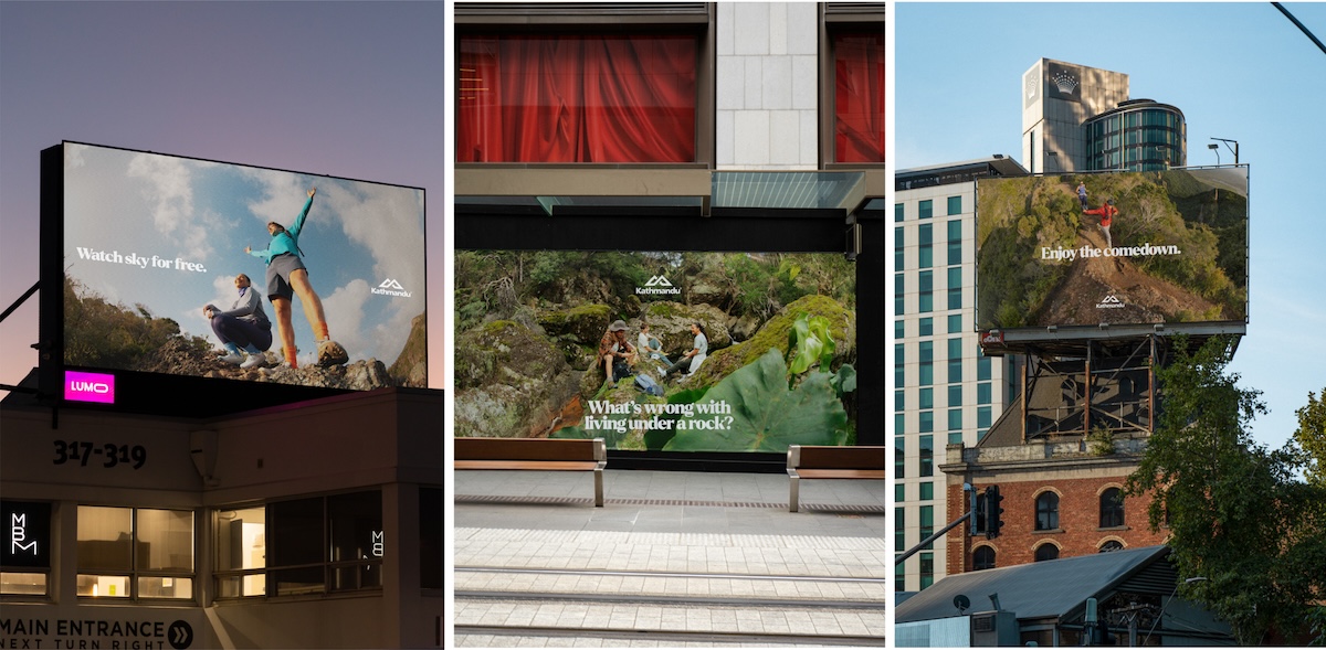
Says O’Sullivan: “This is a significant moment in Kathmandu’s brand history, and one we are proud to share. Aotearoa, and all it represents, is the essence of Kathmandu’s story, and we are excited to celebrate our heritage in all we do moving forward. New Zealand’s wilderness continues to inspire us not only to get out there more often, but also to create thoughtfully designed, sustainably made gear to help our community do the same.”
Come find us. We’re out there. is now live across New Zealand TV, out of home, online and social media platforms.
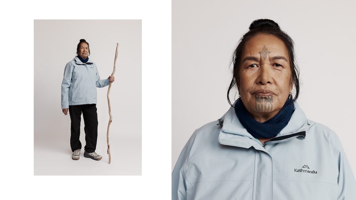
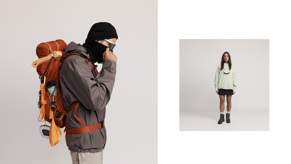
Client: Kathmandu
CEO: Megan Welch
General Manager: Jo O’Sullivan
Creative Manager: Stephen McCarthy
Creative Agency: Motion Sickness
Executive Creative Director: Sam Stuchbury
Senior Creative: Will Macdonald
Senior Creative: Melina Fiolitakis
Creative Copywriter: Freddy Riddiford
Senior Designer: Hamish Steptoe
General Manager: Alex McManus
Account Director: Joe Fraei
Head of Strategy: Hilary Ngan Kee
Head of Production: Joseph McAlpine
Head of Post Production: Jolin Lee
Video Production Company: FINCH
Sound Design & Composition: CAY Works
Photographer (Hero Campaign): Jerry Buttles
Photo Assist (Campaign): Ant Low
Photographer (Eccom): Holly Sarah Burgess
Photography (Additional): Nicole Brannen
Wardrobe Stylist: Helen Young Loveridge
Wardrobe Assist: Estelle Schuler

28 Comments
You went from a great campaign to a preachy manifesto.
I love the previous work and really dislike this.
Shame
You had something ownable and interesting. You’ve now done a category job for outdoorswear. What a shame
The brand now makes sense. Well done to those involved, simple and surely more effective than the last work…
How can you keep changing your tone so dramatically as a brand and still mean anything to anyone ? Preferred their wackier stuff.
Line has stayed the same
Message of the brand has stayed the same
What’s changed is the over-editing, post-production and ‘stuff’ creatives these days layer on and call ‘craft’
Kathmandu are the category leader, sometimes brands need to do category jobs to grow. Both prior ads were doing category jobs. Just with more bells and whistles.
I think what people liked about the last stuff was it took an outdoors brand into a fashion space with an irreverent tone.
And this is right back down to earth. Which is not to say I don’t like it. It’s nicer than most things on TV. It just doesn’t broaden the tent. That’s a really good pun so I’m going to leave it in.
This is a shambles and suggests that Kathmandu is too.
The last one didnt help sell stuff.
Their old line had a great insight. Outdoors people are fruity. The positioning line meant something. Now I don’t know what it’s saying. We’re an outdoor brand so you’ll find us outside?
The brand has had a reshuffling of team internally, which explains the shift in tone. Different priorities. Which is a shame as the old work opened the brand to a new generation of consumers.
But it’s early days for this new work and Motion Sickness are know to produce interesting and different work.
Previous work was more emotive and more distinct, not sure why it needed changing.
Back down to earth. Their last one was a lot of fun (for stoners mainly) but I doubt it moved the needle on brand or sold one extra puffer jacket. Hence, come back down to earth and hook the brand into the reason we go ‘out there’ anyway, the landscapes and the fresh air. I reckon they might even flog a puffer jacket or 2.
This is wallpaper for the category and could be for any overpriced average outdoor brand. What a backwards move. They took all the good bits out. Now all they have to say is that they are an outdoor brand and you’ll find them outside? Who approved that? Lazy as. This won’t do anything. Bring on macpac.
First miss for Motion Sickness. Had to happen at some point but it’s a shame to see it come on such a big project for such an interesting brand
I like this. I like the line and I think real people, not advertising people, will like this too.
The platform line ‘we’re out there’ was Special’s idea – not motion sickness.
I loved the BMF work. It was unique, a nice play into the gorpcore trend to appeal to a younger audience.
In saying that, if it was selling gear it would have stayed. It’s ok to miss from time to time, but when you pivot the work sometimes you go to far back to the usual category stuff as a knee jerk reaction to short term sales. I think they could have maintained the uniqueness of the original tone without throwing everything out but the line.
The original work and platform was from Special
Nice writing in the OOH and parts of the VOs.
Loved the previous work, but maybe real-life outdoor people don’t see themselves as that kooky?
I see this as a soft landing. Better than a 180.
The stills are great and love that it was produced locally with local people
The old stuff was amazing, but like other people said, it moved them into a fashion space. I think that was actually a problem, because the brand never moved with the campaign. They’re not a Salomon, or a Arc’teryx so to be fair, this campaign probably makes more sense for the audience.
Is it just me that has a problem with the line?
Should it be
Go find us. We’re out there?
this new work makes it tangled and confusing
It’s just you. And, no.
And because creatives in NZ/AU do so little of it, it shows in the work.
The “over crafted stuff” was the distinctiveness that made it recognisable and smashed sales for them. Opening to new audiences is needed to drive category growth but to also to not make it a daggy old brand.
This work is nice but weaker in memorability esp with the likes of macpac.
I guess the zoomers weren’t buying into gen-x/boomer brand then
Let’s be honest, Katmandu is a middle of the road mum-and-dad outdoors brand. The old campaign at least altered the status quo and gave them an identity. It wasn’t high fashion it was very populist Wes-Anderson visual playtime. An easy sell to most entry-level campers.
People saying it ‘failed to sell puffer jackets’, then something like this generic work certainly won’t because there’s no discernible difference between it and half a dozen competitors now.
Tell me I’m wrong here.