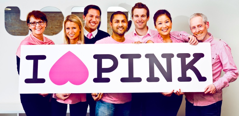
I (heart) pink logo refreshed for new Cancer Council Pink Ribbon Day campaign via Loud
 Loud, Sydney has created a new campaign for Cancer Council Australia’s 2011 Pink Ribbon Day. I (heart) pink includes print, online, POS, social media, DM and PR.
The ‘pink movement’ has become the symbol of breast cancer support both within Australia and internationally. Its’ success means that the market has become cluttered as more breast cancer charities get involved in marketing and fundraising activities.
Loud’s campaign will allow consumers to identify Cancer Council Australia as one of the lead charities supporting the breast cancer cause. Funds raised from Cancer Council’s Pink Ribbon Day contribute to vital breast cancer research, prevention and support services.
Says Joe Van Trump, executive creative director at Loud: “We have taken the iconic and culturally familiar “I heart” logo and refreshed it with a creative twist that brings the heart back to breast cancer. It is a symbol for the Australian public that can be recognised and worn with pride.
“As the campaign is to be executed across a variety of channels and merchandise, it was important that we created a confident identity, one that would immediately support and sit in differentiation from the traditional pink ribbon logo.”
Executive Creative Director: Joe Van Trump
Art Director: Mickey Madgett
Copywriter: Jim Ferron
Account Director: Dimity Atkins
Account Manager: Sam McDonnell
3 Comments
If somethings confusing, does it make sense to add more variations on the theme?
wow this is genius copy I love new york, because we’re down under turn it upside down, and turn it pink.
Actually I think the upside down heart looks like a chicks ass from rear cowgirl perspective.
I think it’s supposed to look like tits.