I Am George launches ‘I Am Bold, I Am George’ campaign via Cummins&Partners, Sydney

Pernod Ricard is launching a big and bold integrated campaign via Cummins&Partners, Sydney for wine brand I Am George.
I Am George launched in 2017 as an answer to consumers wanting something new and different in the traditionally conventional wine sector. The campaign cements the wines positioning by acting differently in the new campaign ” I Am Bold, I Am George”
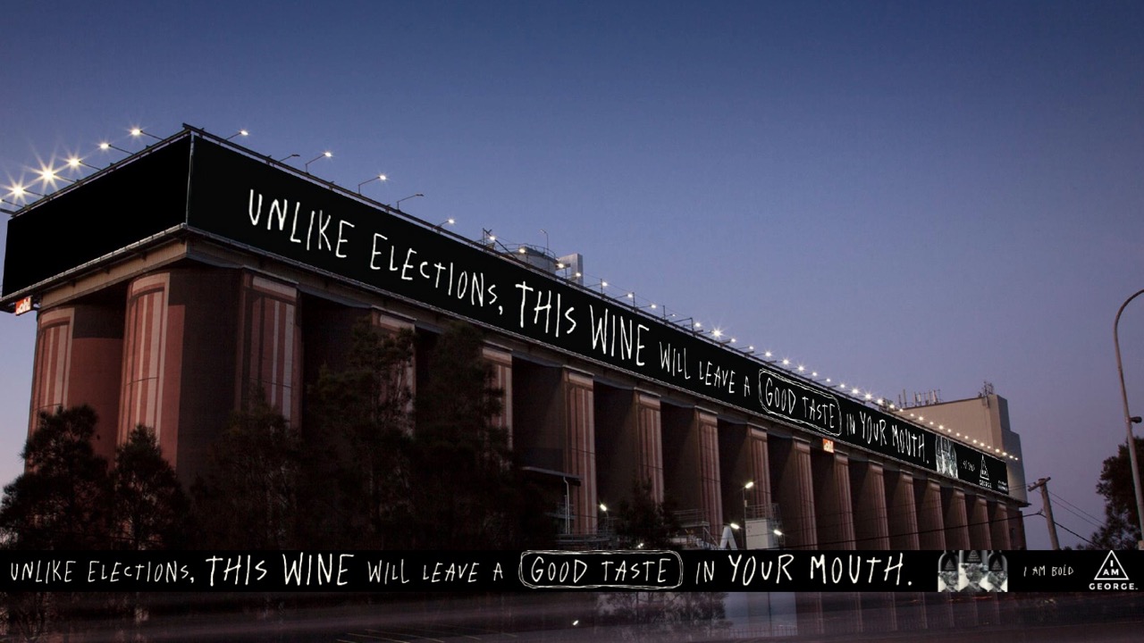
The campaign coincides with the 2019 federal election. With the brand’s above the line campaign “I Am Bold, I Am George” draws an irreverent comparable between how Aussies collectively feel about the election and their taste in wine. The billboard on Glebe Island Silos will have the tagline – Unlike elections, this wine will leave a good taste in your mouth.
Says Eric Thomson, marketing director, Pernod Ricard Australia: “I Am George has a personality unlike other wines brands. George is a great tasting wine that doesn’t take itself too seriously and isn’t afraid to break the ‘rules’ of how wine has traditionally talked to consumers. We will be making ‘Bold’ statements that spark conversations to enjoy George with, rather than boring consumers by talking about grape typicity and aromas.”
Says Kirsty Muddle, managing director, Cummins&Partners: “I Am George is a wine that challenges convention. It gives license to a campaign that can be bold and interrupt the status quo. I Am George, ‘I Am Bold’ in the first instance will culture jack the election.
Leading the campaign, I Am George will be taking over the Southern Hemisphere’s largest billboard on Glebe Island Silos from the 13th of May to the 2nd of June where it highlights the award-winning wines frank tone and quality credentials.
I Am George promotes responsible drinking.

17 Comments
This is a tricky site. People viewing your poster have only a fraction of a second to read the headline from a long way away. They might get that in a few, interrupted viewings. But they won’t be able to read the branding. Which makes the whole thing an epic waste of effort and money. it’s not a strip ad in a newspaper. It’s a poster. And posters are different.
…what caller one said
As above.. saw this while driving over the bridge this morning and had to look 4 times to catch the brand name
Ooh we hired a billboard and put too many words on it to read.
Bold? Hardly.
We forgot to put the brand on it. Oh no. Oh hang in there it is.
Waste. Of. Money.
A. It’s not effective. Too many words and zero brand (you had to put the full ad underneath the proof-of-posting)
B. Who cares? Is boldness a thing people look for with wine?
C. It’s so lame nobody will care about this. Apart from the MD of Cummins and associates or the client.
Really poorly done. No strategy, crap execution, if this wine is not on the shelves in three days time we will know why.
I’ve worked on this client a lot. Props for getting something up. Commiserations for it being so generic and shite.
It’s targeted at the myriad of passengers traveling in cars, buses, trucks contemplating what big red will best alleviate the pain and misery of their existence this evening
I fucking love the taste erections leave in my mouth.
Zero idea what it’s for.
Why would you leave the end panel blank? Wouldn’t you at least put the brand / logo there?
Could’ve at least turned the bottle sideways so you know, we could see it…
Poorly branded, ill conceived, badly timed.
Lets break it down.
The complete wrong format (landscape), for a new brand with zero brand recognition, and where on shelf recognition will be important and so a bottle shot is also important. Invisible branding. Too much copy. A first thought idea. A Headline where you could replace almost any product (porridge, meat pies, gummy bears) and it would still work, which says its borrowed interest, not culture jacking.
What a shocker
It’s not even a real winery. There’s nothing at the address except Jacobs Creek.
As comment one said, no way you can catch this is one viewing.
The previous ad there for Menulog did the same thing.
By extending the width it’s become a very difficult spot to actually use.
@101, the end panel is a separate asset and I think it is a long term booking for Audi. Could be someone else now. You get the point. Its been blacked out for the PoP to cover up what was most probably a more effective execution for another brand.
My work here is done.