Hillross leave nothing to chance in new print campaign via Banjo, Sydney
July 9 2010, 11:20 pm | | 33 Comments
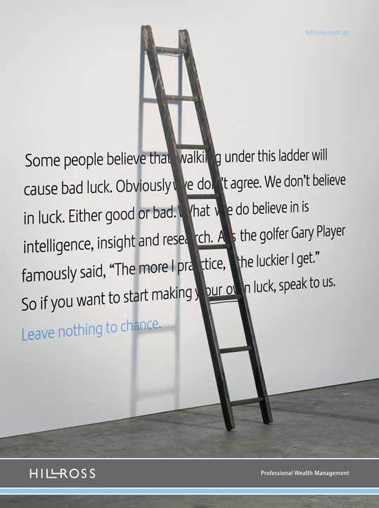
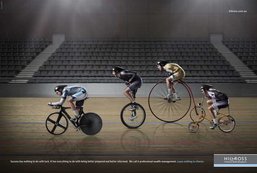
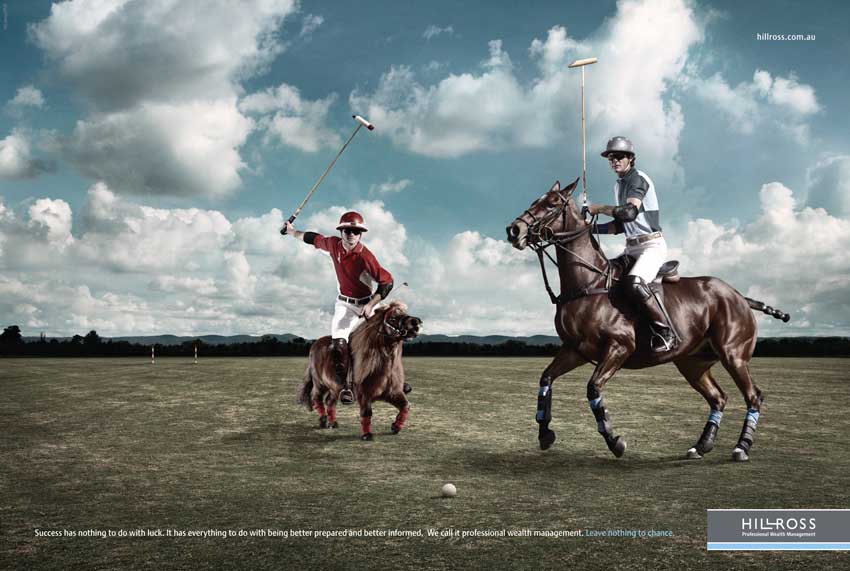
Banjo, Sydney has launched a new print campaign for Hillross, the wealth management firm and part of AMP, which are running in the Fin Review.
The ‘Ladder’ execution has since been selected as the #1 choice on Bestads Top Print this week.
Creative director: Georgia Arnott
Creatives: Georgia Arnott, Sean Larkin
Account Service: Mark Richardson, Richard Frost.
Planner: Ben Lyttle, Celin Buonerba.
Photographer: Penny Clay
Designer/typographer: Sammy Suyono
Retoucher: Jason Riddell
33 Comments
Nice proposition.
Can help thinking the ladder is the only one that expresses it.
beautifully executed
Absolutely incredible. I am amazed at the lateral thinking displayed in this brilliant campaign. I am so so so so jealous and awe struck. Wow.
I don’t get it.
Is there anything that actually links these executions as a campaign? except for the tagline and logo…
Nicely shot, nicely art directed, but where’s the meat.
This is a before the GFC campaign.
they look great… who shot em?
Nice art direction.
But as they say – if it doesn’t gel, it isn’t aspic.
I don’t agree that they are nicely shot or art directed. I’d say, they look like most ‘nice’ ads you see these days. The style is so derivative of one that hundreds of campaigns have used ove the last five years. Sorry nothing new pr interesting there.
12:18pm, ‘awe struck’ are you? really?
Shit, you’re easy to please!
Nice campaign but not ‘absolutely incredible’!
Or are you being sarcastic?
I’m with Greidy here.
The first two ads use the kind of visual metaphors you see in heaps of financial advertising and miss the point of a good strategy.
The ladder is the only one that talks to the strategy, but still lets it down.
Could have been a lot better
Leave nothing to the creatives
Don’t be sarcastic 12:18
ummmm WTF?
Eye catching. Different from all the banks. A strong proposition for me-and I’m in the target market, unlike, I suspect ,most of you. Much simpler and more direct than the ING campaign which uses similiar visual metaphors. Yes it hangs together. Nice thinking.
Exactly the same as Whybin Sydneys ‘Give yourself an unfair advantage’ campaign for CMC Markets, who are a Hillross competitor. CMC stuff picked up metal and got into the Work.
Interchangable visual analogy art directed in the same way as dozens of other visual analogies for banks/computer companies that don’t have anything unique to say.
5/10
@2.33. Welcome to the blog Banjo. Are you the Planner or the Creative?
I love the ladder. The other two are just ad clichés for me though.
Doesn’t make sense. Work harder!
well done Penny. Beautiful shots.
-V
It’s good. Not great, but better than most the sh*t we see the big global agencies PR on here.
Nice work Penny, great shots
I like the shots.
I dislike the strategy. The truth is that wealth management for most people is not a competition. I’m not going up against someone else. I’m merely trying to make the most of what I have. And if that’s a little pony, then so be it.
It makes sense. I get it. But it doesn’t hit a particularly deep truth for me.
shit, shit, crap, shit, crap, shit and more crap. the ol’ shetland pony, kiddy bike is so patronising and unoriginal. Nothing here carries any credibility – I certainly wouldn’t put my money with people who were so puerile when discussing my financial future.
‘We leave nothing to chance’ is a great line. But these visuals don’t make any sense. A more relevant (although perhaps not as visually interesting) visual would have been a roulette wheel with a single number.
Then again, maybe that’s been done, I’m not sure.
I think the shots are great too – as shots.
The problem is they don’t say ‘leave nothing to chance’ which I am assuming reflects the strategy.
The first two ads talk more about getting some kind of advantage, the other one talks more about luck.
There is a disconnect between planning and creative
Reading these comments reminded me of a great old BT press ad by John Bevins.
From memory it read “This is the most infuriating ad you’ll ever read – unless you’re 21”
The copy then compared the returns of two investors; one who started investing at 21 years old and another who started investing at 30 years of age. The 21 year old won hands down.
Being about 21 at the time, it was a very motivating piece of communication.
‘Ladder’ the bedder ad.
Borderline deceptive.
Investing is an inherently risky activity and anyone who suggests otherwise is a fool, lying to you or both.
I’m sure these ads have been ‘legaled’ to death, but I just find the message misleading. No matter how smart you are, how informed and well advised you are, you can always be blindsided by the unforeseen.
Chance always plays a role – and often a bigger one they you might think.
Go read, ‘The Black Swan.’
True 1.39
A lot of very smart and successful investors were burnt during the GFC
Go ask Jamie Packer
Like most advertising, this is eye-catching but shallow. A nicely polished turd.
How on Earth can any financial business promise or imply that they leave nothing to chance? There are so many variables, so many unforseen events, so many mindless herd stampedes on the stock markets in which these funds invest.
A much more credible strategy might be ‘After the GFC nobody, not even the experts have a clue what’s going to happen. Hillross is no different, so you might as well invest with us, our guess is as good as anybody’s.’
Not very good I’ll admit, but at least it’s true.
Ladder – fantastic one off… Then, let’s try to campaign it out… FAIL. The other 2 are woeful!