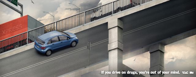
Grey Melbourne’s TAC ‘Confusion’ campaign wins Apr/May + June/July ‘Could Be a Caxton’ comp
 Grey Melbourne’s ‘Confusion’ campaign for TAC has been announced as the April/May and June/July winner of the Could Be a Caxton competition, established by the Caxton Committee and supported by The Newspaper Works to recognise and showcase great creativity on a bi-monthly basis.
For more information on how to enter the Could Be a Caxton competition and the Caxtons in general, visit here.
 Says Cam Blackley, creative director at Droga5 and the judge of the April/May and June/July competition: “I first saw one of these as a huge poster down in Melbourne. I almost crashed. Then I turned the
 ‘tech-house’ up louder. This campaign is a true standout for the months I’m casting my eye over. Right for the target. Well put together. Super simple. I’d like to have done it.”
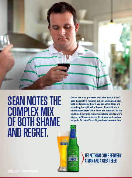
Colenso BBDO  Auckland’s ‘Shame’ campaign for DB Export Dry won highly commended.
Says Blackley: “Let’s be honest the art direction isn’t anything to write home about but the headline is a cracker as is the blokes expression. Nice.”
The Aug/Sept Could Be a Caxton competition is now open for entries. It’s free to enter and anyone can submit nominations. The copywriter and art director responsible for the newspaper campaign judged best of the year’s Could Be a Caxton bi-monthly winning ads, will score an all expenses-paid trip to the 2012 Caxton Awards.
Client: TAC
Agency: Grey Melbourne
Executive Creative Director: Michael Knox
Creative Director: Nigel Dawson
Copywriters: Nigel Dawson, Sharon Condy
Art Director: Josh Murrell
Photographer: Erik Johansson
General Manager: Randal Glennon
Account Director: Jodi Gubana

8 Comments
I spent so long looking at the TAC billboard while driving that I almost crashed.
If it’s a good poster, why is it winning caxtons?
I really like the Export Dry ad. Actually, I think the art direction is spot on for the idea.
I liked it when I saw it win at Cannes this year as part of an integrated entry. Which means that it was done in the early part of 2012. So why is it getting mentioned in could be a caxton or whatever this is? Isn’t this only for new stuff?
I thought of it first.
Another v good creative team.
Should of been the other way around.
The copy on the print ad is bloody genius.
Print is a medium you want to read. Thats why all those old people who still read by the newspaper innit?
How genius is the first copy line: One of the main problems with wine is that it isn’t beer.
Now I’m starting chanting: Other way round! Other way round! Other way round!
Nice simple idea. Slightly different for TAC too.
Good visual that would stop you turning the pages I guess.
…oh, I was talking about the beer ad.