Gravox plays up to Australia’s love of gravy in first campaign from Cummins&Partners

Gravox has launched its first campaign since appointing Cummins&Partners. The integrated campaign rolls out across digital, OOH and cinema.
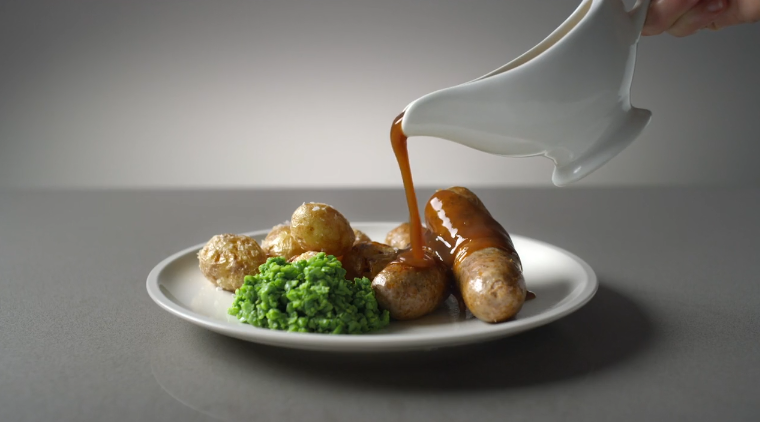
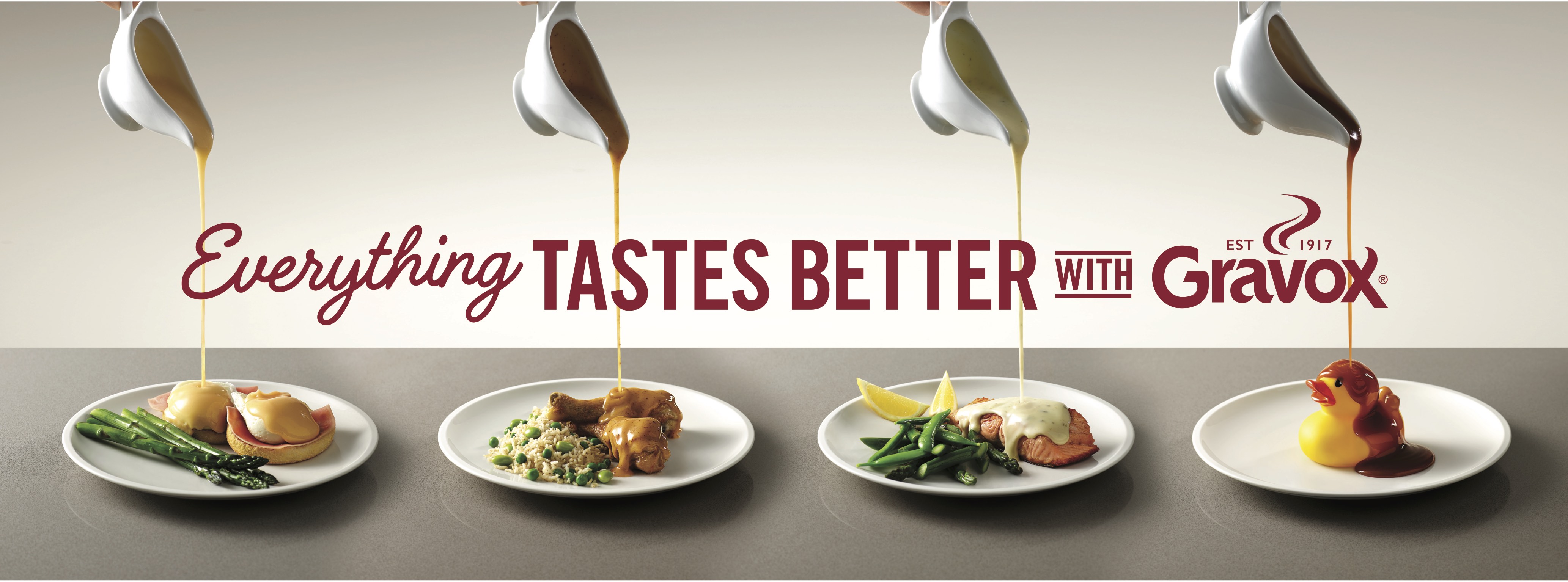
By pouring gravy on anything from a bowl of chips to a rubber duck, the new work highlights the inherent Australian love for gravy, demonstrating that it will make everything taste better.
Says Sean Cummins, Cummins&Partners: “We wanted to create a higher purpose and greater personalisation for the brand. Then we realised it’s just very tasty gravy. So we poured it on food and filmed that.
“It’s the best form of advertising there is… which is product demonstration. We showed Gravox has a wide range of great flavours and usages. It’s nice to do a piece that doesn’t try to be more slice of life advertising. Life is very sliced at the moment so we avoided that.”

Says Erin Putt, brand manager at Kraft Heinz, Australia: “Gravox is such an iconic Australian brand and we really wanted to celebrate what our consumers tell us they love about it, which is Gravox makes their meals taste better. This creative idea and the media strategy behind it gets consumers to re-evaluate how they’ve always known and used Gravox by reintroducing it to them in familiar moments, but in unexpected ways.”
With over 50 products in the Gravox range, there’s a gravy or sauce to be enjoyed on just about anything.
Client: Kraft Heinz, Australia
Chief Marketing Officer – Shalabh Atray
Brand Manager – Erin Putt
Agency: Cummins&Partners
Copywriter: Sean Cummins
Group Account Director: Georgie Bugelly
Senior Account Manager: Juno Forster
Executive Producer: Karley Cameron
Producer: Simone Greentree
Production Company: Hogarth Australia
Broadcast Producer: Tracy Proposch
Director: Ben Flaxman
Post Producer: Cat Park
Editor: David Farnsworth
Colourist: Martin Greer
Online: Kane Dixon
Sound: Production Alley
Engineer: Paul McCosh
Producer: Jess Leman
Media: Spark Foundry

12 Comments
I can’t wait for these comments.
It made me laugh.
I think it would feel more authentically 1950s Australia if they’d shot it in black and white.
What the duck?
It’s nice to smile at simplicity. Well done all
I loved it and made me smile too. I also loved the simplicity.
Unfortunately the food shots and the actual gravy look disgusting
I love the ad but it looks yuk.
I actually disagree. I found it made me hungry and has food appeal.
Gravy is unappealing visually but I felt they did a good job dealing with that problem as well as trying to make it not the dishes the hero. I found myself wanting to eat the food and made me smile at the quirky objects.
Simple concept that ticks the boxes for me. A well executed essentially product demo.
Haha, very nice and simple. Nice job, Sean. Reminds me of you back in L&C days.
There is an underlying genius in this.
I just question the structure. It may have been more interesting to have the random objects first then the food last. Anyway, well done Sean.
Yuk.
I think there’s something in the idea that when you find a good gravy/sauce you want to put it on everything… not sure that’s what this ad is about but that’s what it got me thinking so, yeh, not bad.