From Ted Lasso to Airport Mayhem, Declan Lowney Directs Specsavers’ latest campaign
Specsavers launched its new ‘Should’ve’ TV campaign ‘Airport’ which has been directed by cult comedy director Declan Lowney, known for Ted Lasso and Father Ted. The campaign, developed by Specsavers’ in-house agency, was launched on Channel 9News last night while OOH executions, developed locally by TBWA\Melbourne launch in Sydney and Melbourne airports today.
Harnessing the signature Specsavers humour, the TV ad introduces viewers to married couple Greg and Ella who are about to go on holiday. Ella manages to check in serenely ahead of Greg whilst he parks the car. Greg finally skids into the airport lobby with his wheelie suitcase, cutting it fine to make the departure.
Checking the departure board, Greg rushes frantically to catch his flight and various tense yet amusing scenarios ensue that everyone can relate to. These include the classic moment when you have to scull your bottle of water in front of an unimpressed security guard or relinquish your belt and new espadrilles for a body scan, and of course trying to run along a packed travelator when everyone else is walking.
The scenario ends with Greg racing jubilantly out onto the tarmac where the aircraft is being prepped for takeoff. The TVC cuts to a concerned-looking Ella who is already onboard, peering out of a porthole window as she clocks her husband down below. But will he manage to board the plane, or should he have gone to Specsavers?
The ad is crafted entirely without dialogue, with the comedic emphasis being on visual humour. The protagonist turns into a stuntman of sorts to get around the airport as fast as possible and to his departure gate on time.


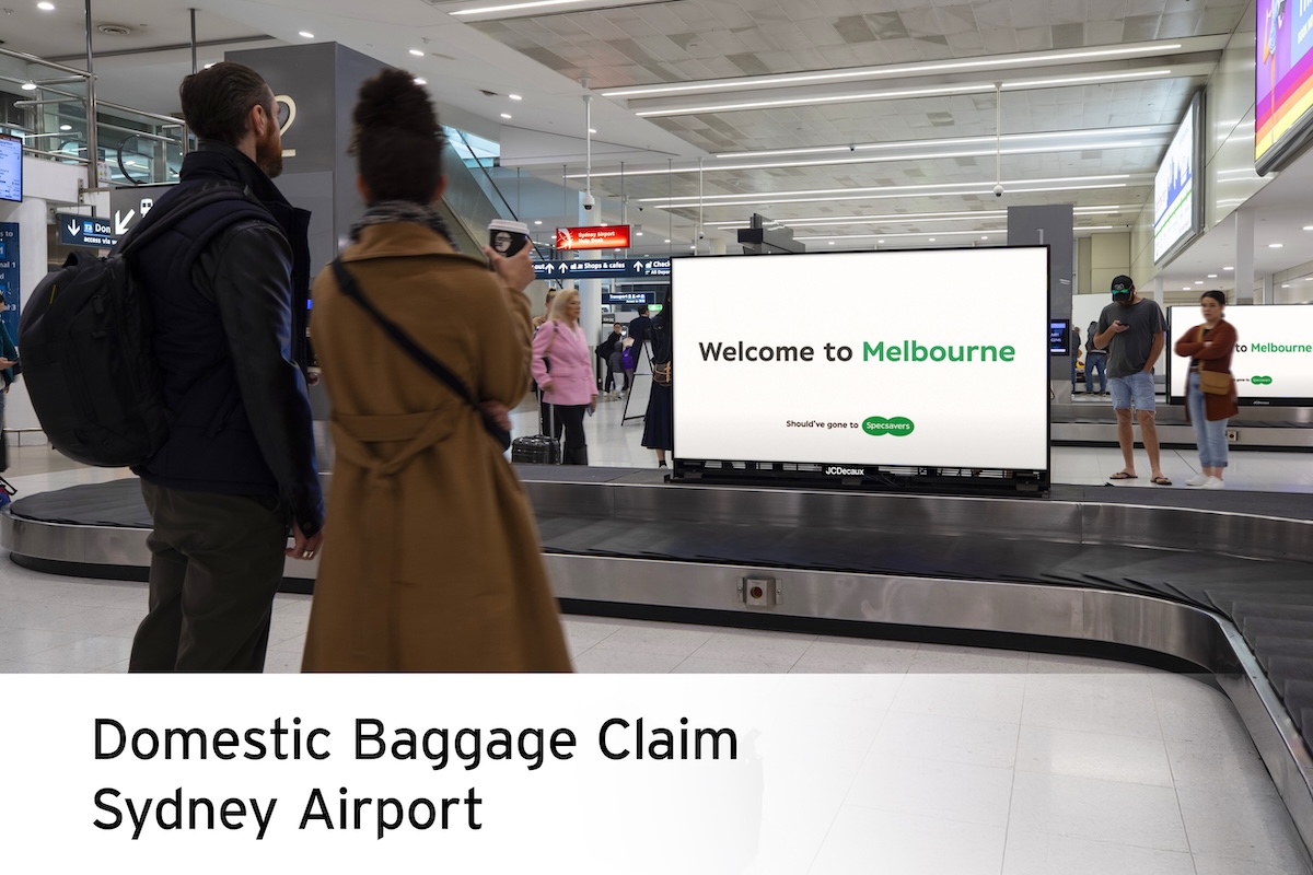
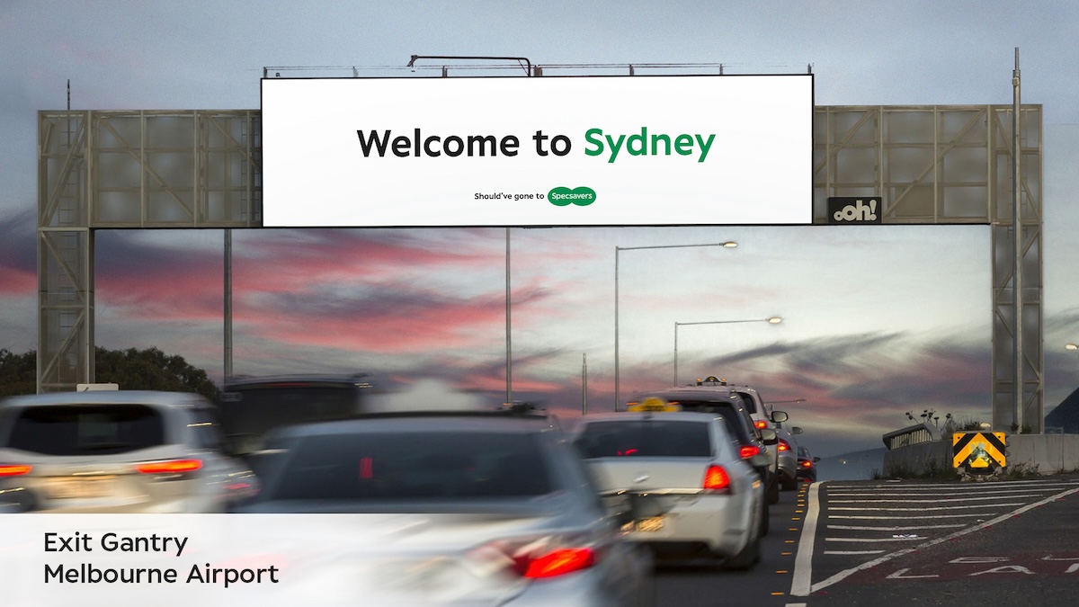
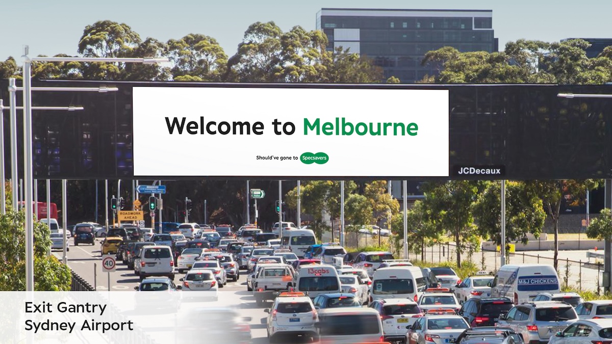
Running until February 2025, the campaign is supported by TV, cinema, SVOD/BVOD, YouTube, Uber, and OOH. The OOH execution includes placements inside key airports in Sydney and Melbourne and around major airports in key states which play off the possibility that the media vendor Should’ve Gone to Specsavers as they might have dispatched the wrong ‘welcome to’ destination creative to each airport.
Says Lowney: “Specsavers have managed to achieve that rare feat of creating their own distinctive brand of humour. Their work has a comedy voice of its own, so my role was to get the best out of the script and maximise the laughs. And telling a story purely with images – along with humour and wit – was right up my runway.”
Says Shaun Briggs, director of marketing planning at Specsavers: “Given the massive popularity of Ted Lasso in this market it is great to be able to work with comedy genius Declan Lowney to bring the Specsavers trademark humour to life. But as with all ‘Should’ve’ campaigns it’s relatable and has that core serious message at the heart of it: that mistakes are easily made if your eyesight is failing, which is a good reminder to Australians of all ages to look after their eye health as we head into the busy school and summer holiday travel periods.”


25 Comments
That is really bad.
What happened to the clever, witty Specsavers ads we used to love? This feels more like slapstick gone wrong, and most of it isn’t about not seeing something right—it’s just about being silly. Very Mr. Bean, rather than clever. The OOH saves it a little. Can we bring back the smart, sharp humour that made Specsavers ads so great?
Does having bad eyesight mean you don’t know whicih side of your phone is the screen, or how to ditch the water bottle if you’re running late for a plane? Almost none of this makes sense on a human or campaign level. Looks like someone accidentally PRd their AWARD school application.
Oh my god, this is so utterly awful. Please for the love of god, get a decent advertising agency.
The OOH doesn’t make sense either. The traveller seeing the billboard is where they’re supposed to be. The billboard is wrong. It’s confusing and just makes Specsavers look stupid.
Where’s my credit for writing this article?
Not even a ‘famous director’ can help TBWA.
What happened? Did the client get a new CMO? Doing nothing would have been better than this.
This is just cringeworthy and not befitting of the history and creative opportunity that this brand platform affords you. Embarrassing for all involved tbh
What a stinker… No credit for a reason.
Perhaps you should have gone to Specsavers before you bag an agency. Clearly states in the sub-head that the AV was developed by Specsavers in-house agency.
Does any agency use the phrase ‘AV’ besides TBWA. Defend it all you want. It’s still bad.
The Marketing Dept is not the Creative Dept. Hiring a famous Director doesn’t make up for a lack of a creative idea.
No quote from anyone from TBWA and no credits. Does this agency even work on this brand? Another miss from the pirates.
Always nice when an australian director gets shafted for an import. Classy TBWA
Should’ve gone to brand school!!
Should’ve left it with the billboards
For a person with such bad eyesight, he manages some incredible feats of skill.
It’s just a bewildering mess.
They aren’t that great.
Is this an imported idea from UK Specsavers, filmed here? or did Aus Specsavers in house come up with this? It’s just rubbish. You could literally cut the first 42 seconds and it would make a better ad. What a terrible waste of money, opportunity and time.
Since the account left Cummins&Partners the creaticmve has been in steady slapstick decline.
No..i dont work for C&P
The fact it was made and ran 7 months ago in the UK and Canada makes this even worse… surely someone pointed out how shit it was then!
a decline in creaticmve slapstick? I’m not going to lie, the C&P work was very, very boring
these are shocking. Badly directed too. Glad you went overseas?
I can quite confidently say this is the worst work Specsavers have ever put out in Australia. Half the mistakes he’s making have nothing to do with bad eyesight.