‘From Space to your place’: Telstra unveils first campaign via +61 for its Satellite Home Internet

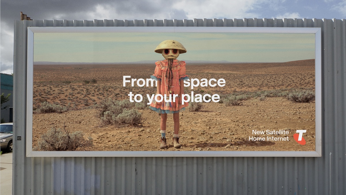
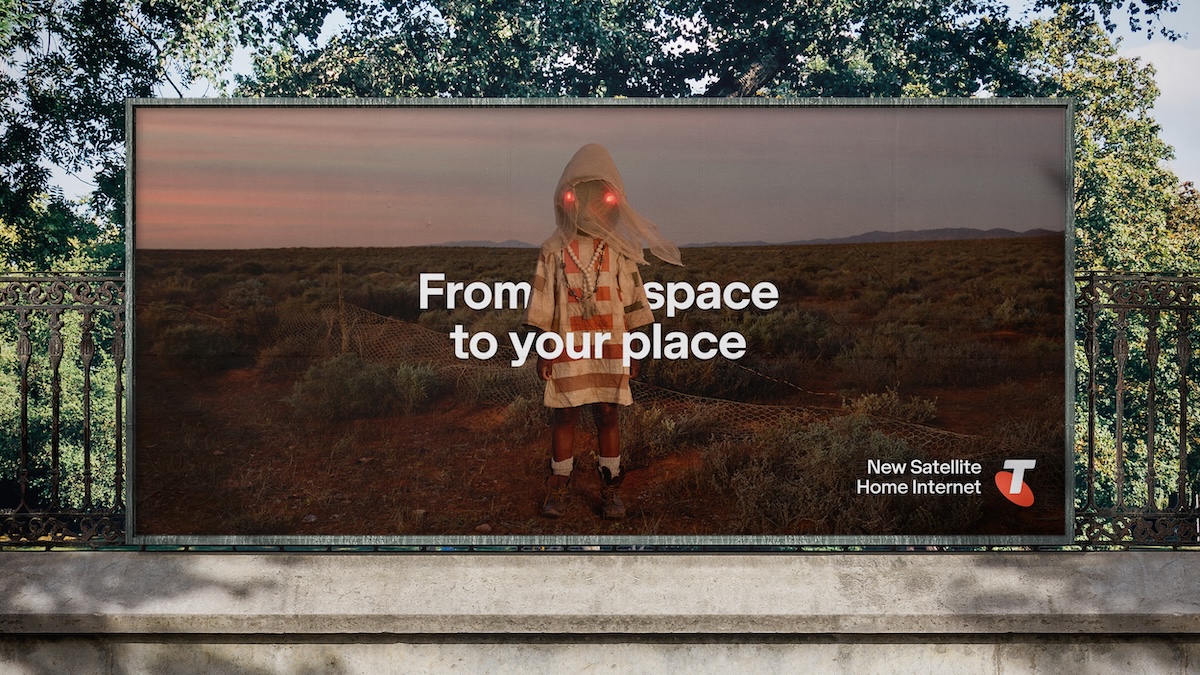
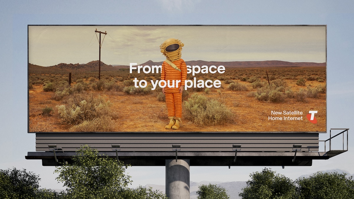
Telstra and its new agency partnership +61, have launched their first campaign together for Telstra Satellite Home Internet powered by Starlink, partnering with one of the world’s most respected photographers, Nadav Kander.
On the first project for +61 and Telstra, the team paired photographer Kander with renowned character designers Odd Studio. The Australian prosthetic specialists, whose experience on films like Prometheus, Alien: Covenant and Thor: Love and Thunder, made them perfectly suited to bring the campaign’s otherworldly, local characters to life.
Says Brent Smart, chief marketing officer at Telstra: “Just months ago +61 was still an idea and now their first work is in market. I love how ambitious, yet simple this work is. And of course it’s beautifully crafted, like everything Micah and his team does. We are just getting started.”
Says Micah Walker, chief creative officer, Bear Meets Eagle On Fire: “It’s a distinctive campaign that lets Australians in more rural areas know that now there’s something floating around in space, just for them.”
This integrated campaign features across OOH, radio, in-store, press, social digital and experiential activations.


Client: Telstra
BMEOF / +61 Chief Creative Officer, Micah Walker
Creative Director, Cameron Dowsett
Creative Director, Mark Tallis
Art Director, Tom Barker
Copywriter, Masha Rimsh
Chief Strategy Officer, Matt Springate
Connections Strategy Director, Alexandra Nel
Senior Strategist, Callum James
Managing Director, Blake Crosbie
Client Partner, Alexandra Stickler
Business Manager, Maya Uwakwe-Kelly
Executive Producer, Lauren Reilly
Senior Integrated Producer, Tayla Marlow
Integrated Producer, Maximilian Stanley
Electronic Artist, Marcelo Canizares
Photographer, Nadav Kander
Retouching, Cream Electric Art
Costume Design, Odd Studio
Sound Design, Sonar Music
Event Production: Revolver
Event Direction: The Glue Society

57 Comments
Looks like theyve used the same plates as the previous network campaign and swapped the talent?
This is sick
…like someone at +61 has been looking at advertising’s own Andy Rovenko’s book Rocketgirl Chronicals…but just not as lovely.
Otherwise fine.
This shows terrific art direction and lovely typography. Sure, they have used Andy Rovenko’s base photography as a reference, but I love what they have done with this campaign. It ticks many boxes.
It was always going to be good, nice work BMEOF
Looks different to everything else out there. Tick
Simple. Beautiful.
Well done all
London based photographer, typography from Uncommon. Is there anything in this that wasn’t derived in England?
Lol ‘typography from Uncommon?’ what do you mean? Did they create letters?
This typographic treatment is a direct rip off of Uncommon’s B&Q campaign.
oooo.. i like these. Well done all.
Fair play, these are pretty good
Simple, clever and engaging. Bravo.
Very nice
Nadav has done a good job of this, but there’s many Aussie shooters that would have got an equally good result.
Pretty shit to see Telstra/+61 not supporting its local creatives at a time when things are turbulent for many.
Poor form.
Could’ve used Andy Lopo or essentially any other epic Aussie photographer.
This is dope
Agree with DSL above, this perpetuates the myth you need overseas talent to make anything good here.
Lovely. Clean, crisp and weird. Well done BMEOF.
https://www.abc.net.au/news/2023-12-26/rocketgirl-chronicles-melbourne-photographer-andrew-rovenko/103253728
One is a child astronaut, the other is aliens.
What’s the same?
… it’s clearly ‘heavily inspired by’ which is entirely OK.
Advertising creatives steal from real creatives all the time.
But don’t pretend there’s not a link between the two.
Reeeaacchhiiinng
I refuse to believe this has anything to do with TBWA. Nice work BMEOF
This rules guys, well done
That’s a long bow you’ve drawn there. Could probs go to Saturn and back.
I love BMEOF’s work. Not this one tho. This one is just ok and that’s the problem.
It’s fair to say that no one is expecting just ok from BMEOF, hopefully the next one is a bang.
May I please speak to the Rocketgirl?
https://www.vincentfournier.co.uk/portfolio/photography/space-project/
They’re both female and looking at the camera while outdoors and alluding to space travel. It’s clearly similar.
Love Andy Rovenko’s work. And this. That’s all.
Not sure about the ROI on the shooter. Nadav Kander is expensive (I get you want to work with the best but this is a simple shoot, so do you really need the best when there a load of good photographers that would have nailed it right here)?
Bragging rights, maybe?
All flashy..
Yet the product is slow compared to Starlink, and uses the old satellite, while the new Gen 3 satellite will.stay with Starlink..
So I can’t see why they are bothering, just setting themselves up for complaints, all to save the customer 10 quid.. a.month.
What’s the big deal?
Who are the audience? Rural Australians? Are they going to look at this and think it’s anything other than advertising people slapping each other on the back because they used a hip photographer?
I fear not.
but id like to see more
Nice. But why did they need 3 posters that are the same?
Hey look a new Wes Anderson movie… wait, no my mistake.
With a focus on AAA compliance, and accessible messaging, this doesn’t really hit the mark.
Visually this is stunning for the photographers folio, love it.
I wonder if they paid ‘Rocketgirl Chronicals’ a fee?
… but that Nadav shot these is such inside baseball.
Theres nothing here that feels intrinsic to Nadav.
It all feels totally motivated by the prestige of being associated with his name, rather than a genuine desire for his artistic contribution.
How come you used the epic Nadav Kander and not an epic Aussie photographer ?
Inspired heavily by Rocketgirl. Slight shame but then again what advertising hasn’t stolen from art?
oh.
Totally agree.Nothing special.Nothing wrong.Are we really so deprived of groundbreaking work that we are discussing at length this quite nice campaign.
Sorry,I’m bored.
Clients and agencies are star…
like it
Nice photo, but an ordinary execution that doesn’t build any meaning for the brand in the long term. Forgettable.
I reckon it’d be regional / rural kids. They see it, go it’s great, then convince Ma & Pa to upgrade the internet from dial-up so they can play Fortnite while they watch ABC iView.
This brand has been many things over many years. The ‘Australia is Why’ era won’t be remembered fondly. But I don’t think the Brent Smart minimalism era will be liked by everyday folks either.
Agree. Ordinary punters prefer ads that tell them exactly what to think and do with lots of information, starbursts and prices.
Importing a photographer of that calibre while local photographers go broke is a real kick in the guts. Telstra should have never have left the Monkeys. At least they fostered local artists. Without a shadow of a doubt – one of the most under-concepted student projects I’ve seen go to OOH.
Are you the same unemployed photographer that’s been moaning throughout the thread? It’s Ai and mid journey that you really need to be concerned about. Not better photographers.
Where’s the female leadership in the creds?
Here:
Business Manager, Maya Uwakwe-Kelly
Executive Producer, Lauren Reilly
I said leadership, not team members
I love the insight that satellites are in space and that the internet is used at your place. I’d just never really thought about it like that before. It’s really convenient that those two words rhyme, too.
Defensive sarcasm noted. Didn’t the recent telstra work have giant starbursts? I recall it being quite a lot more enjoyable and aware of its audience than this beautiful waste of money.
For all the 21 year olds out there, Nadav K is a bit of a legend. But using him for something like this is like asking Scorcese to video your child’s 1st birthday.