Fintech Wisr launches complete brand redesign and platform via Bear Meets Eagle On Fire + Resn
Driven by its purpose of financial wellbeing, ASX-listed neo-lender, Wisr, wants to engage your “smart part”, making it easier for you to make good decisions regarding your finances.
The new creative positioning, “For your smart part”, is part of the company’s first major campaign, in collaboration with creative agency Bear Meets Eagle On Fire (BMEOF). The comprehensive project runs across all brand design, product and communication and is built to deliver a clear, simple message around the company’s purpose, according to Wisr chief marketing officer, James Goodwin.
Says Goodwin: “While people like the idea of financial wellness, depending on their very different circumstances it can be a difficult thing for people to get their heads around. To make it easier, we focus on supporting our customers’ smart decision making and rewarding that good behaviour, which in turn helps Wisr achieve its purpose of helping improve Australians’ financial well-being.
“We’re massively proud of how we’ve built Wisr, but we also knew it was time to realign everything we were doing around a bigger idea, to take that next step. Bear and SPEED, our media partner, have challenged and supported us every step of the way along that journey.”
While the new brand identity retains and builds on some previous aspects of the Wisr brand – the Wisr logo and purpose – almost everything else ‘Wisr’ has been rethought and reinvented around “For your smart part”.
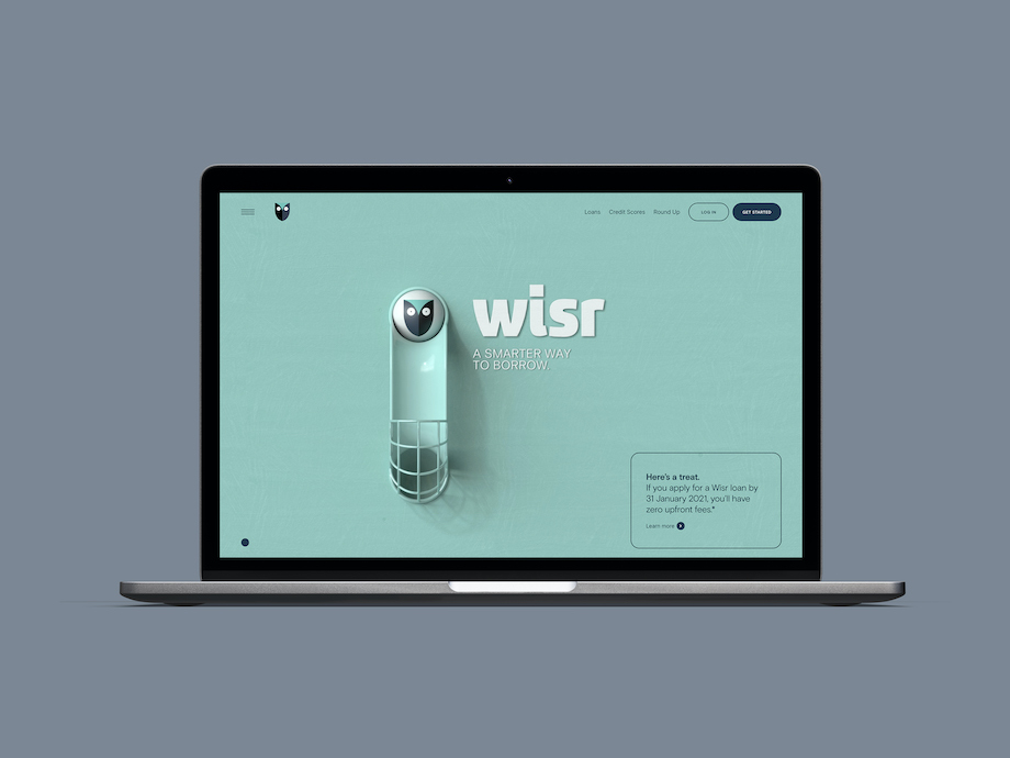
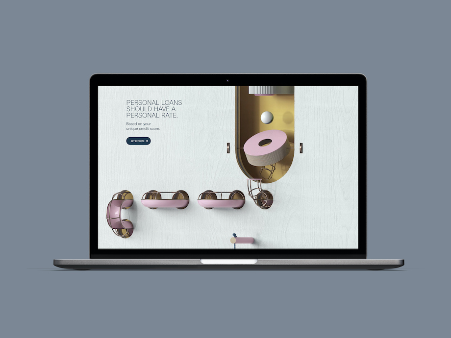
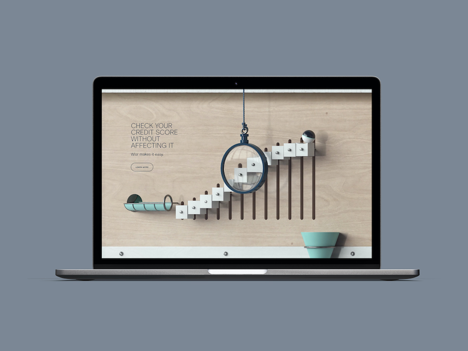
This includes an ambitious and beautifully crafted desktop and mobile experience, co-created by BMEOF and Resn, one of the world’s most respected digital experience design companies. The integrated campaign includes work from famed illustrator Peter Grundy, Swedish-based 3D animation artist Oscar Pettersson and Revolver director Steve Rogers.
Says Toby Hussey, managing director of BMEOF: “It’s not often you find a project and partnership like this. What started out as strategic discussions and a campaign, eventually led to a complete re-evaluation of everything ‘brand’ for Wisr. It’s been a dream project for us.”
Says Micah Walker, founder and chief creative officer of BMEOF: “I’m so proud of all the thinking and craft that’s gone into this. Big shout out to all the talented folks and partners who’ve helped make it happen.”
Says Dan Mercer, creative director of Resn: “Working with Bear and Wisr to help the brand come to life on the site, was a fun creative challenge. It was a great opportunity to bring a high level of design and polish to the fintech category.”
Parts of the redesign and identity can be seen below, along with the new Wisr site and the first three spots in the TV campaign, which roll out this week.
Check out the new Wisr website here: https://wisr.com.au
Executive Producer/ Partner: Pip Smart
Sound House: Rumble Studios
Casting: Peta Einberg Casting
2D Illustration: Peter Grundy


42 Comments
Now I get it. Congrats Steve for BMEOF (again).
Oh my, this is very, very good. Well done all.
AF
Very rare to see a consistently good level of creative across so many touch points. Hats off.
A+ stuff as always but has anyone freed my boi Ricky?
This is gloriously beautiful work. Congratulations all
I love it, BMEOF at it again.
Genuinely excellent
This is all awesome… But I want him to get the honey with the hammer.
That website is quality.
Must have cost some $$$$ for those animations
love the fork. love it all.
Love this, well done!
Nice to see the small guys knocking it out of the park. Excellent stuff from all involved.
Congrats guys, beautiful work all-round. Great to see some simple, but smart storytelling.
Nick
Well done Bear, particularly Ian. A very promising young man indeed.
Sensational stuff. All of it. That site is gorgeous.
Well done you sexy cats. Especially love the website animation.
Lovely as usual.
No matching luggage here. Great super clean site. Simple prop. Beautifully executed on film.
10/10 work. Congratulations to the client for getting such a good result.
Who’d have thought the best looking digital experience out of Australia recently would come from advertising people? Gold stars for all.
Apparently
Perfect. Across every medium. Well done.
Love the tvcs. Well written scripts combined with simple, understated comedy from a world class director.
Seriously amazing work. Smart, creative and well executed. Congrats to all involved.
This is the result of a client and their communications partner being in complete sympatico. It looks effortless. Congratulations to all involved.
It’s super pretty, but don’t be fooled, they are still short term lenders. Fed Gov needs to control this industry (and online gambling while they are at it). More ways to spend money you don’t have isn’t a good thing, no matter how nice a jacket it wears.
Nice one BMEOF. Flexing your smart parts as always.
And while you sit there, taking a self-aggrandising huff of your own farts, you’re probably wearing a pair of sneakers and typing on a laptop, both made by companies that are known to exploit forced human labour. But it’s cool because you didn’t have to purchase with credit.
Quality all over the place. From planning through creative through execution. Lovely stuff.
These executions are based off the laziest insight trope of “don’t do bad thing… do good thing”. The storytelling equivalent of the overused “Product/Service A getting you down? Choose product/service B!” out of home headline.
Also why is the VO American for an Australian spot?
No points to Gryffindor.
The insight from what I can tell is that wisdom and intellect are two seperate things… I.e. You don’t have to be smart to make a wise choice. People are complicated, they do smart stuff and dumb stuff. Wisr is asking you to do smart stuff. At least that was my takeaway…
Everything about this is beautiful. I quit.
If you can’t get behind world class work like this you’re either a troll or you have an agenda.
Ignore the haters.
Resn bringing top-notch digital execution, as usual. Friendly, fun, with a touch of humour. A joy to use!
How many people are getting around this tribute to mediocrity. Do you have a comment farm in Russia pumping these out?
I love this. From film to brand design. Lovely stuff guys
Site is super nice but the spots are weak.
Not funny and the proposition is too much of an afterthought. I had to go back and watch to take in any sort of message. In isolation the spot end frames make no sense at all ie. What on earth in Wisr? A bank, an app?
How on earth does a tiny fintech, actually working in the FINANCE industy, deliver something that could be the best thing i’ve seen come out of Australia in years. I would never have seen this coming. Who are these Wisr geniuses?
Lots of groupthink here.
Website is stunning. Top work RESN.
TV is brilliantly executed but, sad to say, wrong.
Doesn’t leave you knowing what WISR is.
Feels awkward, not feel good.
I know, it’s not cool to say it.
Well done on the social media strategy (the one where all the staff create multiple wanky comments about the mediocre work). The only “world class” thing about this is the 3D.
Looks really nice but unsure if this is nothing more than self-gratifying work made for the agency not the client.