DB Export Dry takes to print via Colenso BBDO
March 15 2012, 4:49 pm | | 26 Comments
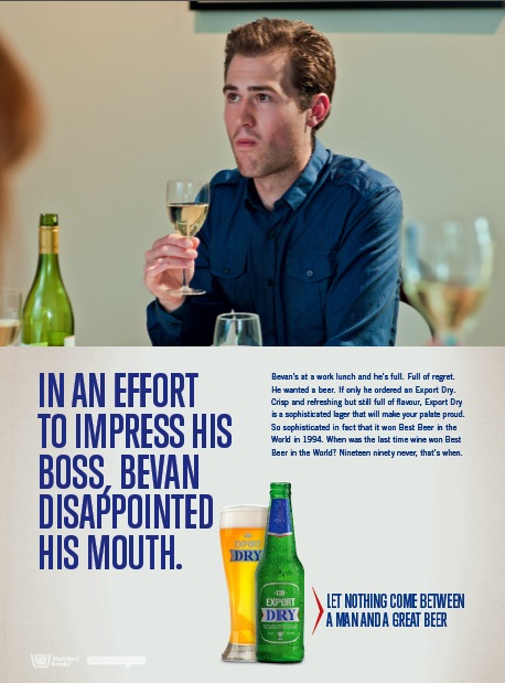 To ensure fewer Kiwi males suffer from wine, DB Export Dry has taken its fight to print.
The magazine and press campaign created by Colenso BBDO highlights the awkward discomfort wine continues to inflict on men.
Fortunately salvation is close at hand thanks to the sophisticated, multi award winning taste of Export Dry.
26 Comments
Got to love these.
Got to love these.
Those sheep-chasing Kiwis not only make better beer…….they make better beer ads. Much better beer ads!
That’s it! These are bloody great.
Yup these are awesome. Great writing. Well down you sheep pummelers
Great line
No, these ads are average in almost every respect.
And I know the beer was voted best in the world in 1994, but that doesn’t mean the ads need to look like they come from that time.
Seems to be a pretty lame, dullish way to present the strategy (against wine).
And they don’t make me want to drink beer.
Which you don’t need much of an excuse to do.
‘Smells like you’re being an idiot’ made me actually LOL like an idiot
Ghastly typography.
Even as a huge (to the point of being awkward) wine fan. I have to admit this is tops.
Great concept! Dull execution.
Much better than the TV spot.
Nice writing.
Did you read these ads? The copy is gold. Critique the art d all you want, but you can’t argue with ‘so what are you waiting for? oh ok well how long is that going to take’. Brilliant!
Loved ‘nineteen ninety never’
Think it’s a little weird to make a big deal about beer of the world 1994 because that was actually 18 years ago. That’s two generations in some places. Beer’s moved on. But the copy is crisp as.
These are tops. Nice one.
That comma in the headline looks like it’s coming out of the top of the ‘P’ though.
Not seeing it what’s with all the hate? These are gold, stop being a dick.
These are gold. And I’m sorry, but I love the typography.
Love this campaign. When did I see copywriting better than this? Nineteen ninety never, that’s when.
Come on all you copywriters (beer drinking and non), you’re jealous of these. Admit it.
I know I am and I only drink gin and I’m not a copywriter and I’m a girl and nobody reads the copy anyway….
I’m jealous.
Great ideas. And that’s what counts.
The pretend Art Directors on here don’t get it because they’re not real art directors.
I read these ads when I’ve had a shit day. Top work.
Great ads. All three of them as well. Bloody brill!
When was the last time wine won best beer in the world?
Almost ROFL’d.
To anyone knocking the art: it wouldn’t be anywhere near as funny if you hammed it / glammed it / free-fontified it.
The very fact it’s delivered straight is what punches you in the stomach.
Art direction isn’t about making everything look pretty. It’s about communicating a tone and conveying a feeling, which these do very well.
I know exactly who the fuckers knocking the art direction are, the ones who use ‘dafont’, and if I ever see a shitty free-font in an ad again, I’ll lock you in a basement until you can make your own fucking type, recite the Letraset book backwards and draw Helvetica with your eyes shut.
Despite the irreverent and beery tone of these ads (that I like in a warm, reminiscent of the 1979 D&AD annual kind of way) there’s a few things in the copy that would make David Denton openly weep.