Casella Wines unveils its new corporate identity ‘Casella Family Brands’ via The Creative Method
 Casella Wines, makers of the famous [yellow tail] wine, has officially launched a new brand identity to support its long-term corporate positioning and growth strategy developed by Sydney-based design agency, The Creative Method. The company will now be branded as Casella Family Brands.
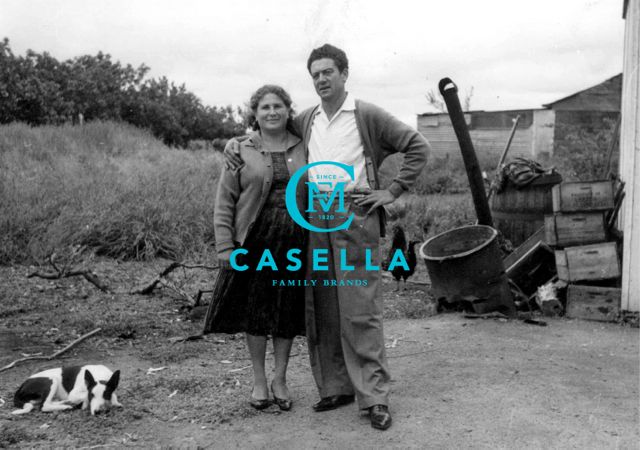
The new identity has been designed to reflect the evolved corporate positioning and is inclusive of a refreshed corporate logo and typeface, a more vibrant corporate colour palette and incorporates a selection of original Casella family photographs.
The new creative will be rolled out across the business with immediate effect. Touch points include a re-designed website, product packaging, company email addresses and stationery, on site signage and all internal communications initiatives including a refreshed internet portal.
The updated brand identity represents the significant shift in John Casella’s vision for the business.
Says Casella: “In order to grow the business year on year, we need to stay relevant to our consumers around the world. As a company we must continue to be inspired to create new and exciting products and drinking occasions, not just for our existing fans but to attract new drinkers. ‘Casella Family Brands’ allows us to explore a wide range of trends, innovations and opportunities in order to create brands and products that deliver against this vision.”
 The new visual identity takes its cues from the original founders, John Casella’s parents, Filippo and Maria Casella, the true architects of the pioneering attitude that Casella maintains to this day.
The intent of the new logo is to reflect the passion and talent for winemaking that has been in the Casella family for generations. It displays the familiar Casella name underneath a monogram which was created using Filippo and Maria’s initials; the letter C is reflective of a family embrace, creating a holding device that serves to illustrate the group of brands to be created under the Casella umbrella. ‘Since 1820’ references the year that great, great, great, great-grandfather Casella planted his first vine in Sicily. At that time, he could not have imagined what he had started, nor the great success his family would achieve.
 The corporate brand colour palette is blue, red, green and yellow, with blue as the hero colour. The vibrancy of the colours serves as a reference to Casella’s flagship brand
[yellow tail]. The bold colour palette is fun, energetic and like the [yellow tail] brand philosophy, looks to challenge the status quo.
Says Tony Ibbotson, creative director of The Creative Method: “We wanted to create something iconic, a monogram that not only reflected the vast history and heritage of the Casella family but also something relevant to the modern consumer. The device itself needed to immediately convey trust and credibility. Modernity and attitude has been pushed through the use of the vibrant colour palette.
“Having such a great wealth of old images from the early Casella years at our disposal was a goldmine. Their images told a great story of hard work and a spirited family of pioneers. We used these images in conjunction with big bold bright colours to bring the old and new generations together.”
Says Casella: “The look and feel represents where old meets new, through creative that takes reference from the past yet with a contemporary look and feel and makes it timeless. I am honoured that a selection of the original, and very special, family photos will be used to bring the history of Casella and generations of winemaking to life. As we enter the next chapter of our history, the re-positioning of Casella Wines to Casella Family Brands is a nod to the future, and reaffirms the role the company intends to play beyond the production of [yellow tail] wine.”

3 Comments
Nice work Tony! Good to see you with your toes still firmly in the wine category.
I presented the C campaign to Casella 6 years ago. Nice to see they are using the idea. Maybe they should now think about the other idea I gave them, stop looking like a factory on the way into Griffith. Give something back, create some kind of parkway along the road into town, maybe a regional tasting room, the great wineries all do it, maybe just a trip to the Barossa may suggest what wine makers can do for their regions.
How much a company gives back to the community can be measured in many ways. Choosing to employ and support local families or sponsor a community event. Rather than subsidise a cellar door, 4hours from nearest Capital City, May be good example of how Casella wines continue to challenge the status quo.