BOAG’S CLASSIC BLONDE CAMPAIGN FROM MOJO SYDNEY IS ‘FAR, FAR FROM ORDINARY’
 Lion Nathan today revealed new creative for Tasmanian low carb beer, Boag’s Classic Blonde. The campaign, entitled ‘Far, far from ordinary’, was developed in partnership with Publicis Mojo Sydney.
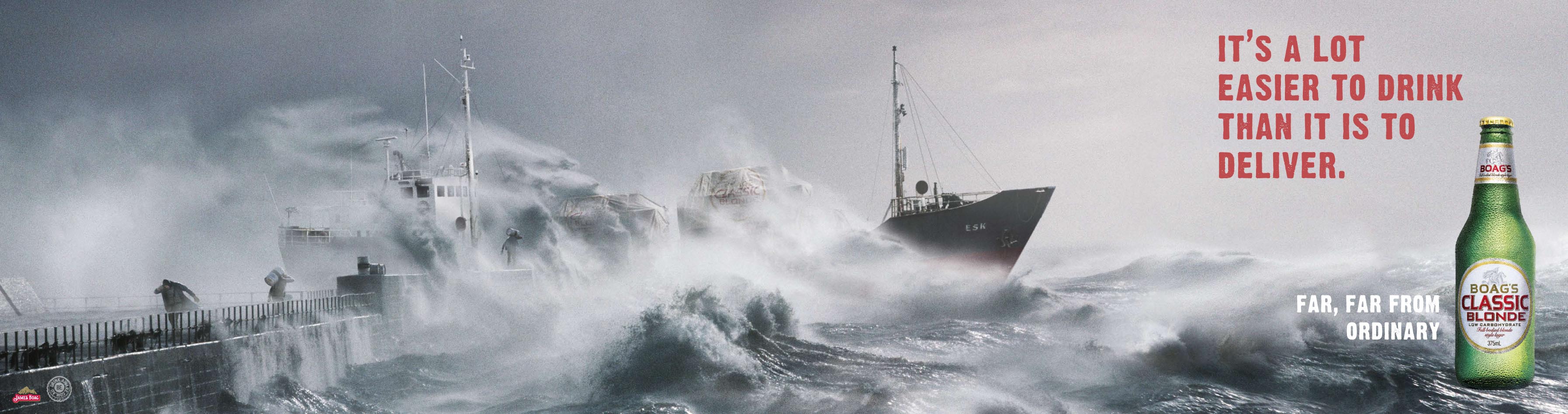
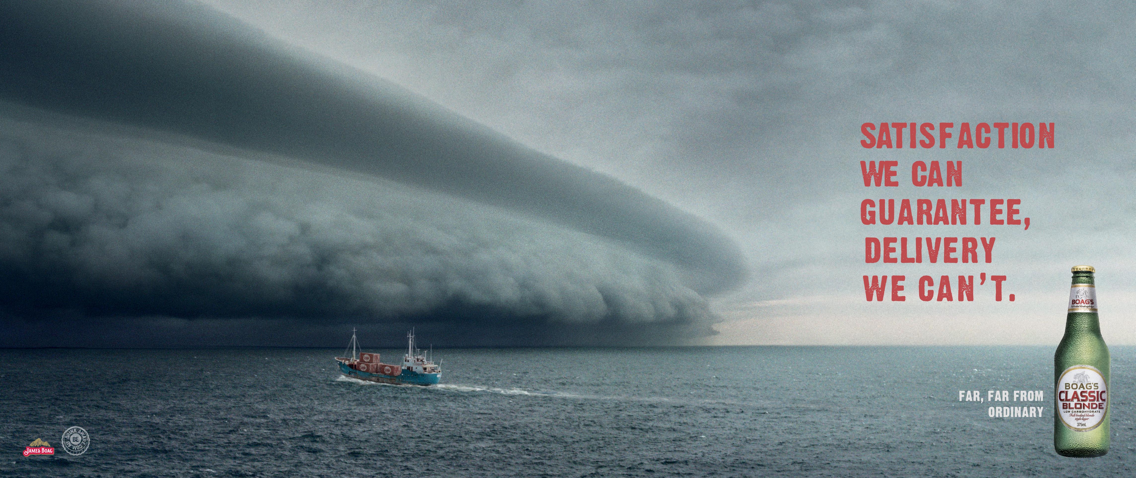
The ‘Far, far, from ordinary’ campaign consists of large format outdoor and press, with a range of executions designed to communicate the idea of Tasmania as a mystical place with a physically challenging landscape that offers the promise of extraordinary beers.
“We’ve all seen picture-perfect images of Tasmania, with misty mountains and clear babbling rivers,” said Arno Lenior, Premium Category Director, Lion Nathan, “This campaign portrays another side of Tasmania: tough and unpredictable, with wild weather and extreme conditions.
“The exaggerated imagery used shows how resilient Boag’s must be to operate there, and of course establishes Boag’s Classic Blonde as a tough brand that has been tried and tested by nature, and as a result is anything but ordinary.
Says Publicis Mojo Sydney creative director, Micah Walker: “Overly beautiful heritage imagery would have been such a predictable way to go, so we’ve turned that on its head to tell a more interesting story about the beer. As the campaign grows there are a lot of really exciting places we can go with the idea.”
A consumer website, www.classicblonde.com.au, is currently being developed by Holler Sydney.
Micah Walker – Creative Director
Simon Cox – Art Director
Justine Armour – Copywriter
Jenny Lipson – Business Director
Simon Ludowyke – Account Director
Tara Seymour – Account Manager
Nicole Milward – Head of Strategy
Lisa Vermaak – Creative Services Director
Alison Dunlop – Art Buyer
Oscar Birken – Senior Producer
Lou Doyle – Producer
46 Comments
Nice work. Good old-fashioned headline and powerful visual advertising.
But you’d expect nothing less from a couple of wise, experienced and talented heads like Justine and Simon. Well done guys.
Monty
“Tasmania as a mystical place with a physically challenging landscape that offers the promise of extraordinary beers”
This is, of course, complete and utter bullshit.
Tasmania is two big country towns with gentle rolling hills in between, plus a few mountains with 5-star Eco lodges on top. Nothing mystical ever happens there, and their beers are pretty good, but far from extraordinary.
But if Boags ever shift their brewery to Mawson Base, Antarctica, brew with glacial ice-melts, and ship it to us via Cape Horn… then this campaign might begin to make some sense.
I’ll bet all those pensioners and families who take their gentle ferry trip across Bass Strait every year are gonna book something safer now: like Bagdad.
Couldn’t they have just added a couple of cylinders to the pipeline?
So what do you call a product born out of wild weather and extreme conditions? IRON BRU? No. How about ‘Classic Blonde’? Sorry, but the strategy doesn’t fit the low carb product.
mmm, salty beer
Actually I would say this is “Very close to ordinary”.
Nice visuals. Lovely Words. An idea. Classic advertising. Good to see.
Dean Bean.
Can’t see it being a long term campaign,they’re already repeating themselves.
Juzzy, that deserves a tea!
As a fairly hardcore Tasmanian bogan can I just say I approve of this campaign.
Makes me feel very special.
Nice work Joozie
robbie
This reminds me of a Singapore beer print campaign, where they used visual of a ship
importing beer. Anyone remember? I think they had the headlines where the ship’s name went. Could have been Tiger Beer.
Wonderful guys. Beautiful artwork, nice line, what more could you ask for.
Not bad. Seen heaps worse.
The 4 dudes that died in the Sydney to Hobart might disagree with your maritime analysis, 9:40AM.
Juzzi love your red lipstick today. mxo
there is fucking boat that crosses there daily.
matter of fact, didnt someone cross Bass Straight on a windsurfer 20 years ago?
mind you he wasnt carrying anything so…. wait… still…wtf?
Ron. Medication, now!
Hey Ron, I hope your not responsible for that terrible AAPT ad on at the moment. Feels like it’s one of yours.
Nice work guys who shot these?
C’mon its nicely art directed,but as a piece of serious communication its rather shallow, despite what all the Mojo guys who have praised it think.
Saw it driving along pacific hwy. Visually it’s stunning.
hey coxy and justine
just read all these comments and thought i better let you know that the 10:28 “Barry” was not me. I don’t agree with him at all, and i don’t want coxy dropping in on me on his 10 foot board to teach me a lesson.
Nice Art Direction, cumbersome copy. Pretty average campaign.
THere are redundant words in the first headline.
Saatchis NZs line for Corona was ‘Miles away from ordinary’.
I really liked these on the blog, then I saw them for real as outdoor supersites and couldn’t read them as i drove past at 70. back to Art Direction for Outdoor 101 i think
What-ho Simon, Simon and Justine,
Nice stuff. Tackling head-on the potential “soft-cock” image of a low carb beer with imagery that shows the complete opposite, and if any brand can pull it off it’s Boags.
It’s beer advertising at the end of the day, so image is paramount – ‘order a low carb beer but feel reasonably butch whilst doing so’. Works for mine…
Paul M. 😉
Thanks for your critique, Phil. Your knowledge on campaigns outside of Australia is very impressive and your comments on the copy make me think you must be a writer who really knows his stuff; not like Justine, Simon and Micah. What would they know?
There’s an idea in there, but somehow the headline doesn’t turn the corner.
Helen, sometimes a weak headline is just a weak headline.
When punters drive past, they won’t care how much money the creatives are on or whether you idolise them because you saw their pic in CB with some cool kids in near a swimming pool in a Cannes villa.
Strong visuals weak idea.
Sorry Monty.
I’m sorry, but the type is way too small, seriously, you can’t read it.
Why do we persist with making billboards that look like mag ads?
I saw it in the city and couldn’t even make out what the packshot was.
Infinitely Sinkable. Maybe they should send the account planner to Davey Jones’ Locker.
where does this campaign go? Saying the same thing in every ad.
That’s not a campaign. Although I haven’t seen the onloin.
Jane, you may have unconsciously invented an exciting new media space.
these are two of five posters as a relaunch for the brand (and no, it’s not all about boats). Once you open it up to telly or whatever, there are many places to go with Far, far from ordinary. You don’t have to do everything in outdoor.
Saw one of them on a 24 driving through Coburg yesterday.
A blur.
Headline disappears, pic becomes irrelevant, branding and product benefit, zero.
Will look good in award shows though.
I couldn’t read the billboard either.
It frustrated me.
In the time it takes me to yawn while cruising past in peak hour at 15km/h I’d miss this ad.
What was it for again?
Oh. Deadliest catch. Great show.
Hahahaha. ahhhh. This work is hilarious. Couldnt they make the beer any smaller? Its like it was developed for print, then put on a billboard at the last minute.
Yeah the image stopped me in my tracks but the copy was hard to read.
Wasn’t me either, and I like them, and I like the simple type execution, far to many plug-ins being used these days just for the hell of it.
What poster? Was it for John West?
Great images! Type is to hard to read for a billboard.
Would make burley sea hardened folk drink it i’m sure.
Luv Andy.
Made me curious enough to buy a six pack.
So you did your job.
But I have a curious question for the client.
Why the fuck do you bother making your beer all the way down there when it tastes like the same tap water crap Tooheys makes up here?
You could save on freight / danger money.
I have done some research. Turns out the beer being advertised in this series is Boag’s Classic Blonde.
I did heaps of research too and found out the campaign is actually for Fisherman’s Friend … it is very good at covering-up beer breath.Genius. Love the reddish type… brilliant way to show the key number.
I also did some research.Turns out that Mojo thought there were signing off on a scam 2 double for The Mildura Gazette.
note to client:
take a drive down City Road Melbourne, and have a look at your poster in-situ. You can only read the headline when you’re stuck at a red light, and only if you’re in the front row… you can’t read the strapline at all, and you can’t make out the brand on the generic green bottle at any distance.
It’s not a bad idea, but it’s an appalling poster execution. You really would’ve thought that someone could have stuck the artwork on a wall, taken a few steps back and said “shit guys – no-one’s going to be able to read this”.
a classic poster error. I’m surprised – I thought mojo was better than that.
After some more research I have found out that this doesn’t exist outside of this blog.
Oh yer, there are a couple of sites up back streets.