‘AUSTRALIA IN THE SKY’ TAKES OFF AS QANTAS BOOSTS US CAPACITY via US creative agency CONVICTS, directed by Australia’s Justin McMillan
For the first time in a decade, Qantas has unveiled a new brand campaign in the North American market as demand for travel between the US and Australia continues to grow. Qantas tapped US creative agency CONVICTS, headed by Aussie expat Pete Maiden, who developed the concept and creative direction, which is directed by Australian director Justin McMillan.
Academy Award-nominated writer, producer and director Baz Luhrmann and four-time Academy Award-winning costume and production designer Catherine Martin act as creative consultants and ambassadors for the campaign, titled ‘Australia in the Sky’, which features Qantas crew alongside an all-star cast of Australian talent including actor and model Charlee Fraser and model Jess Hart.
The campaign lands as Qantas celebrates 70 years of flying to North America this year and continues to invest in new aircraft and routes servicing the US, including Project Sunrise non-stop flights which are expected to take-off between Sydney and New York in 2026.
The airline’s New York – Auckland – Sydney service currently operates four times per week and is set to increase to six per week from October 27th in line with demand over the holiday period.
Qantas Group Chief Marketing Officer Petra Perry said the campaign was designed to share the spirit of Australia with the North American market as more travellers consider a holiday down under.
“Be it through our warm, friendly crew or the premium Australian wine and produce we serve, we want our customers to feel like they’ve started their holiday in Australia from the moment they step onboard a Qantas aircraft.
“It’s easier than ever for US travellers to take a break in Australia, with the majority of our services connecting the two countries in a single hop.
“Throughout our long history of flying to North America and the rest of the world, we’ve always been incredibly proud to share what makes Australia so unique on a global stage.”
When asked why he chose to team up with Qantas, Baz Luhrmann said “Like all Australians, I feel a great deal of pride in Qantas. The moment you step on the flight you’re embraced by the unique spirit that brings a little of Aussie magic to every journey. When you’re on Qantas, you’re not waiting to get to Australia, you’re already there.”
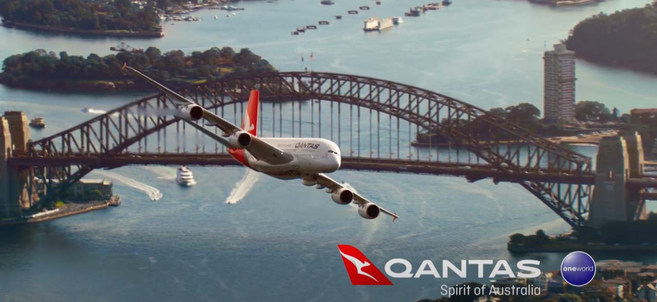
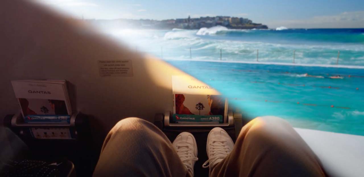
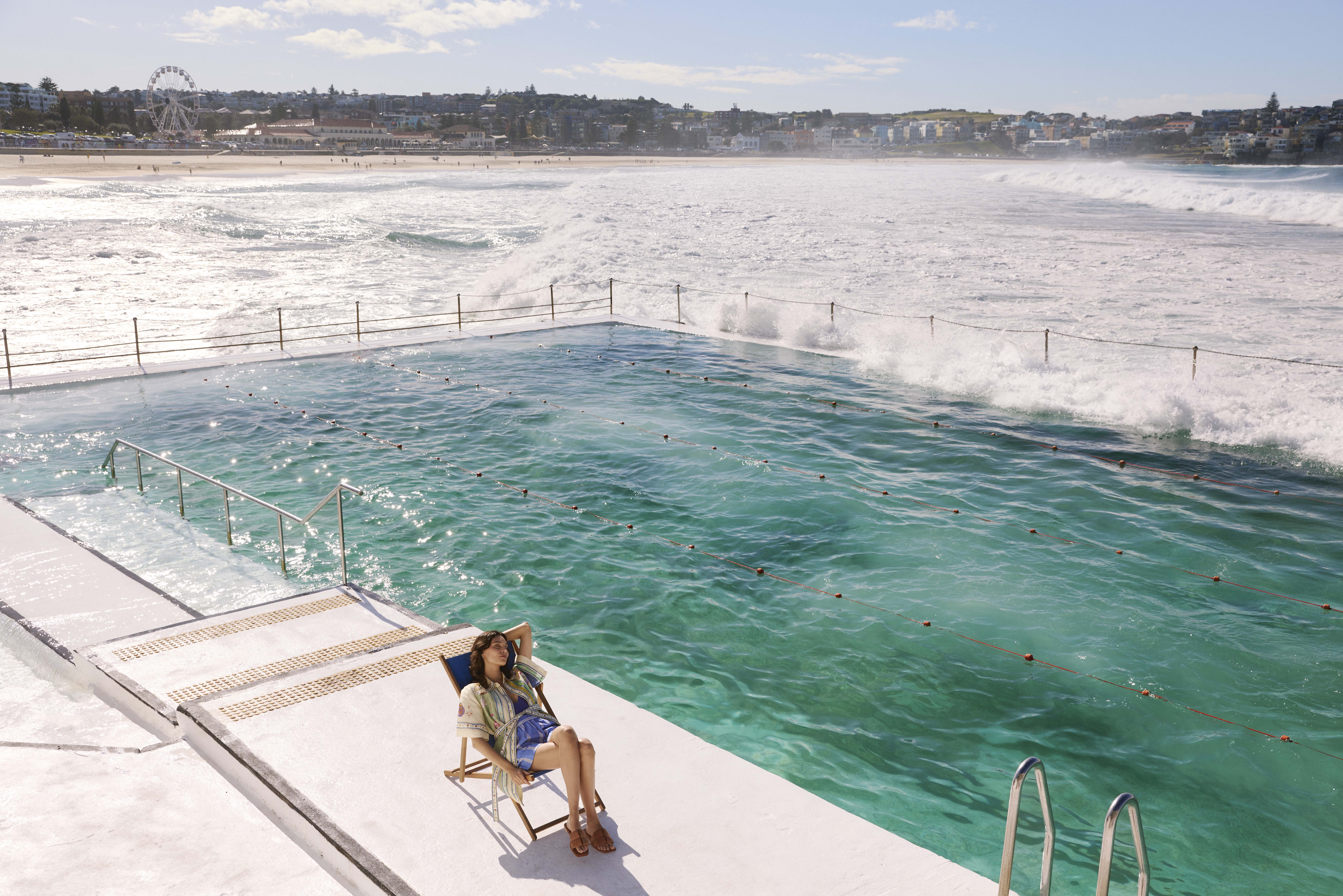
Filmed at Qantas’ Los Angeles hangar onboard an A380 aircraft, the campaign also features scenes from famous locations around Australia including Sydney’s iconic Bondi Beach and a flyover of Sydney Harbour, as well as Melbourne’s Federation Square and the Great Barrier Reef.
Qantas is also the only carrier to operate A380 services with First, Business, Premium Economy and Economy cabins between the US and Australia.

Australian Actor Chris Hemsworth who voiceovers the campaign said “As an Australian, I’ve spent a lot of time traveling on long-haul flights. I find such comfort stepping on a Qantas plane because it immediately feels like coming home.”
“Sharing the spirit of Qantas with our mates in the US–and around the world–has always been a dream of ours,” said Pete Maiden, the Aussie expat founder and CEO of Convicts. “Qantas isn’t just a national favorite down under, the airline brings the Aussie energy to life on their flights with the little touches of magic–from the menu to the staff to the overall energy on the plane–that we captured and amplified in our Australia in the Sky campaign. When we approached the Aussie creative community—from Baz Luhrmann, Catherine Martin, Jess Hart, Charlee Fraser, Pia and Kane Muehlenebck, Will Gluck and Justin McMillan–they all climbed aboard.”
The campaign is soundtracked by Australian duo Angus and Julia Stone and features a wardrobe of Australian designers.
Qantas offers more than 40 flights per week between North America and Australia to destinations such to Sydney, Brisbane, Melbourne.


Agency: Convicts
CEO: Pete Maiden
Executive Creative Director: Tom Law
Group Business Director: Trent Dunlop
Business Director: Dylan Roley
Account Supervisor: Abby White
Senior Writer: Cameron Higgins
Creative Consultants: Baz Luhrmann, Catherine Martin
Executive Producer: Nick Clifford
Social Director: Sean McKeever
US TVC
Director: Justin McMillan
Director of Photography: Tod Campbell
Line Producer: John Gilliland
Post Production: Heckler
Sound: Heckler Sound

72 Comments
What happened the good old qantas ads?
This is so heartless. No wonder they are dropping in the eye of the consumer..
this corny
What a charmless, uninspired ad. Looks like a giant bus, with glarey windows, delivering you to a place with what? – an aquarium. New Yorkers can the same experience by catching the subway to Coney Island. Fail.
Feels like the B team made this. Not sure we’ll be luring many Yanks in 2025.
I thought that a board member who’s a marketing and advertising expert would perhaps inspire something better than this bland, saccharine campaign. It’s like a 1980s tourism expo stand video. And that’s being polite.
WOW! How bad is that.
Captain! Pull up! Pull up! We’re losing altitude!!!
Looks cheap but I bet it cost a pretty penny.
Why would you want the sun blaring in on your flight, isn’t that why they invented window shades? Like, I get the idea that it’s trying to show that Australia has lots of sunshine but a) everyone already knows that and b) in this context it’s just annoying.
Side note, why is Qantas always obsessed with showing people getting wine on the flight and being just so delighted? It makes it look like they’ve never been in an airplane before.
Most airline advertising is pretty bland.
Unfortunately this is no exception.
You would think with an advertising expert on the Qantas
board things would be different.
Nice end shot.
Plane looks like a bus. Talent looks really contrived. Grade looks like the intro to Home and Away.
Rather a production house. I think money could have been better spent on the idea rather then misused talent.
Probably given a budget that any creative / director could only dream of. And then produced something so expected and creatively flat.
The Germans did it with all class a few weeks ago…
https://vimeo.com/1006735396
Abysmal
It’s time to go petra perry!
Cmon Baz.
You made a guy… Wear the logo on his shirt?
Oscar winning creativity right there.
Laugh: ‘Australia starts with Qantas.’ Sure does. You can feel ripped off before you arrive.
And then enjoy the full gouging experience once you’re here.
It’s as tone-deaf as Joyce’s pay packet.
Omg this is bad. And I’m not even in advertising trying to trash talk the other agency. Also if you’re trying to get Americans into the country why would you show a plane leaving?
…..and you are being polite.
You really have to wonder what Luhrmann and Martin actually brought to this project, aside from a hefty invoice. The result is painfully uninspired, relying on outdated and overused clichés about “Australia” that have been rightfully abandoned.
It’s hard to believe this passed as creative work—it’s lazy, out of touch, and entirely irrelevant.
So bad, whatever happened to production values!
When the average in flight safety video is better than your ad you’re in trouble.
This is what happens when management fuck up…they think changing the ads will fix the problem. The only way to fix it is to change the management!!!
Yep, that ads criminal.
This is like one of those cheesy Asian bank ads that you wake up to at 4:AM in a hotel room overseas after falling asleep with the TV on. But conceptually worse with less production value.
I’d pull this down ASAP.
Going to LA to shoot the interior of a Qantas plane and then bragging about it. Makes sense.
So the marketing department wrote this. Got it.
It’s almost like one of Australia’s most iconic brands did a bad ad and the other one didn’t.
The image of the plane tilting is scary.
Convict has been found guilty of producing this!
It’s so bad, in so many ways.
Qantas should be ashamed
Jfc this is absolutely awful. I’d hate to think of how much was spent on this.
Qantas you were wonderful marketers, you created a beautiful image for an amazing airline. Please take marketing seriously again. Work with a good agency, spend some money, and rebuild the spirit.
The only thing that would make this interesting is if they come out next week saying this was all made from a single AI prompt. Which I could imagine, based on how completely derivative this is of every airline ad ever.
That plane and harbour shot looks like a toy plane on a fishing line in front of a flat screen TV….cool retro effect right? right?!
Not like the amazing ads from The Monkeys!
Why would you put your name on this????
What a dream brief. What a terrible idea and execution.
The picture of the plane tilting might freak out Americans.
Straight to jail for that one Convicts.
What the heck was that?
This is some of the best work I’ve seen on this blog ever. And I’m talking about the comments section.
Paying for Baz Luhrmann to oversee this but not putting a dollar behind the actual advert is pathetic. No Australian will know this besides those reading the press release? Terrible investment. Terrible marketers.
The marketing people at qantas have burnt every agency and it’s showing in the quality of the work they’re now making. Laughable
Qantas is an exceptional brand that has been served some brilliant advertising in the last couple of decades. And this feels …. I don’t know the words. Maybe as it is being marketed to the USA I am missing something. Or maybe I am being too polite. Soul less
But not alot to like about this one.
Can’t imagine any creative agencies are going to get Convicts to treat on their next idea.
So cheesy. So uninspiring. So artificial looking. So unoriginal. So bad. And you had such a great director.
Except for a few outstanding exceptions, CMO’s in this country,are second rate. They and the obsequious toadies they gather around them are bland, ladder climbers who regard their bosses as the target audience.
It’s all about the next promotion and the next bonus,
while great brands like Qantas decline before our eyes.
Yep this is not great.
What about The Spirit of Australia / I Still Call Australia Home ads of yesteryear? This has no emotional connection to the travellers. It feels like any other airline on the planet and they’re talking about an onboard experience which is absolutely not differentiated at all.
I think the talent need more lip filler.
Yes this is uninspired but, just to note, the ‘still call Australia Home ‘ ad wont work for this audience – this is for USA – its not their home.
Seems like a lot of money was spent on this to include Australian talent i.e. actors, model, designers. Living in the US, I don’t have a clue as to who this talent is…means zip, nadda. Maybe the trippy aquarium critters swimming inside the plane scene are trying to appeal to the 24 US states allowing recreational marijuana?
Everything, right down to the production, is absolutely terrible.
So many talented out of work Australian-based creatives would have given their left arm to work on this. A mile high miss.
Heartless and unlikeable. On brand for Qantas. Nice.
Not really, but just wanted someone to say something positive.
It has memory structures. So who cares if it’s entertaining or interesting or unique or memorable?
Whose keen for convicts to craft their next campaign?
The CMO has apparently been marketing lead on Qantas Loyalty for some years.Not sure that position qualifies you to oversee an international film production created to address the long haul,North American consumer tourism market.
Big leap with very different skills required.
You know that a CMO doesn’t produce the film, right?
The eye mask transition should have been pulled….it’s atrocious that stands out on a sky of bland.
No creatives were used in the making of this ad.
As an Australian who used to be so proud of QF.
Australia in the sky is a really good line.
It talks to experience, and the idea of arriving at your destination the moment you get on the plane. It’s smart. Why you all hatin’?
I think for a US audience this reflects their positive perceptions about Australia. Turtles! Yummy food!
It’s also massively corny. It’s corn city. It’s like corn thins, but thick ones. Corn thicks.
Guess it’s handy none of us are the target audience.
I’m also deaf and blind.
The film craft is simply terrible. So disjointed and forced. And you can’t say it was budget!
Whether we’re the target audience or not, a badly made commercial full of tired cliched images is still a badly made commercial full of tired cliched images
I have never, in all my days, seen a worst ad.
On every level this is awful.
God. SO cheap looking.
This is what happens when 90% of the job is meetings about meetings and meaningless celebrity involvement
Does this take out a gong for Worst Ad of the Year 2024?
Because I am speechless.