Asahi Super Dry launches a surreal new world in latest campaign via The Monkeys, Melbourne
 In a category often diluted with stories of mateship, Asahi Super Dry needed to create a new wave of energy to break through to premium beer drinkers in its latest campaign, ‘Enter Asahi’.
In collaboration with both Asahi Beverages in Australia and Asahi Breweries in Japan, The Monkeys, part of Accenture Interactive, created the campaign. Leveraging the brand’s Japanese provenance in ways that feel authentic but more importantly, interesting, surprising and mysterious, ‘Enter Asahi’ aims to tap in to consumers’ appreciation for discovery and exploration.
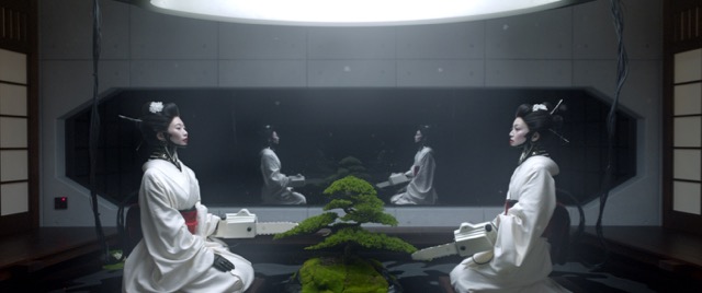
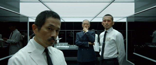
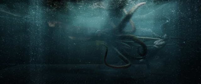
Directed by Marco Prestini from In The Thicket, the film takes audiences on a journey where imagination is not bound by reality. A world of giant squids, robot geisha, fierce warriors and loyal salary men.
 The campaign will roll out internationally across broadcast, cinema, OOH advertising, digital, press, path to purchase and on Asahi’s social channels.
Says Ant Keogh, chief creative officer, The Monkeys Melbourne: “Japan is an exciting and enigmatic place where the traditional and technological collide. This was our inspiration for the ‘world of Asahi’.
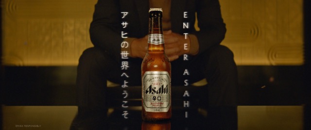
“We avoided a traditional narrative, and took a more surreal, music-video inspired approach. The loose ‘story’ leads to a mysterious Japanese character who collects giant squid and owns a secret research facility dedicated to pruning the perfect Bonsai tree. The idea being that kind of perfectionist would favour precision-brewed Asahi. Having said all that, if people think the ad is cool, Japanese and remember it’s for Asahi, then we’ve probably done our job.”
Says Michael Vousden, marketing manager – beer, Asahi Premium Beverages: “We are very excited to build our foundations for the future and evolve the Asahi Super Dry brand platform and creative proposition into a compelling ‘Enter Asahi’ campaign. The creative impact will cut through to our target and will help recruit the next generation of Asahi Super Dry drinkers in Australia.”
Client: Asahi Premium Beverages
General Manager, Marketing AUS / NZ: Michael Edmonds
Group Category Manager: Kym Bonollo
Beer Marketing Manager: Michael Vousden
Agency: The Monkeys Melbourne
CEO: Paul McMillan
CCO: Ant Keogh
Creative Director: Wayne Ching
Art Director: Joe Sibley
Writers: Ant Keogh, Wayne Ching & Hugh Gurney
Designer: Jess Ramsey
Head of Strategy: Mike Derepas
Head of Production: Romanca Jasinski
Production Coordinator: Anne-Maree Shelton
Group Content Director: Lee Lowndes
Content Director: Navin Arunasalam
Content Executive: Allan Carlow
Production Company: In The Thicket
Director: Marco Prestini @DivisionSydney
Executive Producer: Genevieve Triquet
Producer: Nick Simkins
D.O.P: Stefan Duscio
Production Design: Michael Iacono
Costume Designer: Joanna Mae Park
Editor: Dan Lee @ The Butchery
VFX & Post Production: Alt. VFX
VFX Supervisor: David Edwards
Executive Producer: Tyrone Estephan
VFX Producer: Adrianna Spanos
Colourist: Edel Rafferty
Sound Design: Paul Le Couteur @ Nylon Studios
Music: Level Two Music

88 Comments
これはあまり多様ではない
よくやったクラッカー
That’s epic
Epic. Has Fabio’s fingerprints all over it. He is one beautiful human.
Thank God for a decent beer ad.
Weird flex but ok
Pretty but meaningless.
This spot is very cool. Not to discredit that ad at all, but bought a six pack on Melbourne Cup day and was let down by fact the label read made in China and not Japan.
It’s just back to back Japanese stereotypes.
I like what you did there…
Nice work!
A beautifully crafted yawn.
“Dad, is that your commercial?” “I don’t know.”
…is awesome.
Not bad at all.
Awesome
[siren noise]
Nice one daddio!
Onya Gurney you old dog.
Went out the back for a quiet GURN and noticed something quite odd. A fucking sick beer ad that had be tripping.
well it certainly looks beautiful, I was hoping for a bigger reward at the end of it though and I didn’t get the fact that it was a man who collected Octopi and was obsessed with perfection and that is why he drinks Asahi.
I doubt the general public will either.
A desperately sad dystopian view of a brand and culture ending with a man drinking on his own.
What were you thinking Asahi? Why do you get these monkeys to do work on it?
Just hellish cool.
Don’t care if it doesn’t have an ad-dy idea to it. It’s beer for gods sake.
Cool ad? Job done.
How long has it been since we had a great beer ad in this country. This is the best thing I’ve seen in 5 years. Congrats Monkeys.
I@wrongo
I like dystopian world views. Blade runner. Etc. this is cool.
Yep. Tidy work Monkeys.
I have no idea whats going on. I mean, it’s obviously pretty as hell.
Will this sell beer to the average Australian? No earthly idea, but I hope I get to read the effie paper a year from now so I can find out the answer. (or, note the lack of an effie paper which would be an answer in and of itself).
I liked it better when it wasn’t selling beer
https://www.youtube.com/watch?v=yB8Ci7X5HUU
Frothing. A bit jealous now.
Straight rip no? https://www.youtube.com/watch?v=yB8Ci7X5HUU
lolz.
https://www.youtube.com/watch?v=yB8Ci7X5HUU
Memorable. Stylish. Cool AF
Can you imagine the Lion Nathan version of this ad! 😉
Why am I so underwhelmed by this.
I feel nothing.
welcome to the advertising industry.
Mine was first…
https://www.youtube.com/watch?v=_Qh7jFJ6zWw&t=75s
A continuous camera move! I can think of 40 other references. The move is not new.
Looks awesome. Crazy. Pretty. I like it.
The camera push through time, the minimalist track. Just add some brand queues… like stereotypical Japanese stuff to it. Fleur & Manu, should give you guys a call and ask to see your storyboards.
craft aside, it’s stereotyped and really boring.
…touch his beer.
— Arigato Whatthefucko
Holy shit that’s good.
Remember they used to call the agency Three Drunk Monkeys?
And the adage that if you put 100 monkeys in front of typewriters they’d produce Shakespeare?
I guess this is what you get when you put 1000 drunk monkeys in front of typewriters.
But only one VERY specific and well known one with this VERY same aesthetic… hmm agency comment?
No good having great creative if you have a company that only knows how to trade. From the family of Cruiser and Crack a Woody be good to see if these guys actually pony up some serious media dollars. Or is it one of those super cool targeted campaigns no one can find online.
This is quality, finally someone not trying too hard… cold beer packshot, futuristic Japanese bladerunner aesthetic… job done.
Isn’t Bonsai and outdoor plant?
I always prune my bonsai with a (white) chainsaw.
Credit where credit is due. This is amazing.
Let’s give them the benefit of the doubt. They probably thought they were only ripping off those Lexus ripoffs.
Yep as others have said it’s pretty, but what was the strategy?
Taste Japanese culture with each sip?
Is that a big thing now?
How will people know it’s an easy drinking beer?
The three beer boys make another big budget but mediocre TV ad.
Nothing changes.
A faithful recreation of the video for Gesaffelstein, Pursuit (directed by these two by the way: https://imvdb.com/n/fleur-manu ) sure can make for a pretty TVC.
What exactly has the client purchased from the agency here? 12 agency staff credited and paid to produce this “Creative” that would be more accurately described as a cover version of the original music video, with a pack shot added.
We’ll know how the agency responsible really feel about this work once next years awards shows roll around. If the agency have the temerity to submit this admittedly gorgeous piece of film, who of the so-called “creatives” credited above would dare to claim credit in front of their peers?
@ not on
You’re really trying too hard to discredit something that’s pretty good. Take a good hard look at yourself.
I really like it. Well done Joe. The weirdest beer ad in yonks
If you think Gesafelstein were the first people to use one long shot you haven’t watched enough films.
https://slate.com/culture/2015/07/stanley-kubrick-tracking-shots-montage-celebrate-the-directors-birthday-with-this-following-kubrick-supercut-video.htmlI
It’s great to see you back. Also, check then back door. I think it’s open
You’ve put a logo on someonelses idea… do you actually feel ok about that?
Special Group did the same thing the other day for a university.
We’ve all referenced techniques, but just lifting the whole things is a bit crap. Surely with your collective brain power you could have given it an original twist… guess not
This advertising campaign is obviously targeting mainly the Japanese market, who will be able to relate better to it than the average Joblow.
Awesome visual effects, Go the staff at Alt VFX.
Lol wat.
Why would you target the Japanese market with a satirical take on Japan? It’s an Aussie ad for an Aussie market. Trying to think of how you came to the conclusion it’s for a Japanese market is hurting my head.
That said, the whole thing is pretty underwhelming. Feels like a massively missed opportunity.
An Asahi is a fine beverage to sit back and watch the comments on this blog. Particularly those talking about stealing another idea. Please post the other idea that is the same? Not the same technique, but the same idea. You know the difference right?
*Takes swig of if beer, hits submit, waits for morons to try to justify why previously mentioned reference is the same idea, not technique.
@knock off.
actually I can’t see one single image that is the same as that GESAFFELSTEIN clip. So you’re saying you can’t use a single take shot anymore?
Completely unbranded. Will do a good job for the category. As market leader Asahi may benefit slightly better than everyone else – but gee what a waste of money to make a great ad.
Lots of people saying this is ‘cool’, ‘sick’, ‘amazing’ etc- can anybody tell me why?
As far as I can see it’s pretty boring, been seen before and I. Any see myself saying ‘have you seen that ad where….. happens, because nothing sort of does happen.
What?
And only ALT should be proud.
Idea…. stolen
Execution…. stolen or at least nothing really added
YAAAAWWWWNNNNNNNNN
Why are you so scared?
now which to choose.
Trying to work out what Japanese beer I want more.
https://m.youtube.com/watch?v=Ayovj5hzh7U
I’m pretty sure Gesaffelstein could take legal action against this shit. Can’t see why not considering with how plagiarism this blatant goes down legally in the music industry. Give Robin Thicke a call and ask him.
Go ahead though, keep patting yourselves on the back.
Okay, so they got inspiration from the Gesaffelstein video.
But they also commissioned a rip off track too… I mean that’s HIS style music…
@entered asahi
Same art direction style
Same visual technique, and only the agency will tell you it’s just a camera move
Same music – which suitably is also a ripoff of this: https://youtu.be/2Bgb-60LeK8
Oh and you got a director from France also? Hmmm
Yes mate, it’s the same idea, because there is no concept here other than the fact you put a bunch of Japanese stuff in it. Very creative.
The art direction, music and technique in tandem is the idea.
@ same same
This is the directors other work:
https://vimeo.com/244185050
https://vimeo.com/232897265
If you ask me this visual style /art direction / fashion style is consistent. In other words this ad looks more like his own work than it does Gesaffelstien.
I agree the song is similar.
This is the track they used. Maybe get Zhu to talk to Gessafelstein to talk to Gorgio Moroder to talk to Donna Summer to talk to Kraftwerk to talk to about 500 other electronic artists about how they all are stealing from each other? https://youtu.be/QUKCGkPoH_E
I agree the director is on brand, and he’s quite good that’s why he got the job. Doesn’t mean that we can trivialise the fact that it’s a near carbon copy.
And really, guy who thinks every song with a synth arpeggio in it is somehow the same… that’s a Sarah Huckabee Sanders response.
It’s still a ripoff it’s just that ZHU fucked up this time instead of the ad agency. I just thought it was funny that it was also a ripoff along with the visuals.
Mmm. You’re kind of a dick.
What’s dick is ripping so hard on the music video. It’s not just a camera move, it’s everything. Even down to the guy wheeling a trolly past some computer shit then going through a tiny window into another room while some bass electronica plays. One camera move? Sure. But that’s not the only similarity. Anyone commenting otherwise is delusional and clearly protecting self interests. Nice VFX. But I cringe that the idea got up.
well ya f up there didnt ya
I have no idea whether this is a steal or not, but I’ll take it that it is.
The good side of that is that it’s really easy for the agency to sell in this kind of work:
Just sit the client in front of a screen, press play and say “That’s what we’ll give you. We’ll just stick a shot of the beer at the end.
Simples.
Obviously, this advertising campaign is mainly targeting the Japanese market, where it will be more understood. Awesome visual effects, Go the staff at Alt VFX
Just chiming in on this clusterfuck of comments…
So by that logic @POP you’re saying the director from Europe wrote the script, designed the camera technique and chose the music? and none of you flagged this as a potential issue?
Seems a bit slippery. That’s my .02
why not just be a bit more original with the music track? that is the giveaway.. Also that was FIVE YEARS AGO!
Interesting that the director of this is repped at the same company ‘division’ that fleur and manu were repped at and whom produced the original music video version of this idea. Fleur is still repped there. The director of this and fleur are probably friends. Division would certainly know that this was a rip from the beginning. There would have been a discussion between them all.
Says to me that the agency knew exactly who they were ripping and went straight to the source (good on them for atleast trying to reward the original concievers of the idea if so). But the original directors probably weren’t free or didn’t want to do it for obvious reasons.
I’d say those parisians are all probably laughing. Laughing all the way to the bank exclaiming ‘stoopid Australians!’.
Credit to the director for the craft. Can’t say much for the ‘creatives’.
Sure, it’s not a new technique, but advertising doesn’t need to invent new visual techniques to be engaging and original.
Is Audi ‘Duel’ the same as Guiness’s ‘noitulovE’, or an Alt-J music video, or dozens of other backwards references? No.
Does they use a similar technique? Yes.
Do I like many if them anyway? Yes.
Were they each awarded in their fields? Yes.
Sure, there are lots of examples of similar filmic techniques to this one. But do punters (or award juries) really care?
Was the Gesaffelstien music video about the condensing iconic weird japanese stuff together? No.
Asahi. It’s the japanese one. That one with the cool ad I remember. That’ll do.
Do you think we are all stupid?
It’s obviously not just the technique, it’s the whole vibe, the whole style and design, the tone, the music, even the type of casting.
It’s simply ‘do this’ but with some japanesey stuff.
It’s also not just about the ad industry and ill informed award juries.
What about the directors and musicians who work hard to come up with this stuff so that it becomes successful enough for lazy people like you to press play on YouTube and then be so arrogant to say oh it’s just a technique that’s been done before.
You know what’s right here mate. Posting comments about technique make you look like a complete asshole and idiot.
The Director is Italian, not French…
Hi monkeys person. Doesn’t discount anything of the above comments. Nice try though.
Monkeys, you are killing it lately.
I can smell your smarmy face from here.
Division, the production company you used is French, but thanks for the help Carmen Sandiego
Cool and beautiful.
This is an example of an advertisement which must have cost the client a lot of money – in production terms – but which is utterly devoid of what any intelligent marketer would consider a critical component of an effective brand advertising campaign; an original idea. Instead, this conspicuously expensive (but, frankly, very boring) ad takes the viewer on a journey which never attempts to say anything about Asahi, or the people who drink it, the than that they are Japanese! Who knew???? Indeed, the ad hammers home the beer’s Japanese provenance with such an embarrassingly cliched and heavy hand that I am surprised it has not been referred to Australia’s Human Rights Commission as an example of corporate racism.