ANZ comes out as GAYNZ in new sponsorship campaign via Whybin\TBWA Melbourne
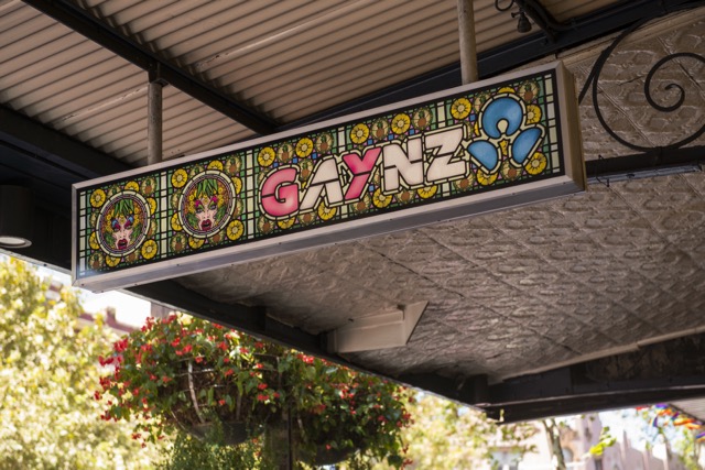 ANZ has become GAYNZ as part of a new campaign via Whybin\TBWA Melbourne in support of the 10th anniversary of the bank’s sponsorship of the Sydney Gay and Lesbian Mardi Gras.
In a public display of pride, the bank’s Oxford Street branch – at the heart of the Mardi Gras parade route in Darlinghurst – has been rebranded as a GAYNZ branch.
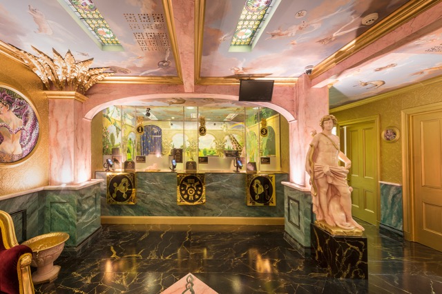
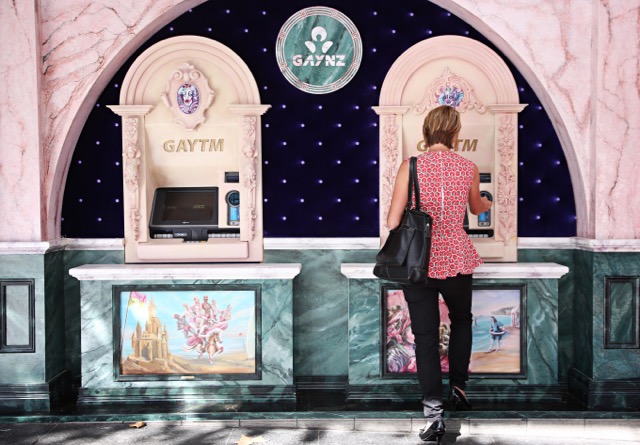 Completely reimagined inside and out, the GAYNZ branch is a baroque-inspired celebration of LGBTI culture. It features two new GAYTMs, ornate walls, a marbled floor and 16 unique, hand-painted murals inspired by the LGBTI community.
Says Mark Hand, chair of ANZ’s Australia Division Diversity Council: “Diversity, inclusion and respect is 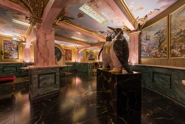 an important part of what we do at ANZ so we are particularly proud of our partnership with Mardi Gras which started because our staff passionately believed in supporting the cause 10 years ago.
“Over the past few years we have had an incredible response to our GAYTMs, so it was only natural to take things to a new level to celebrate the milestone. GAYNZ is often used to describe us at Mardi Gras and we thought transforming the Oxford Street branch and naming it GAYNZ was a fitting way to demonstrate our continued support for the LGBTI community.”
 In a first for an Australian brand and a bank worldwide, ANZ is collaborating with Twitter to develop a rainbow coloured flag emoji, which will appear whenever #GAYNZ is used on the social media platform.
 This year ANZ will have more people than ever participating in the Mardi Gras Parade with 230 staff, family and friends set to march.
Four GAYTMs have also been returned to the George Street and Pitt Street branches. ATM operator fees for non-ANZ cardholders from GAYTMs will once again be donated to Twenty10, a not-for-profit organisation working with and 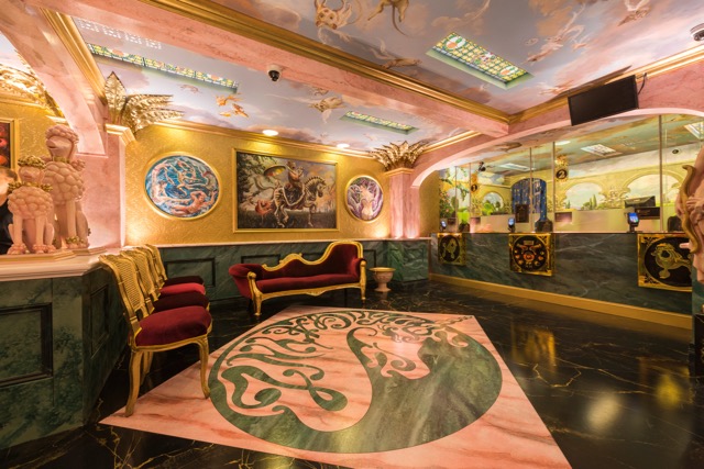 supporting people of diverse genders, sexes and sexualities, their families and communities.
Client: ANZ
Creative Agency: Whybin\TBWA Melbourne
Executive Creative Director: Paul Reardon
Creative Directors: Tara Ford. Daniel Pizzato
Creatives: Tim Woolford. Scott Canning
Senior Producer: Janine Wertheim
Production Company – Will O’Rourke:
Artistic, Design and Project Directors: The Glue Society’s James Dive & Pete Baker
Managing Director/EP: Michael Ritchie
EP/Head of Projects: Josh Mullens
Producer: Jasmin Helliar
Production Manager: Phoebe Marks
Production Designer: Sam Hobbs
Art Director: Sam Wilde
Construction Manager: Cameron Stanton
Scenic Painters: Andrea Davies, Bill Undery, Mark Dixon, Rosalind McKelvey Bunting, Colin Richards, Jo Breneger, Jo Allsop
Graphic Designer: Robyn Schremmer
Regional Group Head: Ricci Meldrum
Group Business Director: Claire Tenzer
Account Manager: Emily Gray
Account Executive: Jack Clemenger
Digital Planner: Paul Arena

28 Comments
All of my many gay and lesbian friends prefer not to be treated differently because of their sexuality. Like the vast majority of the gay community, they’re all what I’d call ‘straight’ gays – regular people, not some mincing, prancing ‘girly boy’ stereotype of yesteryear. Therefore,can someone please explain to me how ‘gaying-up’ a branch, ATM’s etc., isn’t just further perpetuating outmoded gay stereotypes?
[I don’t doubt the ANZ work has been created with all the right intent].
Milking the awards with the same idea, for the 3rd un-straight year.
Stereotyped “gaying-up” of a bank hardly feels modern or forward-thinking – and co-opting a subculture for commercial gain of a multi-national bank is pretty gross too. How about making a real statement by championing LGBTI bank staff and customers, rather than just using gay culture for awards bait?
What next? Video gaymes and fluffy toys? Sounds familiar.
stop.
It’s a sponsorship of the Mardi Gras event, not a representation of the entire gay community.
Why does the ‘gay-branch’ have to look like the entry lobby to Liberace’s home? This is tired old gay stereotyping at its very worst. It’s an insult to the vast majority of gay and lesbian community and their friends. You want to know what a stereo-typical gay and lesbian person looks and acts like? The answer is no different to you and me.
Does it look like Gay New Zealand?
That doesn’t excuse the stereotyping.
Banks milking it for all it’s worth with the whole ‘look how accepting we are’ motif. It was fantastic the first year but now, too much. Thank god the other banks haven’t followed up with more ideas about ‘equality’. Turns the beauty of that first GAYTM idea corporate and crass.
If the Liberace style palace is wrong, then what’s this “right” sort of gay? Something that looks normal? Non-assuming? Something with every person of every colour, holding hands? But not unclothed, no, that’s making assumptions about their sex life, have them wearing something sensible. Nothing too “gay” or “butch” or “dykey” or “twinky”. And put in some kids. And old people. Doing family things, buying groceries, riding bikes, making lasagne. That’s not stereotypically gay. And then just a slogan that says “Sponsoring Mardi Gras”. But no decorative fonts, that might insinuate something. No, just have it in the bank font, on a rainbow flag.
Congratulations, you just made a Telstra ad.
@haters,
It’s for the Mardi Gras – not the general gay population.
Which last time I checked looks like Liberace’s diamanté colonoscopy.
Shame they couldn’t have done something real for the gay community (aka the lock-out laws) but you can’t have it both ways.
Well, not at the Mardi Gras anyway.
i just think turning ANZ things into gay things is tired. time for something new
That Bank is so gay.
Actually, you just described a Medibank ad.
Turning a bank lobby into a trailer trash Las Vegas/Dubai style hotel entrance is so gay! As in “bad gay”
Preach! Rest of y’all find your next high horse to mount
Classic Whybins, milk a weak pun for everything its worth….ok the first time.as it was a bit of fun, now it ‘s too try hard and contrary to what been said it’s aimed at the juries as much as the so called target audience.
… Or no ideas, full stop. Just rehashing the original creative’s idea over and over and riding it all the way to the bank. Giving advertising a bad name, people.
The whole diversity issue has moved on a great deal since they did the ATM thing.They are seriously and embarrassingly out of date.
From the ANZ Facebook page:
“our #GAYNZ branch is inspired by Baroque art and architecture, which has influenced and been adopted by key LGBTI figures throughout history. From Liberace, to Dame Edna, to Gianni Versace – the elaborate flourishes of baroque have become a part of LGBTI iconography.”
Dame Edna, hey?
It might interest ANZ to know, Barry Humphries last year said of Caitlyn Jenner, the most visible transgender human on the planet (that’s the T in LGBTI) “you’re a mutilated man, that’s all.”
I think the problem with this campaign is that they’re trying to do a catch all for diversity and represent the full spectrum of sexuality (LGBTI) but they’re not, they’re using a little niche of GAY to represent something that cannot be adequately nor respectively represented with some faux marble panelling.
… Or no ideas, full stop. Just rehashing the original creative’s idea over and over and riding it all the way to the bank. Giving advertising a bad name, people.
Most of these comments seem to be pretty derogatory. Your complaining about stereotypes yet your being superficial as fuck. The point of the matter here is they feel we are worth celebrating, and they are proud for supporting us. Why’s it matter if they chose to do it in marble? Realistically speaking it’s a mural gallery inspired by the lgbt community set in a “stonewall”.
i never, ever comment on this site (well once every few years), but you my friend have won the blog…
Taken the time to look at how well this thing is resonating with the community at large? Or forgotten why we make ads, have we? There are those that say ‘this doesn’t represent me’ and that is ABSOLUTELY fine. But lots people are smiling, laughing, and taking pictures. How terrible of Whybins and the creatives to unleash that on the world huh.
Bang on. First year good, rest not. It’s not about it being gay, it’s about the idea, and in this case, the same idea used again and again. We’re a creative industry. Don’t match luggage.
The David Jones / Mardi Gras collaboration they did with Carlotta is better.
Jesus Christ died for your sins turn to Him and be forgiven. He loves you .