Sydney Festival 2013 launches ‘This is our City in Summer’ integrated campaign via Alphabet
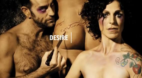 Sydney Festival today launched its 2013 event, with a fully integrated advertising and marketing campaign that uses language to capture the diverse and unique experiences of each Festival-goer via Sydney brand and visual communications agency Alphabet.
The work spans TV, cinema, print, online and outdoor advertising, a new identity, experiential installations, signage, direct marketing materials and printed promotional collateral including a brochure, posters and postcards.
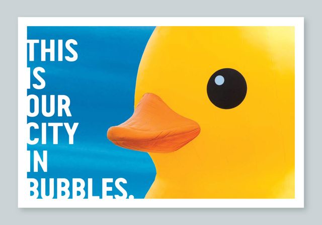 Featuring language as the key tool, the creative utilises the Festival’s strap line, “This is our City in Summer”, with a typographically led campaign that evokes the myriad of personal experiences, emotions, interpretations and responses that will emerge for those attending the Festival.
According to 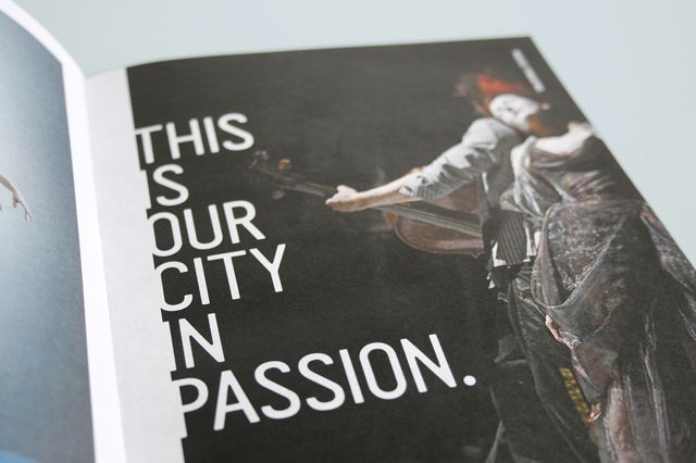 Alphabet co-creative director Paul Clark, realising that the existing strap line could be embraced and utilised as a key concept driver for the campaign, was an exciting breakthrough.
Says Clark: “We needed to enhance its meaning and for it to work much harder on behalf of the Sydney Festival brand and its 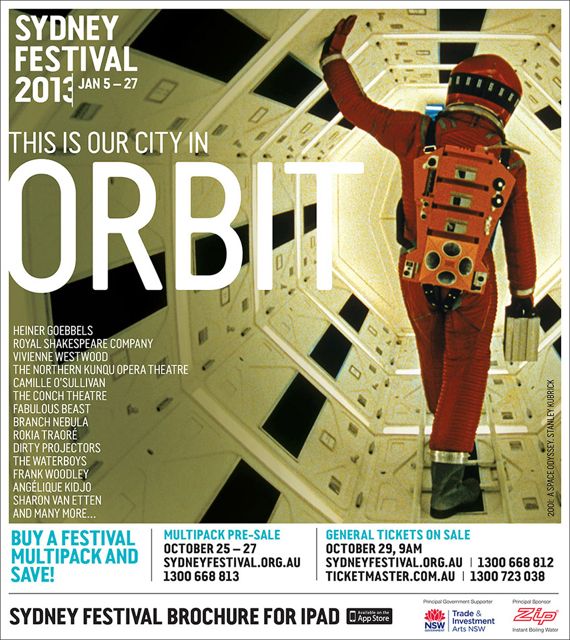 product. We saw that we could use the strap line to challenge, redefine, subvert, contradict and quantify the essence of the Festival brand”.
Tim Kliendienst, co-creative director, says that the resulting campaign sets out to be all-inclusive.
Says Kliendienst: “Each individual will have their own version of the Festival, which reflects how and what they choose to see. Employing a diverse range of literal, metaphoric, categorical, evocative and emotive language to drive the campaign, 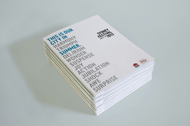 we wanted to provide a platform to define the essence of Sydney Festival in a language based context.”
The 37 year-old Festival, held annually in January, is the largest annual arts and cultural event in Sydney. Last year the Festival drew crowds of over 580,000, attending a diverse array of both free  and ticketed events from local and international artists at venues across the city and greater metropolitan Sydney.
In addition, Alphabet have also crafted a new identity for Sydney Festival, heavily based on contemporary realisations of written communication. The typographic logo utilises a cursor, which the agency says, suggests a stream of thought, the rendering and documentation of words, thoughts and ideas.
Kliendienst said that language and typography play centre stage across both the identity and campaign executions, but still 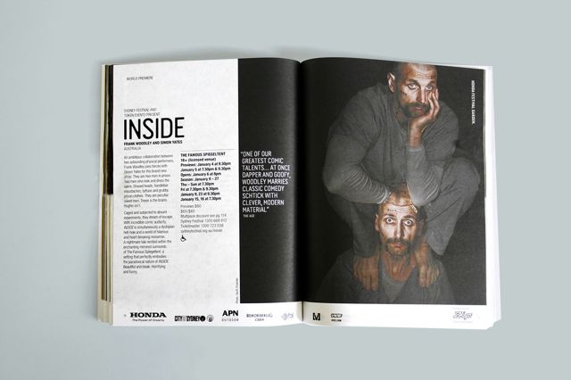 allows the photographic images, from productions involved in next year’s Festival, to lead the creative.
Says Kliendienst: “All graphic material is stripped back, minimised to give the language ultimate potency but allow the diverse range of imagery we’ve used, to be lead creative. Key applications are 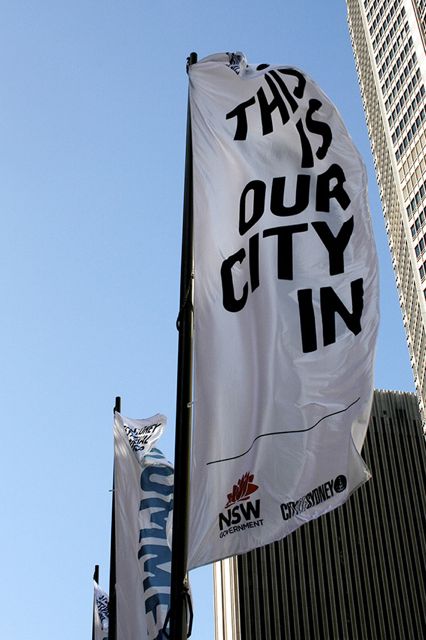 left white, however, like a blank canvas, to give the language a bold uncluttered landscape.”
This approach also follows in the 30 and 60 second TVCs and cinema ads, which were wholly conceived, directed and produced by Alphabet. The motion elements of the campaign utilise the cursor device from the identity, to generate a range of emotive and descriptive words that reflect the productions on offer for 2013. Using the evocative stills provided, the ads integrate language and imagery to provoke intrigue and to provide a preview of the diverse content to come.
Alphabet have created a bespoke element to the program, with interactive installations to activate the campaign throughout the city. Inspired by Sydney Festival artistic director, Lieven Bertel’s interest in experiencing arts events out of traditional context, unexpected interior and domestic objects will be installed in high-traffic outdoor locations. Branded objects will include a bathtub, bed, lockers, park benches, antique cupboards, wheelbarrows and mirrors.
Says Jill Colvin, the Festival’s head of marketing, communications and digital strategy: “This campaign is arresting and highly engaging, because of the way it invites you to think about what Sydney Festival, which has become an iconic Australian arts and cultural event, means to you.
“We’re incredibly excited to see what this campaign will deliver for the Festival and how the work will evolve across Alphabet’s three year tenure.”
The campaign launches today and will run until January. The advertising will be seen in daily Sydney and National metropolitan newspapers, at Dendy Cinemas and on SBS Television, YouTube, Sydney CBD streets banners, JCD Decaux, APN and ROVA outdoor formats.
Client: Sydney Festival
Agency: Alphabet
Creative Directors: Paul Clark & Tim Kliendienst
Designers: Lars Juriansz & Ashleigh Steel
Video Editor: Lara Juriansz
Concept Development Consultants: Penny Bowring & Pim Van Nunen

5 Comments
I was looking forward to see where they were going to take the yellow balloon. It just looks like a generic art program now. Sad.
Didn’t they have money to make the pictures move?
Forgot to say:You should get into advertising with a schpiel like this:
Says Kliendienst: “Each individual will have their own version of the Festival, which reflects how and what they choose to see. Employing a diverse range of literal, metaphoric, categorical, evocative and emotive language to drive the campaign, we wanted to provide a platform to define the essence of Sydney Festival in a language based context.”
Bring back the balloons!!!
Generic generic generic, design by committee or just no skills???
Sad!
Jeepers, you can do a lot on iMovie now huh?