Frost Design takes typography from print to pixels in new tvc for Woolworths South Africa
 Frost Design have created a new TVC for Woolworth’s South Africa, directed by founder and CEO Vince Frost, in his role as creative director of the high-end department store.
The ad, to promote Woolworth’s March sale, features bold typography, a signature of Frost’s distinctive graphic style.
Says Frost: “Adapting our way of thinking to the moving image is always an exciting opportunity. What I loved about making this TVC, was being able to bring the typographic language of the Woolworths brand to life”.
 The 20-second commercials are innovative in their use of typographic descriptions of products, rather than traditional imagery, to create cut through. The creative direction utilises a palette of black and white with a pop of red, which reinforces Woolworth’s monochromatic brand identity, whilst drawing on the colour cues associated with retail clearance sales. Frost’s direction, combining bold typography, colour and sound with fast paced movement, creates an energetic, high-impact call to action.
 Frost have been heavily involved in the extensive brand repositioning program undertaken by South Africa’s leading retailer, after Frost’s appointment to the role of creative director in 2009. Woolworths hope that Frost’s strong design ethic and specialised skills will help raise the standard of design in South Africa, and create positive opportunities for up and coming local designers.
The Frost studio in Sydney, as well as Woolworth’s in-house studio set up personally by Frost in Cape Town, have been working together to roll out and evolve the rebrand across all areas, including advertising and packaging designs for its clothing, home, foods and beauty lines. Woolworths has a presence across Africa and the Middle East, and has more than 400 stores.
Frost appointed Christian Hogue’s specialists motion graphics studio, Lost in Space, to handle the production. The television commercials go to air this week.
CREDITS
Client – Woolworths (South Africa)
Creative Director – Vince Frost, Frost
Director – Vince Frost, Frost
Senior Designer – Ben Hennessey, Frost
Account Director – Grace Kiernan, Frost
Motion Graphics – Lost in Space
13 Comments
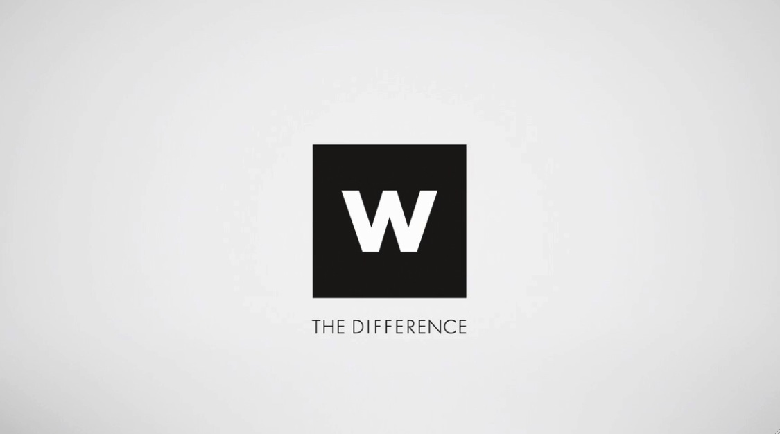
I have never seen Woolworths (SA) logo before – it looks extremely close to the W Hotels identity
you’d expect more from frost.
not compelling one little bit. maybe apart from the number – 50% off.
Really? Why would Frost PR this? Quality control required. I have a lot of respect for Vince Frost, the guy’s a talented designer but this looks like it’s been knocked together by a uni student who has just discovered animated type.
Mr Frost is always banging on about “Big Ideas” but all we see in his executions is BIG TYPE.
Whoever wrote this reminds me of a guy I know. Cramming as many marketing 101 ‘in’ words into a sentence as possible. The guy I know is also a complete tosser.
Hey guy’s moving media is not your bag . . . stick to the static stuff and the funky T-shirts . . .
It’s shite.
Lets hope Sth Aftrican’s are highly literate in speed reading.
Frost just aren’t doing great work these days, it seems.
All I see is DREAMY ASSES. I love dreamy asses.
Design ethic? Specialised skills?
Looks like a bad flash animation from 2002.
“The creative direction utilises a palette of black and white with a pop of red, which reinforces Woolworth’s monochromatic brand identity, whilst drawing on the colour cues associated with retail clearance sales.”
Are these people insane? Who wrote this garbage? An absolutely ludicrous and lame attempt to elevate terrible work to some kind of artistic plane. There is absolutely zero merit in this work.
I give up on this industry!
I guess with sustainability high on peoples priorities, Frost is recycling the typography from their NIB ads. Pull your socks up Vince, This is rubbish
The top image works well as a bold but minimalistic approach. It also withholds enough information to be mysterious and inspire curiosity – if the onlooker doesn’t already know the brand.