Bestads Top 6 of the Week reviewed by Brent Choi, chief creative officer, Cundari, Toronto
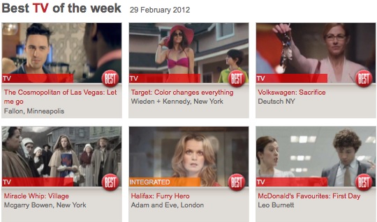
Cosmopolitan Hotel They swung for the fence on this. That’s for sure. And I really value that. I could nitpick some parts, but it was courageous. And fun to watch and delivers on the communication. I think there could have been a little more ‘wrong’. There I go, nitpicking.
Runner-up: Target Again, they went for it. And I guess I just hold a much higher standard for your more typical television ads, such as the other entries where it’s your classic misdirect set up with the reveal. This Target ad was an interesting idea. I will nitpick a bit on this and say it just didn’t visually live up to the promise of colour. I compare it to the great Sony Bravia ones with huge colour. Nonetheless, a fun video and point well-taken.
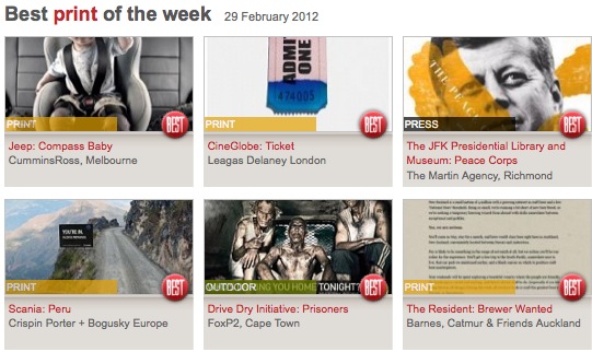
Jeep I don’t love the art direction in this but the concept is fun and rewarding to the viewer. I can see the target loving this too.
Runner-up: CineGlobe I wish I didn’t pick a film festival ad, but it’s clever. And it took me a few seconds to get it, which I like. Simple, creative, but maybe too formulaic? I will say that it looks like a pretty boring film festival. A science film festival?
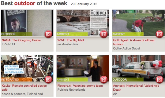
If this week’s entries are a representation of work for the year, the OOH category is sure going to be tough to medal in. Lots of smart, innovative thinking that surprises the viewer.
NAQA – The coughing poster I hate this video. It’s 5 minutes long and could easily have been 90 seconds. I was mad the entire time watching it because I could see the idea after 20 seconds. So I wanted to hate the idea too, but I couldn’t. It was too surprising, memorable and most importantly, delivering on the key communication.
Joint Runner-up: WWF – The Big Melt The idea is simple and the reveal is so tied to the subject matter of climate change. It’s a smart idea. I’m just not sure it’ll have the real-world impact on awareness. It probably gets more views online than in person.
Joint Runner-up: Golf Digest Kind of gimmicky, but perfect placement for the perfect audience.
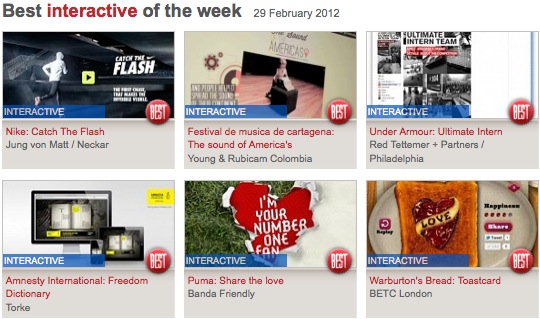
Nike – Catch the Flash It sure helps having a cool product to promote. And the interactive experience lived up to it. I really like the combination of live experience, mobile, and web – all interactive in the same ‘game’. Plus, the object of the game really promoted the product benefit. The other layer (no pun intended) that I liked was how Nike Plus customers got an advantage.
I’m choosing no runner-up this week for this category. I will say I really couldn’t understand the ‘Sound of the America’s’ concept, and the Under Armour one doesn’t show me what the concept is. Amnesty was interesting but just didn’t pull me along enough. Puma concept uses a technique we’ve seen too much before to be innovative. Especially for interactive.