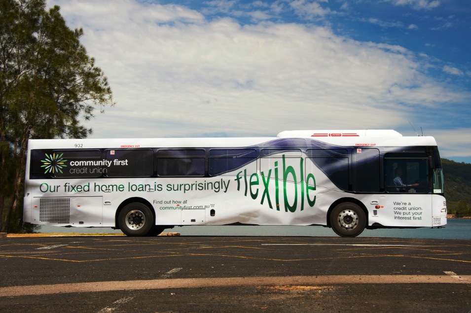
I.D.E.A.S. creates flexibility in bus wrap campaign for Community First’s Fixed Rate Home Loan
 Sydney-based creative agency I.D.E.A.S. working in partnership with Jane Caro today launched the latest instalment of their campaign for Community First Credit Union called ‘We put your interest first’.
This outdoor ‘bus wrap’ execution features a ‘stretched’ bus, which highlights the flexibility of Community First’s Fixed Rate Home Loan.
Working with Electric Art, the agency created a 3D illustration that took an existing image of the bus and then manipulated it so that it appears that the whole bus has been stretched out of shape when this new image is overlaid on the actual bus.
The campaign marks a fresh creative direction for Sydney’s largest community-based credit union following a pitch in July.
Says Michael O’Reilly, head of marketing at Community First Credit Union: “We wanted to take a fresh approach to our creative and bring our innovative product offering to life in a more
entertaining way and that is exactly what the agency did.”
Max Landrak, creative director added: “This is a surprisingly under-utilised medium. Most wraps look like posters on wheels. It’s a shame because when used well, a bus wrap can be a memorable part of any campaign”.
Credits:
TITLE: ‘Flexible Bus’
CLIENT: Community First Credit Union
CLIENT CONTACT: Michael O’Reilly, Head of Marketing
AGENCY: I.D.E.A.S./Jane Caro
CREATIVE: Max Landrak/Jane Caro
3D AND RETOUCHING: Electric Art
MEDIA: Go Transit

19 Comments
1986
It’s a bit of a stretch.
Seems obvious but wouldn’t placing this ad on the side of one of those giant flexi-buses have been a better creative solution?
How can someone who produces work like this be a regular contributor to a show about advertising? This is second rate.
woud love to see the 2011 version…can you show please…and no not connected to agency or client in any way
Should get metal. Nice.
This should well at the big shows.
Guaranteed bronze. Maybe silver.
At last someone is doing something interesting with typography. I miss Rod and Mike. Were they involved?
extremely old school
Are you idiots smoking crack? If I’ve seen this once I’ve seen it a million times.
F*cking lame and in no way PR-worthy.
A million times! Rubbish. Flick through some annuals mate. Have you ever picked up metal? Obviously not if you don’t like this. Look at the type crafting. Stick with your nappy ads junior. And it’s not old school. It’s classic.
If this even comes close to getting metal, I’ll insert a large metal rod in my …..
This one was way better…
http://adsoftheworld.com/media/ambient/copenhagen_zoo_snake_bus?size=_original
Fairly VJ if you ask me.
Use a flexi-bus. Wrap the bus in a slinky decal. Drop the line on it. Done.
This was done by someone who thinks she’s qualified to comment on our industry?
although doing something interesting on the side of a bus isn’t new, hardly anyone ever does it. I do work in media and I actually can’t remember another execution recently that has been vaguely this interesting
The probably had the mid to late 90s AWARD annual where it was a finalist:
Bates Auckland (now defunct) for Countrywide Bank (now defunct). The headline was:
If you think this is flexible \ you should see our home loans (LOGO).
doesn’t look flexible, looks like someones scrunched it up and about to throw it in the bin.