Toko Sydney develops id’s for Sydney Design 2011 and Love Lace exhibition at Powerhouse
 Toko Sydney has developed two separate campaigns for the Powerhouse Museum.
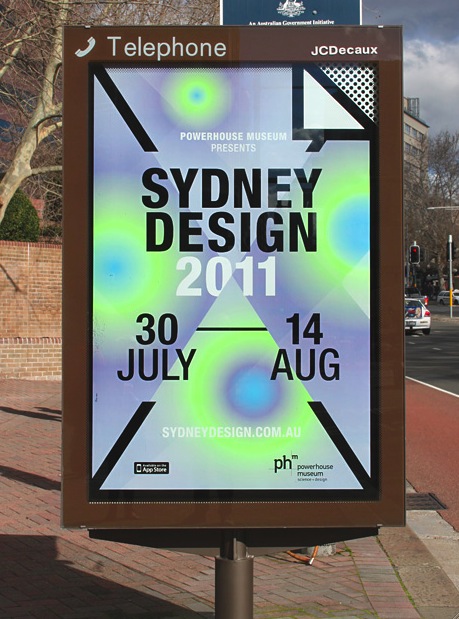
One is a new campaign for Sydney Design which is one of Australia’s most established contemporary design programs. It lasts for 16 days and features 90 events at 33 venues.
This year’s visual identity celebrates paper as an icon through an icon. The simplification and digitalisation of honest and physical paper for our digital world represents the immense changes we experience and will experience in the future.
This little icon represents the connection to the ‘old’ world and helps us navigate through the ‘new’.
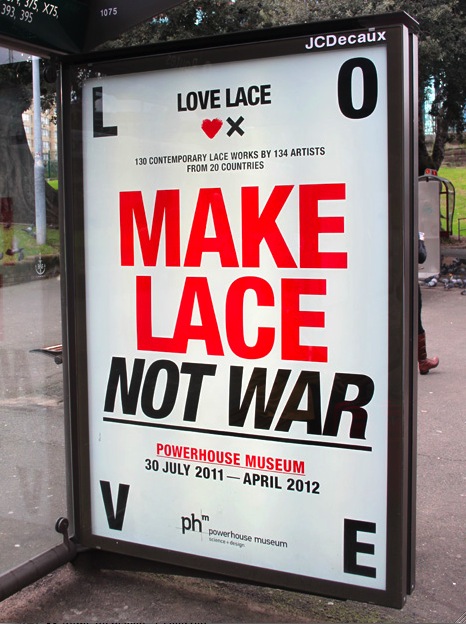 The Love Lace Exhibition is about the
need to challenge the conventional notions of lace in order to attract new audiences for the Museum was the key motivator for the ‘Lace Revolution’ visual identity concept.
Preconceived opinions will be challenged by the provocatively bold execution of marketing and advertising collateral. ‘The Revolution’ embodied in tag-lines like; “Make Lace Not War” and “Open Work For Everyone!” comes to live in a dynamic visual identity representing revolutionary vernacular like protest signs, badges and protest walls.
Toko also developed the exhibition graphics complementing Durbach Block’s exciting architectural design.
1 Comment
That Sydney Design poster pretty much sums up Sydney design.